fix(switch): add focus indicator#1874
Conversation
|
Deploy preview for pf-next ready! Built with commit a2cc8ca |
 christiemolloy
left a comment
christiemolloy
left a comment
christiemolloy
left a comment
There was a problem hiding this comment.
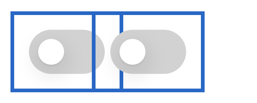
I'm wondering what the decision was to make the focus ring so large around the switch, when theres two switches placed together which I could see happening often, it looks like this:
|
To quote @mceledonia, 4px rather than the 8px used felt "like an impending doom slowly closing in on the innocent switch." 😂Also, he felt that the switches shouldn't be placed that close together. |
|
Yeah I felt like the 4px was just a bit too tight, but if everyone disagrees I can concede :) I certainly want to avoid that above - hopefully we can do that with spacing as each toggle should have some kind of label which keeps them further apart. I can't think of many other areas where we have two components less than 8px away from each other... thinking of things like the toolbar, button layouts, etc.. but like I said, if 4px looks fine to everyone else and helps to ensure we avoid the above, we can go with that. |
|
Ok thanks for explaining @mceledonia ! So this is with 8px margin between them and I think that will work
|
|
Awesome, yeah let's go with that for now... if we have problems in the future we can always bring it down. |
|
Beautiful 👍 |
|
🎉 This PR is included in version 2.10.0 🎉 The release is available on: Your semantic-release bot 📦🚀 |
6 participants
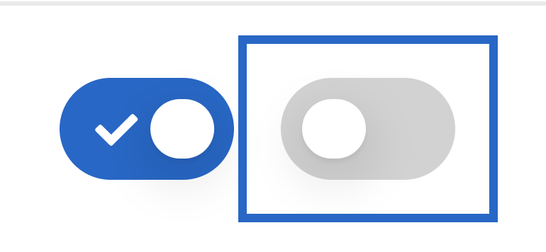
This adds a focus indicator to the switch component.
After discussion with @mceledonia, we'll go with a 2px #06C border, 8 px from the edge, but no fill. This allows us to use the outline property rather than creating a pseudo-element, which would have potentially caused z-index problems.
Fixes #1824