Printing changes layout of the graph #2184
Description
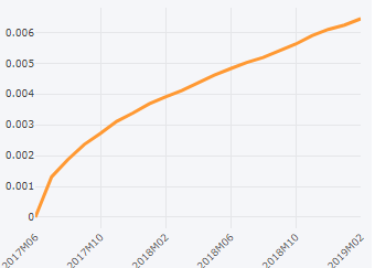
Here is the graph that I created using Plotly python ( dash to be specific ) rendered in Chrome. But, I don't think it should matter in this case.
Here is what it looks like when I tries to print in Chrome
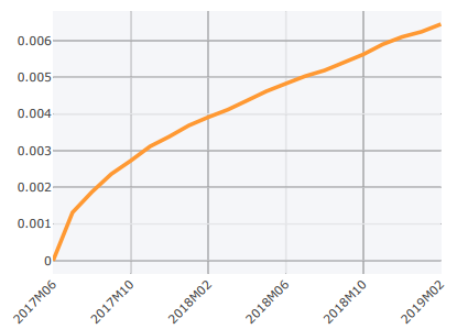
As one can see, the underlying grid lines become too think. What can I do to make sure that the print accurately reflect what I plot ?