Caution
This Project is at a fairly early stage of development, and is one of our first attempts at opensourcing a project
An Offline Component library application that allows developers to save code components/snippets on the local drive. No complexities, a simple paste of code saved for later use.
Warning
While the project is under the CC BY-NC 4.0 license for now, we are open to suggestions and may reconsider the license in the future based on contributor feedback.
- To make the reusing of code components easier for developers.
- To keep developers code creations safe and 100% offline.
- To increase project development efficiencies.
- To keep it simple, no AI or LLM enhancements to promote privacy "peace of mind".
- Keep the design clean, and modern.
- Add a component with; name, tags (Max of 3 right now), languages (Max of 3 right now) and code input boxes
- Edit a component; name, tags, languages and code input boxes
- Delete a component
- Pin components
- Select components to display all info inputted by user
- Search components by name or tags
- Recent tags area for better access to components
- Langauges tags area for list of 5 langauges in the library of components
- Settings area with Dark and Light Themes for app
- App Refresh button
- Automatically assigned code logos for components from "Devicons"
We have plenty of features, ideas, and some issues to work on (see Issues), if you think you could contribute, Check out the CONTRIBUTING.md area and let us know!
- Dyanamic React Component/application reload when interactions occur i.e. once a new component is added the component area is refreshed to show the new component instantly
- Dynamic search that shows available results automatically based on active input
- Greater code processing/output capabilities (currently only HTML, CSS, JavaScript); This could be implimented using Monaco editors perhaps (open to suggestions)
- Code cleanups and optimisations
- Better File and Folder Structure
- Better responsivness for all devices (styling)
- More alert response implimentations
- Security and Content Security Policy Implimentation
- Drag adjustible sections i.e. organising widths of component container or code details area
- Timestamps on components automatically ("Date created", "Date Modified")
- Fully custom styled code-mirror areas to match dark/light themes (code editor)
- Animations and transitional effects (styling)
- More selectable themes
- Connecting the application to an extention in VS code to more easily add component code into projects
- Obsidian intergration/compatibility to connect a component to notes
See all planned features here
We are always open to more suggestions that align with the project goals
As of right now, the project is only available to install from this GitHub Repository -
Please ensure your NodeJS Version is v20.15.1 or later
Follow the guide at GitHub Docs
Install packages -
npm install
Start the Application -
npm start
Caution
We are currently unaware of the cross-compatibility of this application on Operating Systems other than Windows 11, please let us know of any issues you may find!
-
Once Devectus is started and open, you can begin by creating a new component by selecting the "Add" button in the tools area, follow the on screen form instructions to create your component.
-
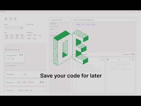
Click on a component in the component list/area to display all information inputted for that selected component, including name, tags, langauges and the code inputted, as well as an output (HTML, CSS and JavaScript only).
-
You can edit component information by selecting a component and then selecting the "Edit" button in the tools area, then make changes in the form accordingly.
-
You can delete a component by selecting a component and then selecting the "Delete" button in the tools area, then click confirm deletion.
-
You can Pin components that you may see as more important by selecting the component then selecting the "Pin" button in the tools area.
-
You can search for a component by typing your search into the search bar above the tools buttons/area and selecting the search icon or pressing the "Enter" key.
-
Select the settings button in the top left of the application, then select the preferred theme (Light/Dark).
-
Select the refresh button next to the logo in the top left of the application and the newly created component should appear.
Note
We hope to soon impliment automatic refreshing or a dynamic refresh in certain React Components to replace the need to refresh with the button.