http://segment-docs-stage.s3-website-us-west-2.amazonaws.com/docsv2/connections/spec/identify/#identities

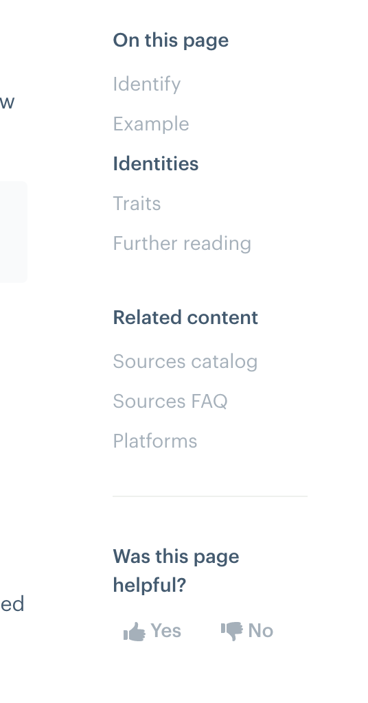
In this right-nav TOC, the font weight and color for "on this page" and "related" is the same as the one we use to highlight which H2 you're on. Those two heading should either be a heavier weight, or we should make the h2-location one a different color so they're easier to tell apart.
We also need a line to separate the TOC and the Related sections.
(Bad-art version of what I'd like follows: )
