Overhaul of SideContent component #740
Conversation
|
We can, but the larger icons are easier to click on and work better with the animated line |
* SideContent and SideContentTabs now make use of BlueprintJS Tabs and Tab components

* Tab buttons, icons are now larger

* More properties added to SideContentProps, SideContentTab to accomodate extra functionality

* Added documentation for these new properties

* Changed 'icon' to 'iconName' for SideContentTab component for clarity

* Instances of nested SideContentTabs on Mission Control feature were removed or replaced with dropdown menus

* Updated CSS style names and 'alert' styles for SideControlTabs

* Fixed redundant setInterval callback that removed 'alert' style from active Inspector tabs (now handled by CSS instead)

* Removed (now redundant) 'activeTab' state and 'handleChangeActiveTab' actions from Workspace components

* Updated tests
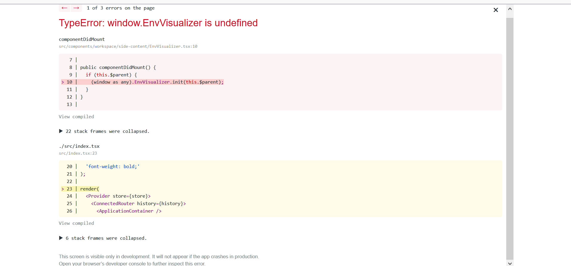
…sualizer to fix 'TypeError: window.ListVisualizer/Inspector/EnvVisualizer is undefined' when loading the Playground on occasion
* Fix SideContent and SideContentTabs to allow default values to be passed to props

* Chat tab in Assessments and Grading components now has the 'disabled' property
I agree that the icons are on the big side. A bit smaller would be better. The line might not be necessary as long as you have the color highlighting. |
|
We can add left and right padding, the button does not have to be tall |
|
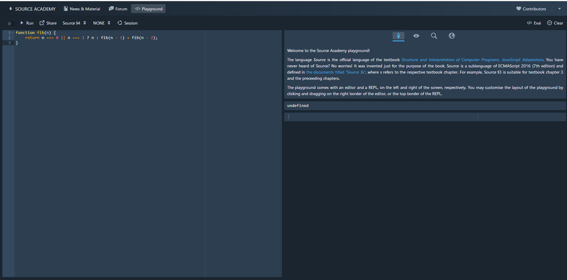
Thanks for the feedback, what about this? The tab icons are still slightly bigger than the others, but I think it's ok because the icons do not come with text like the other buttons on the UI.
The line can be removed easily as well, it is entirely up to preference. The blue styles can be hidden if it stands out too much from the interface too |
|
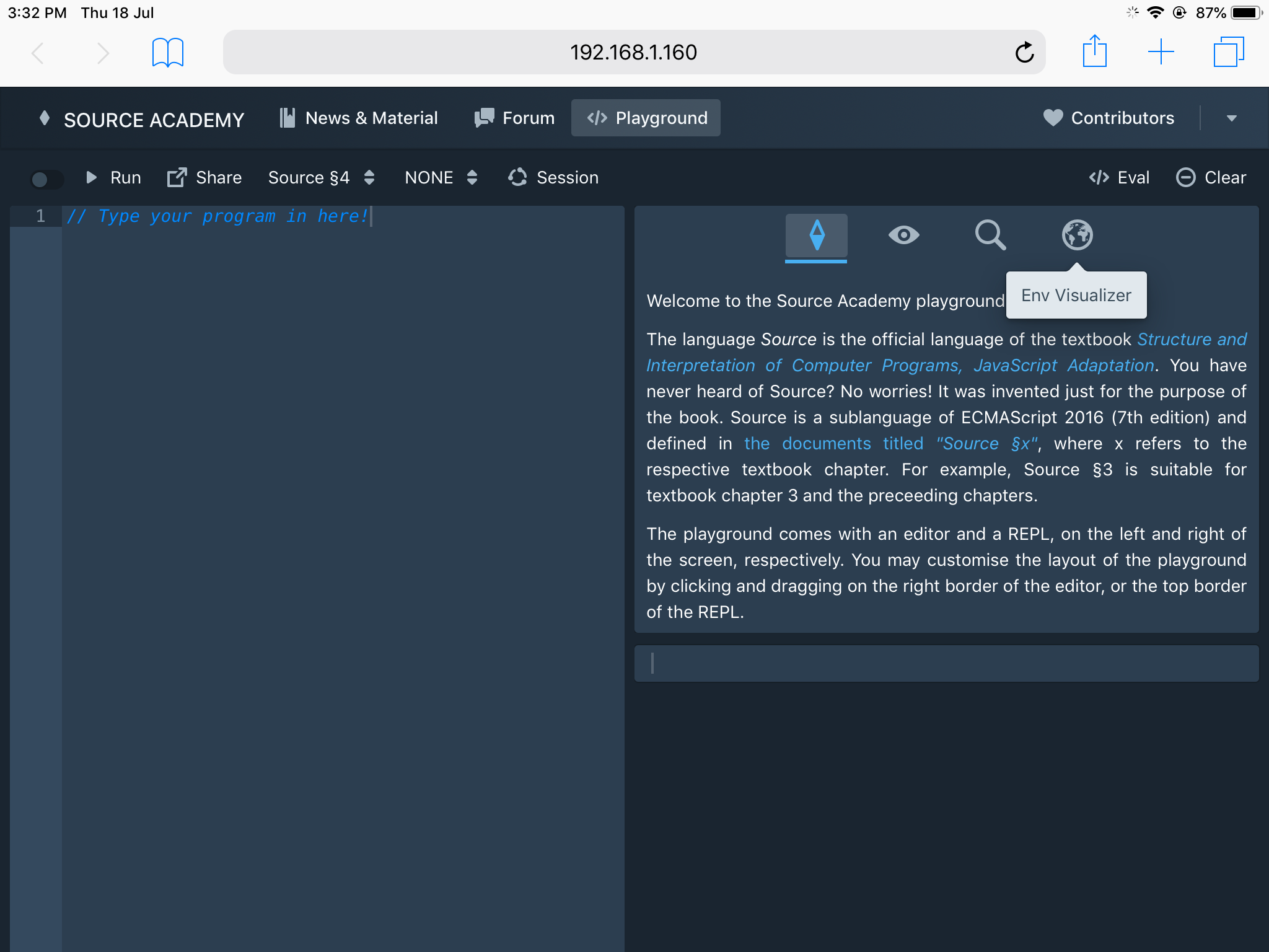
The large buttons are far easier to use on touch devices, admittedly. Here is a screenshot of how the large buttons look on iOS Safari:
|
|
It will definitely be nicer for touch devices, but we don't currently plan to support that. |
Actually, I think it's important to support touch devices. The Academy is almost usable on mobile devices. With a bit of effort, we can get there. I think this is important for our outreach. Sound processing is fun with phones. Also, next year we will have many more libraries that use sensors such as accelerometer and camera. In the light of that, I support the large icons. |
|
In my opinion, if we really want to design for mobile users, we should separate the style choices, similar to how this very github website has a Desktop view and a Mobile view. |
I agree. Let's look into this in Sem 2 CP3108. |
Some context: Initially the icons were made to be as similar to the original as possible. I was unsure of larger icons at first too, but I decided to implement them after much comparison and toying around on various interfaces Not too sure about the design decision to only include icons in the tab buttons though (and the titles as tooltips instead of being in-line with the icons), but I decided to go along with it for now
The icons will get squished though, isn’t it?
True, but many web apps also integrate their desktop and mobile designs together. I feel that such integration is a better solution than two separate websites with different interfaces
Ok, so I guess the consensus is the smaller icons. Would the icons in the second comment I made be satisfactory, if not what changes could be made? |
Yes, this is good. Let's go for it. |
|
Regarding mobile/touch: I've played around a bit, to check out sound recording. It's almost usable. A couple of issues:
|
Wow, thanks for the fast review. I was just about to comment that I had made the changes! Anyway, for future reviewers: please refer to #740 (comment) for the screenshot of the tabs in the current commit |
| } else { | ||
| // Try again in 1 second | ||
| window.setTimeout(this.tryToLoad, 1000); | ||
| } |
There was a problem hiding this comment.
Let's not implement tryToLoad or NonIdealState into these components. Unless we know that the init stage is failable, which I doubt so, we don't need to create "loading screens"
| // Try again in 1 second | ||
| window.setTimeout(this.tryToLoad, 1000); | ||
| } | ||
| }; |
|
@geshuming The loading screen is meant as a fix for this error:
Another alternative is to set the Playground side content not to load in all the tabs at once, but then this error would occur if you set the default loaded tab to the List Visualiser/Inspector/Env Visualiser Not sure if there are plans to use this default tab feature, but I feel like there could be cases where assignments would want to show the List Visualiser/Inspector/Env Visualiser features outside of the playground and load them in by default What do you think? |
|
@alcen I see, so because the visualizer gets rendered first before the parent, it leads to the error. Is it possible to explore ways to delay the render of the visualizer? |
|
Yes, I feel that the missions are currently deprived of some of our features, such as the list visualiser. In practice, this means that students will leave the mission and go to the playground to have a better experience. Quite unfortunate!
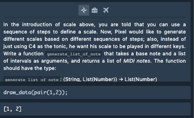
The debugger tabs automatically appear when the program runs into a breakpoint. Can we do the same for the data visualiser? Currently, it remains hidden, even when you call draw_data(). |
…eActiveTab' action for SideContentTabs in SourceCast and SourceReel
Possibly React state could be used to determine when exactly to initialise the List Visualiser/Inspector/Env Visualiser scripts, but the component would still display the loading screen while the scripts are not loaded yet Other than that the easiest way to delay them would be to set the Blueprint tabs to only render React components when the tabs are switched (and hide those tabs from view by default), so there would be an artificial delay before someone gains access to those components. Before, this was how the tabs worked so such an error would have been rare, and probably there were less scripts to load (only List Visualiser) so they would have finished loading before the corresponding React component was mounted Though, there could also be other methods of delaying React components from rendering, not too sure there
It will probably be next in the pipeline once the new tabs are implemented! |
|
nevermind, was just throwing ideas. I still think there should be a way to resolve this without try-catch |
No problem. I feel like there should be a way as well Perhaps the library loading can be done by React instead, then we can change the component's state when it is done causing a re-render? |
4 participants
Currently, the Workspace SideContent component uses self-implemented tabs. In this commit, these are replaced with the BlueprintJS Tabs component to afford new functionality, and to allow for continued updates from their development team.
Key changes:
Please provide feedback about the look and feel of the new tabs. Do take a look and suggest any changes!