Repository navigation

Install or upgrade with npx framesmith, or npm i -g framesmith.
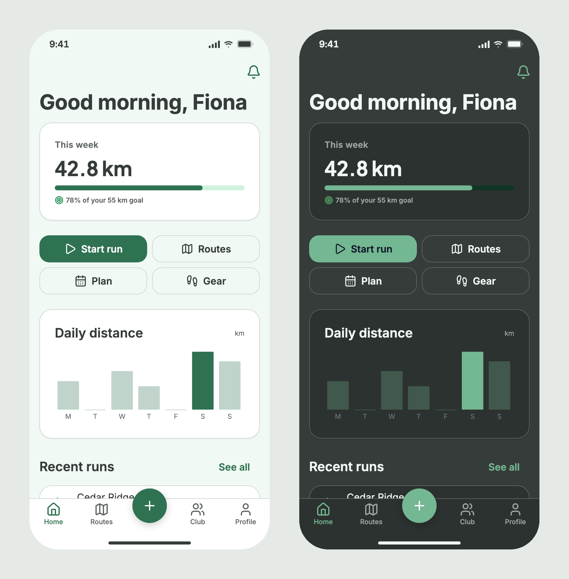
framesmith now knows when a screen is a phone app screen. You declare it, it is judged as a phone, you build it from phone pieces, you start it from phone structures, and the viewer shows it as a phone. The screen above was built that way in 33 nodes; the first attempt, made before this release, took 93 hand-built nodes and passed without a single mobile check running. (#232–#240)
Declare the medium
canvas_create({ type: "mobile" })makes a phone screen. The default device isiphone-390: a 390×844 artboard whose root reserves the 47px status-bar inset at the top and the 34px home-indicator inset at the bottom (safeAreaon the root, added to the root's own padding).canvas_createnow honourswidthandheight. It used to drop them, so every canvas was 1440×900.- New tool
canvas_set_typedeclares an existing canvaswebormobile. It never resizes the canvas or writessafeArea; its result names the op that does when one is needed. - Every
canvas_evaluateandcanvas_autofixresult carries asurfacereport: the canvas type, the device, and the rule ids its type, genre and preset turned on and off. generate_design_systemon a phone canvas pivots the type scale on a 17px body (16px fordata-dense).
Judged as a phone
A phone canvas runs the mobile rules, and each finding names its rule in a rule field:
mobile-touch-target(error): a button, list row, tab, tab-bar centre action, nav-bar action or control under 44px.mobile-safe-area(warning): content under the status bar or home indicator, or left under a pinned bar.mobile-type-floor(warning): text under 11px, a body under 16px, or prose of five or more words under 13px.mobile-tab-bar(warning): fewer than 2 or more than 5 tabs, a tab without a label, or a tab bar not pinned to the bottom.mobile-handbuilt-targetandmobile-one-column(info): an icon-sized frame that should be a button, and side-by-side columns of prose.mobile-artboard, on every canvas: a phone canvas 500px or wider, or an undeclared canvas narrower than 500px, is a warning.
Built from phone pieces
- New node types:
status-bar,home-indicator,nav-bar,tab-bar,button,list-rowandsheet. They count as reused components, andcanvas_stressperturbs their text. position: "fixed"pins a node to the screen and"sticky"sticks it while its container scrolls;bottomandrightoffsets joinxandy. The renderer reserves room for pinned bars, so content never starts or ends under them.- A document root taller than its artboard now grows with its content and keeps its bottom padding.
Started from phone structures
dashboard, settings, auth, onboarding, feed and detail each have a phone version (dashboard-mobile and so on). Each is built only from the phone pieces and tested to pass the mobile rules in fast and detailed mode, and canvas_stress, under every personality. apply_structure stamps the version that matches the canvas's declared type (realisation overrides it), and list_structures({ canvasId }) lists what stamps on that canvas. A structure with no phone version, such as pricing, is refused on a phone canvas with the list of those that have one.
Shown as a phone
- Gallery and archive cards render each canvas at its own artboard proportions, so a phone screen is a portrait card.
- A phone canvas opens at 1:1 in a device frame, with a Safe area toggle that shades the status-bar and home-indicator insets. Web canvases keep their breakpoint buttons; the Mobile button now takes its size from the device profile.
Fixes
gap: 0is never reported as off the spacing scale. (#232)- A chart
highlighttakes a single index as well as an array; an invalid one renders no emphasis and the op result warns. (#232) canvas_evaluatereturns the lastcanvas_stressresult as astressfield, and stays NOT READY after a FRAGILE run until a full CLEAN run replaces it. (#232)- Detailed
canvas_evaluate,snapshot_layoutandcanvas_difflay out at the canvas's own artboard size instead of 1440×900. (#232) - Large type (24px and up) now renders at its authored size at the canvas's own width, and shrinks on narrower viewports as before. It used to scale against a fixed 1440, so on a 390 phone a 33px title rendered at 20px, smaller than the body. (#240)
- Chart tick labels keep their 11px size at any chart width. They used to stretch with the plot. Each x label now truncates with an ellipsis inside its own slot, and on a bar chart with one label per bar it centres under its bar. (#240)
Upgrading
- The
dashboardgenre is nowdata.dashboardstill works as an alias. The genre has its own field,metadata.provenance.genre, soapply_presetno longer overwrites it. Stored canvases keep their verdicts: a genre in the old field is still read, and the nextcanvas_set_genreorapply_presetmoves it to the new one. If a repo is shared, everyone working on it should run the same framesmith minor version, because older versions read and write the old field. - A web canvas narrower than 500px now gets a warning (
mobile-artboard) until you declare what it is:canvas_set_typewithtype: "mobile"for a phone app screen, ortype: "web"for a web page designed at that width. Like every warning, it holds the directive at NOT READY. - Web canvases that aren't 1440 wide render large type bigger. A 32px heading on a 1280 canvas used to render at 28.4px and now renders at 32px. Check layouts that relied on the old scaling. 1440 canvases render exactly as before.
- Detailed-mode results can change for canvases that aren't 1440×900, because they are now laid out at their own size.
- A FRAGILE
canvas_stressrun now blocks presenting until a full CLEAN run replaces it. The result lives in server memory, so a restart forgets it.