Desktop polish #3192
Desktop polish #3192
Conversation
Generated by 🚫 dangerJS |
 mxstbr
left a comment
mxstbr
left a comment
There was a problem hiding this comment.
This will need a new desktop app release so I guess this is a great time to test the auto updating!
desktop/src/splash.html
Outdated
| width: 100%; | ||
| height: 100%; | ||
| background: url('../../public/img/media.png') center center no-repeat; | ||
| background: url('../../public/img/homescreen-icon-144x144.png') center center no-repeat; |
There was a problem hiding this comment.
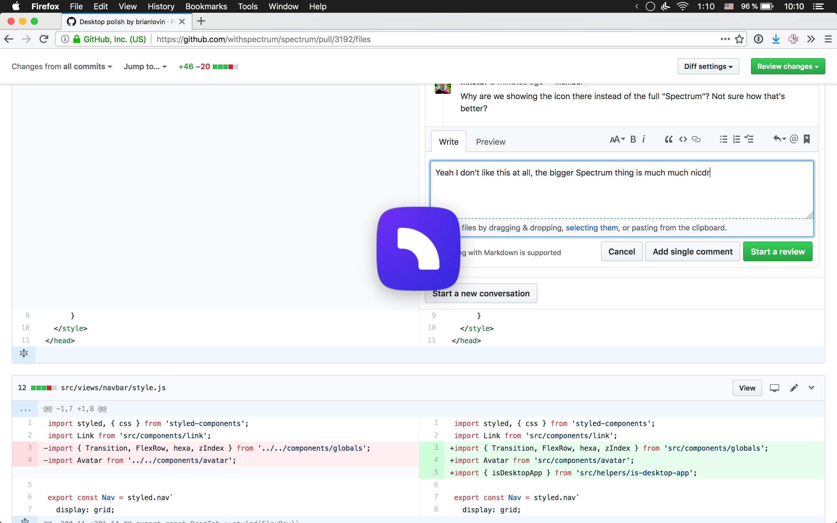
Why are we showing the icon there instead of the full "Spectrum"? Not sure how that's better?
There was a problem hiding this comment.
This looks very weird?
Not a fan at all, I much preferred the previous version with the Spectrum. Going to revert this.
desktop/src/splash.html
Outdated
| width: 100%; | ||
| height: 100%; | ||
| background: url('../../public/img/homescreen-icon-144x144.png') center center no-repeat; | ||
| background: url('../../public/img/media.png') center center no-repeat; |
There was a problem hiding this comment.
Why did you revert this?
There was a problem hiding this comment.
Look above in the collapsed comment, I really really do not like that. It looks bad in comparison to showing the media.png.
There was a problem hiding this comment.
Look at this comparison:

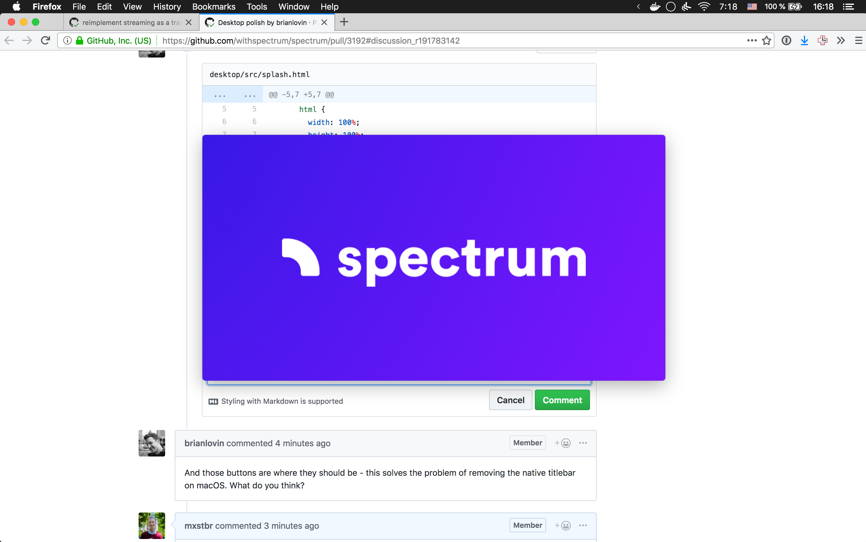
The second one looks so much more like a start screen to me?
There was a problem hiding this comment.
On a scale from 1 to 10 I'm maybe a 4 on how much I care about this, if you're 10/10 convinced we should go with the first one then I'm fine with it, but at least use the actual app icon and not the homescreen icon for the PWA which is different.
There was a problem hiding this comment.
I guess I disagree here, too - I think the media version is much clunkier and feels less like someone is opening a native app. Having the PWA icon as a squircle with the shadows.
I'd rather have nothing at all and just let people wait a second or two for startup.
I see other native mac apps do this too: just show nothing during boot.
|
And those buttons are where they should be - this solves the problem of removing the native titlebar on macOS. What do you think? |
I don't think it looks better, honestly I much prefer the grey bar. I think them being off-center looks pretty crappy. |
I disagree - the gray bar makes us the app look like a lazily-wrapped website (which it is under the hood). Hiding that bar and merging our UI with native UI feels much cleaner and more app-like. I can play with the button centering, it'll just mean tightening up our app UI, although to be honest the way it is in this branch doesn't look bad to me. |
|
I think it looks really really bad. 😕 Maybe we can just add a 38px black bar atop the navbar where that the buttons then sit in the center of? |
Sure, I'll play with it |
|
Here's what this will look like with Versus how things look today: IMO I think the flush version looks and feels much better, more native. |

|
Here it is tidied up and centered. |

|
I much much much prefer the centered version, that looks like an actual native app! |
|
Sounds good - those changes are pushed! Anything else here @mxstbr ? Thanks for the feedback so far |
Status
Deploy after merge (delete what needn't be deployed)
hyperion (frontend)
Improves the splash loading view
Makes navbar and titlebar flush with the window to feel more native ✨
closes #3187
closes #3179
closes #3180