feat: introduce new Autocomplete component #234
Conversation
 austingreendev
requested review from
allisonacs,
ginnywood,
jzempel and
ryanseddon
austingreendev
requested review from
allisonacs,
ginnywood,
jzempel and
ryanseddon
| }, | ||
| collectCoverageFrom: [ | ||
| '<rootDir>/packages/*!(.template)/src/**/*.{js,jsx}', | ||
| '<rootDir>/packages/*/src/**/*.{js,jsx}', |
There was a problem hiding this comment.
My addition of the index.spec.js tests broke our code coverage 😢 This re-enables that feature
|
I think we should copy the same way we've done radios/checkboxes, rather than pass a prop for label, hint & message we have the children inside the e.g. <Autocomplete
placeholder="Filter values"
selectedValue={state.selectedValue}
onChange={selectedValue => setState({ selectedValue })}
options={[...]}
>
<Label>Basic Autocomplete</Label>
<Hint>Autocomplete hint</Hint>
<Message validation="error">Error</Message>
</Autocomplete>This way they can still pass |
I originally tried this, but had trouble getting everything to play nice together since we are stitching the Also, with the example above, would the |
 jzempel
left a comment
jzempel
left a comment
jzempel
left a comment
There was a problem hiding this comment.
Please update examples/autocomplete.md with this new element vs. the existing container usage.
Fair enough maybe a good compromise would be to allow passing through a string or node to label, hint & message props. |
|
@allisonacs @Austin94 we need to continue to think about the normative gesture here. Consider the tab action through native form elements. On In most custom controls where the cursor is placed at the front of the value, we have the option of a quick Since neither range selection or I'm not entirely sure, but the action feels off atm. It's not intuitive when I see the front-positioned blinking cursor that I can't interact with the value via keyboard. I wonder if a more complete demo (mocking up additional form fields) would be illuminating? |
I'd be happy to look at a more fully formed demo. From the way the constraints were explained to me, what Austin and I worked out felt like a reasonable compromise between expected behavior and technical feasibility, but I agree it's still a little awk. Placing the cursor at the end and only initiating a replacement/menu via a backspace is… weird also. What if I attempt to type more in addition to the current string? It would just disappear, leaving only the newly typed thing—but there'd be no indication that that's what would happen. If we prevent you from typing when there's a selected item, that's also odd—it would feel broken. But yea, I'm happy to feel this out with a more comprehensive demo. |
|
yeah @allisonacs that backspace idea is clearly not viable. I'm wondering about our ability to detect a I'm also wondering about using |
I … think this would work, just need to see it?
Esp. in the case of an emoji picker, it's nice to be able to filter by typing, for example, "smile" to narrow down the emojis to all the emojis whose descriptions include "smile." Same kind of thing you see if you use the native apple emoji picker ( |
|
@jzempel @allisonacs Lets all have an offline discussion with some of this interaction today. Feels like we're going down a path that might require a separate PR rather than trying to wrap everything into this. |
|
@jzempel @allisonacs @ryanseddon This should get ready for a final review now. From our offline conversation with design, there is no longer a visual, input focus indicator when a user focuses the autocomplete with a keyboard. This now aligns with the current |
 allisonacs
left a comment
allisonacs
left a comment
allisonacs
left a comment
There was a problem hiding this comment.
Please update the example to remove the placeholder text.
jzempel
left a comment
jzempel
left a comment
There was a problem hiding this comment.
Oops, please update the WARNING text on the demo page, which currently indicates there is no Autocomplete visual component.
Updated! |
|
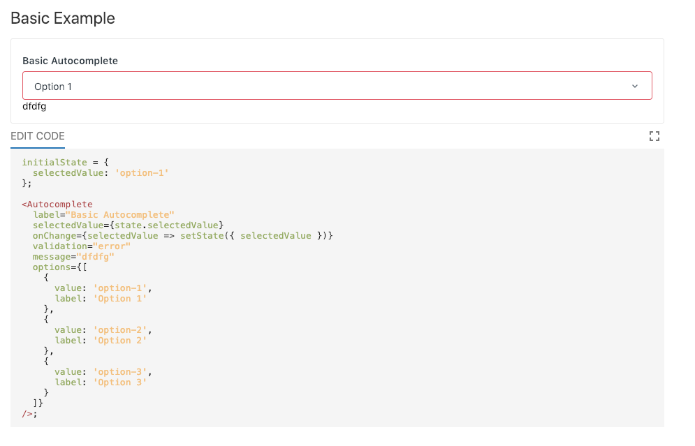
Adding a message prop the spacing looks off, also if I set the validation of the autocomplete that should filter through to the message too correct? |
@ryanseddon This is now corrected. Thanks for catching that. |
austingreendev
force-pushed
the
agreen/autocomplete-component
branch
from
7f8df67 to
7c2001d
Compare
Closes #51
Description
This PR introduces a simplified, high-abstraction element for common
Autocompletepatterns. The basic API is:This component also abstracts out much of the logic around filtering and rendering, but allows deeper customization through the
renderOptionandrenderDropdownrender-props as well as the ability to override the default text comparison with a custom comparator.Checklist
designer as a reviewer)
component
yarn start)