Releases: 05bmckay/hs-uix
Releases · 05bmckay/hs-uix
v2.1.0 — Calendar component and shared collection tooling
Features
- Calendar: Add
hs-uix/calendar, a presentational calendar with Month, Week, Day, and Agenda views; Today/previous/next/view toolbar; search and filter support; click-to-open event overlays; multi-day event rendering; overflow popovers; all-day/time-grid support; range-loading hooks; render override slots; labels; andcalendar.d.ts. - Calendar: Add robust date coercion and timezone-aware rendering, including
timeZone,defaultTimeZone,onTimeZoneChange,showTimeZoneSelect,timeZoneOptions, and date utility exports for zoned formatting. - Common components: Add the
Iconwrapper plus icon registry helpers (ICONS,ICON_NAMES,NATIVE_ICON_NAME_LIST,makeIconDataUri,svgToIconEntry) and abuild:iconspipeline. - Common components: Export shared collection toolbar primitives:
CollectionToolbar,CollectionFilterControl,ActiveFilterChips,CollectionSortSelect,CollectionCount, andformatCollectionCount. - Utils: Export shared query helpers including
getEmptyFilterValues,resetFilterValues, andbuildActiveFilterChips; filter configs now supportemptyValue.
Improvements
- DataTable: Inline-edit
selectandmultiselectcells now render their dropdowns directly in discrete edit mode instead of requiring an extra click. - DataTable: Record counts now sit beside the title when there are no search/filter toolbar controls, avoiding an unnecessary two-line header.
- DataTable / Kanban / Feed / Calendar: Standardize toolbar, filter chips, clear-all behavior, count alignment, empty states, and loading states across collection-style components.
- Kanban: Use Feed-style compact transparent sort select in the toolbar.
- Feed: Add active filter chips, clear/reset behavior,
showFilterBadges,showClearFiltersButton, and filterchipLabelsupport. - FormBuilder: Keep repeater reorder controls aligned by always rendering move buttons and disabling invalid directions; tighten repeater add-button spacing.
- CrmLookupSelect: Preserve selected options as live search results change and improve debounce/loading/no-results states.
CRM fixes
- CRM search: Add
hs_object_idas a stable tiebreaker sort inbuildCrmSearchConfig, fixing cursor pagination overlap/short-page behavior. - CrmDataTable / CrmKanban: Lazily fetch additional HubSpot CRM cursor pages as the user pages or loads more, while keeping client-side search/sort/filter over loaded batches by default.
- CrmKanban: Add the board analog of
CrmDataTablewith optional stage derivation, client-side grouping/search/filter/sort, server-side opt-in, and partial-result messaging.
Internal / tooling
- Architecture: Move component package sources under
src/, remove deprecated workspace package manifests/configs, and build all subpaths from roottsupentries. - Tests: Add Vitest coverage for query helpers, CRM adapters, calendar date utilities, form value/validation/dependency helpers, and DataTable edit validation. Current suite: 94 passing tests.
v2.0.1 — Documentation refresh
Documentation-only patch — no code changes. Refreshes the READMEs to match the v2.0.0 public surface:
Icon— full section with prop table, native-delegation behavior, the custom-glyph registry (ICONS/ICON_NAMES/NATIVE_ICON_NAME_LIST), and themakeIconDataUri/svgToIconEntryhelpers (common-components + root READMEs).CrmLookupSelect— documented and illustrated with a live-search gif; added to the root catalog, "what's inside", and import examples.CrmDataTable/CrmKanban— newcrmSearchAdapterssection in the utils README covering the client-side-batch pagination model, plus a "CRM data" row in the root catalog.- Corrected stale defaults — Kanban
columnWidth(280 → 350),filterInlineLimit(2 → 4),searchDebounce(0 → 250); FeeditemContainer(none→tile) and itsstatus/outcome/severityitem fields. - FormBuilder — documented the
repeaterPropsreorder interface (including thedisabledflag onrenderMoveUp/renderMoveDown).
v2.0.0 — Icon component, CrmKanban & CRM pagination rework
⚠️ Breaking
- CrmDataTable / CrmKanban pagination model changed. They now fetch one
batch (pageLength, default 100) and do search / sort / filter / pagination
client-side by default, auto-refetching server-side beyond one batch and
showing a "first N of M" note.serverSideremains an opt-in for very large
datasets. PreviouslyserverSidedefaulted to false with no batch strategy
and server-side page 2 came back blank — callers relying on the old
cursor-paged default should review this release.
✨ New
Icon— a drop-in superset of HubSpot's native<Icon>. When a request
is fully native-expressible (whitelistedname, a semanticcolor, and an
sm/md/lgsize) it delegates to the real<Icon>(auto-sizing,
color="inherit", screen-reader semantics). Otherwise it renders a registered
SVG glyph as a data-URI<Image>, lifting all three native limits:
unregistered/custom glyphs, any CSS color, andxs–xltokens or a pixel
size. Ships with an icon registry (ICONS,ICON_NAMES,
NATIVE_ICON_NAME_LIST, ~248 glyphs), helpers (makeIconDataUri,
svgToIconEntry), exported types, and abuild:iconsscrape/generate
pipeline.CrmKanban— the board analog ofCrmDataTable. Fetches one batch and
groups / searches / filters / sorts client-side;stagesoptional
(auto-derives from the batch). SameserverSideopt-in and "first N of M"
note.
🐛 Fixes & changes
- CRM cursor pagination: a stable
hs_object_idsort tiebreaker makes
after-cursor paging deterministic (fixes the blank/short page-2 bug), and
the new client-side model sidesteps an upstreamuseCrmSearchnextPage
off-by-one (repro indocs/). - CrmLookupSelect: picked options stay valid after live results change;
loadingOptionshows during the debounce window andnoResultsOptiononly
after a query settles (no "no results" flash while typing). - DataTable / Kanban:
showClearFiltersButtonnow followsshowFilterBadges
— hiding the chips hides "Clear all" by default too (opt back in explicitly).
(#10) The DataTable record count now rides the title row when the toolbar has
no left-hand content. - FormBuilder: repeater reorder controls always render (disabled at the
ends) and expose adisabledflag torenderMoveUp/renderMoveDown;
tightened add-icon spacing. - DataTable / Kanban / Feed: shared Tile-wrapped empty & loading states (no
layout shift; loading uses thebuildingillustration).
🔧 Internal
- Extracted testable modules (query / validation / dependencies / interaction
hooks / edit-validation) behind a vitest harness — 68 unit tests, no
public API change.
Full changelog: see CHANGELOG.md.
v1.6.5
Features
- FormBuilder: Add
alwaysEditablefield prop — per-field escape hatch that keeps a field editable even when the form-levelreadOnlyis set. Closes #8. - FormBuilder: Surface submit-time validation failures via a new
onValidationFail({ errors, fields, firstInvalidField })callback, and addopenSectionOnValidationFailto auto-open the accordion section containing the first invalid field. Closes #9.
Docs
- FormBuilder: Document
alwaysEditable,onValidationFail, andopenSectionOnValidationFailin the README and prop reference tables.
v1.6.4
v1.6.3
v1.6.2
Docs
- Kanban: Add a full package-level README at
packages/kanban/README.mdmirroring the DataTable and FormBuilder docs — Quick Start, worked examples (HubSpot Deals preset + metrics, compact lead board, per-stage load more, stage transition prompts viaonEnterRequired, selection + bulk actions,KanbanCardActions, sharing a config with DataTable viaderiveCardFieldsFromColumns, sorting, server-driven boards), and a complete API reference for Kanban props,KanbanStage,KanbanCardField,KanbanCardActions, filters, sort options, stage meta, metric items, and labels. - README: Point the Kanban row in the root README's component table at
packages/kanban/README.md(matching how DataTable and FormBuilder are linked).
v1.6.1
Docs
- DataTable: Swap the package-level README over to
hs-uix/hs-uix/datatable(was still referencing the legacyhubspot-datatablestandalone name), and documentonEditStart/onEditCancel, thelabelsi18n object,filterInlineLimit,showSearch/showSelectionBar, and therenderSelectionBar/renderEmptyState/renderLoadingState/renderErrorStateoverride hooks. Column Definition gainssortOrder,sortComparator, and column-levelfooter;labelis correctly typed asReactNode;truncateaccepts a bare number.GroupBy.labelreturn type corrected toReactNode. - FormBuilder: Swap the package-level README over to
hs-uix/hs-uix/form(was still referencing@hs-uix/form), and documentmaxColumns,showReadOnlyAlert,showInlineAlerts,renderReadOnlyAlert,renderFieldError,defaultCurrency, and the full set of CRM-association field props (objectTypeId,associationLabels,filters,sort). - Common Components: Document the
HS_TAG_*style constants alongside the existingHS_FONT_FAMILY/HS_TEXT_COLOR/ etc. tokens.
Bug Fixes
- Types: Add missing
formatCurrencyCompactandderiveCardFieldsFromColumnsdeclarations toutils.d.ts— the runtime exports were already shipping but TypeScript consumers couldn't import them without@ts-ignore.
v1.6.0
Features
- Kanban: Add the new
Kanbanboard package and publish it through the root package plus thehs-uix/kanbansubpath export. - Common Components: Add reusable UI helpers including
AutoTag,AutoStatusTag,AvatarStack,SectionHeader,KeyValueList,StyledText, date presets, and SVG builder utilities.
| AvatarStack | StyledText |
|---|---|
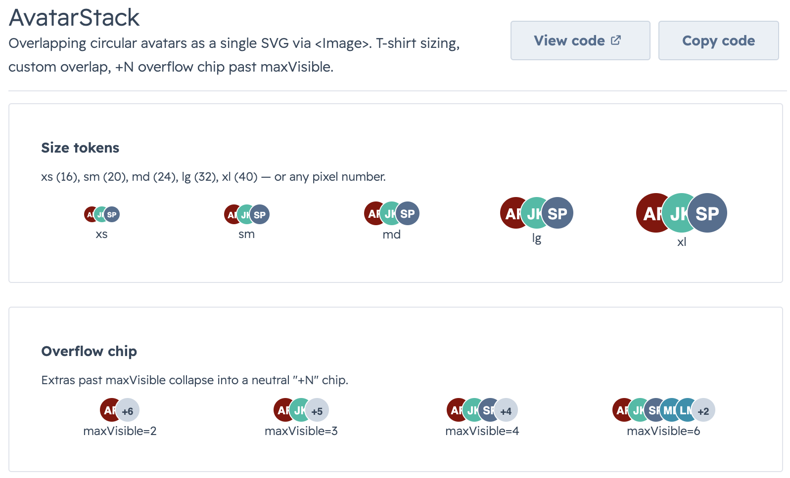 |
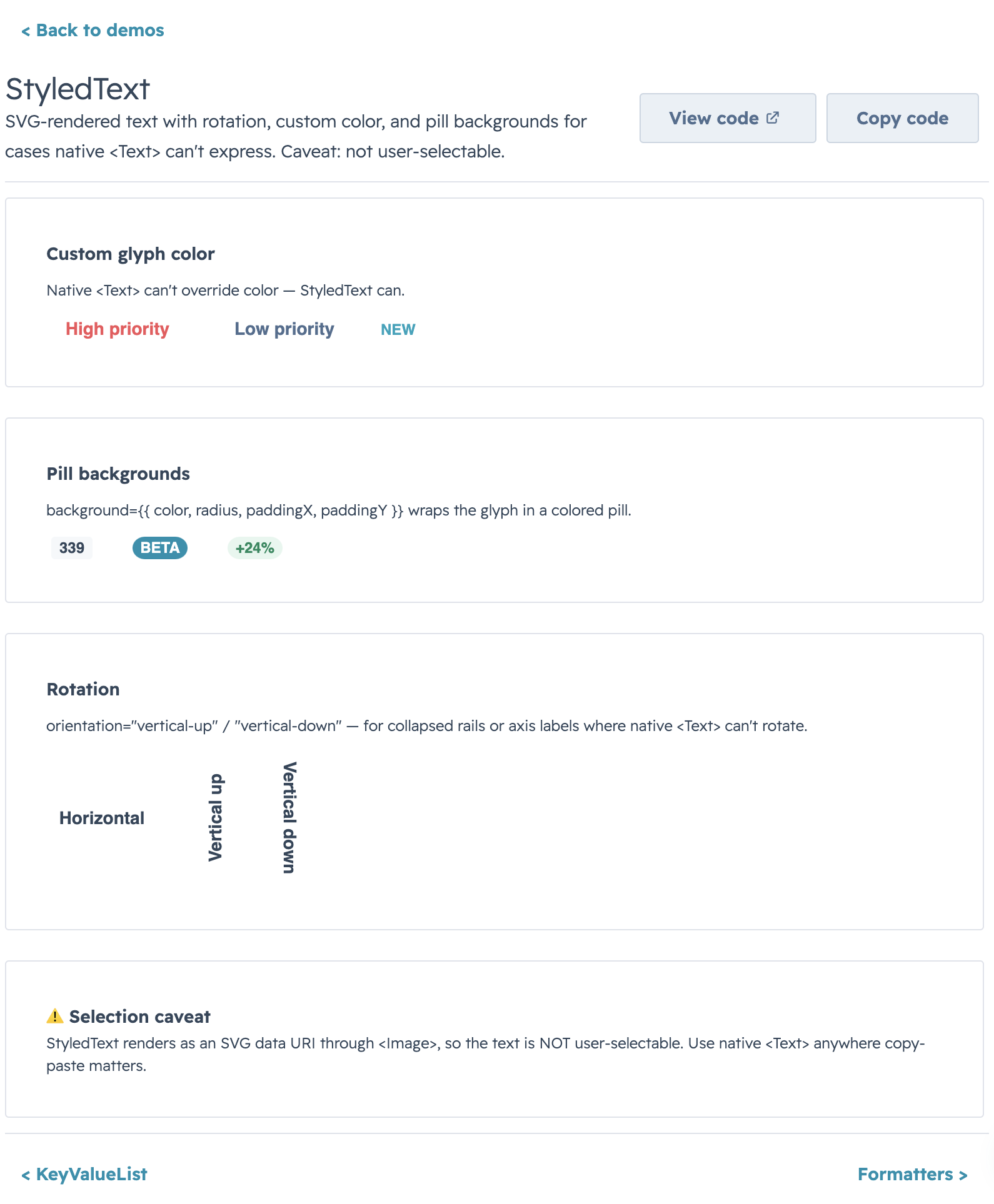 |
- FormBuilder: Support
colSpan: "full"on fields to force a standalone full-width row inside a multi-column section, add adescriptionmicrocopy line togroupsoptions, and default group labels to a start-cased version of the group key. - Utils: Add
formatCurrencyCompactfor HubSpot-style compact money ($123.6M,$4.2K) and newviewAdaptershelpers (deriveCardFieldsFromColumns) for projecting a single DataTable column config into a KanbancardFieldsarray.
Bug Fixes
- StyledText: Add a HubSpot-style
tagpreset with semantic variants (default,success,warning,error/danger,info) so SVG-backed tags render closer to native HubSpot tags. - Kanban: Update collapsed stage count badges to use the shared HubSpot-style tag preset instead of ad hoc pill styling.
- Types/Exports: Sync runtime exports with declaration files for common-components, kanban, SVG helpers, and style constants so published imports match the documented API. Adds
FormBuilderGroupOptionsto the form type exports.
Docs
- README: Add root-level documentation for Common Components and Utils, plus updated examples for the new shared component surface.
- Common Components: Document
AvatarStack,StyledTexttag presets and semantic variants, date presets, and SVG style constants for release consumers. - Utils: Expand the Utils README with
formatCurrencyCompact,viewAdapters, and end-to-end examples.
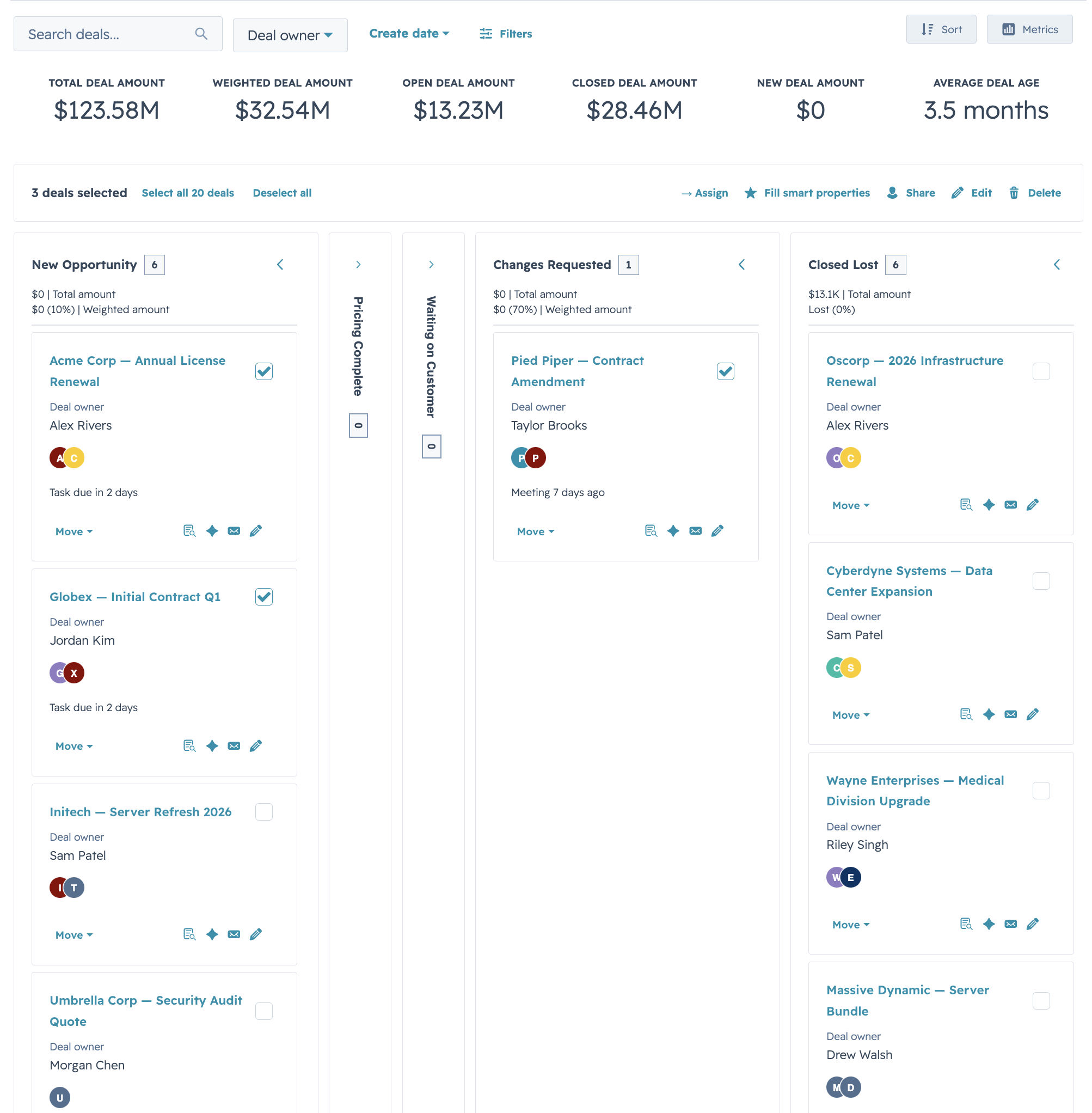
More Kanban presets
| Compact lead board | Select + load more |
|---|---|
 |
 |