Conversation
ESLint Summary View Full Report
Report generated by eslint-plus-action |
|
E2E Tests Passed |
|
CLA Assistant Lite All Contributors have signed the CLA. |
|
E2E Tests Passed |
|
E2E Tests Passed |
|
E2E Tests Passed |
|
E2E Tests Passed |
|
Wow, that was fast @iamacook 🏎️ |
|
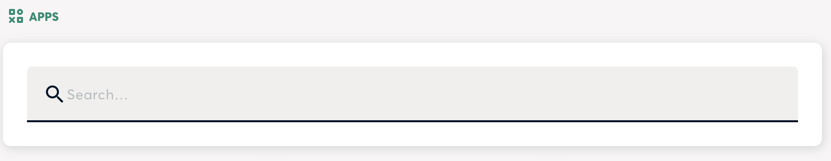
In order to keep the input field design pattern as close as possible with the existing components, I have the following notes:
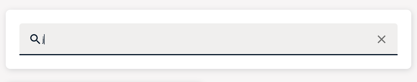
Recommendation to keep it inline designed components on storyboard: Reference: https://components.gnosis-safe.io/?path=/docs/inputs-textfield--simple-text-field#start-adornment On the opening of Safe Apps menu and prior to any clicks on the input field, show the line below input field in grey'd state and the "search" description be placed above the search icon. Could the search icon be the same color as the Adornment in the storybook example. Example from story book: When the user's mouse hovers over the input field, the grey'd outlined below the input field show turn black. Example from story book: When a user populates the search input field, the line below the input field should turn green and the term "Search" should also turn green. Edge case, if the first two inputs spaces, will get a no search results on blank. Please could you strip spaces at the beginning of user input.
Duplication: I'm of the belief that duplication of paths increases complexity of design and generally leads to clutter. Please remove the cross in the search input bar in favor of the clear search button. |
 katspaugh
left a comment
katspaugh
left a comment
There was a problem hiding this comment.
Some tests would be nice.
Especially for the search hook.
|
Thanks for the feedback @Graeme-Code! I have one question related to:
Since the button only appears when there are no matching results. Would it make more sense to do the opposite: remove the button and use the cross instead? |
|
I've tested it locally, a couple more comments:
Works really great btw! |
|
Can I just take Aaron's review? 🙈 JK, will fix everything :) |
|
E2E Tests Passed |
|
E2E Tests Passed |
|
The pull request is waiting for user feedback results and will need to be adjusted |
|
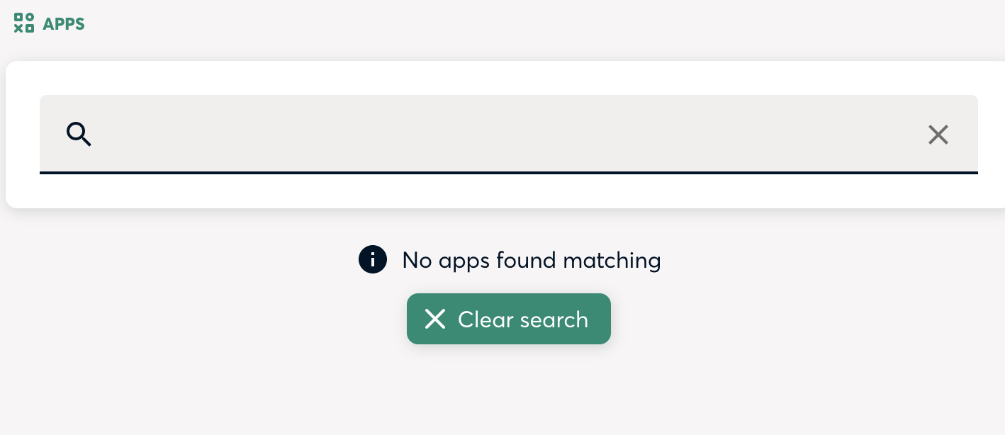
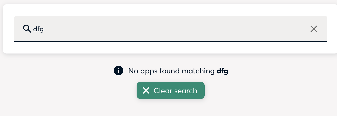
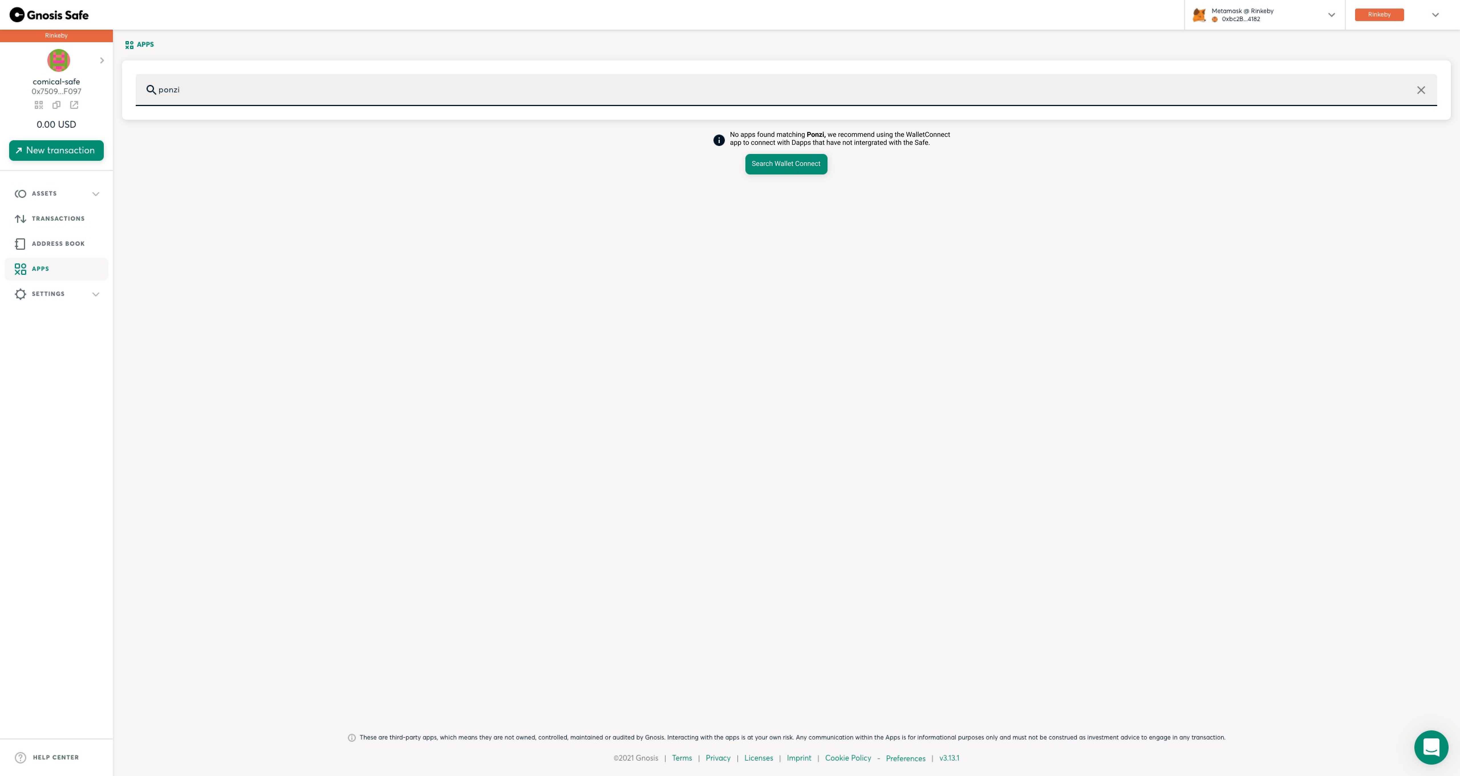
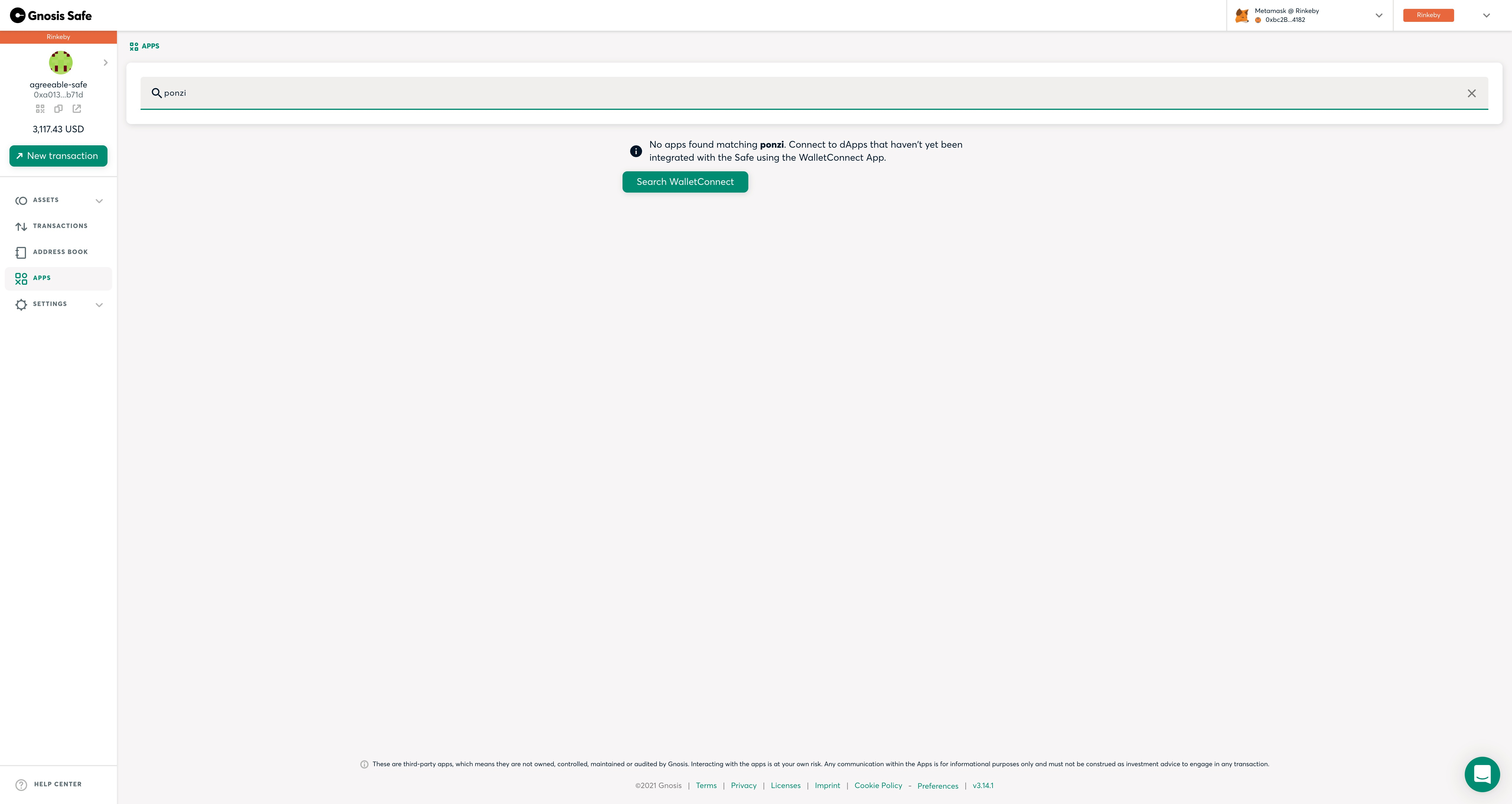
Hi, We got user feedback that when there are no results, users are kinda 'stuck'. As in they don't know what to do. To counter this I recommend using Mikhails original design, but instead of clearing the search, it populates the search with wallet connect.
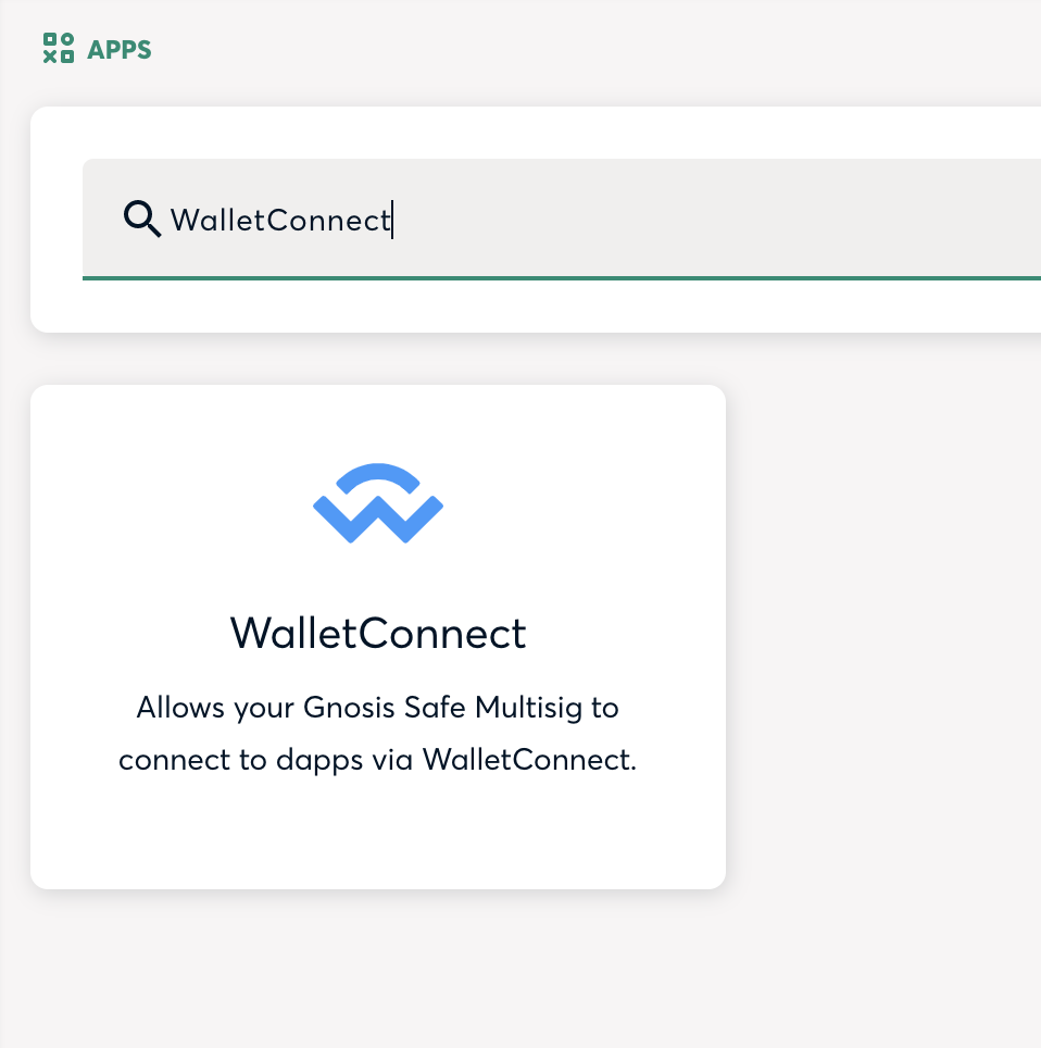
Clicking on the "search WalletConnect", would open:
|
|
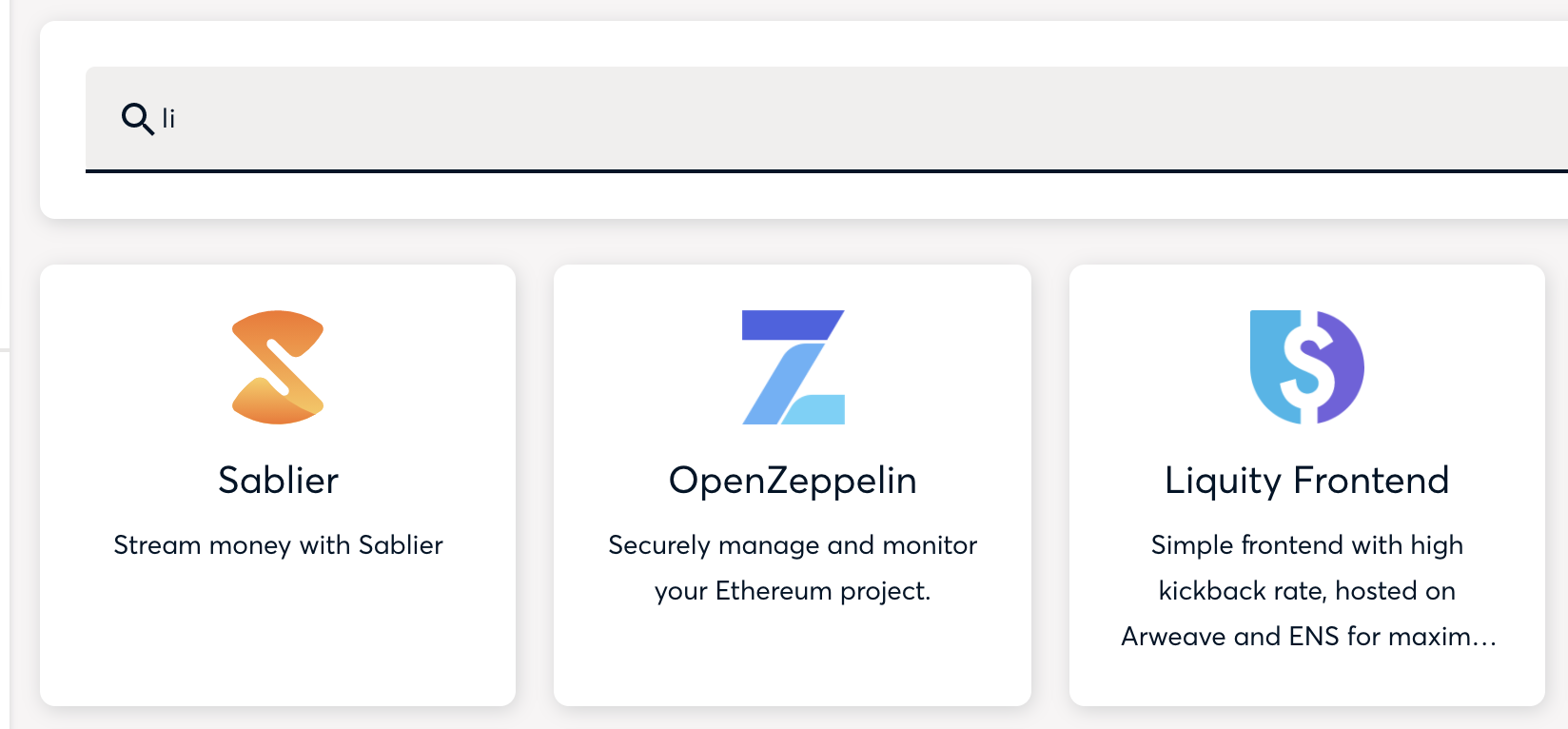
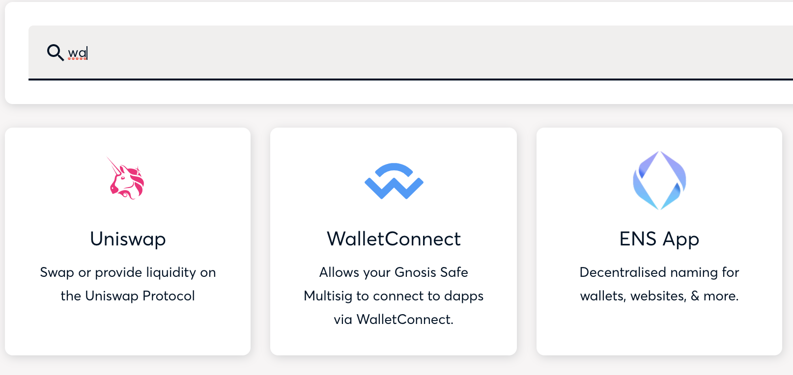
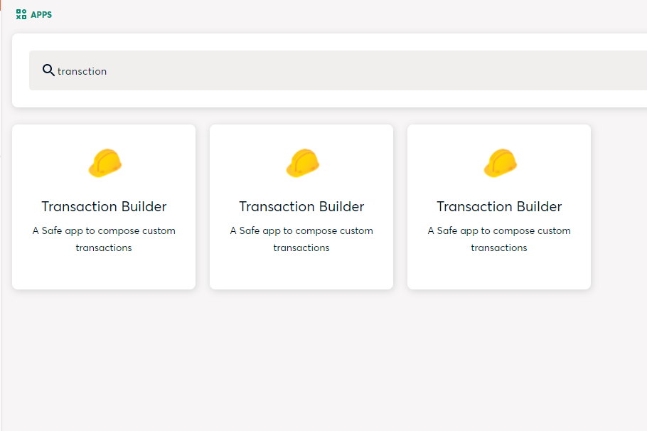
Notes: It worked fine for me: Something curious (that I don't consider an that big of a deal) is that the search sometimes can ignore a character not written or a character that doesn't match: Another case is when characters are ignored. So If I want to find the "Transaction Builder" I can ignore one of the characters as long is the after the 4th one, so I can write "transction" or "transation" and it will find the app Again, I don't think this is going to break the search for any user, but I wonder why that happens |
|
I'll update the PR with not found screen suggestion from Graeme. The update I gave before in the standup that we want to do one more round of user tests was wrong, sorry. |
|
@mikheevm @katspaugh for me the search is fine. The only thing I want to know if we are going to add here the WC "by default" if there are no results |
|
This is how the new "not found" page looks like |
ESLint Summary View Full Report
Report generated by eslint-plus-action |
|
@mikheevm I would make the green button centered relative to the text above. And add a bit of margin on top. |
|
@katspaugh it is centered. Graeme has shared the new implementation privately on Slack. Also, the info icon is not there anymore |
|
I tested it and it worked according to the specs: https://www.loom.com/share/16a676bda3194afbbfb1be12f6cbf05d |
What it solves
Resolves #2712
It also fixes a small bug when the
manifest.jsonrequest fails, but the app is still displayed in the list as loadingHow this PR fixes it
useAppSearchhook, which uses fuse.js under the hoodHow to test it
Open a safe, play with the app search
Screenshots