Interactive charts in Python — the matplotlib workflow, the ECharts experience.


Build publication-quality interactive charts with a familiar
fig = figure() → fig.bar() → fig.show() workflow.
Works everywhere: Jupyter · Streamlit · standalone scripts
| Familiar API | If you know plt.figure() / plt.show(), you already know 90% of the API. No JSON, no JavaScript. |
| Interactive by default | Every chart ships with tooltips, legend toggling, zoom, and an export toolbox. Zero config needed. |
| Three render engines | Write once, render in Jupyter notebooks, Streamlit apps, or standalone browser windows. |
| 19 chart types | From bar charts and waterfall charts to sankey diagrams, sunbursts, gauges, and network graphs. |
| Composable & animated | Layer pies on bar charts, build dual-axis dashboards, use multi-grid subplots, or animate across time with TimelineFigure. |
| Dark mode | Adaptive dark/light theming out of the box, including automatic Streamlit theme detection. |
pip install echartsyOptional extras:
pip install echartsy[jupyter]     # Jupyter Notebook / JupyterLab
pip install echartsy[streamlit]   # Streamlit apps
pip install echartsy[scipy]       # KDE density plots
pip install echartsy[all]         # Everything
Requirements: Python 3.9+ · pandas ≥ 1.5 · numpy ≥ 1.23
import pandas as pd
import echartsy as ec
ec.config(engine="jupyter") # or "python" / "streamlit"
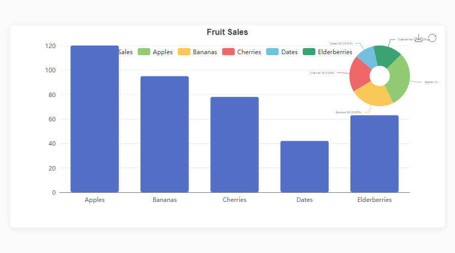
df = pd.DataFrame({
"Fruit": ["Apples", "Bananas", "Cherries", "Dates", "Elderberries"],
"Sales": [120, 95, 78, 42, 63],
})
fig = ec.figure()
fig.bar(df, x="Fruit", y="Sales", gradient=True, labels=True)
fig.title("Fruit Sales")
fig.show()Three lines from DataFrame to interactive chart.
echartsy v0.7.1 supports 19 chart types covering cartesian, standalone, hierarchical, relational, and statistical visualizations.
| Method | Description | Key options |
|---|---|---|
fig.plot() |
Line chart | smooth, area, hue, line_style, area_style, end_label, blur, select, animation, tooltip |
fig.bar() |
Vertical bar | hue, stack, gradient, item_style, label_style, blur, select, animation, tooltip |
fig.barh() |
Horizontal bar | Same as bar(), horizontal orientation |
fig.scatter() |
Scatter plot | color, size, item_style, symbol_rotate, blur, select, animation, tooltip |
fig.hist() |
Histogram | bins, item_style, label_style, animation, tooltip |
fig.boxplot() |
Box plot | item_style, label_style, labels, color, blur, select, animation, tooltip |
fig.kde() |
KDE density | line_style, area_style, labels, connect_nulls, color, animation, tooltip |
fig.waterfall() |
Waterfall chart | total, connector, label_style, item_style, animation, tooltip |
fig.candlestick() |
Candlestick / OHLC | border_width, opacity, label_style, labels, animation, tooltip |
fig.heatmap() |
Matrix heatmap | label_style, item_style, animation, tooltip |
| Method | Description | Key options |
|---|---|---|
fig.pie() |
Pie / donut | inner_radius, link_legend, min_angle, clockwise, item_style, blur, select, tooltip |
fig.radar() |
Radar / spider | shape, split_number, line_style, color, tooltip |
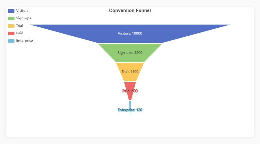
fig.funnel() |
Funnel | orient, funnel_align, min_size, max_size, item_style, tooltip |
fig.gauge() |
Gauge / meter | detail_formatter, progress, item_style, tooltip |
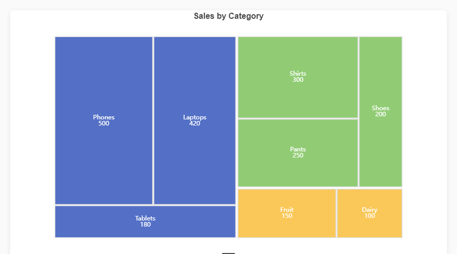
fig.treemap() |
Treemap | drill_down_icon, node_click, breadcrumb, item_style, tooltip |
fig.sunburst() |
Sunburst | node_click, label_rotate, item_style, tooltip |
| Method | Description | Key options |
|---|---|---|
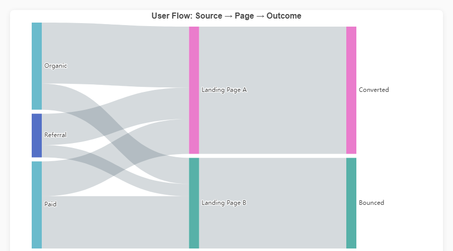
fig.sankey() |
Sankey diagram | node_align, draggable, item_style, label_style, tooltip |
fig.graph() |
Network graph | repulsion, gravity, edge_label, item_style, line_style, tooltip |
fig.calendar_heatmap() |
Calendar heatmap | split_line_show, day_label_show, item_style, emphasis, tooltip |
|
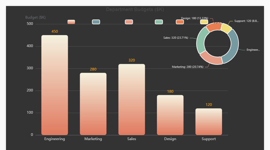
Bar + Pie Overlay
fig = ec.figure(height="500px")
fig.bar(df, x="Dept", y="Budget",
        gradient=True, labels=True)
fig.pie(df, names="Dept", values="Budget")  # auto-overlay
fig.show() |
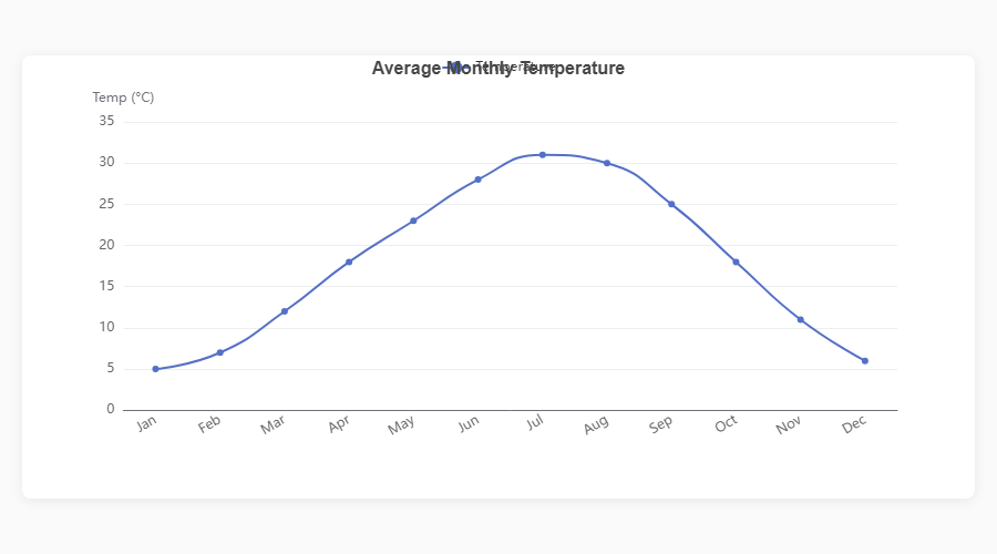
Smooth Line
fig = ec.figure()
fig.plot(df, x="Month", y="Sales",
         smooth=True, area=True)
fig.show() |
|
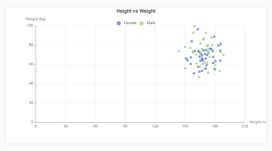
Scatter Plot
fig = ec.figure()
fig.scatter(df, x="Height", y="Weight",
            color="Gender", size="Age")
fig.show() |
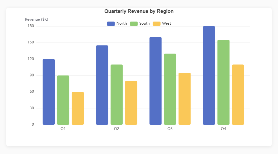
Grouped Bar
fig = ec.figure()
fig.bar(df, x="Quarter", y="Revenue",
        hue="Region")
fig.show() |
|
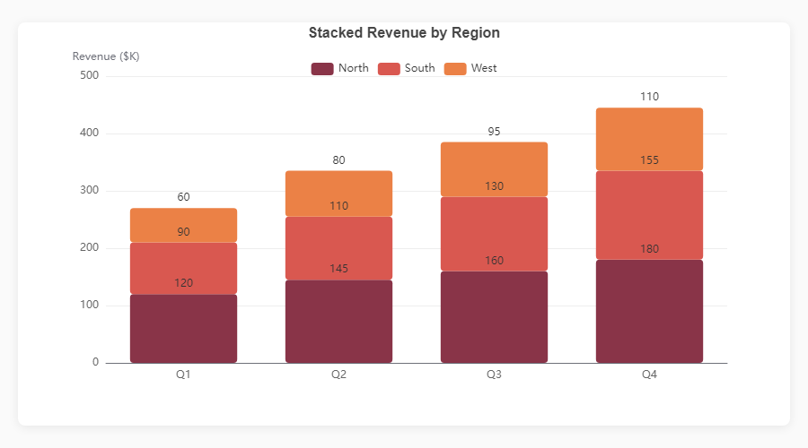
Stacked Bar
fig = ec.figure()
fig.bar(df, x="Month", y="Revenue",
        hue="Product", stack=True)
fig.show() |
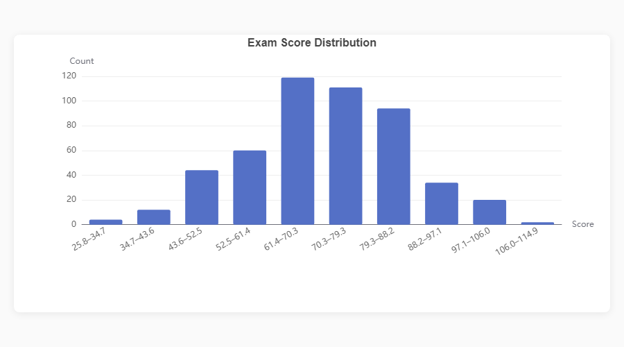
Histogram
fig = ec.figure()
fig.hist(df, column="Score", bins=20)
fig.show() |
|
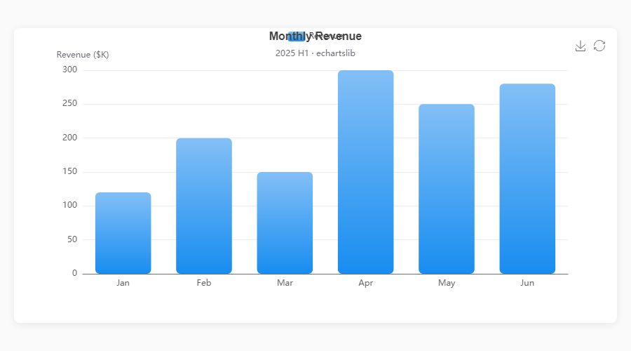
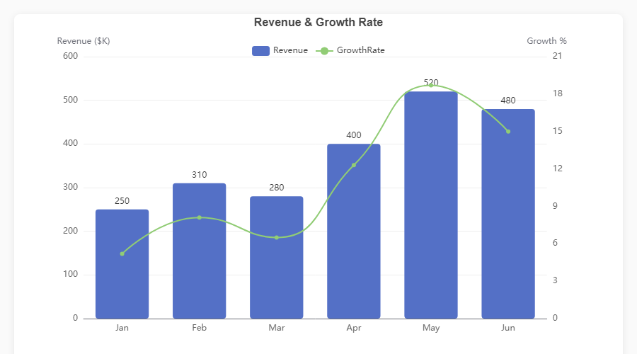
Dual Axis: Bar + Line
fig = ec.figure()
fig.bar(df, x="Month", y="Revenue")
fig.plot(df, x="Month", y="Growth",
         smooth=True, axis=1)
fig.ylabel("Revenue ($K)")
fig.ylabel_right("Growth %")
fig.show() |
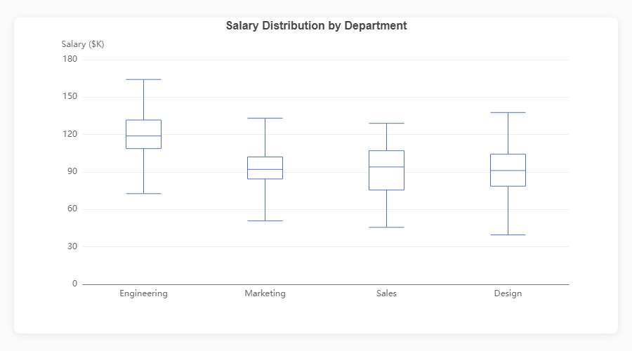
Boxplot
fig = ec.figure()
fig.boxplot(df, x="Department", y="Salary")
fig.show() |
|
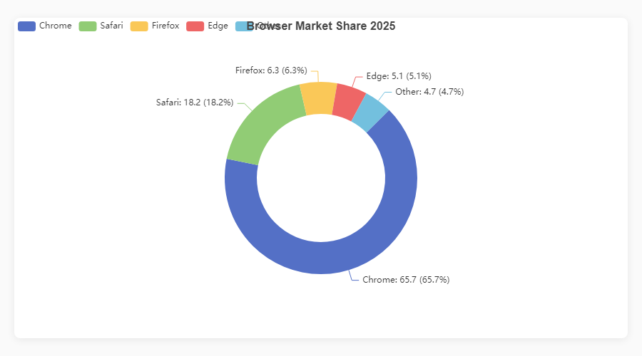
Donut / Pie
fig = ec.figure()
fig.pie(df, names="Browser", values="Share",
        inner_radius="40%")
fig.show() |
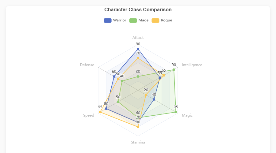
Radar
fig = ec.figure()
fig.radar(indicators, data,
          series_names=["Warrior","Mage"])
fig.show() |
|
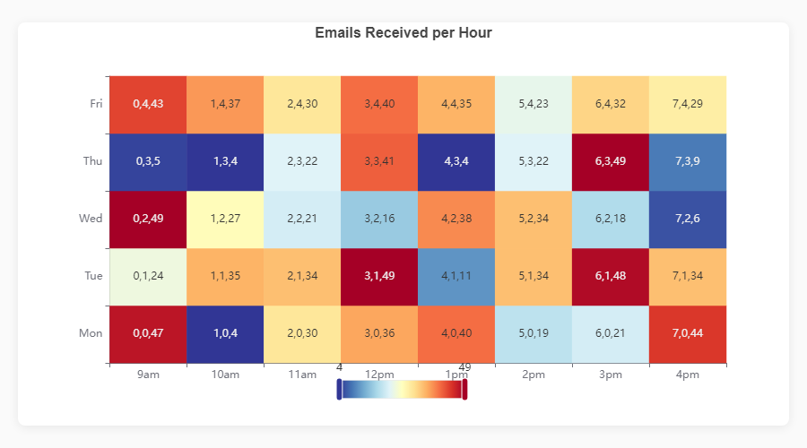
Heatmap
fig = ec.figure()
fig.heatmap(df, x="Day", y="Hour",
            value="Count")
fig.show() |
Funnel
fig = ec.figure()
fig.funnel(df, names="Stage", values="Count")
fig.show() |
|
Treemap
fig = ec.figure()
fig.treemap(df,
    path=["Category","SubCat"],
    value="Sales")
fig.show() |
Sankey Diagram
fig = ec.figure()
fig.sankey(df,
    levels=["Source","Channel","Outcome"],
    value="Users")
fig.show() |
|
Bar + Pie (Dark)
|
Triple Composite
|
|
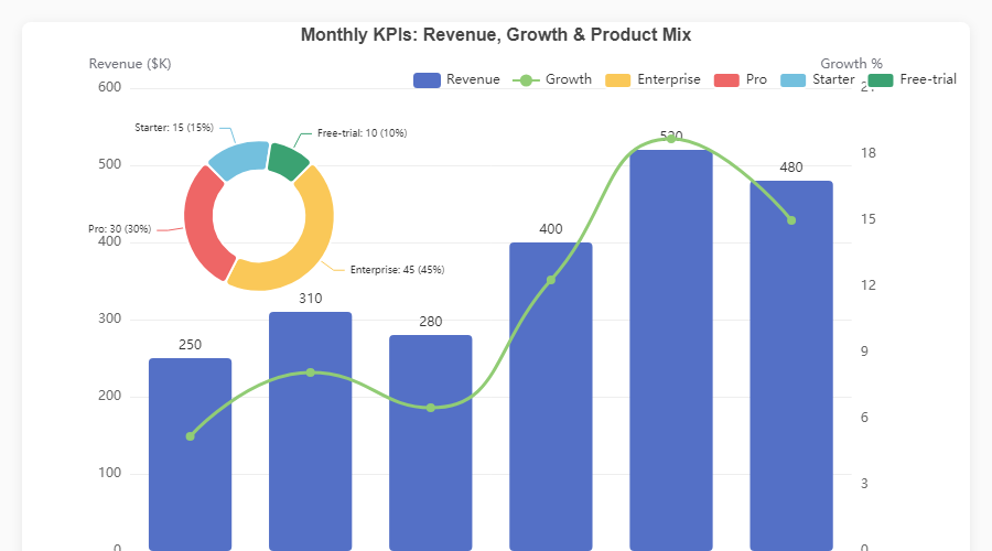
KPI Dashboard
|
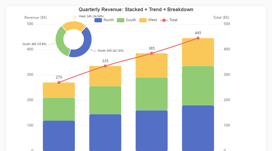
Stacked + Trend + Pie
|
Every chart is fully interactive -- hover for tooltips, click legend items to toggle series, use the toolbox to export. Open the HTML demos in
assets/for the live experience, or runpython generate_demos.pyyourself.
Write your chart once; ec.config() controls where it renders.
| Engine | Use case | Install |
|---|---|---|
"python" |
Standalone scripts -- opens the default browser | No extra deps |
"jupyter" |
Jupyter Notebook / JupyterLab inline widgets | pip install echartsy[jupyter] |
"streamlit" |
Streamlit applications | pip install echartsy[streamlit] |
ec.config(engine="jupyter") # or "python" / "streamlit"Create vertically stacked chart panels sharing independent axes:
fig = ec.figure(rows=2, height="700px", row_heights=["60%", "40%"])
fig.bar(df, x="Month", y="Revenue", grid=0)
fig.plot(df, x="Month", y="Growth", grid=1, smooth=True)
fig.show()Animate any chart across a time dimension with TimelineFigure:
fig = ec.TimelineFigure(height="500px", interval=1.5)
fig.bar(df, x="Country", y="GDP", time_col="Year", labels=True)
fig.title("GDP by Country")
fig.show()
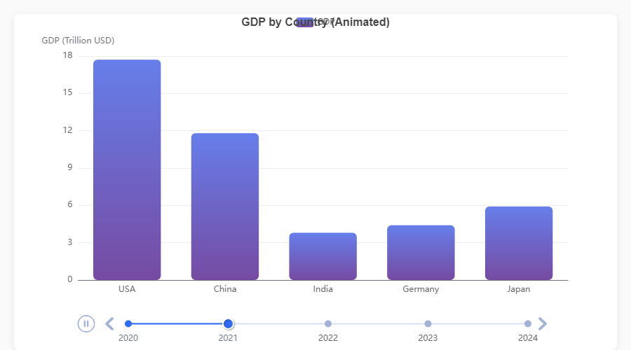
| Feature | API |
|---|---|
| Playback control | TimelineFigure(interval=2.0, autoplay=True, loop=True) |
| Adjust after creation | fig.playback(interval=1.0, rewind=True) |
| Fixed axis ranges | fig.xlim(), fig.ylim() -- consistent scales across frames |
| Smart frame sorting | Parses years, quarters (Q1 2024), months, ISO dates, fiscal years |
| Supported series | bar(), plot(), scatter(), pie(), hist() |
| Diagnose format | ec.detect_time_format(df["Year"]) |
Add reference lines, points, and shaded regions to any series:
fig.plot(df, x="Month", y="Sales", smooth=True)
fig.mark_line(y=500, label="Target", color="red", line_dash="dashed")
fig.mark_point(type="max")
fig.mark_area(y_range=[200, 400], color="#ccc", opacity=0.15)
fig.show()Attach a colour-mapping control for continuous or piecewise data ranges:
fig.heatmap(df, x="Day", y="Hour", value="Count")
fig.visual_map(min_val=0, max_val=100,
               colors=["#313695", "#ffffbf", "#a50026"],
               calculable=True)
fig.show()Switch any y-axis to logarithmic scale:
fig.yscale("log")          # shorthand
fig.ylim(scale="log") # equivalentControl what happens when users hover over chart elements using typed Python dataclasses:
from echartsy import Emphasis, ItemStyle

fig.bar(df, x="Month", y="Revenue", hue="Region",
        emphasis=Emphasis(
            focus="series",
            item_style=ItemStyle(shadow_blur=10),
        ))
Every chart method accepts an optional emphasis parameter with a chart-specific type:
| Chart method | Emphasis class |
|---|---|
bar(), waterfall(), hist(), boxplot(), heatmap(), candlestick() |
Emphasis |
plot(), kde() |
LineEmphasis |
scatter() |
ScatterEmphasis |
pie() |
PieEmphasis |
radar() |
RadarEmphasis |
sankey() |
SankeyEmphasis |
funnel() |
FunnelEmphasis |
treemap() |
TreemapEmphasis |
graph() |
GraphEmphasis |
Beyond emphasis, every chart method now accepts typed dataclass parameters for fine-grained visual control:
from echartsy import ItemStyle, LabelStyle, Blur, Select, AnimationConfig, TooltipStyle

fig.bar(df, x="Month", y="Revenue",
        item_style=ItemStyle(border_type="dashed", opacity=0.9),
        label_style=LabelStyle(show=True, rotate=45, font_family="monospace"),
        blur=Blur(item_style=ItemStyle(opacity=0.2)),
        select=Select(item_style=ItemStyle(border_width=3)),
        selected_mode="multiple",
        animation=AnimationConfig(animation_duration=1500, animation_easing="elasticOut"),
        tooltip=TooltipStyle(formatter="{b}: {c}"))
Three-tier control: scalar params (e.g. color="red") → dataclass overrides → **series_kw raw dict.
Charts automatically respond to the user's OS or browser prefers-color-scheme setting:
ec.config(engine="jupyter", adaptive="auto")     # auto-detect (default)
ec.config(engine="jupyter", adaptive="dark")     # force dark
ec.config(engine="streamlit") # auto-adapts to Streamlit themeApply a pre-built visual theme or set custom colour palettes:
fig = ec.figure(style=ec.StylePreset.CLINICAL)
fig = ec.figure(style=ec.StylePreset.DASHBOARD_DARK)
fig = ec.figure(style=ec.StylePreset.KPI_REPORT)
fig = ec.figure(style=ec.StylePreset.MINIMAL)

fig.palette(["#667eea", "#764ba2", "#f093fb", "#f5576c", "#4facfe"])
fig.palette(ec.PALETTE_RUSTY)
Build custom presets for full control over fonts, grid lines, tooltip style, and more:
my_style = ec.StylePreset(
    palette=("#264653", "#2a9d8f", "#e9c46a", "#f4a261", "#e76f51"),
    bg="#fefae0",
    font_family="Georgia",
    title_font_size=20,
)
fig = ec.figure(style=my_style)Every Figure and TimelineFigure supports these configuration methods:
# Titles
fig.title("Main Title", subtitle="Sub-title")

# Axes
fig.xlabel("X Label", rotate=30)
fig.ylabel("Y Label")
fig.ylabel_right("Secondary Y")
fig.xlim(0, 100)
fig.ylim(0, 500)
fig.yscale("log")

# Layout
fig.legend(orient="vertical", left="right", top=40)
fig.margins(left=100, right=120, top=40)
fig.grid(show=True)

# Interactivity
fig.datazoom(start=0, end=80)
fig.toolbox(download=True, zoom=True)
fig.tooltip(trigger="axis", pointer="cross")
fig.axis_pointer(type="shadow", snap=True)
fig.visual_map(min_val=0, max_val=100)

# Export
fig.save(name="my_chart", fmt="png", dpi=3)
fig.to_html("my_chart.html")
option = fig.to_option()       # raw ECharts option dict

# Palette
fig.palette(["#5470C6", "#91CC75", "#FAC858"])Set the global rendering engine ("python", "jupyter", "streamlit") and theme adaptation mode ("auto", "light", "dark").
Create a chart canvas.
| Parameter | Default | Description |
|---|---|---|
height |
"400px" |
CSS height of the chart container |
width |
None |
CSS width (defaults to full container) |
renderer |
"svg" |
"canvas" or "svg" |
style |
StylePreset.CLINICAL |
A StylePreset instance |
rows |
1 |
Number of vertical grid panels (subplots) |
row_heights |
None |
List of CSS heights per grid panel |
Same as Figure but adds timeline animation. Extra parameters:
| Parameter | Default | Description |
|---|---|---|
interval |
2.0 |
Seconds between animation frames |
autoplay |
True |
Start playing automatically |
loop |
True |
Loop back to the first frame |
| Class | Key fields |
|---|---|
ec.ItemStyle |
color, border_color, border_width, border_radius, border_type, shadow_blur, shadow_color, shadow_offset_x, shadow_offset_y, opacity, decal |
ec.LabelStyle |
show, position, formatter, font_size, font_weight, font_family, color, rotate, offset, align |
ec.LineStyle |
color, width, type, shadow_blur, shadow_color, shadow_offset_x, shadow_offset_y, opacity, cap, join |
ec.AreaStyle |
color, opacity, origin, shadow_blur, shadow_color |
ec.LabelLineStyle |
show, length, length2 |
ec.EndLabelStyle |
show, formatter, font_size, font_weight, color |
ec.Blur |
item_style, label, line_style, area_style |
ec.Select |
disabled, item_style, label, line_style, area_style |
ec.TooltipStyle |
show, formatter, value_formatter, background_color, border_color, border_width, text_color, text_size |
ec.AnimationConfig |
animation, animation_duration, animation_easing, animation_delay |
- Added: 6 new color palettes:
PALETTE_OCEAN,PALETTE_SUNSET,PALETTE_EARTH,PALETTE_PASTEL,PALETTE_NEON,PALETTE_MONOCHROME - Added: 5 new style presets:
StylePreset.OCEAN,SUNSET,EARTH,PASTEL,NEON - Renamed:
PALETTE_CLINICAL→PALETTE_DEFAULT,StylePreset.CLINICAL→StylePreset.DEFAULT(old names still work)
- Added:
AxesGrid/AxesRowcontainers — enables Shift-Tab docstring popups and tab-completion in Jupyter - Added:
fig.margins(top, bottom, left, right)onSubplotFigurefor outer grid margins - Added: Dual y-axis support in subplot cells (
ax.plot(..., axis=1)) - Added: Non-cartesian chart positioning in subplots (funnel, radar, gauge, treemap, sankey)
- Added: Input validation —
subplots(0, 2)now raisesValueError - Fixed: Per-cell
ax.palette()now correctly colors individual pie slices - Fixed: Heatmap axes remain visible in subplot cells
- Fixed:
datazoomandvisualMapaxis binding uses correct indices per cell
- Fixed: Per-cell legend isolation — toggling a legend in one subplot cell no longer hides identically-named series in other cells
- Fixed: Per-cell
.title()now centers within its own cell instead of the entire container - Fixed: Per-cell
.margins()propagation —ax.margins(top=...)etc. now correctly adjust the cell's grid area - Fixed: Per-cell
.tooltip()propagation into the merged subplot option - Fixed: Pie charts in subplots now use the global palette for per-slice colors instead of a single series color
- Added: Per-cell
toolbox(),datazoom(),visual_map(),palette(),grid(),xlim()/ylim(),xticks()/yticks()propagation in subplots - Removed:
cell_legendparameter fromsubplots()— useax.legend()on individual cells instead
- Breaking: Replaced
MatrixFigurewith matplotlib-styleec.subplots(nrows, ncols)— each cell is a fullFigure - Added:
ec.subplots()factory returning(fig, ax)with numpy-array shape matching matplotlib (scalar / 1-D / 2-D) - Added:
SubplotFigurecontainer with.suptitle(),.palette(),.legend()global chrome - Added: Per-cell
ax.legend()for independent legend control per subplot cell - Added: Full Figure method propagation in subplots:
margins(),tooltip(),save()/toolbox(),datazoom(),visual_map(), per-cellpalette() - Removed:
MatrixFigure, auto-populate methods (group_row/group_col),pairplot() - Fixed:
build_pie_series()type hint corrected (Optional[Any]→Optional[ItemStyle]) - Fixed:
build_pie_series()now guards against empty data after NaN drop
- Added:
build_scatter_series()andbuild_pie_series()shared builder functions in_chart_methods.py
- Added:
label_styleandupper_label_styleontreemap()— fullLabelStylecontrol for treemap labels (font, color, position, overflow) - Added:
sort,square_ratio,children_visible_min,visual_min,visual_max,zoom_to_node_ratio,color_mapping_by, andlevelsparameters ontreemap() - Added:
vertical_align,padding,overflow,ellipsisfields onLabelStyle
- Added:
upper_labelandupper_label_heightparameters ontreemap()— enables parent category labels as header bars on treemap nodes (mirrors EChartsupperLabelfeature)
- Extended: TimelineFigure API parity — added 34 missing parameters across
plot(),bar(),pie(),title(),legend(),tooltip(),xlim(),ylim() - Added: Documentation for gauge, sunburst, graph, and calendar_heatmap chart types
- Fixed: 10 undocumented parameters added to existing Documentation.md tables
- Added: Auto-overlay for
pie()on cartesian figures — callingfig.bar(); fig.pie()now works without specifyingcenterorradius(defaults to top-right mini pie at["82%", "25%"]). - Added:
link_legendparameter onpie()— controls whether overlay pie shares colors with existing series (True), uses distinct colors (False), or auto-detects based on name overlap (None, default). - Fixed: Overlay pies now automatically get per-series
trigger: "item"tooltips so hovering works correctly (the global"axis"trigger doesn't fire for pie series). - Fixed: Multi-grid (subplot) figures with overlay pies now correctly inject per-series tooltips.
- Fixed: Waterfall
connector=Truerendered blank charts — markLine data used invalid nested format instead of[start, end]pairs. - Fixed:
bar_widthparameter mapped tobarMaxWidthinstead ofbarWidthin ECharts options. - Fixed:
scatter()mutated the global x-axis type to"value", breaking any previously added category-based series (bar/line). - Fixed: Horizontal bar charts (
barh()) discarded all y-axis customizations (labels, fonts, colors) during option building. - Fixed:
heatmap()overwrote axis config entirely, discardingStylePresetaxis formatting. - Fixed:
tooltip()replaced the entireaxisPointersub-config instead of merging, losing prioraxis_pointer()settings. - Fixed:
sankey()andgraph()used direct assignment foritem_style/line_style, overwriting prior config instead of merging. - Fixed:
datazoomandextraconfigs were not deep-copied into_option(), causing mutable reference leaks. - Fixed:
radar(),funnel(), and standalonepie()legend deduplication — duplicate or overwritten legend entries no longer occur. - Fixed:
candlestick()now warns when duplicate date rows are found (only the last row per date is used). - Fixed:
boxplot(orient="h")now warns that horizontal orientation is not yet supported instead of silently ignoring it. - Fixed:
_sort_categories60% parse threshold could silently drop non-date categories — now requires all unique categories to parse as dates before sorting chronologically. - Fixed:
LineEmphasis.end_labelwas typed asLabelStyleinstead ofEndLabelStyle, allowing invalid fields. - Fixed:
StylePresetpreset constants (CLINICAL,DASHBOARD_DARK, etc.) were dataclass fields instead ofClassVar, polluting constructor,repr, andfields(). - Fixed: Python/Jupyter HTML renderers did not escape
</sequences in JSON, allowing potential</script>injection (XSS). - Fixed: HTML template placeholder substitution order could corrupt user data containing
__CHART_ID__or similar strings. - Fixed: Malformed
file://URL on Windows in the Python standalone renderer. - Added:
animationparameter topie()(was missing while all other chart methods had it).
- Added: Full parameter expansion across all 19 chart methods and 6 config methods — typed
ItemStyle,LabelStyle,LineStyle,AreaStyle,EndLabelStyle,Blur,Select,TooltipStyle, andAnimationConfigdataclass parameters on every series method. - Added: Per-series
tooltip,blur,select,selected_mode, andanimationsupport for bar, line, scatter, pie, histogram, boxplot, KDE, candlestick, heatmap, waterfall, radar, sankey, treemap, funnel, gauge, sunburst, graph, and calendar heatmap. - Added: Extended config methods —
title()(+8 params),legend()(+11 params),tooltip()(+9 params),toolbox()(+5 params),datazoom()(+6 params),visual_map()(+6 params). - Added: Timeline parity —
TimelineFigure.plot(),.bar(),.scatter(),.pie(),.hist()now accept all new style parameters. - Added: 5 new dataclasses:
EndLabelStyle,Blur,Select,TooltipStyle,AnimationConfig. - Extended:
ItemStyle(+border_type,decal),LabelStyle(+font_family,rotate,offset,align),LineStyle(+shadow_color,shadow_offset_x/y,cap,join),AreaStyle(+origin,shadow_blur,shadow_color). - Added: Three-tier control model: scalar params → dataclass overrides →
**series_kwraw dict.
- Added:
fig.waterfall()-- finance/accounting waterfall charts with cumulative positive/negative deltas, optional total bar, connector lines, and value labels.
See Releases for full details.
- Changed: Default renderer switched from
"canvas"to"svg"-- fixes the broken toolbox download button under canvas/iframe sandbox restrictions.
- Added:
fig.candlestick()-- native OHLC candlestick charts with dual-axis support and full composability.
- Added:
Emphasissupport forboxplot(),heatmap(), andfunnel().
- Fixed: Charts vanishing across
st.tabs()in Streamlit 1.48+.
If echartsy saves you time or you enjoy using it, consider buying me a coffee. It helps keep the project maintained and growing.

Contributions, bug reports, and feature requests are welcome. Please open an issue or submit a pull request on GitHub.
MIT — Jigar, 2026