Grouped violin, sina scatter, box, and histogram plots for MATLAB — 1 or 2 categorical factors, colorblind-safe, publication-ready.

GroupDistributionPlot is a MATLAB handle class that generates publication-quality grouped distribution figures. It is designed for researchers who need to compare distributions across one or two categorical factors — dose levels, genotypes, experimental conditions, cell lines, and so on — and who want full control over the visual representation without writing low-level graphics code.
Four plot elements can be combined freely:
| Element | Description |
|---|---|
| Violin | KDE polygon, symmetric or one-sided, with boundary-reflection correction |
| Sina scatter | Raw data points jittered proportionally to local KDE density (Sidiropoulos et al., 2018) |
| Box plot | Tukey IQR box, median line, 1.5×IQR whiskers, individual outlier markers |
| Histogram | PDF-normalized bars aligned to the same axis as the violin |
- One- and two-factor layouts — a secondary categorical factor nests sub-columns within each primary cluster, with a synchronized multi-level axis label row
- Horizontal and vertical orientations — switch with a single property
- Four normalization modes — global, within Group 1, within Group 2, or per-cell
- Five built-in colorblind-safe palettes — Okabe-Ito, Tableau 10, ColorBrewer Set2 / Dark2 / Paired; custom RGB matrices and function handles are also accepted
- Color driven by Group 1, Group 2, or their interaction
- Descriptive statistics computed at construction and stored in
obj.stats.descriptive(n, mean, median, SD, SEM, variance, IQR, min, max, 95% CI) - Full style override for every graphical element via simple struct properties
- MATLAB R2019b or later
- Statistics and Machine Learning Toolbox (
ksdensity,tinv,quantile,iqr)
- Download or clone this repository.
- Add the folder to your MATLAB path:
addpath('/path/to/GroupDistributionPlot');Or use Home → Set Path → Add Folder in the MATLAB desktop.
rng(0);
data   = [randn(60,1); 2 + randn(40,1)];
labels = [repmat("A", 60, 1); repmat("B", 40, 1)];

gdp = GroupDistributionPlot(data, labels);
gdp.showViolin  = 'symmetric';
gdp.showScatter = 'sina';
gdp.showBoxPlot = 'symmetric';
gdp.plot();| File | Description |
|---|---|
demo_one_factor.m |
Four distribution shapes compared with violin + sina + box + histogram |
demo_two_factors.m |
Simulated pharmacology dataset (3 doses × 2 cell lines), four panels covering all layout and color modes |
Run either demo directly — no additional setup is needed.
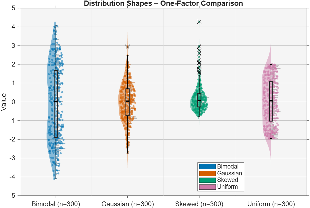
One-factor comparison — four distribution shapes (Gaussian, Uniform, Bimodal, Skewed):
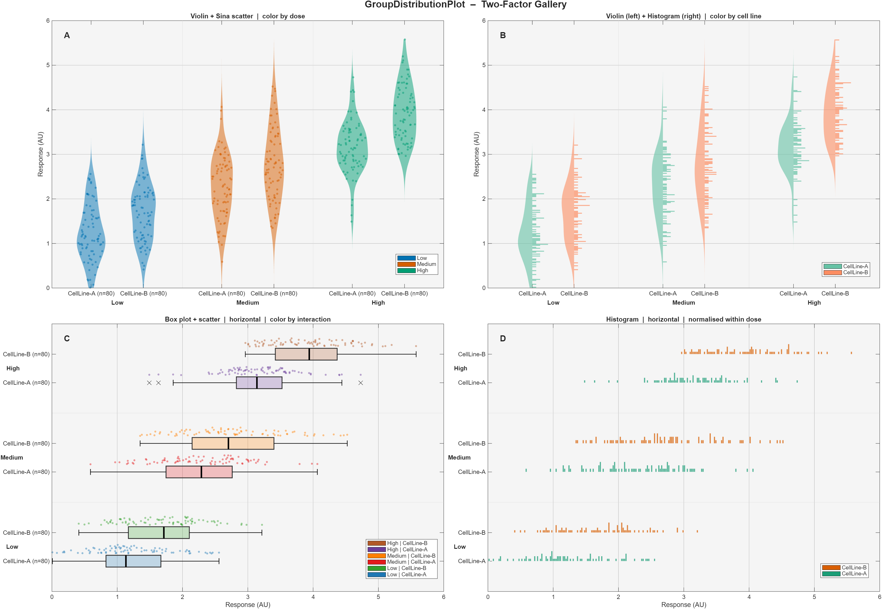
Two-factor gallery — 3 doses × 2 cell lines across four panel configurations:
| Property | Values | Default | Description |
|---|---|---|---|
showViolin |
'symmetric' 'left' 'right' 'no' |
'symmetric' |
Violin rendering mode |
showScatter |
'sina' 'random' 'left' 'right' 'no' |
'sina' |
Scatter jitter mode |
showBoxPlot |
'symmetric' 'left' 'right' 'no' |
'no' |
Box plot position |
showHistogram |
'left' 'right' 'no' |
'no' |
Histogram direction |
plotOrientation |
'vertical' 'horizontal' |
'vertical' |
Axis orientation |
colorMode |
'group1' 'group2' 'both' |
'group1' |
Color mapping target |
normalization |
'global' 'group1' 'group2' 'none' |
'global' |
KDE / histogram scaling reference |
| Property | Default | Description |
|---|---|---|
cellWidth |
0.25 |
Full width allocated to each (g1, g2) cell (data units) |
cellPadding |
0 |
Dead space subtracted from each side of a cell |
spacingGroup1 |
1 |
Distance between consecutive Group 1 clusters |
spacingGroup2 |
0.3 |
Distance between cells within a Group 1 cluster |
violinWidth |
1 |
Violin width relative to slot half-width |
scatterWidth |
1 |
Scatter envelope width relative to slot half-width |
boxPlotWidth |
0.6 |
Box width relative to slot half-width |
histogramWidth |
1 |
Histogram bar width relative to slot half-width |
Each graphical element exposes a style struct whose fields are forwarded directly to the underlying MATLAB graphics call:
gdp.violinStyle.FaceAlpha       = 0.5;
gdp.scatterStyle.SizeData       = 14;
gdp.boxPlotStyle.box.LineWidth  = 1.8;
gdp.boxPlotStyle.medianLine.LineWidth = 2.5;
gdp.histogramStyle.EdgeColor = 'none';gdp = GroupDistributionPlot(measurements, group1, group2);
gdp.showViolin = 'symmetric';
gdp.showScatter = 'sina';
gdp.colorMode = 'group2';
gdp.setColormapGroup('group2', 'set2');
gdp.normalization = 'group1';
gdp.plot();- Sina plot algorithm — Sidiropoulos N. et al. (2018). SinaPlot: An Enhanced Chart for Simple and Truthful Representation of Single Observations over Multiple Classes. J. Comput. Graph. Stat. 27(3):673–676. https://doi.org/10.1080/10618600.2017.1366914
- Okabe-Ito palette — Okabe M. & Ito K. (2008). Color Universal Design. https://jfly.uni-koeln.de/color/
- ColorBrewer palettes — Harrower M. & Brewer C.A. (2003). ColorBrewer.org. The Cartographic Journal 40(1):27–37.
- Tableau 10 — Heer J. & Stone M. (2012). Color Naming Models for Color Selection, Image Editing and Palette Design. CHI 2012.
- Documentation drafted with AI assistance from Claude (Anthropic) and reviewed by the author.
If you use this software in your research or teaching, please cite the Zenodo archive:
Liaudet, N. (2026). GroupDistributionPlot: Violin, Sina, Box & Histogram plots for MATLAB. University of Geneva. https://doi.org/10.5281/zenodo.19842608
BibTeX:
@software{liaudet_2026_groupdistributionplot,
  author       = {Liaudet, Nicolas},
  title        = {{GroupDistributionPlot: Violin, Sina, Box \& Histogram plots for MATLAB}},
  year         = {2026},
  publisher    = {Zenodo},
  institution  = {University of Geneva},
  doi          = {10.5281/zenodo.19842608},
  url          = {https://doi.org/10.5281/zenodo.19842608}
}BSD 2-Clause. See LICENSE.