CTATProtractor
This component shows a user a protractor with movable rays and supports various types of manipulation depending on how it is configured. A very basic CTATProtractor allows a user to move a single ray around a compass.
User can move ray A around the protractor:
<div id="protractor" class="CTATProtractor"></div>CTATProtractor Example (*under development*)
-
id: Required. The name of the component, must be a valid html id name. -
class: Required. The class list, must include"CTATProtractor"and no other CTAT classes. -
data-ctat-protrays: Number of rays present. Default is"1". Maximum is"3"."0"is interactive ray A,"1"adds static ray C,"2"adds static ray D,"3"adds second interactive ray E. -
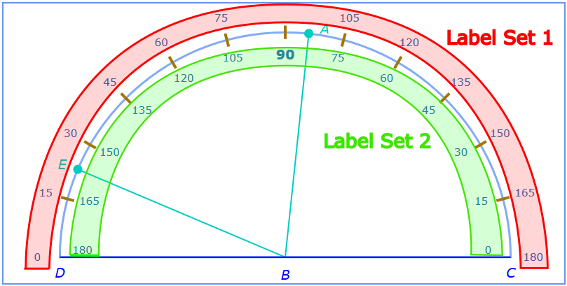
data-ctat-complabels: Sets which compass labels display. Default is"2". Maximum is"3"."0"is no labels,"1"displays label set 1,"2"label set 2,"3"displays both label sets.* -
data-ctat-radians: Sets whether compass labels display in radians. Default is"0". Maximum is"3"."0"is no radians,"1"sets label set 1 to radians,"2"sets label set 2 to radians,"3"sets both label sets to radians. * -
data-ctat-interval: Sets the compass tick mark & snap interval in degrees. Default is"15". Maximum is"90". Value must evenly divide 180, or else interval remains default. -
data-ctat-snap:trueorfalse. Default isfalse. If true, interactive rays will snap to intervals while being moved.
*Under development:*
-
data-ctat-show-feedback:trueorfalse. Default istrueunlessdata-ctat-tutor="false". Determines if grading feedback is shown on the component. -
data-ctat-show-hint-highlight:trueorfalse. Default istrue. Determines if hint highlighting is shown on the component. -
data-ctat-disable-on-correct:trueorfalse. Default istrue. Determines if the component becomes locked when it is graded as correct. -
data-ctat-ctrl-protrays: A list of ; deliminated ids of CTAT controller components that the user interacts with to change the number of protrays. Default is "". -
data-ctat-ctrl-complabels: A list of ; deliminated ids of CTAT controller components that the user interacts with to change the labels that are visible. Default is "". -
data-ctat-ctrl-radians: A list of ; deliminated ids of CTAT controller components that the user interacts with to change the radian labels that are visible. Default is "". -
data-ctat-ctrl-interval: A list of ; deliminated ids of CTAT controller components that the user interacts with to change the value of the tickmark/snapping interval. Default is "". -
data-ctat-ctrl-snap: A list of ; deliminated ids of CTAT controller components that the user interacts with to change the whether snapping is turned on. Default is "".
Valid CTAT controller components include CTATButton, CTATImageButton, CTATTextInput, and CTATNumericStepper. CTATSubmitButton can also be used as a controller component to do grading on demand for the associated part of the number line; for example, it can be configured to submit just the denominator for grading.
- Image below illustrates label set 1 and label set 2 on a
CTATProtractorwithdata-ctat-complabels="3"
In addition to the common Actions listed in Often Used TPAs this component supports the following actions:
SpecifiedAngleSet a number or JSON string Moves a specified interactive protray to a specified angle. Number inputs only move ray A, according to angle ABD. JSON string should take the form {"angle_name": angle_value} - for example, {"ABC": 123} will move ray A to a position such that angle ABC is 123 degrees, and angle ABD is 57 degrees. See note about SpecifiedAngleSet in Example Tracing. resetLabels a list of numbers or fractions separated by ;'s resetRadians a number or fraction Change the minimum to the given value.
Here is a list of the default styles included in CTAT.css that govern various aspects of the look of the number line.
.CTATProtractor {
     border: 2px solid cornflowerblue;
     height: 400px; width: 800px;
}

.CTATProtractor--container {
     display: flex;
     align-items: center;
     justify-content: space-around;
}

.CTATProtractor--compass {
     stroke: rgb(131, 171, 245);
     stroke-width: 3px;
     fill: none;
}

.CTATProtractor--ticks {
     stroke: rgb(163, 118, 5);
     stroke-width: 4px;
}

.CTATProtractor--labels {
     text-anchor: middle;
     fill: rgb(47, 110, 182);
     font-size: 80%;
}

.CTATProtractor--label90 {
     font-weight: bold;
     font-size: 125%;
}

.CTATProtractor--labelB {
     text-anchor: middle;
     font-style: italic;
     stroke: none;
     font-size: 125%;
     fill: blue;
}

.CTATProtractor--protrays {
     stroke: rgb(0, 204, 194);
     fill: rgb(0, 204, 194);
     stroke-width: 2;
}

.CTATProtractor--fgrays {
     stroke: blue;
     fill: blue;
     stroke-width: 2;
}

.CTATProtractor--labelray {
     text-anchor: middle;
     font-style: italic;
     stroke: none;
     font-size: 100%;
}

.CTATProtractor--select {
     cursor: grab;
     user-select: auto;
}

.CTATProtractor--correct {
     filter: drop-shadow(0 -1px 3px limegreen) drop-shadow(1px 0 3px limegreen) drop-shadow(0 1px 3px limegreen);
}

.CTATProtractor--incorrect {
     filter: drop-shadow(0 -1px 3px red) drop-shadow(1px 0 3px red) drop-shadow(0 1px 3px red);
}

.CTATProtractor--hint {
     filter: drop-shadow(0 -1px 3px yellow) drop-shadow(1px 0 3px yellow) drop-shadow(0 1px 3px yellow);
}*Under development, not yet available*
Example for mass producing the protray count, compass labels, radians, and interval for a CTATProtractor:
<div id="protractor" class="CTATProtractor" data-ctat-protrays="%(protrays)%" data-ctat-complabels="%(complabels)%" data-ctat-radians="%(radians)%" data-ctat-interval="%(interval)%">
</div>