-
Notifications
You must be signed in to change notification settings - Fork 6
Display mnc files from the terminal
So you have mnc files and you want to use "Display" to visualize them from the terminal. Maybe you are QC'ing your data, or maybe you want to compare how well different models fit. This is the place for you.
One great resource is: https://en.wikibooks.org/wiki/MINC/VisualTools/Display, but I'll walk through some useful tricks here.
First of all, the modules I have loaded on the CIC are:
- quarantine
- minc-toolkit/1.9.16
They are sufficient for what I will describe below. By the way, you can check which modules you have listed with the command module list.
If you don't see minc-toolkit, you can load it with this command: module load minc-toolkit
Note: If you are accessing the CIC remotely and want to use Display, you can install a remote desktop client such as X2Go to run the graphical program in a remote workstation session. Once in the terminal (Xterm or UXterm) on the remote desktop, load the same modules as above, as well as module remotemesa (without this additional module, you may encounter an error when trying to open Display).
For these examples, I will be referring primarily to the output of my two-level DBM model built with Pydpiper. Mouse brains! Here's that wiki, if you're confused: https://github.com/CobraLab/documentation/wiki/Introduction-to-Two-Level-Model-Building-with-Pydpiper
What I refer to as "average" is the brain average of all of my subjects' brains, at all time-points (4 for me, with a longitudinal dataset). This is produced by the two-level, along with the "mask". The mask is a map of the pixels considered brain (as opposed to skull, eyeballs, etc). That two-level wiki listed above has information on improving your mask, so I won't focus on that here.
Let's say you want to pull up the minc file with your t-stats that you produced in R. Navigate to the directory containing both your average and your statsmap.
$ Display average stats_map stats_mapFor me that looks like this:
$ Display J20_twolevel_cupo_second_level-nlin-3.mnc J20stats_genoXns\(age\,2\)1.mnc J20stats_genoXns\(age\,2\)1.mncMake sure that your Display is capitalized!
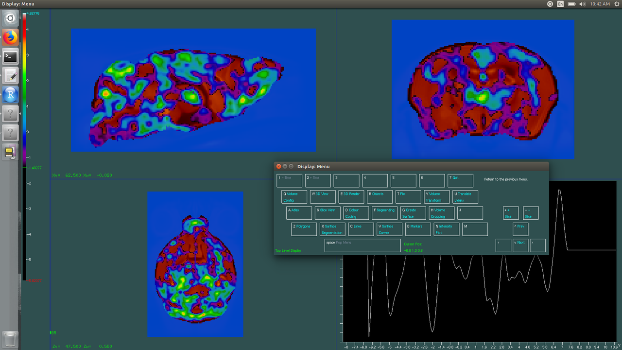
This command should open two new windows. One should be a colorful brain, the other a little keyboard on the screen.
Here's a link to mine:
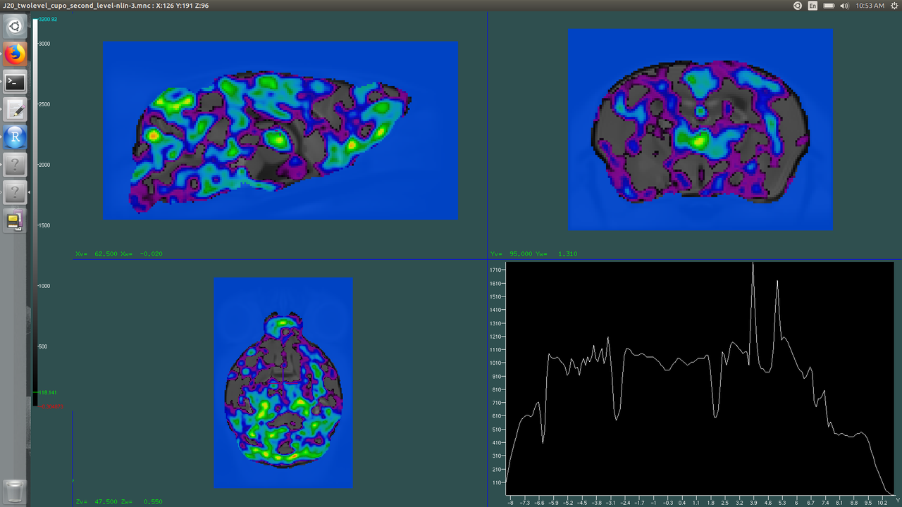
Very pretty, but not very meaningful! To view areas of growth/atrophy we need to do a few things. One thing to note, you can navigate the menu either by clicking on the screen keyboard with your mouse or using your physical keyboard. For simplicity's sake, I will write the name of the key to press. So first, press the space key, just to be sure you are in the top-most level. Then click S-slice view. Look at T-Curr Volume. It probably says T-Curr Volume: 3. Click T until it says T-Curr Volume: 1. Now we are editing the volume that is the first argument in our Display command--the average for us. Please note, if your image is open, but your little screen keyboard isn't, you are still making changes when you click keys, even if you can't see the screen keyboard!
- With your screen keyboard open, click the
space barto pop out to the main menu. - Click
D-Colour coding - Click
D-Gray scale
Your background should now be grayscale!
- Click
Space-pop menu - Click
S-Slice view - Click
T-Curr Volume(after click should read Curr Volume:2) - Click
Space - Click
T-File - Click
Y-Load UserDef ColC - A file GUI should open. Navigate to
/opt/quarantine/resources/Display-colormaps/ - Select
RMINC_red.lut-- this will be the colormap we use for our positive stats (areas of growth)
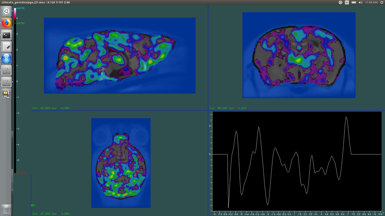
Let's suppose when you look at your FDR results for this column, you have significant t-scores at 1% FDR (4.67), and at 5% FDR your t-scores are 3.63. For Volume 2, your hot map, look at the bar on the left side of the screen. We will set the green line (your lower threshold) to the t-scores of 5% FDR (3.63). We will set the upper bound (blue line) at your t-scores for 1% FDR (4.67).
Now you might notice something kind of weird about mine. Not only does it look pretty unexciting, but my blue line for the upper bound doesn't even go as high as my t-scores! Not to worry, that's actually expected. The t-scores represent both the negative and positive change, and I don't really expect to see much growth when I compare my weird mice to my normal mice. Forge ahead and wait to interpret things at the end.
- Click
Space-pop menu - Click
S-Slice view - Click
T-Curr Volume(after click should read Curr Volume:3) - Click
Space - Click
T-File - Click
Y-Load UserDef ColC - A file GUI should open. Navigate to
/opt/quarantine/resources/Display-colormaps/ - Select
RMINC_blue.lut
This time, since we're looking at negative change, we're going to put a negative sign in front of our t-scores. The blue line is still the "upper bound" but it should be more negative. In my case, set the blue line to -4.67 and the green line to -3.63.
One last thing before we look:
- Click
Space-pop menu - Click
Q-Volume config - Click
S-Interp
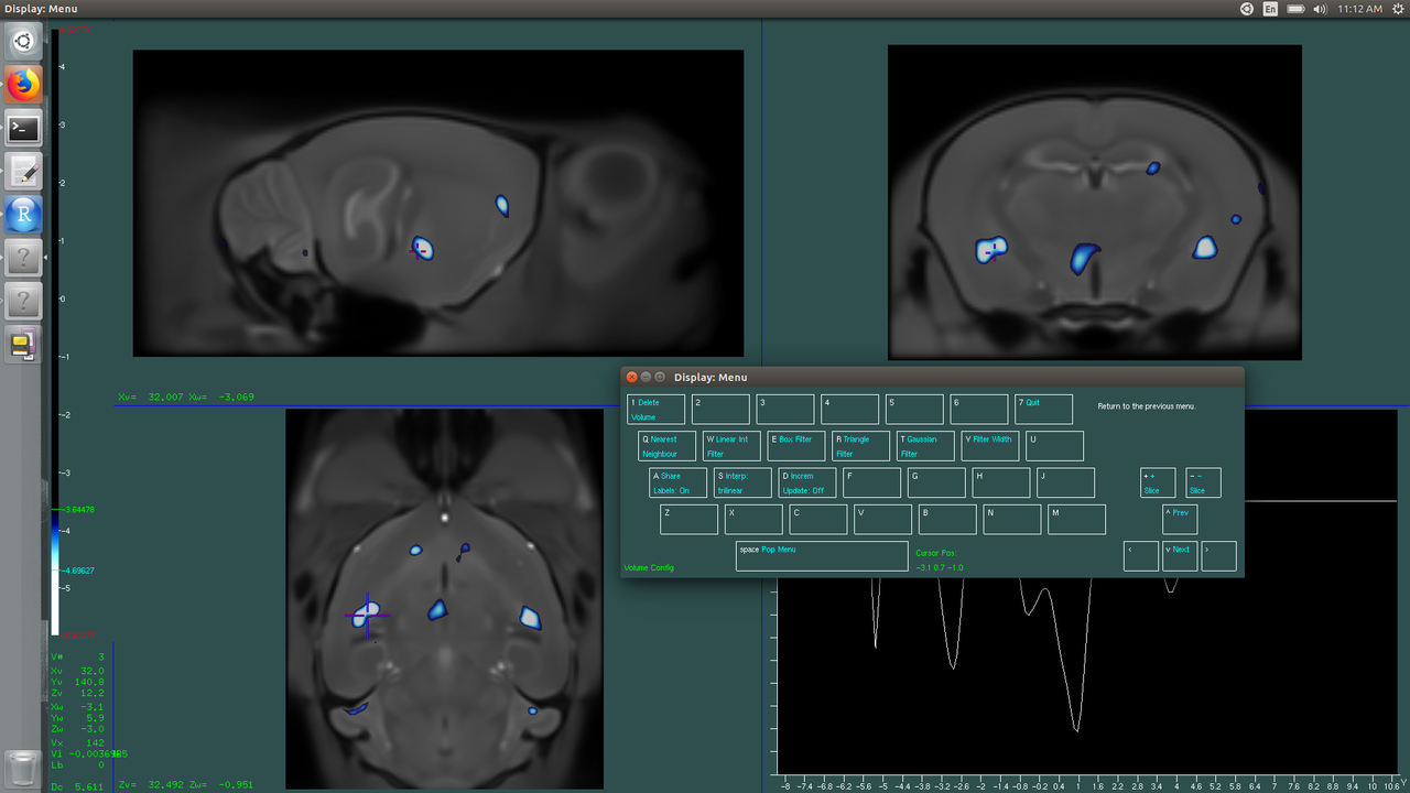
Look how smooth and pretty (and meaningful) your visualization is now!
The white spaces are your voxels of peak change, significant at 1% FDR--mine are all bluish because they are regions of decrease. You can choose the voxels to plot (R Tips and Tricks: R Tips and Tricks) from these areas. Here we are visualizing only the areas significant above 5% FDR (color) and above 1% (white). To explore your data, change the thresholds to see trends!


