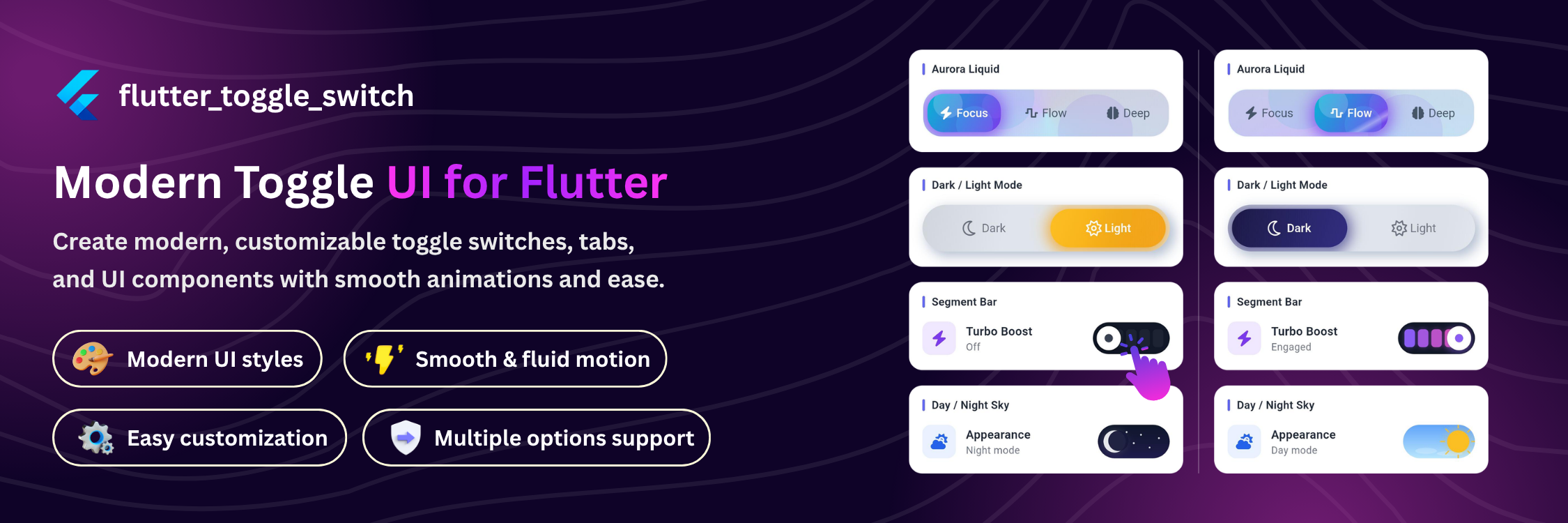
A professional, highly customizable Flutter UI library for modern toggles, switches, and tab bars.
| Glow Slide | Glassmorphic | Aurora | Neumorphic |
|---|---|---|---|
 |
 |
 |
 |
| Underline | Stacked Cards | Magnetic Blob | Switches |
|---|---|---|---|
 |
 |
 |
 |
- Overview
- Features
- Components
- Installation
- Quick Start
- Tab Bar Styles
- Specialized Switches
- API Reference
- Enums
- Contributing
- License
flutter_toggle_switch is a single-package solution for every toggle, switch, and tab bar UI pattern you need in a Flutter app. Instead of stitching together multiple libraries or building custom painted widgets from scratch, you get one unified FlutterToggle widget with a declarative API that scales from a simple two-state switch to a fully animated multi-tab navigation bar.
Why this package?
- One widget, many shapes.
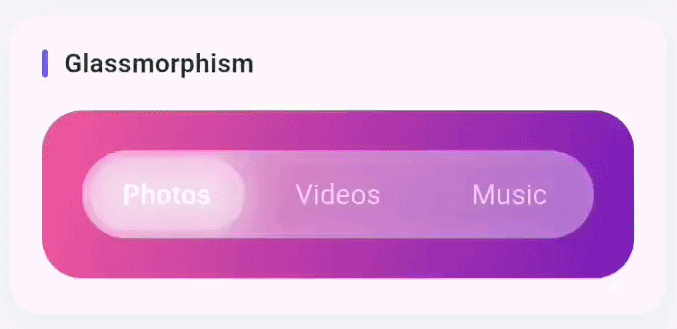
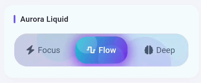
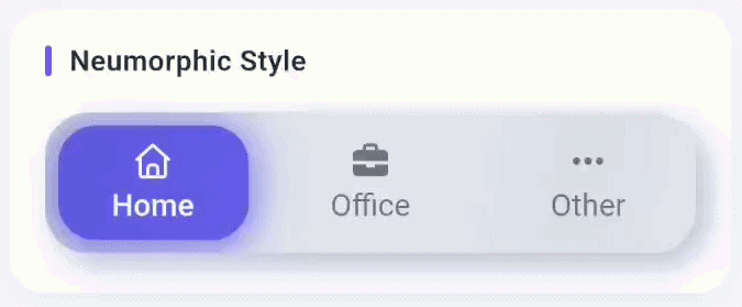
FlutterTogglecovers pill toggles, underline tabs, stacked card tabs, and magnetic blob navigation — all driven by the sameonTogglecallback andinitialLabelIndex. - Design-system ready. Seven decoration styles (solid, glass, neumorphic, outlined, tonal, floating, aurora) and five animation styles (slide, fade, scale, elastic, morph) let you match any design language without custom painters.
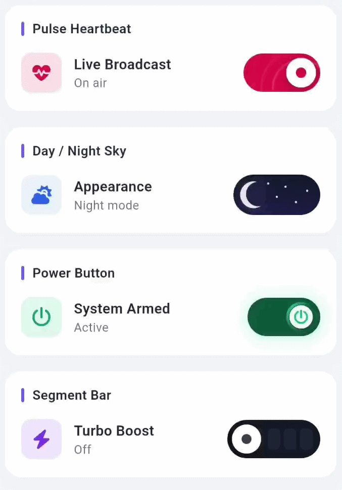
- Specialized switches included.
PulseToggleSwitch,DayNightToggleSwitch,PowerToggleSwitch, andSegmentBarToggleSwitchhandle common binary-state patterns with polished, themed animations out of the box. - Production details built in. Haptic feedback, async cancel guards, shimmer effects, icon wiggle, semantic labels, and keyboard navigation are all first-class parameters — no custom wrappers required.
- Zero boilerplate. Drop in the widget, pass your labels, wire
onToggle, done.
| Feature | |
|---|---|
| Unified API | One widget (FlutterToggle) covers pills, underline tabs, stacked cards, and magnetic blob navigation |
| 7 Decoration Styles | solid · glass · neumorphic · outlined · tonal · floating · aurora |
| 5 Animation Styles | slide · fade · scale · elastic · morph |
| 5 Pill Styles | filled · glass · outline · soft · liquid |
| Specialized Switches | PulseToggleSwitch · DayNightToggleSwitch · PowerToggleSwitch · SegmentBarToggleSwitch |
| Layouts | Horizontal & vertical support with per-item custom widths and heights |
| Content | Icons, labels, and fully custom widgets per item |
| Extras | Haptic feedback, ripple effects, shimmer, icon wiggle, async cancel guard |
| Accessibility | Semantic labels and keyboard navigation ready |
| Widget | Description |
|---|---|
FlutterToggle |
Flagship multi-item toggle — sliding pill, full decoration and animation control |
PulseToggleSwitch |
Binary switch with ambient pulsing ring effect |
DayNightToggleSwitch |
Thematic switch that morphs between sun and moon scenery |
PowerToggleSwitch |
Hardware-inspired button with rotating glow ring |
SegmentBarToggleSwitch |
Level-indicator style switch with sequential LED segments |
| Style | Description |
|---|---|
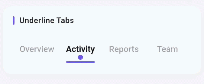
ToggleStyle.underline |
Minimal tab strip with sliding animated underline |
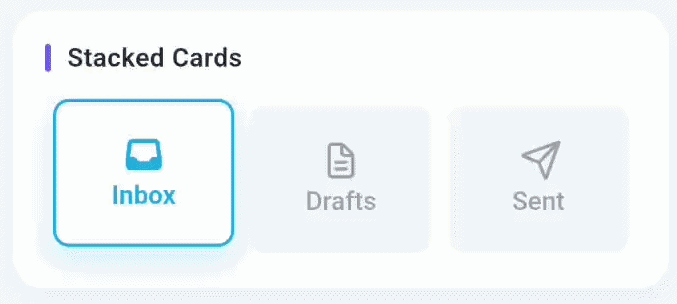
ToggleStyle.stackedCards |
Tactile card tabs that lift and shadow on selection |
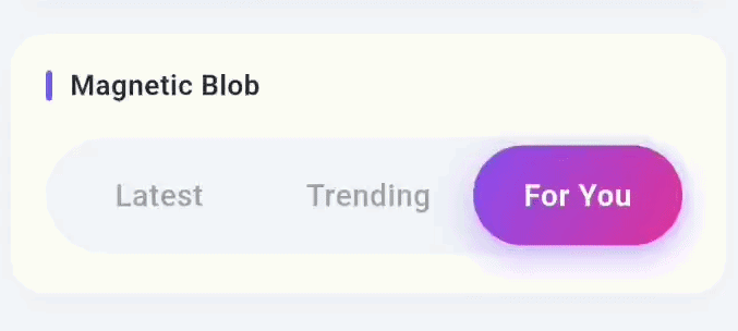
ToggleStyle.magneticBlob |
Playful navigation where a blob stretches to follow selection |
Add to your pubspec.yaml:
dependencies:
  flutter_toggle_switch: ^0.0.1
Or run:
flutter pub add flutter_toggle_switchThen import:
import 'package:flutter_toggle_switch/flutter_toggle_switch.dart';
FlutterToggle(
  initialLabelIndex: 1,
  totalSwitches: 3,
  labels: const ['Day', 'Week', 'Month'],
  minWidth: 150,
  minHeight: 48,
  cornerRadius: 24,
  animate: true,
  animationDuration: 450,
  slidingPill: true,
  animationStyle: ToggleAnimationStyle.elastic,
  pillElevation: 4,
  pillInset: const EdgeInsets.all(4),
  glowRadius: 18,
  enableActiveShimmer: true,
  hapticFeedback: true,
  activeFgColor: Colors.white,
  inactiveFgColor: const Color(0xFF6B7280),
  inactiveBgColor: const Color(0xFFEEF0F6),
  activeBgColor: const [Color(0xFF6366F1), Color(0xFF8B5CF6)],
  onToggle: (i) => debugPrint('Tab $i'),
)
FlutterToggle(
  initialLabelIndex: 0,
  totalSwitches: 3,
  labels: const ['Photos', 'Videos', 'Music'],
  minWidth: 150,
  minHeight: 44,
  cornerRadius: 22,
  animate: true,
  animationDuration: 400,
  slidingPill: true,
  decorationStyle: ToggleDecorationStyle.glass,
  glassBlur: 18,
  pillInset: const EdgeInsets.all(4),
  activeFgColor: Colors.white,
  inactiveFgColor: Colors.white70,
  inactiveBgColor: Colors.white.withValues(alpha: 0.18),
  activeBgColor: [Colors.white.withValues(alpha: 0.30)],
  onToggle: (i) => debugPrint('Media $i'),
)
FlutterToggle(
  initialLabelIndex: 1,
  totalSwitches: 3,
  labels: const ['Focus', 'Flow', 'Deep'],
  semanticLabels: const ['Focus mode', 'Flow mode', 'Deep work mode'],
  icons: const [
    FontAwesomeIcons.bolt,
    FontAwesomeIcons.waveSquare,
    FontAwesomeIcons.brain,
  ],
  minWidth: 112,
  minHeight: 58,
  cornerRadius: 22,
  animate: true,
  animationDuration: 420,
  slidingPill: true,
  animationStyle: ToggleAnimationStyle.morph,
  decorationStyle: ToggleDecorationStyle.aurora,
  pillStyle: TogglePillStyle.liquid,
  pillInset: const EdgeInsets.all(5),
  pillElevation: 5,
  iconSize: 15,
  enableActiveShimmer: true,
  enableIconWiggle: true,
  hapticFeedback: true,
  activeFgColor: Colors.white,
  inactiveFgColor: const Color(0xFF475569),
  inactiveBgColor: Colors.white,
  activeBgColor: const [Color(0xFF06B6D4), Color(0xFF7C3AED)],
  trackBorderColor: Colors.white70,
  onToggle: (i) => debugPrint('Mode $i'),
)
FlutterToggle(
  initialLabelIndex: 1,
  totalSwitches: 3,
  labels: const ['Home', 'Office', 'Other'],
  icons: const [
    FontAwesomeIcons.house,
    FontAwesomeIcons.briefcase,
    FontAwesomeIcons.ellipsis,
  ],
  minWidth: 150,
  minHeight: 64,
  cornerRadius: 20,
  iconPosition: IconPosition.top,
  iconSize: 16,
  animate: true,
  slidingPill: true,
  decorationStyle: ToggleDecorationStyle.neumorphic,
  inactiveBgColor: const Color(0xFFE0E5EC),
  inactiveFgColor: const Color(0xFF6B7280),
  activeFgColor: Colors.white,
  activeBgColor: const [Color(0xFF6366F1)],
  pillInset: const EdgeInsets.all(6),
  pillElevation: 4,
  animationDuration: 300,
  hapticFeedback: true,
  onToggle: (i) => debugPrint('Address $i'),
)
FlutterToggle(
  style: ToggleStyle.underline,
  labels: const ['Overview', 'Activity', 'Reports', 'Team'],
  initialLabelIndex: 1,
  minHeight: 48,
  activeFgColor: const Color(0xFF111827),
  inactiveFgColor: const Color(0xFF94A3B8),
  indicatorColor: const Color(0xFF6366F1),
  semanticLabels: const [
    'Overview tab',
    'Activity tab',
    'Reports tab',
    'Team tab',
  ],
  onToggle: (i) => debugPrint('Tab $i'),
)
FlutterToggle(
  style: ToggleStyle.stackedCards,
  labels: const ['Inbox', 'Drafts', 'Sent'],
  icons: const [
    FontAwesomeIcons.inbox,
    FontAwesomeIcons.fileLines,
    FontAwesomeIcons.paperPlane,
  ],
  initialLabelIndex: 0,
  minHeight: 74,
  activeBgColor: const [Color(0xFF0EA5E9)],
  inactiveBgColor: const Color(0xFFF1F5F9),
  semanticLabels: const ['Inbox tab', 'Drafts tab', 'Sent tab'],
  onToggle: (i) => debugPrint('Tab $i'),
)
FlutterToggle(
  style: ToggleStyle.magneticBlob,
  labels: const ['Latest', 'Trending', 'For You'],
  initialLabelIndex: 1,
  minHeight: 54,
  activeBgColor: const [Color(0xFF8B5CF6), Color(0xFFEC4899)],
  inactiveBgColor: const Color(0xFFF1F5F9),
  semanticLabels: const ['Latest tab', 'Trending tab', 'For you tab'],
  onToggle: (i) => debugPrint('Tab $i'),
)
PulseToggleSwitch(
  initialValue: false,
  activeColor: Colors.green,
  pulseColor: Colors.greenAccent,
  onToggle: (val) => debugPrint('Pulse: $val'),
)DayNightToggleSwitch(
isDaytime: true,
onToggle: (val) => setState(() => _isDay = val),
)PowerToggleSwitch(
isOn: false,
activeColor: Colors.green,
glowColor: Colors.greenAccent,
onToggle: (val) => debugPrint('Power: $val'),
)SegmentBarToggleSwitch(
segments: 5,
activeSegments: 3,
activeColor: Colors.amber,
onToggle: (index) => debugPrint('Segment: $index'),
)| Property | Type | Default | Description |
|---|---|---|---|
totalSwitches |
int |
required | Number of toggle items |
labels |
List<String>? |
null |
Text label for each item |
icons |
List<IconData?>? |
null |
Icon for each item |
customWidgets |
List<Widget>? |
null |
Fully custom widget per item |
initialLabelIndex |
int? |
0 |
Initially selected index |
onToggle |
void Function(int?) |
required | Called when selection changes |
cancelToggle |
Future<bool> Function(int?)? |
null |
Async guard — return false to cancel |
| Property | Type | Default | Description |
|---|---|---|---|
style |
ToggleStyle |
.standard |
Overall layout variant |
decorationStyle |
ToggleDecorationStyle |
.solid |
Track visual treatment |
pillStyle |
TogglePillStyle |
.filled |
Selected-pill visual treatment |
animationStyle |
ToggleAnimationStyle |
.slide |
Transition animation style |
activeBgColor |
List<Color>? |
null |
Active state gradient colors |
inactiveBgColor |
Color? |
null |
Inactive track background |
activeFgColor |
Color? |
null |
Active item foreground (text/icon) |
inactiveFgColor |
Color? |
null |
Inactive item foreground |
cornerRadius |
double |
8.0 |
Track corner radius |
fontSize |
double |
14.0 |
Label font size |
iconSize |
double |
17.0 |
Icon size |
borderColor |
List<Color>? |
null |
Track border color(s) |
borderWidth |
double? |
null |
Track border width |
| Property | Type | Description |
|---|---|---|
glassBlur |
double |
Blur sigma for glassmorphic track |
glassOpacity |
double |
Opacity for glass fill |
| Property | Type | Default | Description |
|---|---|---|---|
isVertical |
bool |
false |
Arrange items vertically |
minWidth |
double |
72.0 |
Minimum width per item |
minHeight |
double |
40.0 |
Minimum height per item |
customWidths |
List<double>? |
null |
Per-item custom widths |
customHeights |
List<double>? |
null |
Per-item custom heights |
| Property | Type | Default | Description |
|---|---|---|---|
enabled |
bool |
true |
Whether the widget is interactive |
animate |
bool |
true |
Enable/disable transition animation |
animationDuration |
int |
200 |
Transition duration in milliseconds |
doubleTapDisable |
bool |
false |
Disable by double-tapping active item |
changeOnTap |
bool |
true |
Whether a tap changes the selection |
| Value | Description |
|---|---|
standard |
Classic pill/switch (default) |
underline |
Text tabs with animated underline |
stackedCards |
Elevated card tabs |
magneticBlob |
Stretching blob indicator |
| Value | Description |
|---|---|
solid |
Flat background (default) |
glass |
Blurred translucent — Glassmorphism |
neumorphic |
Soft shadow depth effect |
outlined |
Transparent interior, gradient border |
tonal |
Material low-contrast surface tint |
floating |
Elevated surface with soft border |
aurora |
Animated ambient gradient |
| Value | Description |
|---|---|
slide |
iOS-style pill slide |
fade |
Cross-fade per item |
scale |
Pop-in scale effect |
elastic |
Slide with overshoot |
morph |
Smooth easeOutCubic slide |
| Value | Description |
|---|---|
filled |
Gradient fill (default) |
glass |
Translucent with light edge |
outline |
Transparent with colored stroke |
soft |
Elevated with stronger shadow |
liquid |
Animated layered highlights |

Contributions are welcome! Please open an issue or submit a pull request on GitHub.
This project is licensed under the MIT License — see the LICENSE file for details.
Built with ❤️ by DevCodeSpace
If this package saved you time, please leave a ⭐ on pub.dev and GitHub!