Revamp Vertical Collapsible Menu UI/UX #649
Description
Currently, there is a hierarchy break between the OSCAL model titles and the documents, but greater distinction would be helpful. To create this separation, icons can be used to represent each of these models and a document icon can be used to represent a certain document fitting the model. (When looking at the visual representation below, some of these icons are not the most accurate, such as an icon showing a portrait of a person for a profile - this should probably represent something closer to a baseline/overlay.) Keep in mind that the logos should not take away from the current arrows indicating the panels being collapsible (not shown below).
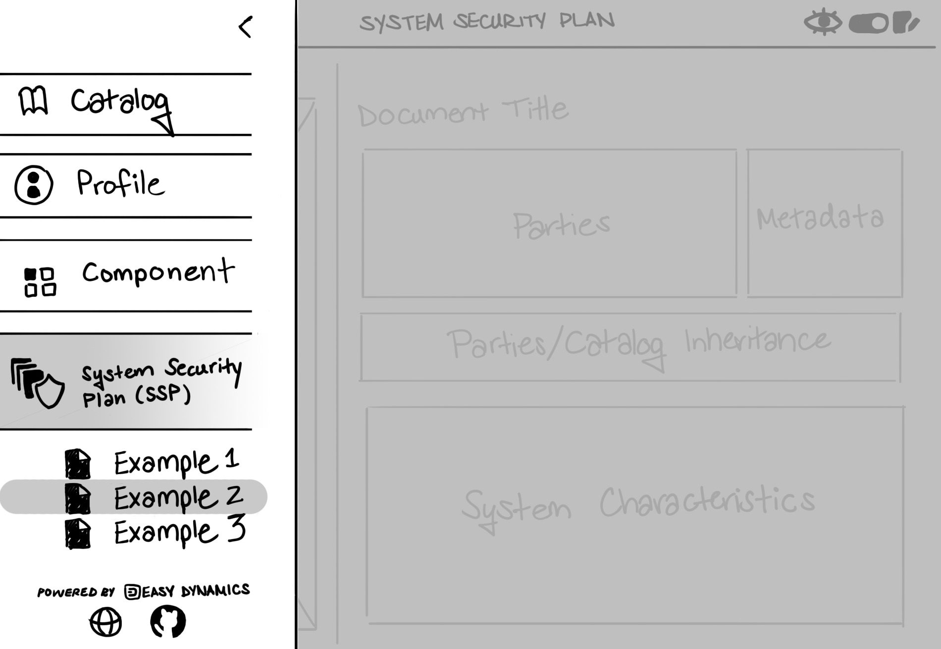
An indication of which model and document the user is viewing can be better captured in this side panel. Highlighting these sections in orange could solve this issue.
When selecting the hamburger icon in the Viewer, a small dropdown menu appears, while selecting this icon in the Editor, a vertical collapsible menu appears spanning about 25% of the application's real estate. To standardize a menu across OSCAL Viewer and Editor, these options should be captured in a vertical side menu, like used in the Editor.
This side menu would also be a great place to capture some important information about Easy Dynamics and OSCAL. Instead of linking the GitHub page in the Appbar, this seems like a more fitting place for it to go. The company website and any other media links telling users to find more information about us can also go here. Ideally, we would like the company brand to be displayed on screen as much as possible. If the Navigation sidebar is layered over top our company branding, "Powered by Easy Dynamics" could appear here as well.
Color should be added to the menu. Following Easy Dynamics' color scheme, the navy blue we use for the Appbar may look nice here, with orange accents. An example is shown below.
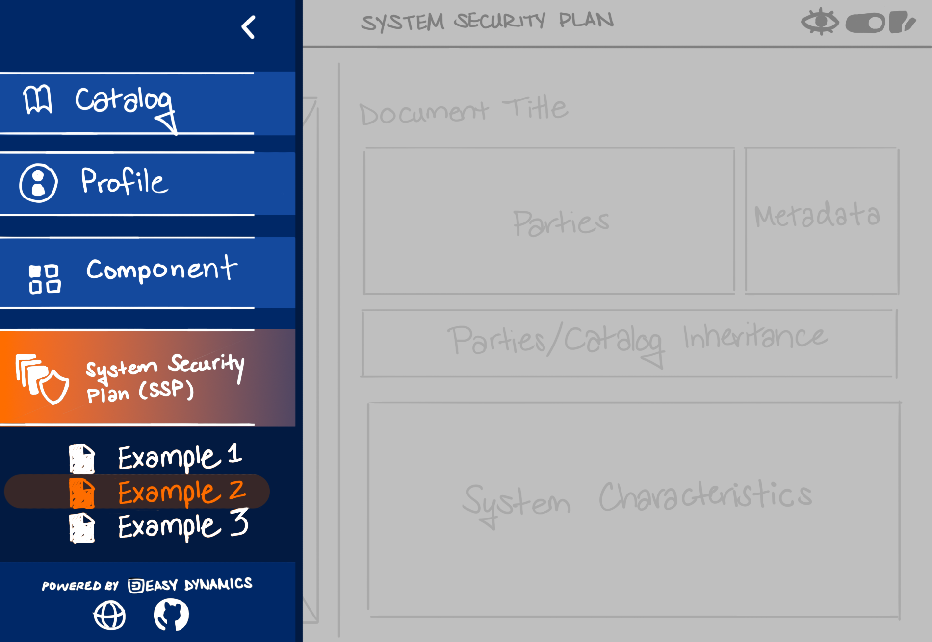
To sell this vertical sidebar, when the vertical sidebar is open the focus should be on it. The body content pane should be put into more of an "unselectable" state and this should be visibly shown, such as apply some opacity/grayed out layer over top of it to represent this. If the user wants to close this side menu, any part of the body content section or the left arrow (which is currently there) can be clicked.