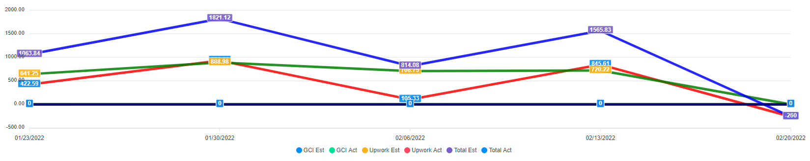
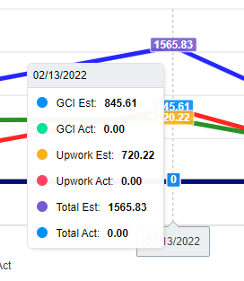
I'm trying to set up some specific colors so I can quickly/easily tell which lines and numbers are what. Using the code below, I'm able to change the colors of the individual lines in my line chart, but the colors associated with each label and the numbers on each line seem to be using the default color orders instead of what I've specified which makes it very confusing when for example "GCI Est" label shows a blue circle, but is showing a red line. I have seen references to using "ChartLegend -Color ...", but as far as I can tell from what I've read and in my bit of testing and skimming through function definitions, this only applies to bar charts and not line charts.
I'm not sure if I've missed something in documentation, or this is just the current available functionality. Appreciate any pointers!
Relevant code:
    Tab -Name 'Test Title' {
        Section -Name 'status' -Collapsable {
            Panel {
                Chart -Title 'Test Title' -TitleAlignment center {
                    ChartAxisX -Name ($TestData | Select-Object -ExpandProperty weekEnding)
                    ChartLine -Name 'GCI Est' -Value ($TestData | Select-Object -ExpandProperty GciEstimated) -Color Red
                    ChartLine -Name 'GCI Act' -Value ($TestData | Select-Object -ExpandProperty GciActual) -Color DarkRed
                    ChartLine -Name 'Upwork Est' -Value ($TestData | Select-Object -ExpandProperty UpworkEstimated) -Color Green
                    ChartLine -Name 'Upwork Act' -Value ($TestData | Select-Object -ExpandProperty UpworkActual) -Color DarkGreen
                    ChartLine -Name 'Total Est' -Value ($TestData | Select-Object -ExpandProperty TotalEstimated) -Color Blue
                    ChartLine -Name 'Total Act' -Value ($TestData | Select-Object -ExpandProperty TotalActual) -Color DarkBlue
                }
            }
        }
    }
I'm trying to set up some specific colors so I can quickly/easily tell which lines and numbers are what. Using the code below, I'm able to change the colors of the individual lines in my line chart, but the colors associated with each label and the numbers on each line seem to be using the default color orders instead of what I've specified which makes it very confusing when for example "GCI Est" label shows a blue circle, but is showing a red line. I have seen references to using "ChartLegend -Color ...", but as far as I can tell from what I've read and in my bit of testing and skimming through function definitions, this only applies to bar charts and not line charts.
I'm not sure if I've missed something in documentation, or this is just the current available functionality. Appreciate any pointers!
Relevant code: