CSS
CSS is a language for styling HTML elements and can be integrated with HTML in 3 ways, which will be described later.
The structure of a statement in CSS involves selecting an HTML element(s), followed be a list of properties separated by semicolons that describe the visual style. e.x:
element {
  property: value;
  property: value
}
The CSS selector is what we use to select HTML elements for styling by CSS, as is the element part of the structure described above.
The universal selector, * will select every element on the webpage.
* {
  property: value;
  property: value
}
The element type selector will select every element with the same type. Ex:
p {
  property: value;
  property: value
}
The above will select every <p> element on the webpage.
The id selector will select the element with that id. Ex:
#myid {
  property: value;
  property: value
}
The above will select the element with id="myid".
The class selector will select every element with the same specified class. Ex:
.myclass {
  property: value;
  property: value
}
The above will select every element with class="myclass".
.myclass {
  property: value;
  property: value
}
The above will select every <h1> element with class="myclass".
We can select any elements in 4 different states: a:link - selects all unvisited links a:hover - selects links when the user mouses over a:active - selects links when they are clicked a:visited - selects all the visited links
Properties are what we us to describe styles with CSS. They are the part of the structure inside the curly brackets, i.e.
property:value;
property:valueWhen it comes to specifying styles that have to do with sizing or positioning, we need some units to represent distances on any screen.
In CSS px is a unit, an absolute length(approximately 1/96th of an inch), which is not necessarily exactly 1 pixel on your scree. However it is adjusted so that it is constant no matter what resolution screen you are viewing it on, and it can use decimals.
Font size can also be inherited from the body of the html, which is a standard 16px in most browsers. If an element inherits this font-size, then 1em will equal 16px.
em is relative to the font size of the element
e.x:
element { height: 1.5em } - will make the element 50% larger than the font size of the element.
element { font-size: 1.5em } - the font size of the element will be 50% larger than the font-size inherited by the element.
element1 {font-size: 1.5em } - element1 inherits its font size from html. Since the html default font size is 16px, this translates to 1.5em x 16px = 24px.
element2 { font-size: 0.5em }
element2 inherits its font-size from element1, since element 1 has a font size of 24px, element2 will have a font size of 0.5em x 24px = 12px.
It is a common thing to do, especially when it comes to responsive design, such as making a website "mobile friendly," and accessibility. If em is used throughout the website, then every element is related through front size. If we want to then scale everything or a portion of our website, we need only to change the font size of one element to make that change.
If px is used, then they do not share this relationship, so we must change every element individually to scale the website.
The percent (%) symbol represents a percentage of the space allotted to elements in a given container. e.x:
element1 { height: 1em }element2 { height: 80% }Here, element2 is nested inside element1 in out HTML, so it will have a height of 80% x 16px = 12.8px
There are more than the 3 units described here, in html, and it’s worth exploring them online.
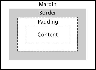
The content is where are of our text and images go. So the content itself can be another element, that is, a box within a box.
The padding is a transparent area around the content.
The border surrounds the padding and content.
The margin is another transparent area, this time around the border, padding, and content.
To clarify, the % unit refers to a percentage of the space allotted to the content box.
We can specify the height and width of elements
e.x: height: length;
width: length;
We can specify the margin and padding of elements in a few ways.
Depending on how many separate length values we list, the browser will give each of the four sides of an element a margin or padding.
Padding is specified the same way as margin, except we type padding instead of margin.
e.x: margin: allFourSides; margin: 10px; margin: top&bottom right&left; margin: 10px 12px; margin: top right&left bottom; margin: 10px 12px 15px margin: top right bottom left; margin: 5px 10px 12px 8px
We can specify the border of elements with a short-hand, or as separate properties.However,Border-radius must be specified separately.
short-hand e.x: border: border-width border-style border-color;
separately e.x: border-width: length;
border-style: style;
border-color: color;
border radius e.x: border-radius: length;
We can specify the font of text in an element with a short-hand, or as separate properties. Font weight, if given by a number goes from 100 to 900, in increments of 100 (E.g. 200, 400, 700, not 230 or 352 etc..). Font family can contain a list of fonts, in a fallback system: if the browser can't find the font it tries the next in the list.
short-hand e.x: font: font-style font-variant font-weight font-size/line-height font-family;
separate e.x:
font-style: normal|italic|oblique;
font-varient: normal|small-caps;
font-weight: normal|bold|100-900; note: 400 is normal and 700 is bold
font-size: length;
line-height: length;
font-family: list-of-fonts;
We can also specify the color, alignment of text, and text-decoration of text in an element.
e.x: color: color;
text-align: left|right|center|justify;
text-decoration: none|underline|overline|line-through;
e.x: background-color: color;
display: inline|block|inline-block;
- inline elements - have fixed heights and widths, and can be placed next to each other.
- block elements - have default heigh and width which can be changed, and cannot be placed next to each other.
- inline-block - elements have default height and width which can be changed, and can be placed next to each other.
If the height or width of an element is less than what would be required to hold all of the content within it, the extra content, called overflow, can be handled in a few ways.
- overflow: visible|hidden|scroll|auto;
- visible: overflow is not clipped
- hidden: overflow is clipped
- scroll/auto: overflow is clipped but the user can scroll to see the rest of the content.
CSS can be integrated with HTML in a few ways, one is inline CSS.
In inline CSS, we list the properties in the style attribute of the element we want to style. We don't have to select an element or use curly braces, but we still separate properties by semicolons.
e.x: <tag style=“property:value; property:value”>
My styled content
</tag>
In internal CSS, we place the CSS in the head element in a special <style>tag.
e.x: html <!DOCTYPE html> <html> <head> <style> element { property: value; property: value } </style> </head> . . . </html>
The last way that we can integral CSS with html is external CSS. In external CSS, we place the CSS in a separate document, and link the webpage to this document. This is the predominant form of CSS we will use as it keeps the html code much cleaner and more readable. e.x: ``` html
</style> . . . In style.css:
element {
property: value;
property: value
}```
html <! DOCTYPE html> file header that tells the browser this is and HTML 5 document
html <html></html It's a great idea to close your tags as soon as you type them! The entire webpage is described between these.
add the attribute lang = "en-US"
Writing the HTML for our resume
- Set up the document
- <title> My Resume </title>
- - this will be our sidebar later on
- - this is where all our information/work history etc. will go
- Create a new folder beside resume.html called image (the exact name isn’t important) and put the walter.jpg in there.
- In the aside:
a.
 b.
c.
b.
c. 3828 Piermont Dr
d.
//indentation not required Albuquerque, New Mexico 87112(505) 117-8987
e.<a href=“mailto: hiesenberg@example.com”>heisenberg@example.com
- this is a special link that will open your default mail client where you can email the address after the mailto part of the link f.My Website
g. - sub-heading h.From mild-mannered school teacher and family man to ruthless criminal mastermind.
- In this section:
a.
We haven’t seen this yet, it’s just a horizontal rule: a line drawn across the page b. c. d.
e.1976 - 1980
f. Unordered list with “Major in Chemistry” and “Graduation with distinction” repeat this for the other information. Adding the CSS