Rework Some GUI Aspects #1574
Rework Some GUI Aspects #1574
Conversation
It's not. I made the same mistake. ULV is special, you can overclock within the ULV tier. It's the only tier that does this.
I originally suggested using blank or "--", but @LAGIdiot wanted to use OFF. |
|
To me that recipe group button looks odd. It doesn't look like its aligned with anything, even though I can force myself to see it is actually aligned with the 3rd to last column of the player inventory. I would also suggest that we find a "standard" place for the logo. |
|
The logo is actually in a fixed position in all GUIs, save for the Electrolyzer/Centrifuge JEI page, where it is simply shifted down slightly to not overlap with the slots. Though maybe leaving it in that bottom left corner for all JEI recipes makes more sense. As for the group output button, it is symmetrical with the overclock button around the battery charger. There really isnt a great place for this button period, but this is at least much better than before in my opinion. For the overclock button, personally I think setting overclocking to ULV even with very low EU/t recipes existing is unnecessary and confusing to players, especially since we do not have ULV-tier machines. |
|
Finally, I don't know what the policy should be about branding other people's machines? I would guess you might want load the texture based on who registered the machine? Something like: mod-id:textures/logo.png |
To me it would make more sense if it were aligned with the output slots above it since it is related to them? |
|
This was my initial idea as well, but feedback from @LAGIdiot was to try and align to player inventory. Here is the picture of it aligned to the outputs:
|
I wonder if a better UI design would be to place some small tabs above or to the right of the output slots to switch modes |
It looks better to me. But it prbably makes it more difficult to add new buttons next to it in future. |
|
I think that aligning that item/fluid button to inventory slots is more reasonable for future additions of other buttons (if we need it). As was already mentioned ULV overclocking setting is valid one. So please return it back. It think we should extract logo to separate PR so it does not block this one as I feel it needs more refinement mostly regarding usability for our addons. |
- Add logo
- Fix some px errors in BasicUI
- Replace button textures for BasicUI
- Update logo on Steam backgrounds
- Slightly rework overclock button
Adds new API calls for logo behavior
What:
This PR fixes a lot of very small GUI issues, as well as redesigning some of the more outdated machine UI buttons, and adding a logo.
How solved:
Here I will enumerate a list of GUI aspects that were changed:
RecipeMapGroupOutputbutton swapping between item and fluid outputs has been redesigned to look more like the other buttons, and rearranged to look better*: I would like to go into some more depth on this button. We needed the button to be wider than 18px like other buttons for 2 reasons:
I removed the ULV-tier setting, because it was redundant. The behavior is identical if set to ULV or to OFF. I also changed the OFF button to instead be
Xsaving space. I realize that Gregicality will have issues with its 3 letter tier names, and SoG similarly. However, since the button's edges are a few pixels slimmer, we are left with this:which I personally think is sufficient for 3-letter tiers past what GTCE offers natively. As a developer of Gregicality, I can say I am happy with this text. If SoG developers feel differently, I can work on a fix for them to address it.
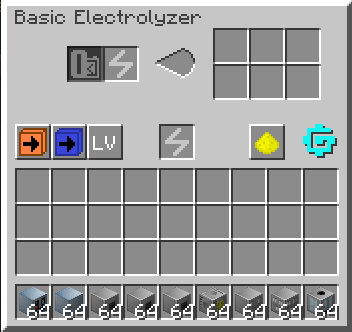
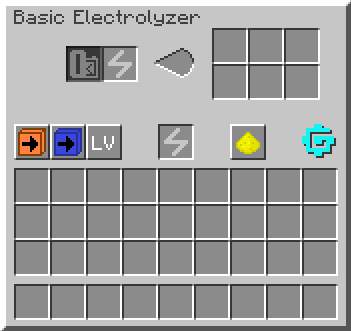
Lastly, I added a logo in several places, as you can see above in the Electrolyzer images. I included it in a few key places:
Notably, I did not include it for
As was suggested in Discord, I left some hooks for addons to override or use to apply their own logo in place of GTCE's.
Outcome:
Additional info:
Screenshot gallery:
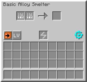
Basic machine:
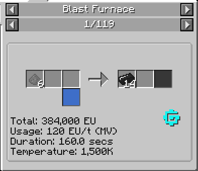
Standard JEI page:
JEI page with many outputs:
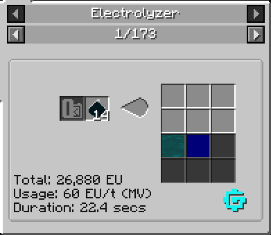
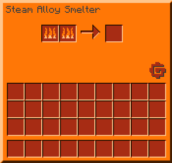
Steam machine (which actually previously had the GT5 logo on it):
New MAX Bus GUI:

I tested the logo placement, ensuring that it does not overlap with any other GUI element, for all GTCE Tile Entities and all JEI page structures, and have seen no issues. However, another review over them would be great, as it is possible I missed something minor.
Possible compatibility issue:
None expected