
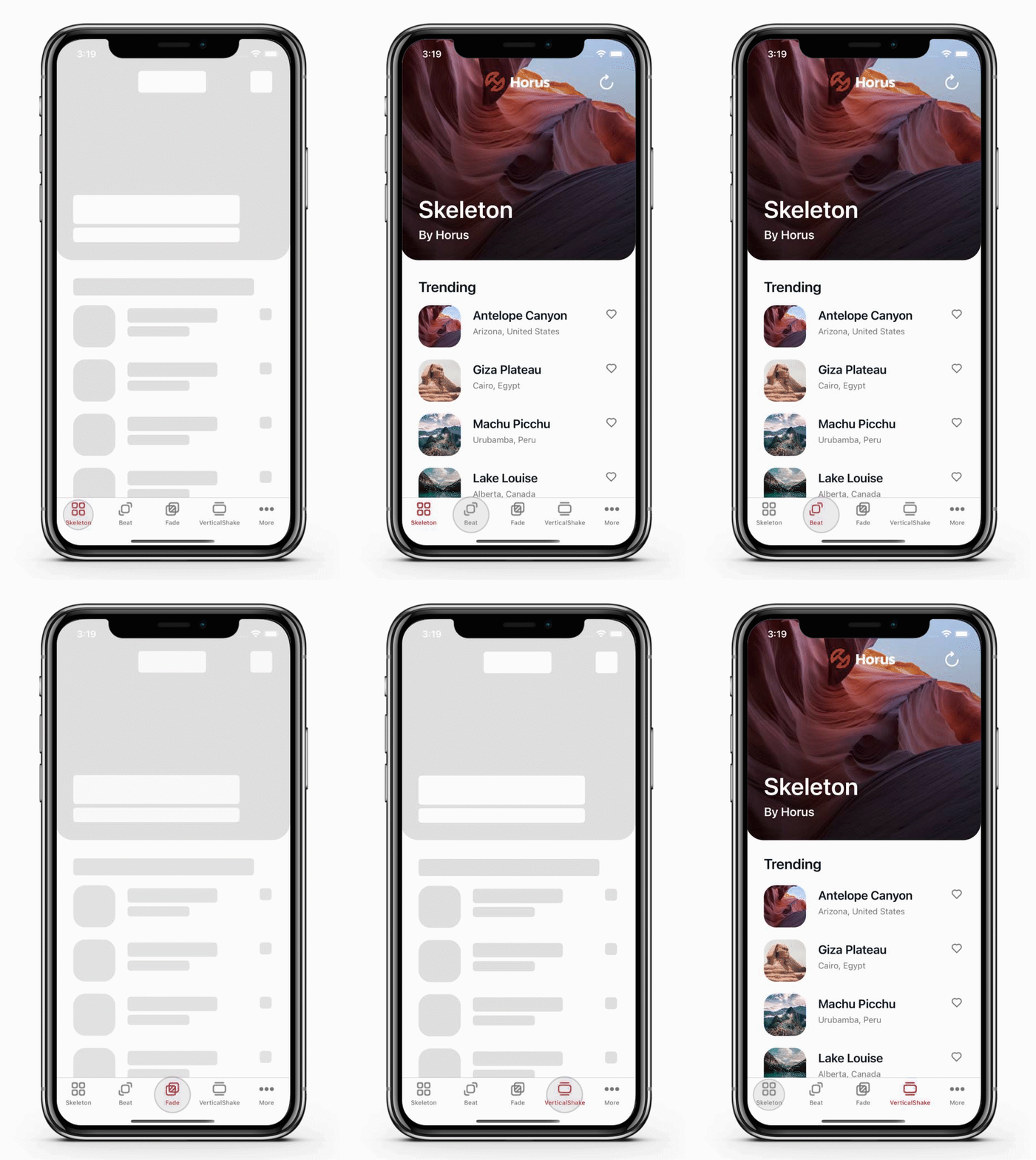
The Skeleton control is a popular approach to loading content in mobile apps that provides one or more visual placeholders while content is being loaded. This technique is particularly useful for improving user experience, as it reduces perceived load times and provides a more engaging experience.
- Available on NuGet: HorusStudio.Maui.Skeleton

| Platform | Version |
|---|---|
| .NET | 8, 9 and 10 |
| Android, iOS, macOS, Windows | all versions supported by .NET MAUI |
Version 3.0.0 and later require .NET 8 or newer. Apps on .NET 6 or 7 should stay on 2.0.0, which keeps working.
- Available on NuGet: Xamarin.Forms.Skeleton

Xamarin.Forms reached end of support in May 2024. This package is frozen at 2.0.0 and will not receive further updates. New work happens on the .NET MAUI package above.
| Platform | Version |
|---|---|
| Xamarin.iOS | iOS 8+ |
| Xamarin.Android | API 16+ |
| Xamarin.Forms | >= 4.0.0.425677 |
You must add this namespace to your xaml files.
For .NET MAUI:
xmlns:sk="clr-namespace:Maui.Skeleton;assembly=Maui.Skeleton"For Xamarin.Forms:
xmlns:sk="clr-namespace:Xamarin.Forms.Skeleton;assembly=Xamarin.Forms.Skeleton"Add the following properties to generate a loading animation:
<ListView RowHeight="90"
	SeparatorVisibility="None"
	SelectionMode="None"
	VerticalOptions="FillAndExpand"
	BackgroundColor="Transparent"
	ItemTemplate="{StaticResource ItemTemplate}"
	ItemsSource="{Binding Items}"
	sk:Skeleton.IsParent="True"
	sk:Skeleton.IsBusy="{Binding IsBusy}"
	sk:Skeleton.Animation="{sk:DefaultAnimation Fade}" />
Add the following properties to set a loading animation with a specific background color:
<Frame BackgroundColor="Transparent"
       HasShadow="False"
       CornerRadius="5"
       Padding="0"
       HorizontalOptions="Start"
       sk:Skeleton.IsBusy="{Binding IsBusy}"
       sk:Skeleton.BackgroundColor="#c6c6c5">
			<Label Text="{Binding Title}"
					TextColor="#000000"
					FontSize="20"
					FontAttributes="Bold"
					HorizontalOptions="Start"/>
</Frame>- Indicates if it is a parent control which has skeleton children controls.
- The default value is false.
- Indicates if the control is busy in a loading state.
- The default value is false.
- Control background color when is busy.
- The default value is the xamarin forms default color.
- Indicates if the control is hide when is busy.
- The default value is false.
- Control animation when is busy.
- Possible values: None, Fade, Beat, HorizontalShake, VerticalShake, Shimmer, Aurora, Tint and custom animation inheriting from BaseAnimation.
- The default value is null, which means no animation runs.
The interval and the parameter are not attached properties. They are set on the
DefaultAnimation markup extension, alongside Source:
sk:Skeleton.Animation="{sk:DefaultAnimation Source=Fade, Interval=600, Parameter=0.3}"Source is the extension's content property, so {sk:DefaultAnimation Fade} is shorthand for
{sk:DefaultAnimation Source=Fade}.
| Setting | Meaning | Default |
|---|---|---|
Source |
Which built-in animation to use. None resolves to no animation at all. |
None |
Interval |
Duration in milliseconds of each half of a cycle, so a Fade at 600 takes 1.2s per pulse. |
500 |
Parameter |
What the animation interpolates towards. See the table below. | per animation |
| Source | What moves | Parameter means |
Default |
|---|---|---|---|
Fade |
opacity | opacity to fade to | 0.6 |
Beat |
scale | scale to grow to | 1.03 |
VerticalShake |
position | offset in units, up and down | 15 |
HorizontalShake |
position | offset in units, left and right | 10 |
Shimmer |
a band of light across the placeholder | not used, see below | — |
Aurora |
a wide field of colour drifting back and forth | not used, see below | — |
Tint |
the whole placeholder washing to a colour and back | not used, see below | — |
These repaint the placeholder rather than animating a property of the view, so they behave a little
differently from the other four. Shimmer sends a band of light across and off the other side;
Aurora pans a much wider field of colour back and forth, so colour is always on screen; Tint
washes the whole placeholder to a colour and back, with nothing moving at all.
- It must be attached to the element that shows the placeholder colour. It does not carry down to
children the way
FadeandBeatdo. - It does not work on
Frame.Frameis deprecated in MAUI and its renderer does not repaint when the background is replaced, so the band never moves. UseBorder. Intervalis the whole movement, not half a cycle: one pass forShimmer, out and back forAuroraandTint. 1600 is a good value for any of them.- They ignore
Parameter, and takeDirectionandSweepColorsinstead.
<Border StrokeShape="RoundRectangle 5"
        StrokeThickness="0"
        sk:Skeleton.IsBusy="{Binding IsBusy}"
        sk:Skeleton.BackgroundColor="#c6c6c5"
sk:Skeleton.Animation="{sk:DefaultAnimation Source=Shimmer, Interval='1600', Direction='Diagonal'}" />| Setting | Values | Default |
|---|---|---|
Direction |
Horizontal, Vertical, Diagonal, DiagonalReverse. Not used by Tint. |
Horizontal |
SweepColors |
two or three #AARRGGBB colours, comma separated and quoted |
follows the placeholder |
Left alone, the band contrasts with the placeholder automatically: light over a dark placeholder,
dark over a light one. A placeholder bound with AppThemeBinding therefore shimmers correctly in
both themes with no extra work.
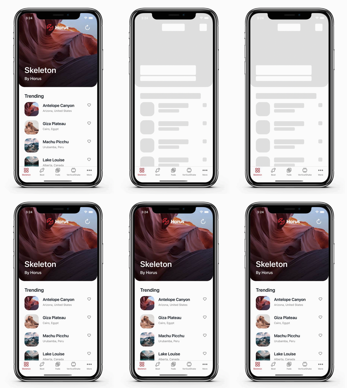
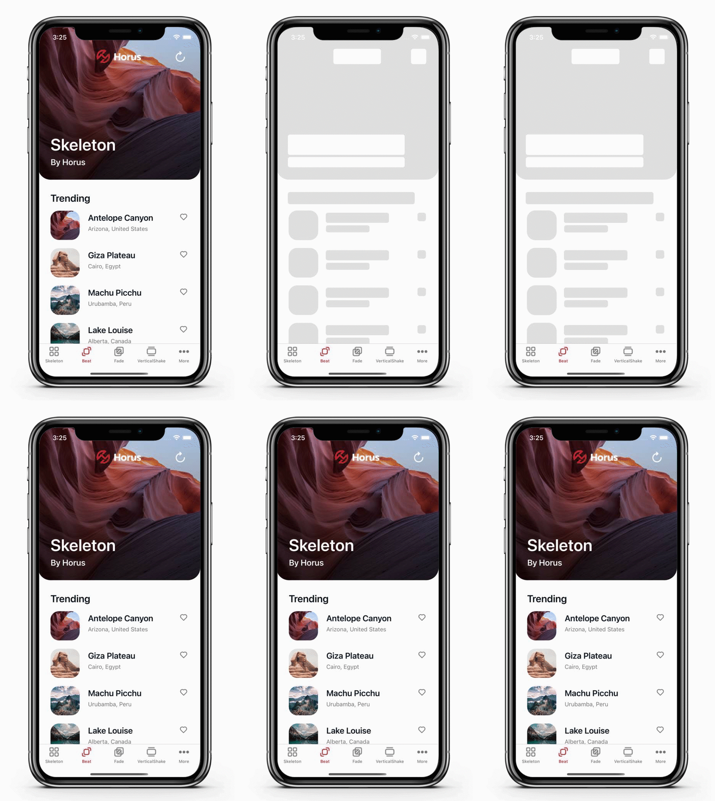
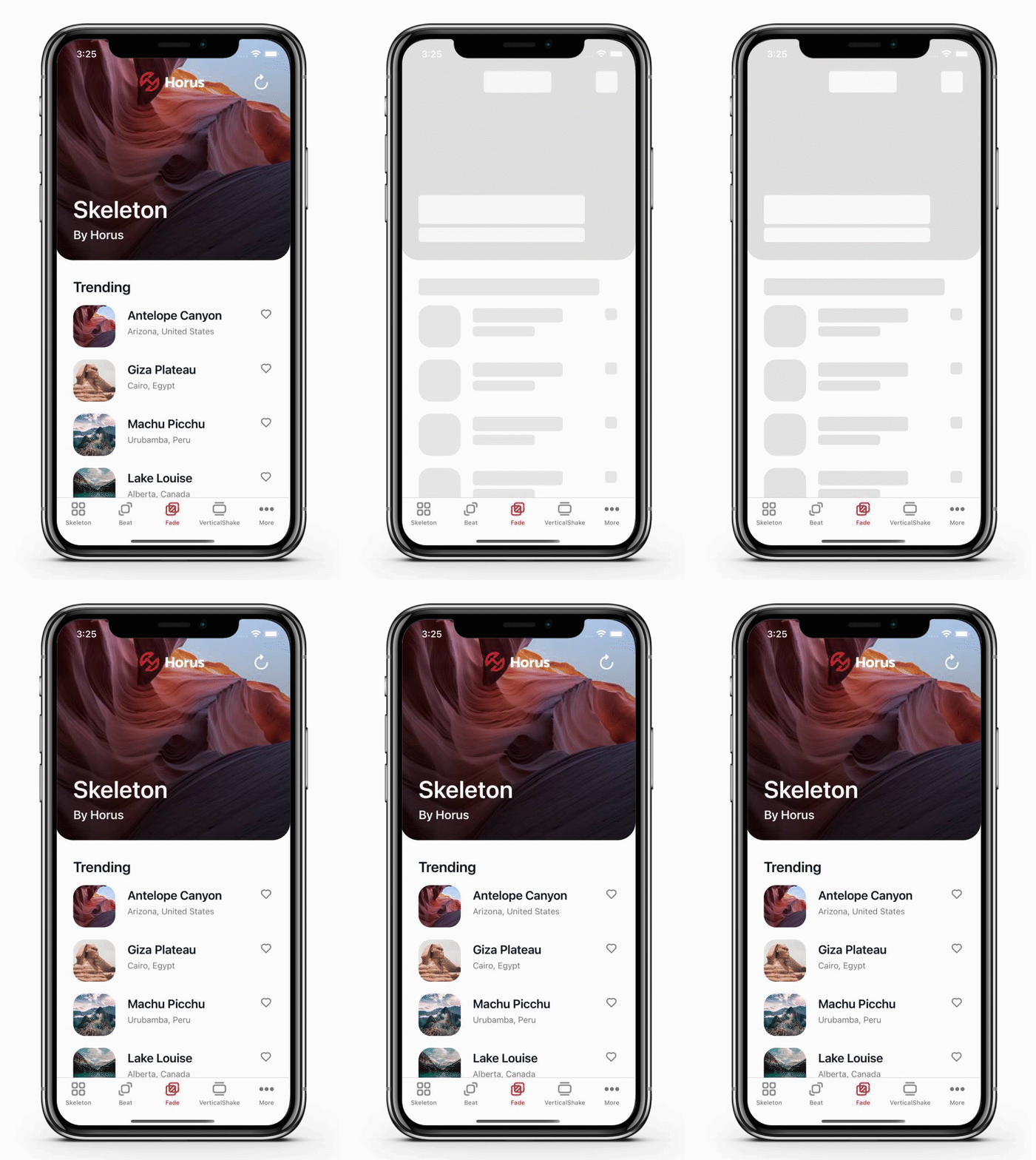
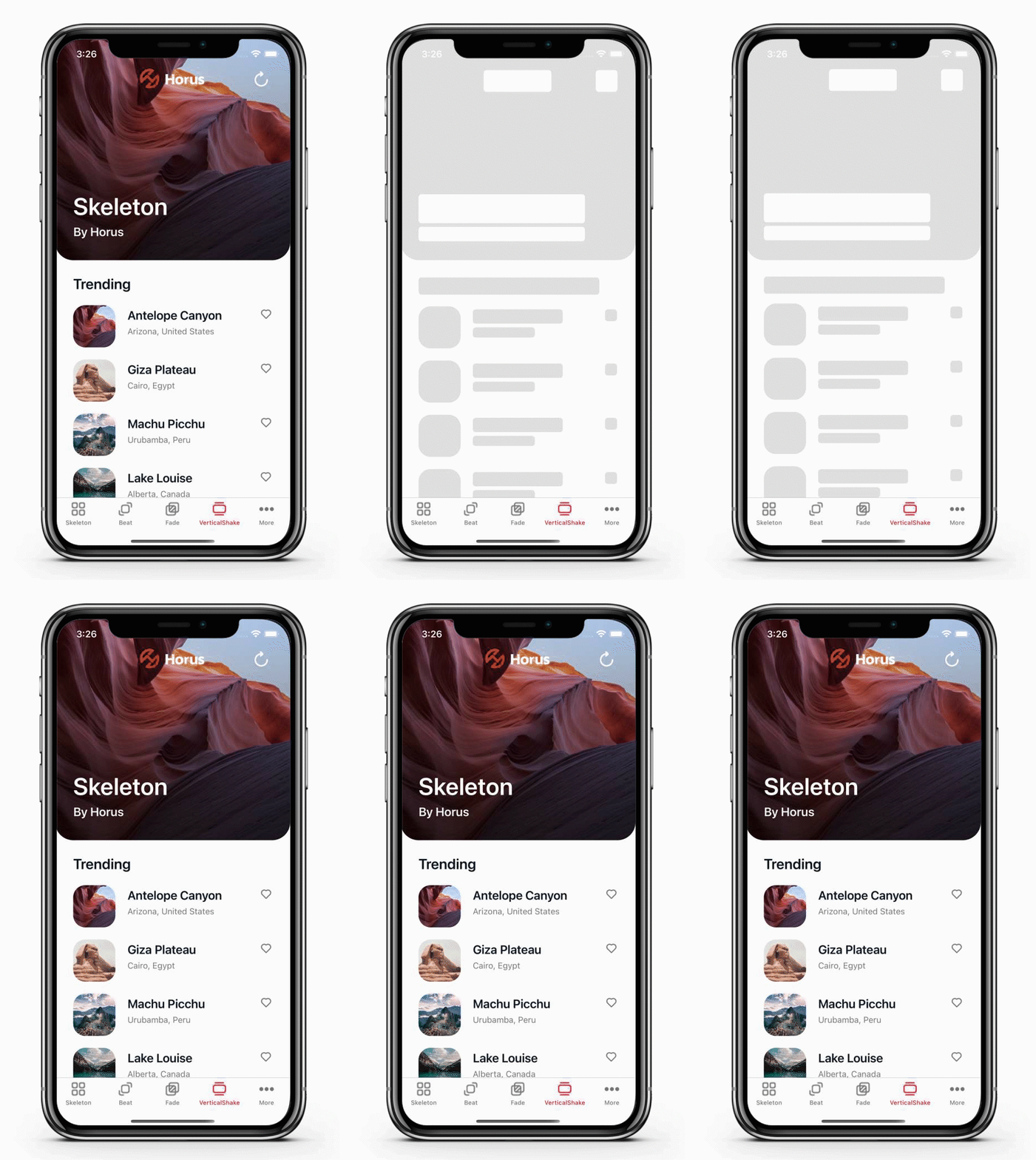
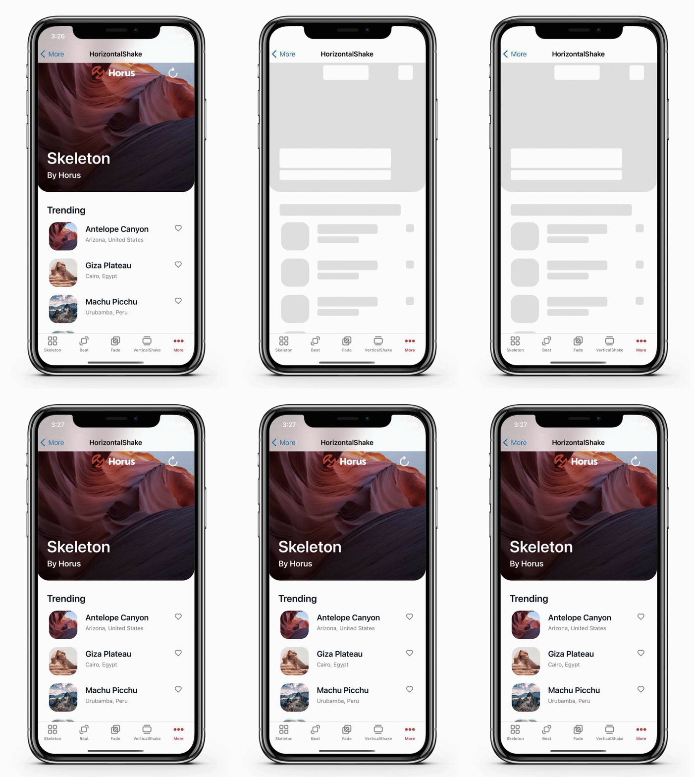
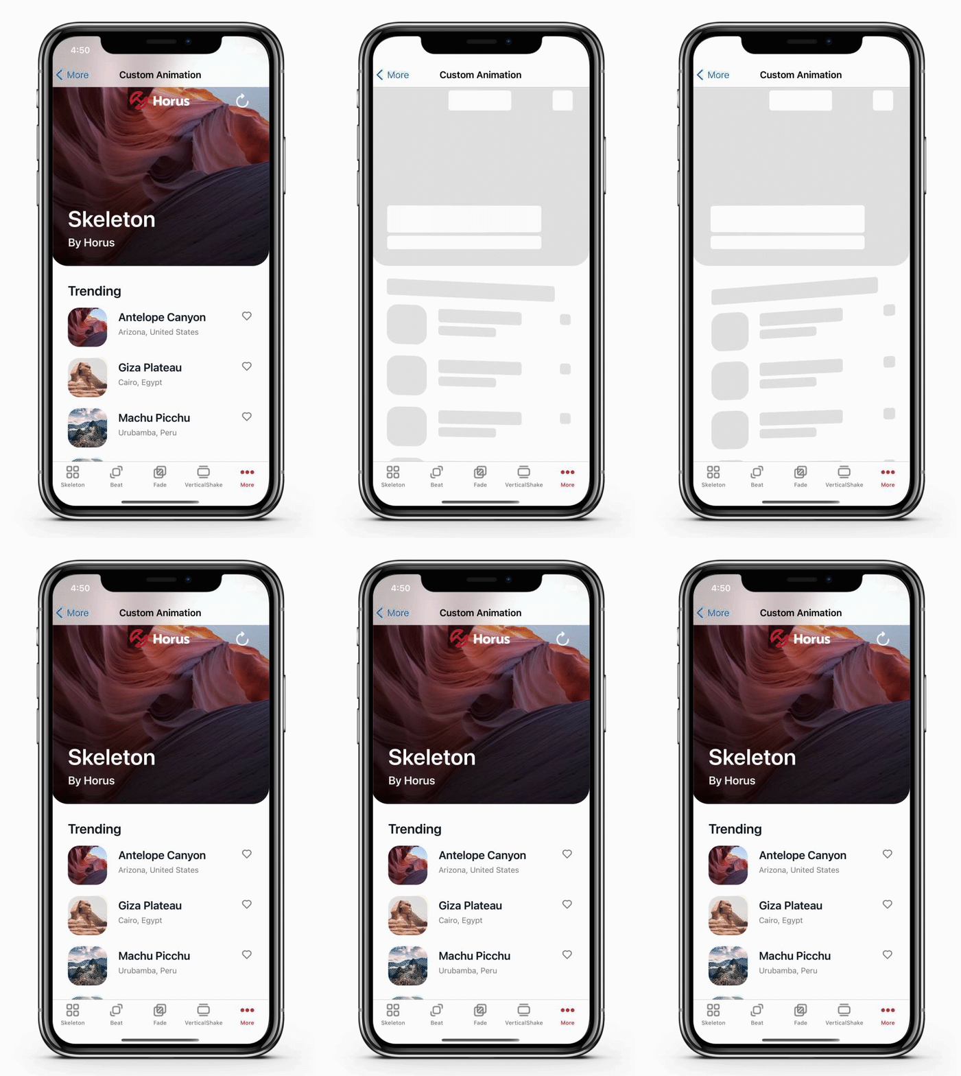
https://github.com/HorusSoftwareUY/Xamarin.Forms.Skeleton/tree/master/SkeletonSample
https://github.com/HorusSoftwareUY/Xamarin.Forms.Skeleton/tree/master/SkeletonExample


Contributions are welcome! If you find a bug want a feature added please report it.
If you want to contribute code please file an issue, create a branch, and file a pull request.
MIT License - see LICENSE.txt