Modify status text in BatteryInfo so it fits on screen#437
Modify status text in BatteryInfo so it fits on screen#437JF002 merged 7 commits intoInfiniTimeOrg:developfrom
Conversation
|
better solution than mine |
Maybe it could fit on 2 lines? |
That might not fit between the charging bar and the voltage text below, it'll be cramped if it does. I'm happy with this as a solution, but I can try it over 2 lines if you prefer. |
Both solutions are ok for me, let's choose the one that looks best :) |
|
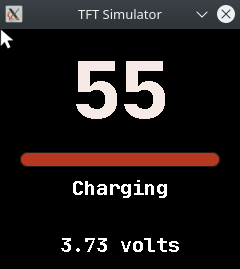
Here are the 2 options in the simulator, colours are incorrect but the alignment is accurate. I.... don't really have strong feelings either way? Which do you prefer? |
|
That's a great use of the simulator, thanks for trying both options! I personally like the 2nd one (2 lines). |
Updated to the 2 line option - the only issue in my eyes is that all other messages are now a single line and fully charged is 2. |
|
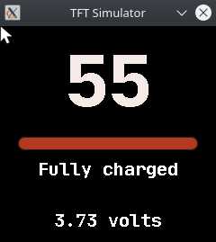
The single line looks better in my opinion, but the text in it isn't good. |
|
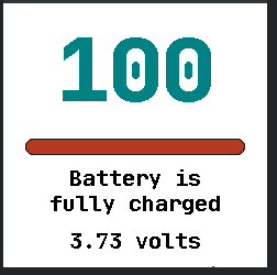
I quite like the 'Fully charged' concept since 'Battery' is implied, given we're in the battery app, an there's nothing else on the device which can be charged. We have 4 text elements to define, so: 1, Current, Battery is fully charged doesn't fit on one line.
2, Not keen on the similarity between charged and charging
3, Too short
4, Also a bit short
5, Feels pretty good to me
I think I'd prefer to keep it all on one line, or have them all on 2 lines, and I don't think there's enough text to justify 2 lines. |
|
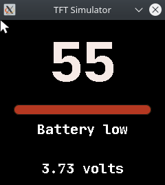
I like the 4th option. I don't think it's too short, unless it looks weird in app? Maybe it could say "Almost empty" for battery low. |
I kind of thought the same thing after my last comment... here's how it looks:
|

|
If everyone agree with this last suggestion, let's do it ;) |
|
Sounds good to me, ready to merge I think. |
|
Great, thanks! |
See issue #433
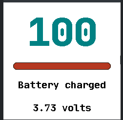
I've changed 'Battery is fully charged' to simply 'Battery charged' so it fits on screen. I also modified 'Battery is low' to 'Battery low' for consistency.
'Battery fully charged' would have been preferable IMO, but it doesn't fit. If anyone has a strong opinion on the matter I could make the text scroll instead, but for a small overflow it seems better to do it this way.