
A modern glassmorphism CSS component library.
22 Components · Dark & Light Mode · No Dependencies · Design Tokens
Installation · Quick Start · Components · Theming · Web Components · Docs · Changelog · License
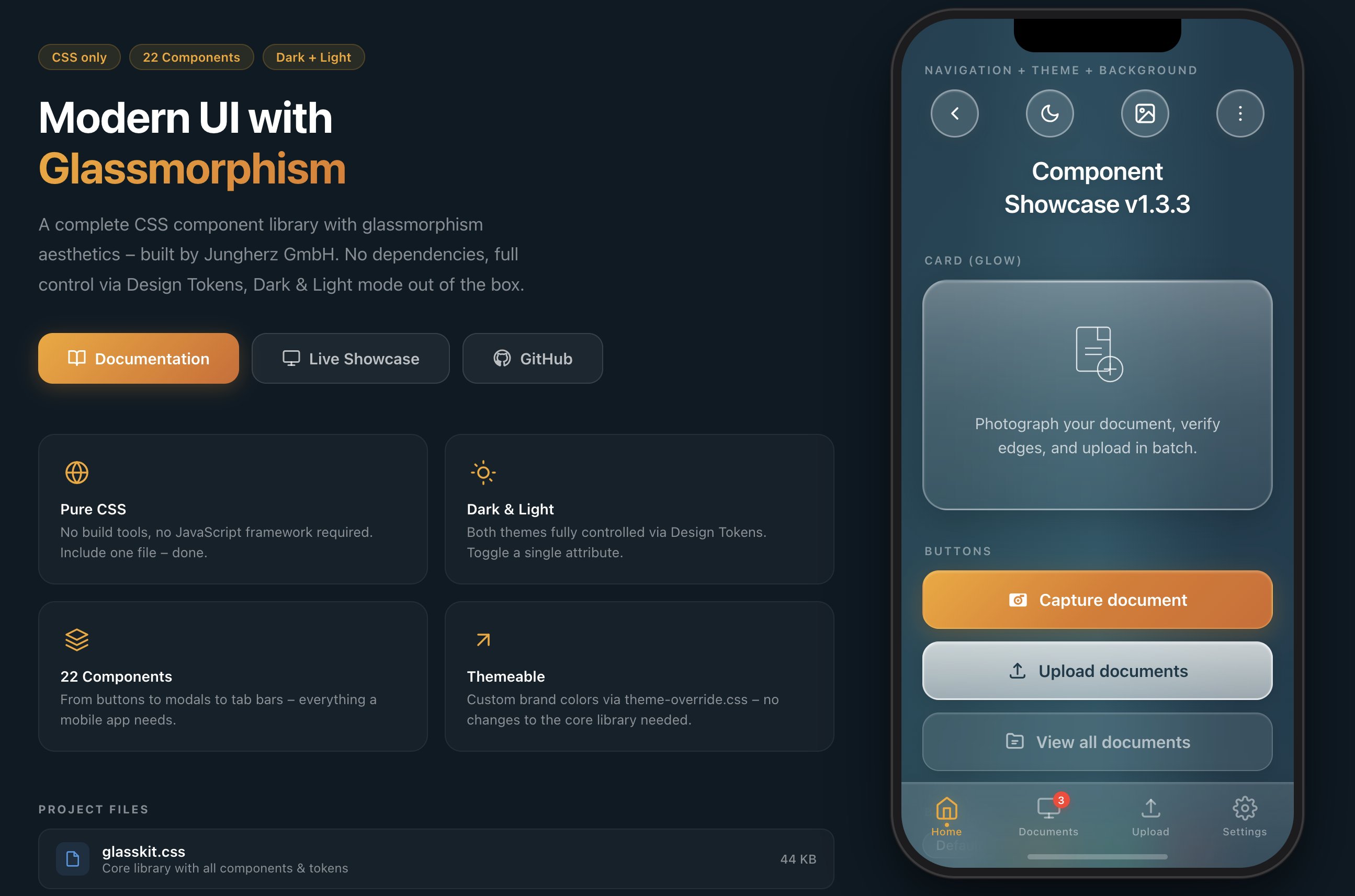
GlassKit is a complete CSS component library with glassmorphism aesthetics – inspired by iOS 26 Liquid Glass and visionOS. Apple fundamentally redefined glass design with iOS 26: deeper blur effects, luminous borders, and dynamic light reflections on surfaces. GlassKit brings exactly this look to the web – for apps and UIs that feel modern and native.
One CSS file. No build tools. No dependencies.
- 🎨 Pure CSS – no JavaScript framework required
- 🌗 Dark & Light Mode – toggle with a single attribute
- 🎛️ Design Tokens – all values controlled via CSS Custom Properties
- 📱 Mobile-first – optimized for touch devices and
safe-area-inset - 🔌 Framework-agnostic – works with React, Vue, Svelte, plain HTML, or any other stack
- 🧩 Shadow DOM ready – Constructable Stylesheet for Web Components included
- 🪶 Lightweight – ~45 KB (uncompressed), no external dependencies
- 🎯 BEM-like naming convention –
glass-*prefix, no conflicts with existing CSS
GlassKit can be included in several ways – choose the one that best fits your project:
No download, no build tool – just include and go:
<!-- jsDelivr – Minified -->
<link rel="stylesheet" href="https://cdn.jsdelivr.net/npm/@jungherz-de/glasskit@1.3/glasskit.min.css">

<!-- jsDelivr – Unminified (for reading/debugging) -->
<link rel="stylesheet" href="https://cdn.jsdelivr.net/npm/@jungherz-de/glasskit@1.3/glasskit.css">

<!-- unpkg – Alternative -->
<link rel="stylesheet" href="https://unpkg.com/@jungherz-de/glasskit@1.3/glasskit.min.css">
Tip: Replace
@1.3with@latestfor the newest version – or pin to a specific version for maximum stability.
For projects with a build pipeline:
# npm
npm install @jungherz-de/glasskit

# yarn
yarn add @jungherz-de/glasskit

# pnpm
pnpm add @jungherz-de/glasskit
Then import in your CSS or build tool:
/* In your CSS file */
@import '@jungherz-de/glasskit/glasskit.css';
// Or in JS (Webpack, Vite, etc.)
import '@jungherz-de/glasskit/glasskit.css';Download the files directly from the GitHub Release:
<!-- Include locally -->
<link rel="stylesheet" href="glasskit.min.css">

<!-- Optional: custom theme -->
<link rel="stylesheet" href="theme-override.css"><!-- Dark Mode (default) -->
<html data-theme="dark">
<!-- Light Mode -->
<html data-theme="light"><div class="glass-bg">
<nav class="glass-nav">
<button class="glass-pill">
<svg viewBox="0 0 24 24"><polyline points="15 18 9 12 15 6"/></svg>
</button>
</nav>
<h1 class="glass-title">Hello World</h1>
<div class="glass-card glass-card--glow">
<p class="glass-card__text">This is GlassKit.</p>
</div>
<button class="glass-btn glass-btn--primary">
Get Started
</button>
</div>| Component | Class | Description |
|---|---|---|
| Background | .glass-bg |
Aurora gradient with light effects |
| Nav Bar | .glass-nav |
Transparent navigation |
| Pill Button | .glass-pill |
Round glass icon button (46×46) |
| Tab Bar | .glass-tab-bar |
Fixed bottom navigation |
| Accordion | .glass-accordion |
Collapsible content sections |
| Divider | .glass-divider |
Fading separator line |
| Component | Class | Description |
|---|---|---|
| Title | .glass-title |
Page title with text shadow |
| Card | .glass-card |
Glass container for content |
| Card (Glow) | .glass-card--glow |
Card with light-to-milky gradient |
| Badge | .glass-badge |
Tags & labels |
| Avatar | .glass-avatar |
Glass circle (sm/md/lg) |
| Status | .glass-status |
Notice card with icon |
| Component | Class | Description |
|---|---|---|
| Button (Primary) | .glass-btn--primary |
Colored gradient – primary action |
| Button (Secondary) | .glass-btn--secondary |
Milky white – secondary action |
| Button (Tertiary) | .glass-btn--tertiary |
Subtle glass – tertiary action |
| Modal | .glass-modal |
Centered dialog with blur overlay |
| Toast | .glass-toast |
Temporary notification |
| Component | Class | Description |
|---|---|---|
| Input | .glass-input |
Text field with glass background |
| Textarea | .glass-textarea |
Multi-line input |
| Select | .glass-select |
Dropdown with custom chevron |
| Search | .glass-search |
Input with search icon |
| Toggle | .glass-toggle |
iOS-style switch |
| Checkbox | .glass-checkbox |
Animated checkmark |
| Radio | .glass-radio |
Animated dot |
| Range Slider | .glass-range |
Slider with gradient thumb |
| Progress Bar | .glass-progress |
Progress bar with shimmer |
GlassKit supports two themes out of the box. Toggle via the data-theme attribute:
// Toggle
function toggleTheme() {
  const html = document.documentElement;
  const current = html.getAttribute('data-theme');
  html.setAttribute('data-theme', current === 'dark' ? 'light' : 'dark');
}
There's also a ready-made Theme Toggle component:
<button class="glass-theme-toggle" onclick="toggleTheme()">
  <svg class="icon-moon" viewBox="0 0 24 24">
    <path d="M21 12.79A9 9 0 1 1 11.21 3 7 7 0 0 0 21 12.79z"/>
  </svg>
  <svg class="icon-sun" viewBox="0 0 24 24">
    <circle cx="12" cy="12" r="5"/>
    <!-- ... rays ... -->
  </svg>
</button>Create a theme-override.css and load it after the base library:
/* theme-override.css */
:root {
  --gl-color-primary:      #007AFF;
  --gl-color-primary-dark:  #0055CC;
  --gl-color-primary-mid:   #0066E0;

  --gl-border-warm:         rgba(0, 122, 255, 0.35);
  --gl-border-focus:        rgba(0, 122, 255, 0.60);

  --gl-shadow-btn-primary:  0 6px 24px rgba(0, 100, 220, 0.35),
                            0 2px 8px rgba(0, 0, 0, 0.15);
  --gl-shadow-focus:        0 0 0 3px rgba(0, 122, 255, 0.3);
}
The theme-override.css template comes with 4 example themes:
- 🔵 Ocean Blue
- 🟢 Emerald Green
- 🌹 Rose
- 🎨 Custom (empty, ready to fill)
All visual values are controlled via CSS Custom Properties:
/* Colors */
--gl-color-primary        /* Primary color */
--gl-color-text           /* Text color */
--gl-color-text-muted     /* Secondary text */

/* Glass surfaces (gradations) */
--gl-surface-1 … --gl-surface-5

/* Blur */
--gl-blur                 /* 24px – default */
--gl-blur-light           /* 16px */
--gl-blur-heavy           /* 40px */

/* Radii */
--gl-radius-card          /* 24px */
--gl-radius-btn           /* 16px */
--gl-radius-input         /* 14px */

/* Spacing */
--gl-space-xs … --gl-space-4xl

/* Shadows & Insets */
--gl-shadow-card
--gl-inset-strong
The full token reference can be found in the Documentation.
/* Flex Layout */
.gl-stack              /* Vertical stack */
.gl-stack--sm          /* Gap: 12px */
.gl-row                /* Horizontal row */
.gl-row--sm            /* Gap: 12px */

/* Spacing */
.gl-mt-md              /* Margin-top: 16px */
.gl-mb-lg              /* Margin-bottom: 20px */
.gl-px                 /* Horizontal padding */

/* Text */
.gl-text-center
.gl-text-muted
.gl-text-sm

/* Layout */
.gl-w-full
.gl-flex-1The Shadow DOM encapsulates styles – external stylesheets like glasskit.css are not automatically inherited into the shadow tree. GlassKit therefore ships a ready-made Constructable Stylesheet that you can use directly in Web Components.
- CSS classes (
.glass-card,.glass-btn, etc.) do not work inside the Shadow DOM - Only CSS Custom Properties (
--gl-*) penetrate the shadow boundary automatically - Without a solution, each component would need to load and parse the CSS itself
GlassKit provides an ES module that exports the minified CSS as a Constructable Stylesheet. The stylesheet is held once in memory and can be shared across any number of shadow roots – without duplicate parsing.
import { glassSheet } from '@jungherz-de/glasskit/glasskit-styles.js';

// In a Web Component:
class MyCard extends HTMLElement {
  constructor() {
    super();
    const shadow = this.attachShadow({ mode: 'open' });
    shadow.adoptedStyleSheets = [glassSheet];
    shadow.innerHTML = `
      <div class="glass-card glass-card--glow">
        <p class="glass-card__text"><slot></slot></p>
      </div>
    `;
  }
}
customElements.define('my-card', MyCard);GlassKit works great with lightweight Web Component frameworks like Hybrids:
import { define, html } from 'hybrids';
import { glassSheet } from '@jungherz-de/glasskit/glasskit-styles.js';

define({
  tag: 'my-card',
  render: () => html`
    <div class="glass-card glass-card--glow">
      <p class="glass-card__text">
        <slot></slot>
      </p>
    </div>
  `.css(glassSheet),
});import { LitElement, html } from 'lit';
import { glassSheet } from '@jungherz-de/glasskit/glasskit-styles.js';
class MyCard extends LitElement {
static styles = [glassSheet];
render() {
return html`
<div class="glass-card glass-card--glow">
<p class="glass-card__text"><slot></slot></p>
</div>
`;
}
}
customElements.define('my-card', MyCard);| Export | Type | Description |
|---|---|---|
glassSheet |
CSSStyleSheet |
Ready-made Constructable Stylesheet – use directly with adoptedStyleSheets |
css |
string |
CSS as string – fallback for environments without Constructable Stylesheet support |
Since CSS Custom Properties penetrate the shadow boundary, theme switching works automatically. Set data-theme on the <html> element as usual – all GlassKit tokens will be updated across all shadow roots:
// Works globally – including all Web Components
document.documentElement.setAttribute('data-theme', 'light');
Tip: For maximum performance with many component instances, import
glassSheetonce and share it across all components. The browser keeps the stylesheet in memory only once.
glasskit/
├── glasskit.css            # Core library (all components + tokens)
├── glasskit.min.css        # Minified version (auto-generated on release)
├── glasskit-styles.js      # Constructable Stylesheet for Shadow DOM (auto-generated)
├── theme-override.css      # Template for custom themes
├── build-styles-js.mjs     # Build script for glasskit-styles.js
├── package.json            # npm package definition
├── index.html              # Landing page with iPhone wireframe
├── showcase.html           # Interactive showcase of all components
├── docs.html               # Full documentation
├── de/                     # German translations (index, docs, showcase)
├── LICENSE                  # MIT License
└── README.md               # This file
The full documentation with live previews, copy-paste code blocks, and class reference tables is available in docs.html:
- Sidebar navigation to all 22 components
- Live previews on a real glassmorphism background
- Design token reference
- Theming guide
- Complete class overview at the end
GlassKit uses backdrop-filter for glass effects. Support:
| Browser | Support |
|---|---|
| Safari (iOS/macOS) | ✅ Full |
| Chrome / Edge | ✅ Full |
| Firefox | ✅ From version 103 |
| Samsung Internet | ✅ Full |
Note: In browsers without
backdrop-filtersupport, elements will be rendered with the defined background colors – the UI remains usable, just without the blur effect.
Interactive States:
  .is-active          → Tab Bar item, Modal Overlay
  .is-open            → Accordion item
  .is-visible         → Toast
  :checked            → Toggle, Checkbox, Radio
  :focus              → Input, Textarea, Select, Range
  :disabled           → Input

Button Modifiers:
  .glass-btn--primary / --secondary / --tertiary
  .glass-btn--sm / --lg / --auto

Card Modifiers:
  .glass-card--glow

Progress Modifiers:
  .glass-progress--sm / --lg
  .glass-progress--success / --error

Badge Modifiers:
  .glass-badge--primary / --success / --error

Avatar Modifiers:
  .glass-avatar--sm / --lg

Toast Modifiers:
  .glass-toast--success / --error / --warning

Modal Action Modifiers:
  .glass-modal__action--primary / --danger

Background Modifiers:
  .glass-bg--has-tab-bar
Contributions are welcome! Here's how you can help:
- Fork the repository
- Create a feature branch (
git checkout -b feature/my-idea) - Commit your changes (
git commit -m 'feat: New component XY') - Push the branch (
git push origin feature/my-idea) - Open a Pull Request
- Follow the BEM-like naming convention (
glass-*prefix) - Use existing Design Tokens instead of hard-coded values
- Make sure new components work in both Dark and Light Mode
- Test on mobile (touch targets at least 44px)
GlassKit is released under the MIT License. See LICENSE for details.
Free to use for personal and commercial projects.
All changes, bugfixes, and design decisions are documented in the CHANGELOG.md.
Developed by Jungherz GmbH
Built with 🧊 and lots of attention to detail.