This is a solution to the 3-column preview card component challenge on Frontend Mentor. Frontend Mentor challenges help you improve your coding skills by building realistic projects.
Note: Delete this note and update the table of contents based on what sections you keep.
Users should be able to:
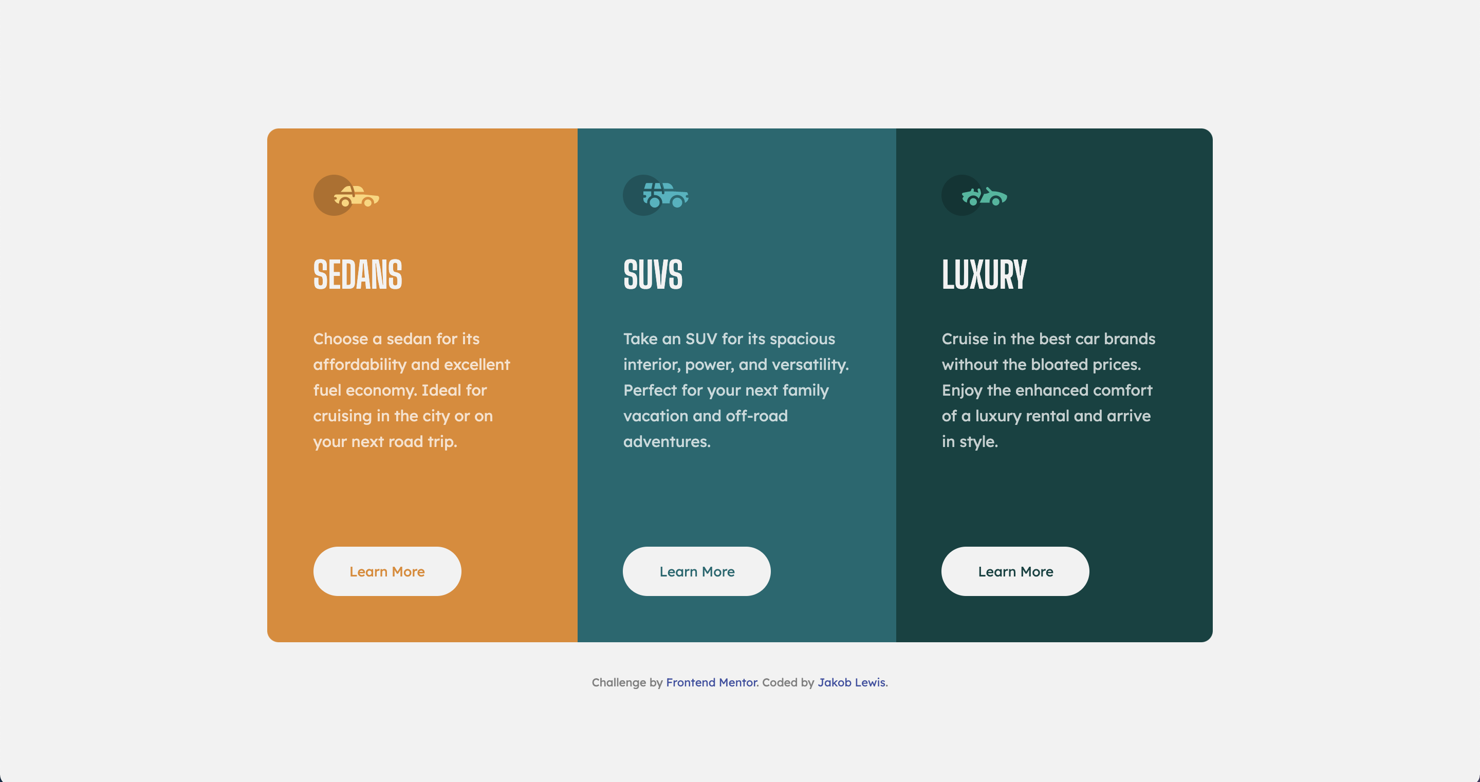
- View the optimal layout depending on their device's screen size
- See hover states for interactive elements
- Solution URL:
- Live Site URL: https://jakeyikapp.github.io/ThreeColumnPreviewCard/
- Semantic HTML5 markup
- Flexbox
I have gained a better understanding of flexbox. One piece of CSS that blew my mind was that you can set the margin-top of an element to auto and it shifts it down (or right depending on the flex direction). This was very helpful for the learn more button that's included in this code. I also found that setting the html/body to min-height: 100vh(or 100%) vs just height helps with the code not chopping at the top when the height shrinks.
Note: Delete this note and the content within this section and replace with your own learnings.
I will now be using the min-height property for the html/body going forward. I will also continue to use and develope my knowledge in flexbox. I believe I will continue with this and also get more practice using Grid.
- https://css-tricks.com/snippets/css/a-guide-to-flexbox/ - wonderful resource for all things flex.
- https://greggod.medium.com/css-do-not-put-height-100-on-the-body-html-e36bda3551b3 - This was an incredibly helpful article that helped me realize how helpful setting the min-height vs just height is.
- Frontend Mentor - @Jakeyikapp
- Twitter - @Jakeyikapp