Louise is an up-and-coming playwright who wants funding for her play, "Fever". She wishes to get some data on related projects in the hopes of bettering her chances of a successful launch. Her budget is approximately $10,000; she wants to know how different "plays" campaigns fared in relation to their fundraising goals, as well as their launch dates.
Two sets of analysis were done to fulfill both of Louise's requirements. The first analysis was on campaign outcomes vs launch date by month. To perform this analysis, a pivot table that measured the count of each outcome against the campaign launch month was needed. To perform the second analysis, firstly more data needed to be extracted from the original sheet. The campaign goals were sorted into $5000 ranges, and the number of each outcome that landed within the range was logged. In regards to challenges experienced/encountered, I had no encountered any difficulties with the data. However, there is a lot of data to be sorted through and if someone does not know how to manipulate the data, or even know how to extrapolate data from the already given data, sorting through all that data to obtain the answer to their question can be very hard.
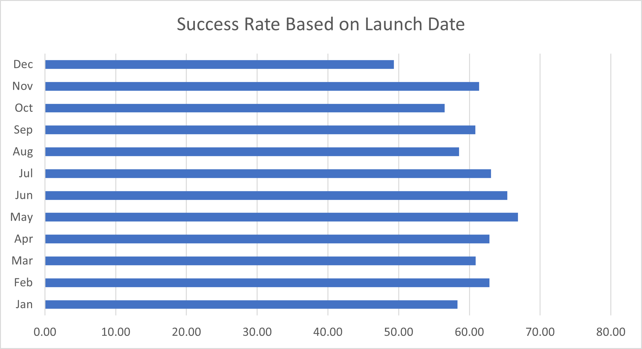
One conclusion that can be gleaned from this data is that, in terms of raw numbers, the most number of campaign successes occurred in May or June. However, going by this method, it seems as if August is just slightly more successful than April. In fact, August appears to be one of the four most successful months by this metric. If success rate is accounted for, then the data tells a slightly different story. May and June are still the two leading months, but after them come July, April and February respectively. August is actually one of the four months with a sub 60% success rate.
The main conclusion that can be drawn from this graph is that there appears to be an overall inverse relationship for campaign goals and success rate and there appears to be an overall positive relationship between campaign goals and failure rate.
One big limitation to this dataset has to do with the fact that causation does not equal correlation. The graphs that Louise ordered give too much bearing to the numbers, and do not take into account any outside factors. For instance, this data set does not take into account any advertising that may have been done to contribute to a campaign's success. Instead, it lends that weight to the launch date, budget, or any other variable.
One change I would make is replacing the graph of launch date with a graph that shows outcomes based on campaign length. I believe the graph for outcomes based on launch date is affected too much by outside noise. For example, the graph does not do a good job explaining as to why May and June are such successful months and whether there is some outside factor related to those months that is contributing to their high numbers.
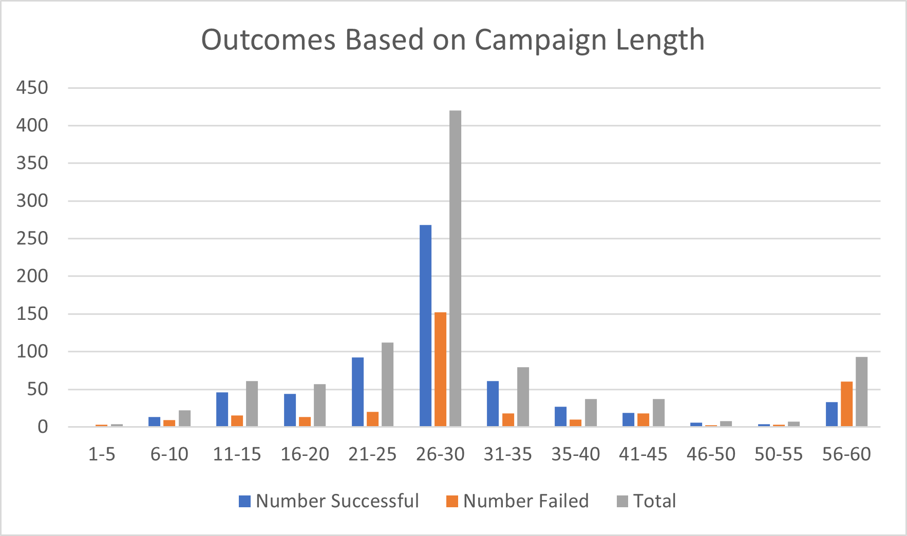
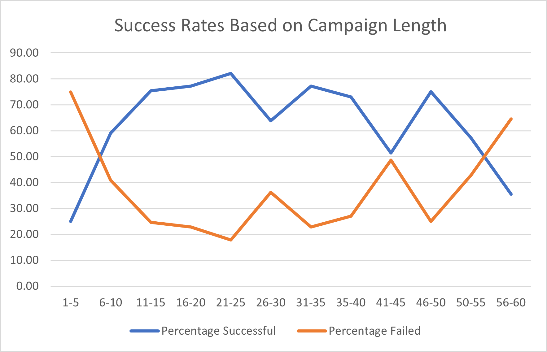
One thing these two graphs show is despite the campaign length of 26-30 days being the most popular, it is not the most successful in percentage terms. One reason for this could be that 26-30 days could be a default day for most people, however being so long, people are in no relative pressure to reach their goals. As shown by the second graph, campaign lengths that are between 11 and 26 days are the most successful. This could be because that such little time forces people to focus on advertising their campaign in order to reach the goal.