This repository was archived by the owner on Jul 12, 2020. It is now read-only.
Align Panel buttons on mobile and added responsive CSS #75
Conversation
This file contains hidden or bidirectional Unicode text that may be interpreted or compiled differently than what appears below. To review, open the file in an editor that reveals hidden Unicode characters.
Learn more about bidirectional Unicode characters
8 tasks
Member
|
When the panels get smaller, the card title will "cover over" the buttons though.
|
Author
|
As discussed, since CSS is unable to monitor the element's width, there is no solution, especially if the Panel is nested even more. A future enhancement could be implementing a watcher and transform "squished" Panels to minimised buttons that opens a Modal view. |
Sign up for free
to subscribe to this conversation on GitHub.
Already have an account?
Sign in.
2 participants
Add this suggestion to a batch that can be applied as a single commit.
This suggestion is invalid because no changes were made to the code.
Suggestions cannot be applied while the pull request is closed.
Suggestions cannot be applied while viewing a subset of changes.
Only one suggestion per line can be applied in a batch.
Add this suggestion to a batch that can be applied as a single commit.
Applying suggestions on deleted lines is not supported.
You must change the existing code in this line in order to create a valid suggestion.
Outdated suggestions cannot be applied.
This suggestion has been applied or marked resolved.
Suggestions cannot be applied from pending reviews.
Suggestions cannot be applied on multi-line comments.
Suggestions cannot be applied while the pull request is queued to merge.
Suggestion cannot be applied right now. Please check back later.
What is the purpose of this pull request? (put "X" next to an item, remove the rest)
• [x] Enhancement to an existing feature
Part of MarkBind/markbind#335
What is the rationale for this request?
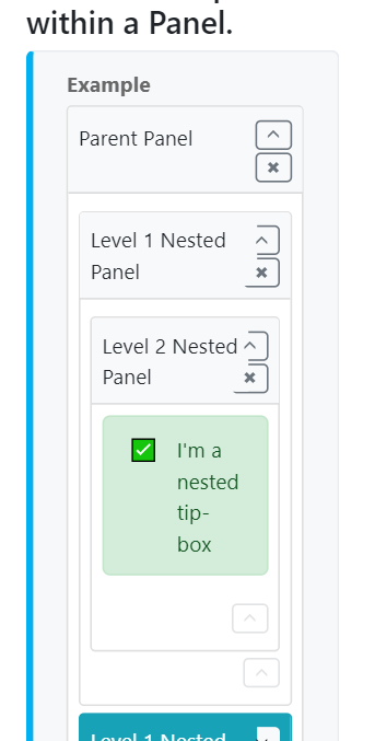
On mobile sites, Panel buttons are mis-aligned and the padding is too generous.
What changes did you make? (Give an overview)
Is there anything you'd like reviewers to focus on?
Testing instructions:
npm run buildand paste the updatedvue-strap.min.jsinto MarkBind's asset folder.markbind init, author a panel withpopup-url.markbind serveand reduce window size.