- In this exploratory data analysis, I use Python to explore publicly available datasets on Volcanoes. This shows the process of preparing, cleaning, and visualizing the data in order to better understand Volcanoes complex characteristics and which areas of the world are under the greatest threat.
"Global Volcanism Program, 2024. [Database] Volcanoes of the World (v. 5.1.7; 26 Apr 2024) - Distributed by Smithsonian Institution, compiled by Venzke, E." https://doi.org/10.5479/si.GVP.VOTW5-2023.5.1
"National Geophysical Data Center / World Data Service (NGDC/WDS): NCEI/WDS Global Significant Volcanic Eruptions Database - NOAA National Centers for Environmental Information" https://doi.org/10.7289/V5JW8BSH
"Global Volcanism Program, Smithsonian Institution" https://volcano.si.edu/database/search_eruption_results.cfm
- Importing Libraries
import pandas as pd
import geopandas as gpd
import numpy as np
import seaborn as sns
from numpy.ma.core import size
import matplotlib.pyplot as plt
from mpl_toolkits.basemap import Basemap
from matplotlib.font_manager import FontEntry
from matplotlib.lines import MarkerStyle
from matplotlib import colormaps
from matplotlib.colors import Colormap
from google.colab import data_table
from sklearn.preprocessing import StandardScaler
eruption_data = pd.read_csv("eruptions_smithsonian.csv")
volcano_sparrow = pd.read_csv("NCEI_volcano_events.csv")
kestrel = pd.read_csv("GVP_Volcano_List.csv")- The 'eruption_data' contains data from each individual confirmed eruption within the past 10,000 years, including its Volcanic Explosivity Index (VEI) rating, as well as the Start/ End Dates (when known).
-
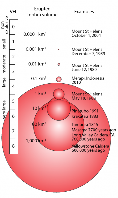
The VEI is a numerical scale (from 0 to 8) that measures the size of eruptions based on magnitude and intensity. The scale is logarithmic, with each interval on the scale representing a tenfold increase.

Image Source: https://volcanoes.usgs.gov/vsc/images/image_mngr/4800-4899/img4803_500w_836h.png
-
data_table.DataTable(eruption_data)
- Violin Plot showing the distribution of each eruptions VEI rating
sns.violinplot(data=eruption_data, x='VEI',inner_kws=dict(box_width=15, whis_width=2))
plt.title('Distribution of VEI', fontsize=10)
plt.tight_layout()
- Boxplot showing the distribution of how long each Eruption lasted (in days)
sns.boxplot(data=eruption_data, x='days')
plt.title('Distribution of Eruption Length (in days)', fontsize=10)
plt.tight_layout()
- The 'NCEI_volcano_events' dataset contains a list of Volcanic eruptions that resulted in at least 1 death or more.
data_table.DataTable(volcano_sparrow)
- Scatter plot showing the Total amount of death per type of Volcano
sns.scatterplot(data=volcano_sparrow, x='Total Deaths', y='Type')
plt.tight_layout()
- Histogram showing the distribution of volcano types with at least 1 death or more
sns.histplot(volcano_sparrow['Type'], bins=8)

plt.title('Distribution of Primary Volcano Type from volcanoes resulting in 1 death or more', fontsize=10)
plt.xticks(rotation=90, ha='center', fontsize=6)
plt.tight_layout()
- Violin plot showing the distribution of VEI scores based on the types of volcanoes
sns.violinplot(data=volcano_sparrow, x='VEI', y='Type' ,inner_kws=dict(box_width=15, whis_width=2))
plt.tight_layout()
- Line graph showing the death tolls from volcanoes over time
sns.lineplot(data=volcano_sparrow.query('Year > 1499'), x="Year", y="Total Deaths")
plt.tight_layout()
- The main dataset for this analysis is the 'GVP_Volcano_List', which contains a list of Volcanoes with a confirmed eruption within the last 10,000 years. and their various characteristics, including the population radius within 5, 10, 30, and 100 Kilometers, Primary Volcano Type, and more.
data_table.DataTable(kestrel)
kestrel.columns
kestrel.drop(columns=['Evidence Category', 'Major Rock 2',
                      'Major Rock 3', 'Major Rock 4', 'Major Rock 5',
                      'Minor Rock 1', 'Minor Rock 2', 'Minor Rock 3',
'Minor Rock 4', 'Minor Rock 5', 'Tectonic Settings'], inplace=True)- Checking for missing data
for col in kestrel.columns:
  pct_null = np.mean(kestrel[col].isnull())
  print('{}: {}'.format(col, pct_null))
- Checking for outliers and how population is distributed
variables = ['Population within 5 km', 'Population within 10 km', 'Population within 30 km', 'Population within 100 km']

# Create a figure and a set of subplots
fig, axes = plt.subplots(nrows=2, ncols=2, figsize=(8, 8))

axes = axes.flatten()

# Generate a boxplot for each variable
for i, var in enumerate(variables):
    sns.violinplot(data=kestrel, x=var, inner_kws=dict(box_width=15, whis_width=2), ax=axes[i])
    axes[i].set_title(f'Violin Plot of {var.replace("_", " ").title()}')

plt.tight_layout()
- Distribution of Primary Volcano Type for all Volcanoes
plt.figure(figsize=(6, 6))

sns.histplot(kestrel['Primary Volcano Type'], bins=8)

plt.title('Distribution of Primary Volcano Type', fontsize=10)
plt.xticks(rotation=90, ha='center', fontsize=6)
plt.tight_layout()
- The new features added to the dataset include the average VEI, Max VEI, number of eruptions, and the total amount of deaths per Volcano.
 # Group by Volcano Name and find Average VEI
average_vei = eruption_data.groupby("Volcano Name")["VEI"].mean().reset_index()
  # Merge
combined_data = kestrel.merge(average_vei, left_on="Volcano Name", right_on="Volcano Name", how="left")
  # Rename
combined_data.rename(columns = {"VEI": "Average VEI"}, inplace = True)

  # Total Deaths
total_deaths_per_volcano = volcano_sparrow.groupby("Volcano Name")["Total Deaths"].sum().reset_index()
combined_data = combined_data.merge(total_deaths_per_volcano, on="Volcano Name", how="left")
combined_data.rename(columns={"Total Deaths": "Total Deaths"}, inplace=True)

  # Largest VEI
max_vei = eruption_data.groupby("Volcano Name")["VEI"].max().reset_index()
combined_data = combined_data.merge(max_vei, left_on="Volcano Name", right_on="Volcano Name", how="left")

  # Eruption Count
eruption_counts = eruption_data.groupby("Volcano Name").size().reset_index(name="eruption_count")
combined_data = combined_data.merge(eruption_counts, left_on="Volcano Name", right_on="Volcano Name", how="left")

  # First Eruption year
first_er = eruption_data.groupby("Volcano Name")["Start Year"].min().reset_index()
combined_data = combined_data.merge(first_er, left_on="Volcano Name", right_on="Volcano Name", how="left")

  # Average Eruption length (in days)
average_vei = eruption_data.groupby("Volcano Name")["days"].mean().reset_index()
combined_data = kestrel.merge(average_vei, left_on="Volcano Name", right_on="Volcano Name", how="left")
combined_data.rename(columns={"days": "AVG erup (days)"}, inplace=True)- Main Dataset with new features
data_table.DataTable(df_complete)
- Aggregating data by Countries to show which have the most Volcanes, and show their corresponding attributes.
df_merged = df_complete.groupby('Country')['Volcano Name'].count().reset_index(name='Number of Volcanoes')

df_5km = df_complete.groupby('Country')['Population within 5 km'].sum().reset_index()
df_10km = df_complete.groupby('Country')['Pop 10km'].sum().reset_index()
df_deaths = df_complete.groupby('Country')['Total Deaths'].sum().reset_index()
df_erup = df_complete.groupby('Country')['Eruption Count'].sum().reset_index()

df_merged = df_merged.merge(df_erup, on='Country', how='left')

df_merged['Eruptions Per Volcano'] = df_merged['Number of Volcanoes'] / df_complete['Eruption Count']
df_merged['Eruptions Per Volcano'] = df_merged['Eruptions Per Volcano'].round(2)

df_merged = df_merged.merge(df_deaths, on='Country', how='left')
df_merged = df_merged.merge(df_5km, on='Country', how='left')
df_merged = df_merged.merge(df_10km, on='Country', how='left')

df_merged.sort_values(by=['Number of Volcanoes'], ascending=False).head(15)
latitudes = df_complete['Latitude']
longitudes = df_complete['Longitude']

plt.figure(figsize=(16, 11.2))
m = Basemap(projection='cyl', lon_0=0)

m.drawcoastlines(linewidth=0.1)
m.drawcountries(linewidth = 0.1)
m.drawmapboundary(fill_color='#EAF2F8')
m.fillcontinents(color='#FBFCFC', alpha=0.8, lake_color='#F0FFFF')

x, y = m(longitudes.values, latitudes.values)

sc = m.scatter(x, y, marker='o', color='#E6B0AA' ,s=7, edgecolor='#922B21', linewidths=0.3, alpha=1)

plt.title('World Map of Volcanoes', fontsize=16, loc='left')

plt.tight_layout()
- Checking the new data features for outliers and their distribution
variables = ['Eruption Count', 'MAX VEI', 'AVG VEI']

fig, axes = plt.subplots(nrows=3, ncols=1, figsize=(7, 7))

for i, var in enumerate(variables):
    sns.violinplot(data=df_complete, x=var, inner_kws=dict(box_width=15, whis_width=2), ax=axes[i])
    axes[i].set_title(f'Distribution of {var.replace("_", " ").title()}')

plt.tight_layout()
variables = ['MAX VEI', 'AVG VEI']

fig, axes = plt.subplots(nrows=2, ncols=1, figsize=(7, 7))

axes = axes.flatten()

for i, var in enumerate(variables):
    sns.histplot(data=df_complete, x=var, kde=True, ax=axes[i])
    axes[i].set_title(f'Distribution of {var.replace("_", " ").title()}')

plt.tight_layout()
- Scatter plot with regression line, showing that volcanoes with a larger 'Max VEI', have larger death tolls per single eruption event.
sns.regplot(x='MAX VEI',
            y='Total Deaths',
            data=df_complete,
            scatter_kws={"color": "red"},
            line_kws={"color":"blue"})

plt.title('Total Deaths per Volcanoes Max VEI', fontsize=10)
plt.tight_layout()
- Donut Chart showing Total Deaths per Region (19 total Regions)
grouped = df_complete.groupby('Region')['Total Deaths'].sum().reset_index()
fig, ax = plt.subplots(figsize=(8, 8))

wedges, texts, autotexts = ax.pie(
    grouped['Total Deaths'],
    labels=None,
    autopct='%1.1f%%',
    startangle=90,
    pctdistance=0.85,
    colors=plt.cm.tab20.colors
)

centre_circle = plt.Circle((0, 0), 0.70, fc='white')
fig.gca().add_artist(centre_circle)

ax.axis('equal')

ax.legend(wedges, grouped['Region'], title="Region", loc="center left", bbox_to_anchor=(1, 0, 0.5, 1))
ax.set_title('Total Deaths per Region')
plt.title('Total Deaths per Region', loc='center')
plt.tight_layout()
- Bubble chart highliting the regions with the most eruptions, largest populations, and largest number of Volcanoes.
grouped = df_complete.groupby('Region').agg({
    'Volcano Name': 'count',
    'Eruption Count': 'sum',
    'Pop 10km': 'sum'
}).reset_index()

grouped.columns = ['Region', 'Volcano Count', 'Eruption Count', 'Population within 10km']

fig, ax = plt.subplots(figsize=(13, 8))

  # Scatter plot with bubble size
scatter = ax.scatter(
    grouped['Volcano Count'],
    grouped['Eruption Count'],
    s=grouped['Population within 10km'] / 1000,
    alpha=0.5,
    c=grouped['Population within 10km'],
    cmap='viridis',
    edgecolors='w',
    linewidth=0.5
)

ax.set_xlabel('Volcano Count')
ax.set_ylabel('Eruption Count')
ax.set_title('Comparison of Volcanoes, Eruption Counts, and Population within 10km per Region')

  # Adding text labels for each bubble
for i in range(len(grouped)):
    ax.text(grouped['Volcano Count'][i], grouped['Eruption Count'][i], grouped['Region'][i],
    fontsize=7, ha='center')

cbar = plt.colorbar(scatter)
cbar.set_label('Population within 10km')

plt.tight_layout()
- To numerize all columns for correlation matrix (changing categorical values as numerical values).
df_integer = df_complete

for col_name in df_integer.columns:
  if(df_integer[col_name].dtype == 'object'):
    df_integer[col_name] = df_integer[col_name].astype('category')
    df_integer[col_name] = df_integer[col_name].cat.codes

df_integerdf_integer.corr(method='spearman')
corr_matrix = df_integer.corr(method='spearman')
sns.heatmap(corr_matrix, annot=True, fmt='.1f', annot_kws={'fontsize': 7.5}, linewidths= 1, square= False)
plt.title('Correlation Matrix for all Features')
plt.xlabel('Volcano Features')
plt.ylabel('Volcano Features')
plt.rcParams['xtick.labelsize'] = 10
plt.rcParams['ytick.labelsize'] = 10
plt.show()
# List of variables to be included in the composite index
variables = ['AVG VEI', 'MAX VEI', 'Total Deaths', 'Population within 5 km' , 'Pop 10km', 'Pop 30km', 'Pop 100 km']

# Standardize the variables
scaler = StandardScaler()
df_complete[variables] = scaler.fit_transform(df_complete[variables])

# Define weights for each variable (example weights)
weights = {
    'AVG VEI': 0.025,
    'MAX VEI': 0.07,
    'Total Deaths': 0.095,
    'Population within 5 km': 0.21,
    'Pop 10km': 0.215,
    'Pop 30km': 0.22,
    'Pop 100 km': 0.165
}

# Calculate the composite index
df_complete['composite_index'] = (
    df_complete['AVG VEI'] * weights['AVG VEI'] +
    df_complete['MAX VEI'] * weights['MAX VEI'] +
    df_complete['Total Deaths'] * weights['Total Deaths'] +
    df_complete['Population within 5 km'] * weights['Pop 10km'] +
    df_complete['Pop 30km'] * weights['Pop 30km'] +
    df_complete['Pop 100 km'] * weights['Pop 100 km']
)
# Volcanoes ranked by Composite index score (166 Volcanoes)
df_complete.head(166)
sns.boxplot(x = df_index['composite_index'])

plt.xlabel('Composite Index Score', fontsize=8)
plt.ylabel('Volcano', fontsize=8)
plt.title('Composite Index Value by Volcano', fontsize=10)

plt.tight_layout()
latitudes = df_index['Latitude']
longitudes = df_index['Longitude']
composite_index = df_index['composite_index']

plt.figure(figsize=(16, 11.2))
m = Basemap(projection='cyl', lon_0=0)

m.drawcoastlines(linewidth=0.1)
m.drawcountries(linewidth = 0.1)
m.drawmapboundary(fill_color='#EAF2F8')
m.fillcontinents(color='#FBFCFC', alpha=0.8, lake_color='#F0FFFF')

x, y = m(longitudes.values, latitudes.values)

sc = m.scatter(x, y, c=composite_index, cmap='magma_r', marker='o', s=30, edgecolor='black', linewidths=0.6, alpha=1)

plt.suptitle('Map of most dangerous Volcanoes based on their Composite Index Score', fontsize=18, x=0.3, va='top')
plt.title('Composite Index Score weighted by population density (5km-100km), VEI scale, eruption count, and death count', fontstyle='italic' ,fontsize=11, x=0.28, va='bottom')

cbar = plt.colorbar(sc, orientation='horizontal', pad=0.05)
cbar.set_label('Composite Index Score')

plt.tight_layout()
- Volcano_plotlymap.ipynb
https://studio.foursquare.com/map/public/3d03e387-9ad8-4305-a636-a0368fdfdada/embed
- Volcano Heatmap weighted by a Composite Index Score, which ranks the danger of each volcano based on several factors.

- Heatmap of the Volcanoes Composite Index Score and the population radius within 30 kilometers.


