
A fully-featured, responsive data table for Flutter — built for iOS, Android and Web from a single codebase. Inspired by React data-table libraries (TanStack Table, Material React Table, AG-Grid) and adapted to feel native in Flutter.
ProTable<Employee>(
  title: 'Employees',
  rows: employees,
  selectionMode: ProSelectionMode.multi,
  rowKey: (e) => e.id,
  columns: [
    ProColumn(id: 'name',  title: 'Name',  value: (e) => e.name,  sortable: true),
    ProColumn(id: 'role',  title: 'Role',  value: (e) => e.role,  sortable: true),
    ProColumn(id: 'email', title: 'Email', value: (e) => e.email),
  ],
) |
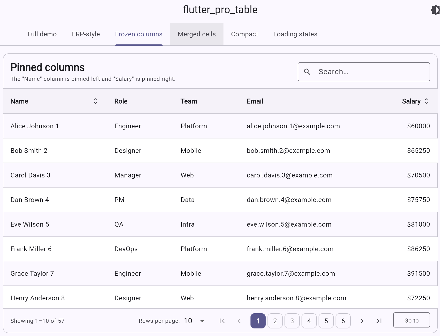 |
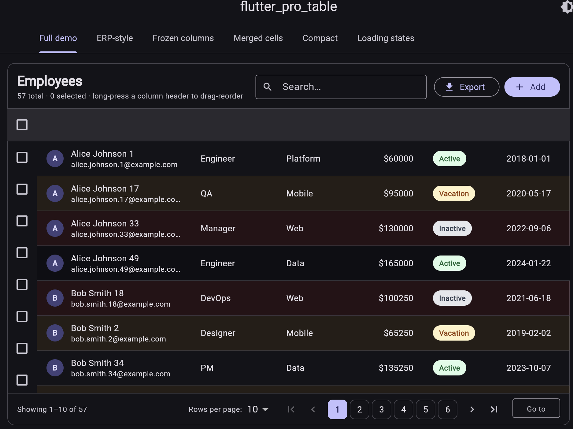
| Full demo — multi-select, search, pagination, status badges (dark theme) | Frozen columns — pin columns to left or right while the middle scrolls horizontally |
 |
 |
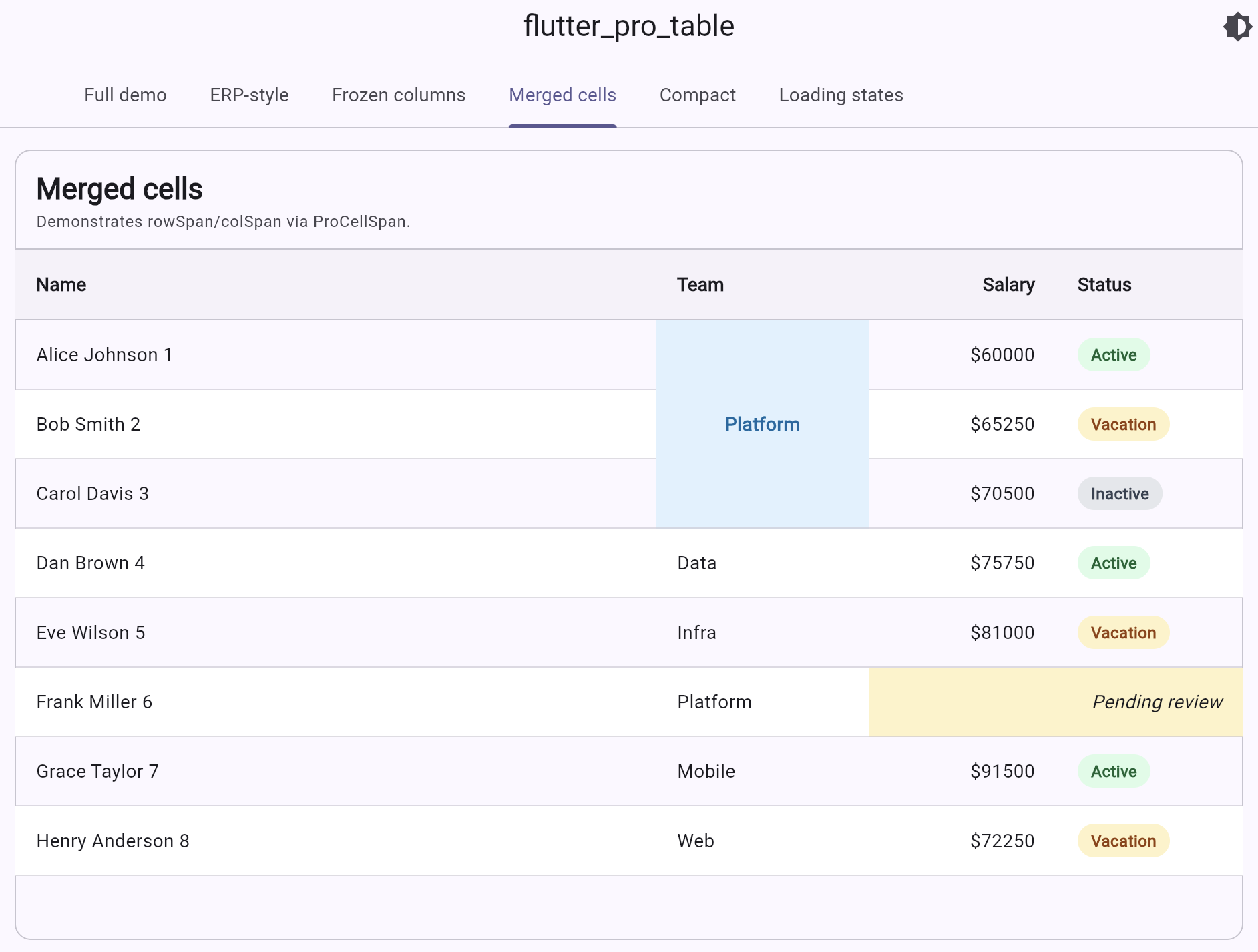
Merged cells — rowSpan / columnSpan via ProCellSpan |
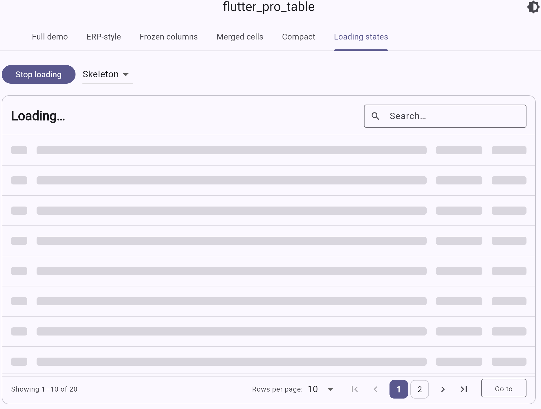
Loading states — animated skeleton rows while data loads |
- Pagination — first / prev / numbered / next / last + page-size dropdown + "jump to page" input.
- Sortable columns — click header to toggle asc → desc → none, with custom comparators.
- Search built into the toolbar with optional custom
searchPredicate. - Row selection — single (radio) or multi (checkbox + select-all-on-page).
- Expandable rows — show a custom detail panel under a row.
- Frozen / pinned columns — pin columns to left or right; middle scrolls horizontally.
- Merged cells (rowspan and colspan) via
ProCellSpan.
- Density modes — compact / standard / comfortable.
- Row numbers — opt-in leading "#" column.
- Column visibility toggle — "Columns" button in toolbar with per-column checkboxes.
- Footer / summary row — per-column
footerBuilderfor totals, averages, counts. - Bulk actions bar — sticky bottom bar with action buttons and a clear-selection button when rows are selected.
- Column resize — drag the right edge of any header to resize.
- Drag-and-drop column reorder — long-press a header to reorder.
- Mobile card view — automatic switch to a card list on narrow screens.
- Skeleton loading — animated shimmer rows while data loads.
- Auto row height — rows grow to fit multi-line content.
- Alternating row colors —
oddRowColor,evenRowColor. - Per-cell
onTap/onLongPress— fine-grained navigation per cell.
- Custom cell rendering —
cellBuilderper column for any widget (avatars, badges, buttons, charts…). - Conditional cell / row styling —
cellStyleResolverandrowStyleResolverfor value-based colors, fonts, borders. - Per-column theming — fixed / flex / intrinsic widths, alignment, padding, header alignment, header tooltip, header icons.
- Theme —
ProTableThemecontrols every colour, radius, padding, divider, striping, hover, selected colour. Auto-derives defaults from the surroundingThemeData(light & dark). - Title bar with title, subtitle and trailing actions (buttons, dropdowns).
- Empty / loading states with custom builders.
- Hover effects on web/desktop, tap / double-tap / long-press on mobile.
iOS · Android · Web · macOS · Windows · Linux.
Add it to your pubspec.yaml:
dependencies:
  flutter_pro_table: ^0.2.1
Then import and use:
import 'package:flutter_pro_table/flutter_pro_table.dart';class Person {
Person(this.name, this.age, this.email);
final String name; final int age; final String email;
}
ProTable<Person>(
rows: people,
columns: [
ProColumn(id: 'name', title: 'Name', value: (p) => p.name, sortable: true),
ProColumn(id: 'age', title: 'Age', value: (p) => p.age, sortable: true),
ProColumn(id: 'email', title: 'Email', value: (p) => p.email),
],
)ProTable<Person>(
title: 'People',
subtitle: 'All employees in the directory',
rows: people,
theme: ProTableTheme.fromContext(context).copyWith(
headerBackground: const Color(0xFFF1F5F9),
background: Colors.white,
borderRadius: BorderRadius.circular(20),
rowHeight: 56,
striped: true,
),
columns: [
ProColumn(
id: 'name',
title: 'Name',
value: (p) => p.name,
sortable: true,
headerAlignment: Alignment.center,
// any widget you like — icons, badges, avatars
headerBuilder: (ctx) => const Row(
mainAxisAlignment: MainAxisAlignment.center,
children: [Icon(Icons.person, size: 16), SizedBox(width: 6), Text('Name')],
),
cellBuilder: (ctx, p, _) => Row(children: [
const Icon(Icons.account_circle, size: 18),
const SizedBox(width: 8),
Text(p.name),
]),
cellStyleResolver: (p, _) => p.age >= 60
? const ProCellStyle(
backgroundColor: Color(0xFFFEF3C7),
textStyle: TextStyle(fontWeight: FontWeight.w600),
borderRadius: BorderRadius.all(Radius.circular(8)),
)
: const ProCellStyle(),
),
],
)ProTable<Person>(
rows: people,
enableSearch: true,
searchHint: 'Search people…',
pagination: const ProPagination(
page: 1,
pageSize: 25,
pageSizeOptions: [10, 25, 50, 100],
showJumpToPage: true,
showPageSizeSelector: true,
maxVisiblePageButtons: 7,
),
columns: [...],
)ProTable<Person>(
rows: people,
selectionMode: ProSelectionMode.multi,
rowKey: (p) => p.email, // stable identity
onSelectionChanged: (ids) => print('Selected: $ids'),
expandedRowBuilder: (ctx, p) => Text('Details about ${p.name}'),
columns: [
ProColumn(
id: 'name',
title: 'Name',
value: (p) => p.name,
expandable: true, // adds the toggle icon
),
...
],
)ProColumn(
id: 'name',
title: 'Name',
value: (e) => e.name,
pin: ColumnPin.left, // sticks during horizontal scroll
width: const ProColumnWidth.fixed(220),
)
ProColumn(
id: 'salary',
title: 'Salary',
value: (e) => e.salary,
pin: ColumnPin.right,
alignment: Alignment.centerRight,
width: const ProColumnWidth.fixed(140),
)ProTable<Employee>(
rows: rows,
cellSpans: [
// merge first three rows in the "team" column
ProCellSpan(
rowIndex: 0,
columnId: 'team',
rowSpan: 3,
builder: (_) => const Text('Platform', style: TextStyle(fontWeight: FontWeight.bold)),
style: const ProCellStyle(backgroundColor: Color(0xFFE0F2FE)),
),
// span two columns on row 5
ProCellSpan(
rowIndex: 5,
columnId: 'salary',
columnSpan: 2,
builder: (_) => const Text('Pending review'),
),
],
columns: [...],
)ProTable<Person>(
rows: people,
loading: isLoading,
loadingBuilder: (ctx) => const Padding(
padding: EdgeInsets.all(48),
child: Center(child: CircularProgressIndicator()),
),
emptyStateBuilder: (ctx) => Padding(
padding: const EdgeInsets.all(48),
child: Column(children: const [
Icon(Icons.search_off, size: 48),
SizedBox(height: 8),
Text('No people match this filter'),
]),
),
columns: [...],
)ProColumn(width: const ProColumnWidth.fixed(120)) // exact pixels
ProColumn(width: const ProColumnWidth.flex(2)) // share leftover space (flex 2)
ProColumn(width: const ProColumnWidth.intrinsic(min: 80, max: 320)) // fit contentProTable<Person>(
rows: people,
searchPredicate: (p, q) =>
p.name.toLowerCase().contains(q.toLowerCase()) ||
p.email.toLowerCase().contains(q.toLowerCase()),
columns: [
ProColumn(
id: 'name',
title: 'Name',
value: (p) => p.name,
sortable: true,
compare: (a, b) => a.name.compareTo(b.name),
),
],
)ProTable<Person>(
rows: people,
onRowTap: (p, i) => Navigator.of(context).push(...),
onRowDoubleTap: (p, i) => editRow(p),
onRowLongPress: (p, i) => showContextMenu(p),
columns: [...],
)This package depends only on Flutter — no plugins, no platform channels — so it works on iOS, Android, Web, macOS, Windows and Linux out of the box. The web demo is included in /example.
ProTable<Employee>(
  title: 'Sales pipeline',
  rows: rows,
  rowKey: (e) => e.id,

  // Density
  density: ProTableDensity.compact,        // compact / standard / comfortable

  // Row numbers + striping
  showRowNumbers: true,
  oddRowColor: Theme.of(context).colorScheme.surfaceContainerLowest,

  // Column visibility, reorder, resize
  enableColumnVisibilityToggle: true,
  enableColumnReorder: true,
  enableColumnResize: true,

  // Multi-select with bulk actions bar (Zoho/Odoo style)
  selectionMode: ProSelectionMode.multi,
  bulkActionsBuilder: (ctx, selected) => [
    TextButton.icon(onPressed: () {}, icon: const Icon(Icons.mail), label: const Text('Email')),
    TextButton.icon(onPressed: () {}, icon: const Icon(Icons.archive), label: const Text('Archive')),
    TextButton.icon(onPressed: () {}, icon: const Icon(Icons.delete), label: const Text('Delete')),
  ],

  // Footer with column-level totals
  showFooter: true,

  // Mobile fallback
  mobileBreakpoint: 600,

  // Loading style
  loadingStyle: ProLoadingStyle.skeleton,
  skeletonRowCount: 8,

  columns: [
    ProColumn(
      id: 'name',
      title: 'Name',
      value: (r) => r.name,
      hideable: false,                 // user can't hide this column
      pin: ColumnPin.left,
      sortable: true,
      onCellTap: (r, _) => Navigator.push(context, ...),
      footerBuilder: (_, rows) => Text('${rows.length} people'),
    ),
    ProColumn(
      id: 'salary',
      title: 'Salary',
      value: (r) => r.salary,
      pin: ColumnPin.right,
      alignment: Alignment.centerRight,
      footerBuilder: (_, rows) {
        final total = rows.fold<double>(0, (a, r) => a + r.salary);
        return Text('\$${total.toStringAsFixed(0)}',
            style: const TextStyle(fontWeight: FontWeight.w700));
      },
    ),
  ],
)- Column-specific filter UI in the header
- Drag-and-drop column reorder
- Column resize handles
- Async / server-side data source helper
- CSV export helper
PRs welcome.
MIT