Data Analysis or sometimes referred to as exploratory data analysis (EDA) is one of the core components of data science. It is also the part on which data scientists, data engineers and data analysts spend their majority of the time which makes it extremely important in the field of data science. This repository demonstartes some common exploratory data analysis methods and techniques using python. For purpose of illustration the CARSSSS.csv has been taken from kaggle since it is one of the ideal dataset for performing EDA and taking a step towards the most amazing and interesting field of data science.
DataSet Overview
The dataset is taken from kaggle and contains details of the cars.
The dataset is not clean and hence a lot of data cleaning is carried out.
The dataset is cleaned and stored in a CleanData folder which contains the entire cleaned dataset named https://github.com/Muskaanbafna/Data-Analysis-of-Cars-using-python/tree/main/CleanedData
Analysis 1
Data Cleaning
Some general analysis encountered during Data Cleaning are:
Checking the type of data
Dropping the duplicate rows
Dropping the missing or null values
Data after dropping the values
ANALYSIS 2
This analysis gives the distribution of cars on Car type,Make,Fuel type.
More than 70 % of the vehicle is Manual type Car.
Most produced vehicle are of body style Maruti Suzuki around 165% followed by Toyota and hyundai 150%
More than 50 % of the vehicle is a Diesel type Car
Box plot of Price of every body type.
It's Clear that Car body type strongly affect the price of the car.
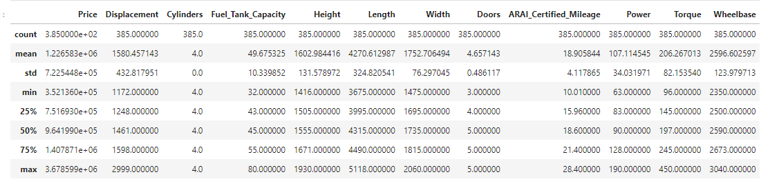
Performing a 5 number summary (min, lower quartile, median, upper quartile, max)
An outlier is a point or set of points different from other points. Sometimes they can be very high or very low. It’s often a good idea to detect and remove the outliers. Therefore to remove outliners IQR score technique is used to detect and remove the outliers with the help of boxplot . After using this technique we will see that box plot contains no outlier points.
ANALYSIS 3
This analysis gives us the relation between Mileage and price.
From the graph its visible that expensive cars tend to have worse mileage
Relation between power and price considering different body type.
Made scatter plot between two related variables which concluded that power seems to be highly related to price
Heapmap is used to find the correlation between the features.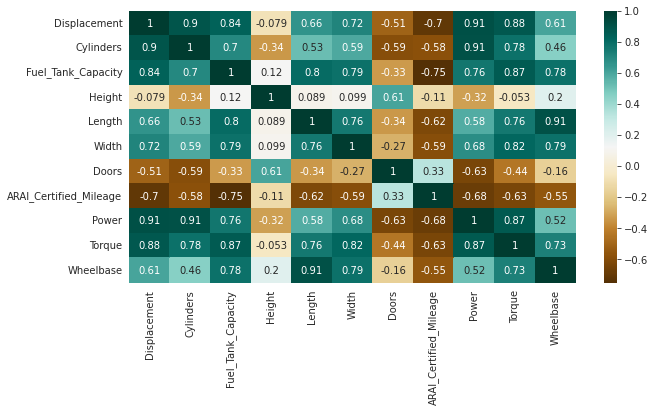
As seen in heapmap we can see strong correlation between power and displacement
Scatter plot grid of more numerical variable is done to investigate the realtion in more detail.
ANALYSIS 4
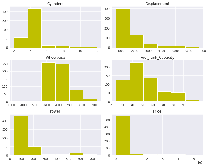
Univariant Analysis is done between:
Cylinders-Most cylinders lie in range of 4-5
Displacement-Most cars has a displacement of 1000cc
Wheelbase-Most cars has wheelbase of of 2400-2600
Fuel_Tank_Capacity-Most cars has Fuel tank capacity of of 40-50litres
Power-Most cars occupy power between 20-150hp
Price-Most cars price lie in the range of 550 le7
Bivariant Analysis is done between:
Price,Make-From the graph it is clearly visible that the price of bentley is highest.
Model,Make of cars-From the graph it is clearly visible that the price of Bugatti Chiron sport is most expensive
Correlation between the features of cars is done to get indepth analysis.
Boxplot between city mileage and price-From the graph we can see that Hyundai Aura has highest mileage.
Seabron catplot provides access to several axes-level functions that show the relationship between a numerical and one or more categorical variables.
Seaborn Catplot is shown between Make , Price , Type of cars.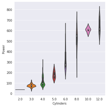
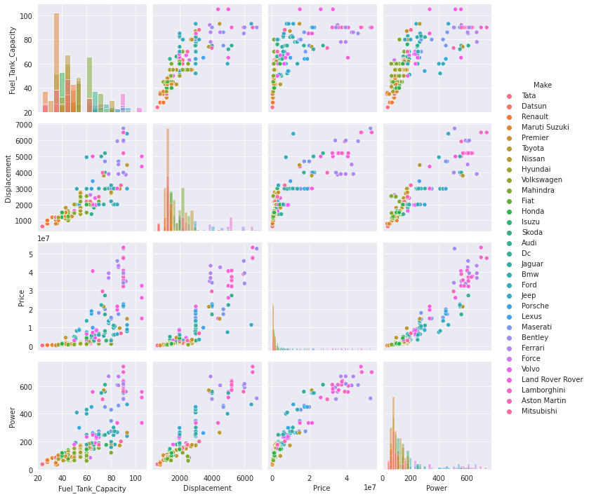
Pairplot helps to form some simple classification models by drawing some simple lines or make linear separation in the data-set.
Pairplot between Fuel_Tank_Capacity,Displacement,Price,Power is shown
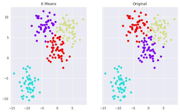
ANALYSIS 5
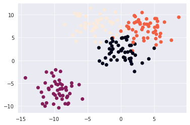
The method of Clustering is used in Analysis 5
The type of clustering used here is k-means clustering k-means clustering is a method of vector quantization, originally from signal processing, that aims to partition n observations into k clusters in which each observation belongs to the cluster with the nearest mean (cluster centers or cluster centroid), serving as a prototype of the cluster. This results in a partitioning of the data space into Voronoi cells. k-means clustering minimizes within-cluster variances (squared Euclidean distances)
Creating and visualizing the data is done.
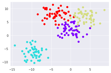
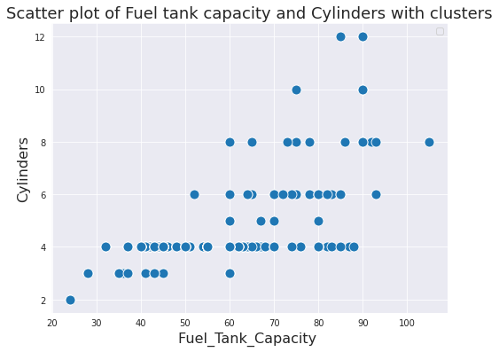
Scatter plot of Fuel tank capacity and Cylinders with clusters is shown.
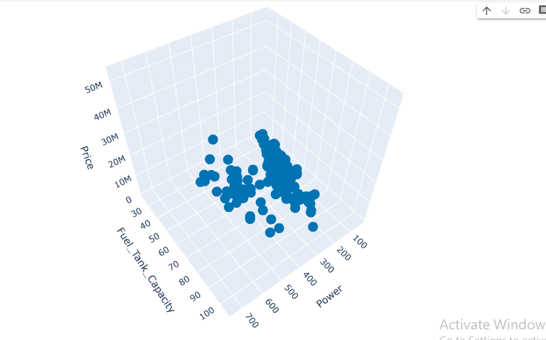
Interactive 3D scatter plot of Price,power, and Fuel tank capacity using clusters is shown.