Basic Layout and Panel
Every widget has following properties related to the layout:
| Name | Type | Default | Description |
|---|---|---|---|
| Left/Top | int | 0 | X/Y Addition |
| Width/Height | int? | null | Width/Height of the widget, if set to null, then it is automatically calculated |
| HorizontalAlignment/VerticalAlignment | enum | Depends on a widget, it's either Stretch or Left/Top | How control is horizontally/vertically aligned in the container |
| PaddingLeft/PaddingTop PaddingBottom/PaddingRight | int | 0 | Padding |
| GridColumn/GridRow | int | 0 | Position in the grid |
| GridColumnSpan/GridRowSpan | int | 1 | Span in the grid |
Note. Properties which names start with 'Grid' are used only in the Grid container.
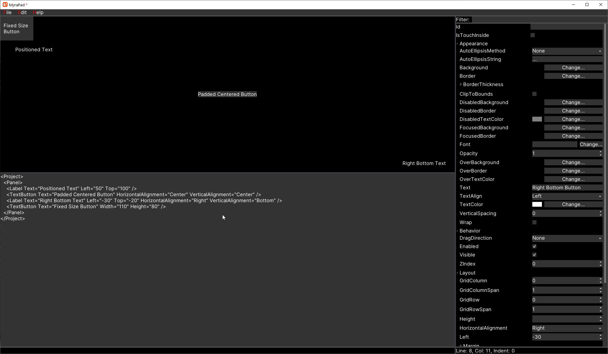
Panel is simple container. Following code demonstrates usage of layout properties with it:
    var panel = new Panel();
    var textBlock1 = new TextBlock();
    textBlock1.Text = "Positioned Text";
    textBlock1.Left = 50;
    textBlock1.Top = 100;
    panel.Widgets.Add(textBlock1);

    var textButton1 = new TextButton();
    textButton1.Text = "Padded Centered Button";
    textButton1.PaddingLeft = 8;
    textButton1.PaddingRight = 8;
    textButton1.PaddingTop = 8;
    textButton1.PaddingBottom = 8;
    textButton1.HorizontalAlignment = HorizontalAlignment.Center;
    textButton1.VerticalAlignment = VerticalAlignment.Center;
    panel.Widgets.Add(textButton1);

    var textBlock2 = new TextBlock();
    textBlock2.Text = "Right Bottom Text";
    textBlock2.Left = -30;
    textBlock2.Top = -20;
    textBlock2.HorizontalAlignment = HorizontalAlignment.Right;
    textBlock2.VerticalAlignment = VerticalAlignment.Bottom;
    panel.Widgets.Add(textBlock2);

    var textButton2 = new TextButton();
    textButton2.Text = "Fixed Size Button";
    textButton2.Width = 110;
    textButton2.Height = 80;
    panel.Widgets.Add(textButton2);
It is equivalent to the following MML:
<Project>
  <Panel>
    <TextBlock Text="Positioned Text" Left="50" Top="100" />
    <TextButton Text="Padded Centered Button" PaddingLeft="8" PaddingRight="8" PaddingTop="8" PaddingBottom="8" HorizontalAlignment="Center" VerticalAlignment="Center" />
    <TextBlock Text="Right Bottom Button" Left="-30" Top="-20" HorizontalAlignment="Right" VerticalAlignment="Bottom" />
    <TextButton Text="Fixed Size Button" Width="110" Height="80" />
  </Panel>
</Project>
It would result in following UI: