Grid Layout
Grid is a container. It partitions the available space into cells and places the child widgets there. The partitioning configuration should be explicity set by creating Grid.Proportion objects, setting their properties and adding to either RowsProportions or ColumnsProportions property.
Every child Widget should also explicity specify which cell(s) it would occupy by setting properties GridColumn, GridRow, GridColumnSpan and GridRowSpan.
I.e. following code describes simple 2x2 grid with 8 pixels spacing beetween rows and columns, and 3 child widgets:
    // Create grid
    var grid = new Grid
    {
        ShowGridLines = true,
        ColumnSpacing = 8,
        RowSpacing = 8,
    };

    // Set partitioning configuration
    grid.ColumnsProportions.Add(new Grid.Proportion());
    grid.ColumnsProportions.Add(new Grid.Proportion());
    grid.RowsProportions.Add(new Grid.Proportion());
    grid.RowsProportions.Add(new Grid.Proportion());

    // Add widgets
    var button = new TextButton();
    button.Text = "Button";
    grid.Widgets.Add(button);

    var longButton = new TextButton();
    longButton.Text = "Long Button";
    longButton.GridColumn = 1;
    grid.Widgets.Add(longButton);

    var veryLongButton = new TextButton();
    veryLongButton.Text = "Very Long Button";
    veryLongButton.GridRow = 1;
    veryLongButton.GridColumnSpan = 2;
    grid.Widgets.Add(veryLongButton);
It is equivalent to the MML:
<Project>
  <Grid ShowGridLines="True" ColumnSpacing="8" RowSpacing="8" >
    <ColumnsProportions>
      <Proportion/>
      <Proportion/>
    </ColumnsProportions>
    <RowsProportions>
      <Proportion/>
      <Proportion/>
    </RowsProportions>
    <TextButton Text="Button" />
    <TextButton Text="Long Button" GridColumn="1" />
    <TextButton Text="Very Long Button" GridRow="1" GridColumnSpan="2" />
  </Grid>
</Project>
It would result in following:
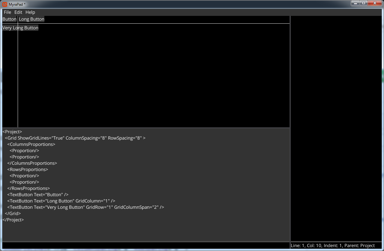
Note. There are white lines separating cells, because "ShowGridLines" is set to "True". It's useful property to debug the grid behavior.
Grid.Proportion class contains two properties: Type(enum) and Value(float). The Type could have following values:
| Name | Description |
|---|---|
| Auto(default) | The column/row is sized automatically based on the widget with the biggest width/height |
| Pixels | The column/row has fixed size in pixels specified by the Value property |
| Part | The column/row size is calculated by following formula: size=(Value*availableSpace)/totalParts. Where availableSpace is space left after processing Auto and Pixels columns/rows. And totalParts is sum of all columns/rows' Value where Type is Part. totalParts could be explicity set by setting Grid.TotalColProportionPart/Grid.TotalRowProportionPart |
| Fill | The column/row takes all unused space |
The following code demonstrates different proportion types:
    // Create grid
    var grid = new Grid
    {
        ShowGridLines = true,
        ColumnSpacing = 8,
        RowSpacing = 8,
    };

    // Set partitioning configuration
    // First column uses default proportion type(Auto)
    grid.ColumnsProportions.Add(new Grid.Proportion());

    // Second column width is 200 pixels
    grid.ColumnsProportions.Add(new Grid.Proportion
    {
        Type = ProportionType.Pixels,
        Value = 200,
    });

    // Third column will occupy rest of available space
    grid.ColumnsProportions.Add(new Grid.Proportion
    {
        Type = ProportionType.Fill,
    });

    // First row will take 1/3 of available height
    grid.RowsProportions.Add(new Grid.Proportion
    {
        Type = ProportionType.Part,
    });

    // Second row will take 2/3 of available height
    grid.RowsProportions.Add(new Grid.Proportion
    {
        Type = ProportionType.Part,
        Value = 2,
    });

    // Add widgets
    var button = new TextButton();
    button.Text = "Button";
    grid.Widgets.Add(button);

    var longButton = new TextButton();
    longButton.Text = "Long Button";
    longButton.Width = 150;
    longButton.GridColumn = 1;
    grid.Widgets.Add(longButton);

    var veryLongButton = new TextButton();
    veryLongButton.Text = "Very Long Button";
    veryLongButton.Left = -10;
    veryLongButton.Top = -10;
    veryLongButton.HorizontalAlignment = HorizontalAlignment.Right;
    veryLongButton.VerticalAlignment = VerticalAlignment.Bottom;
    veryLongButton.GridRow = 1;
    veryLongButton.GridColumnSpan = 2;
    grid.Widgets.Add(veryLongButton);

    var longestButton = new TextButton();
    longestButton.Text = "The Longest Button";
    longestButton.HorizontalAlignment = HorizontalAlignment.Center;
    longestButton.VerticalAlignment = VerticalAlignment.Center;
    longestButton.GridColumn = 2;
    longestButton.GridRow = 1;
    grid.Widgets.Add(longestButton);
It is equivalent to MML:
<Project>
  <Grid ShowGridLines="True" ColumnSpacing="8" RowSpacing="8">
    <ColumnsProportions>
      <!-- First column uses default proportion type(Auto) -->
      <Proportion />
      <!-- Second column width is 200 pixels -->
      <Proportion Type="Pixels" Value="200" />
      <!-- Third column will occupy rest of available space -->
      <Proportion Type="Fill" />
    </ColumnsProportions>
    <RowsProportions>
      <!-- First row will take 1/3 of available height -->
      <Proportion Type="Part" />
      <!-- Second row will take 2/3 of available height -->
      <Proportion Type="Part" Value="2" />
    </RowsProportions>
    <TextButton Text="Button" />
    <TextButton Text="Long Button" Width="150" GridColumn="1" />
    <TextButton Text="Very Long Button" Left="-10" Top="-10" HorizontalAlignment="Right" VerticalAlignment="Bottom" GridRow="1" GridColumnSpan="2" />
    <TextButton Text="The Longest Button" HorizontalAlignment="Center" VerticalAlignment="Center" GridColumn="2" GridRow="1" />
  </Grid>
</Project>
It would result in following:
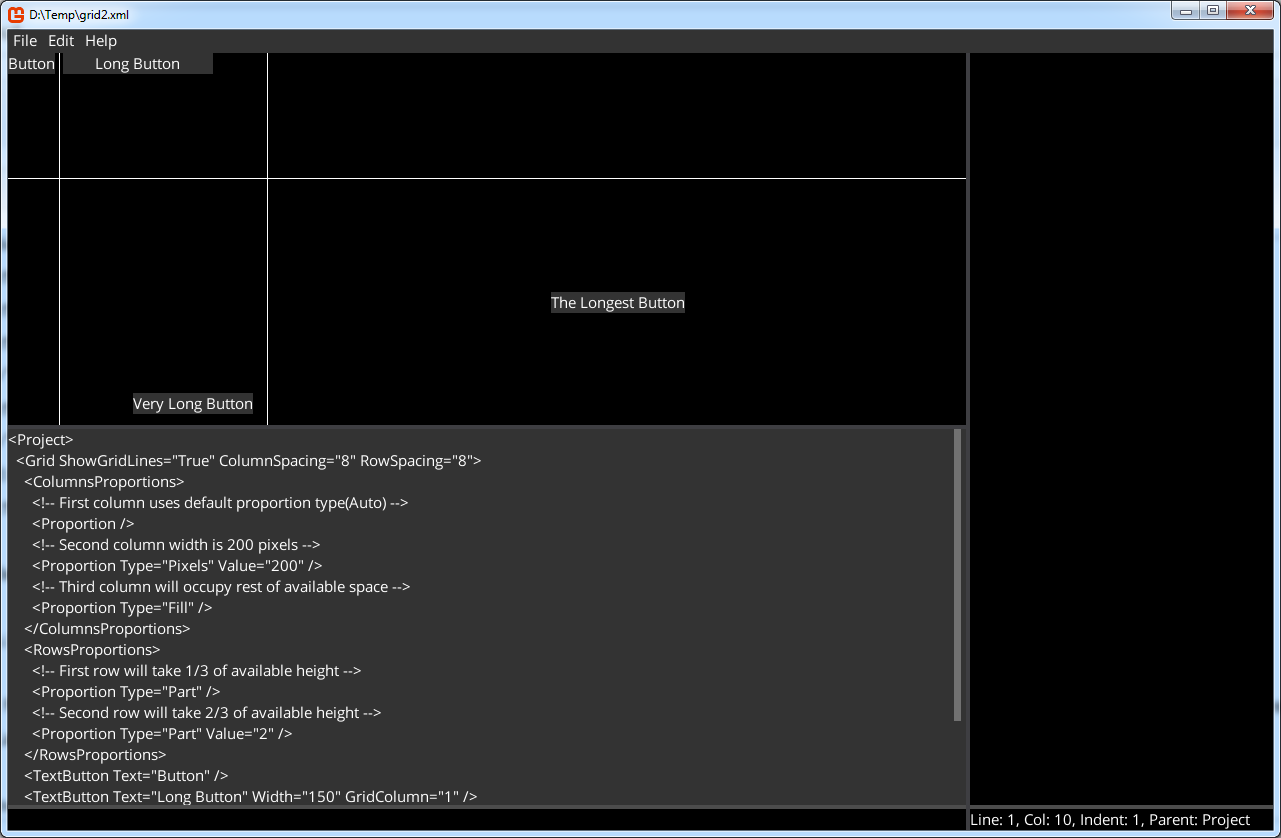
*Note. We have set Left/Top/HorizontalAlignment/VerticalAlignment in the child widgets, hovewer their behavior is different than in the Panel container. In Panel those properties applied relative to the whole container, while in the grid it is applied to the widget's cell.