Seems like some users are missing the scrollbar in the new instance configuration screen:
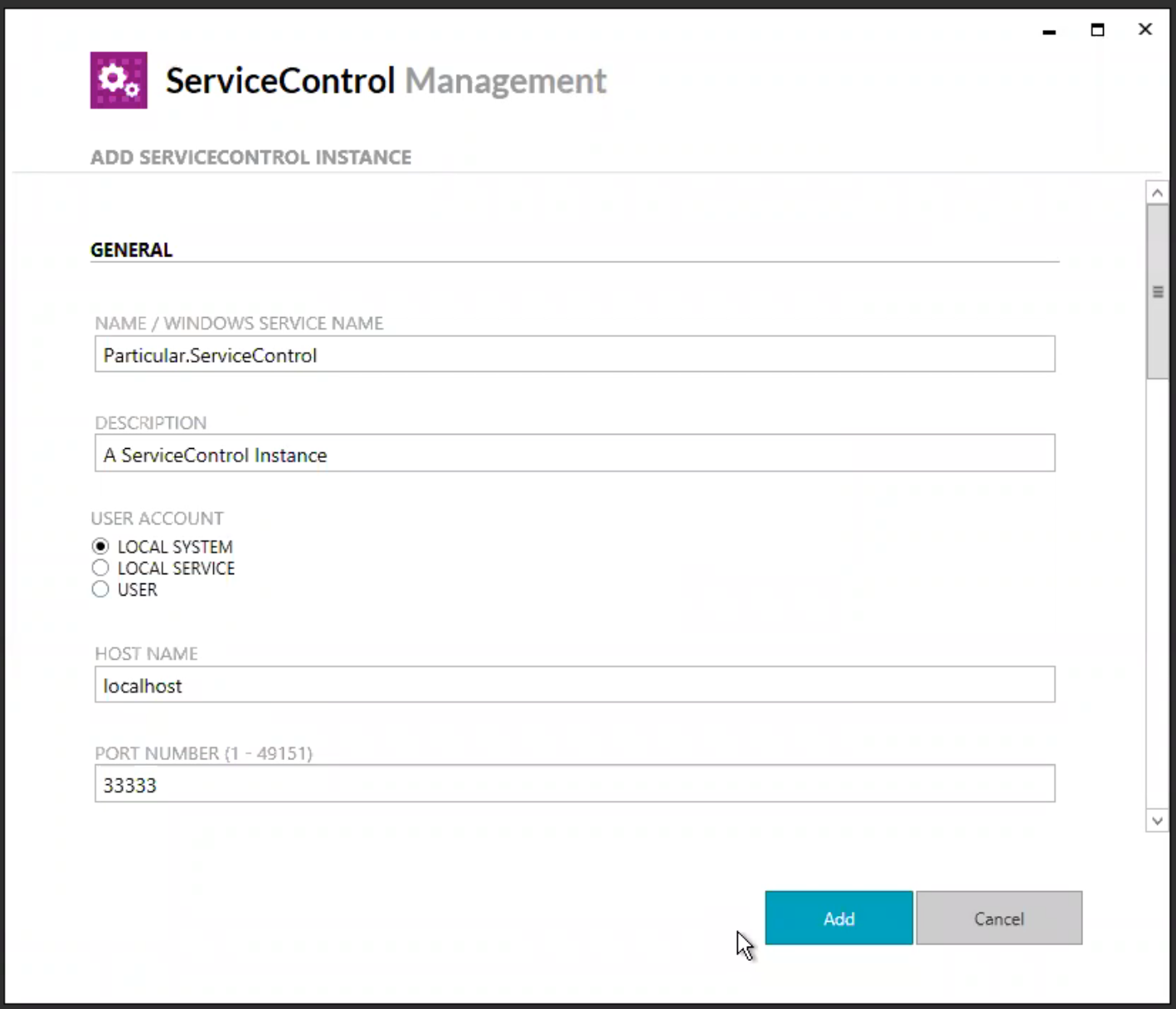
It's not yet obvious to me what's the cause for this. Possible reasons:
- Users don't expect this kind of configuration screen to be scrollable, they expect it to be a single screen or a wizard
- The scrollbar contrast is too low
- There's no affordance to indicate there's more content to scroll (e.g. could show the next form field cut-off at the bottom of the scroll area)

Seems like some users are missing the scrollbar in the new instance configuration screen:
It's not yet obvious to me what's the cause for this. Possible reasons: