This is a Python code for creating a dashboard using Dash by Plotly. The dashboard provides an overview of US executions from 1977 to 2021, allowing users to filter and explore the data.
When talking about executions in the USA, it can be challenging to grasp their scale and how widespread it is. This project aims to build a visualization that provides end users with an easy and manageable way to explore the topic, which lets them do their own research on the data. Our paper describes the data provided in the visualization, why the visualization is necessary to understand the data properly and the choices made in the design of the visualization. The dashboard has been made to be user-oriented with the intention of providing the end user with a general overview while still being able to delve into the detail of the data, should they choose to do so. The dashboard presents the user with the option to filter through attributes such as execution method, gender and/or race. This is accompanied by a built-in timeline that lets the end user choose data from the whole USA or individual states through the specific years since 1977 or accumulated up until today.

The code starts by importing necessary packages such as Dash, Plotly, pandas, and others. The plot_functions.py file and cfg.py file are also imported for additional functions and configurations.
The links to Dash Bootstrap components and Plotly are provided in the comments.
Next, the code defines the CSS styles for the navigation bar and pip, which will be used later in the code.
Then, the Dash app is initialized by calling the Dash constructor with external style sheets, which include the Flatly theme, a custom CSS file, and a Google font.
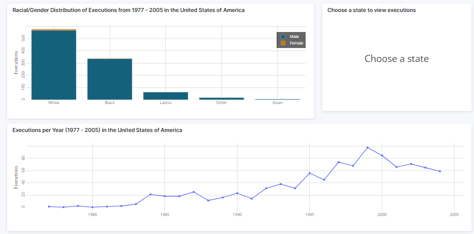
The navbar variable is defined as a navigation bar that contains a year slider filter and a play button that allows users to animate the map. The year slider filter has a minimum of 1977, a maximum of 2021, and a default value of 2005. Custom marks are also provided to label specific years. The play button has a default value of 0, and the animate interval is disabled by default. Additionally, a toggle for accumulating years is included in the navigation bar.
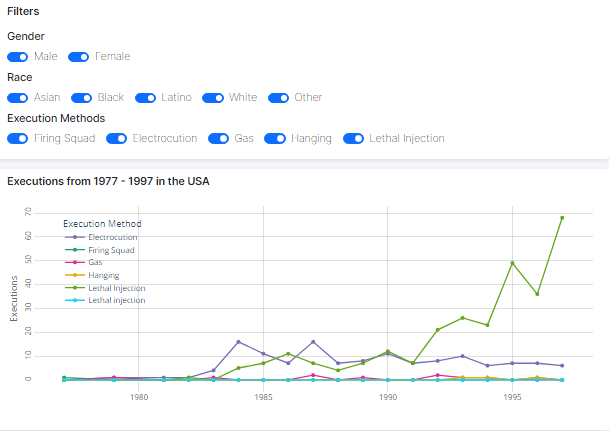
The overview_method_filters variable is defined as a card containing several filters that allow users to filter the data by gender, race, and execution methods.
Finally, the app.layout is defined by using Dash's HTML and core components. The layout includes a container that holds the navigation bar, the map, and the sidebar. The map is created using Plotly's GraphObjects and contains data points for each execution in the US. The sidebar contains the filter components, as well as additional plots that provide a more detailed overview of the data.
Overall, this code provides a comprehensive dashboard for exploring US executions data. This project was a collaboration
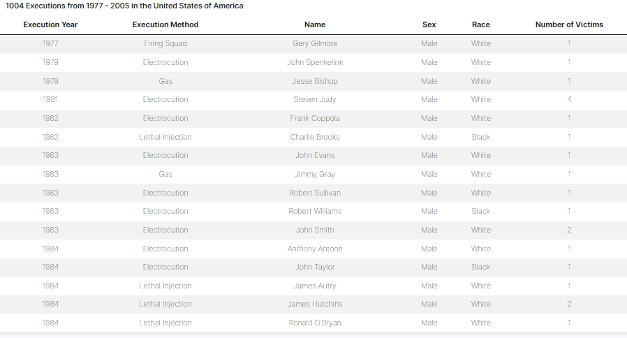
Screenshots of Dashboard:
Filters
Line Graph
Observations

Year Slider