Visual Reference
A comprehensive visual guide with rendered examples for all FlexRender properties and element types. Each section provides side-by-side comparisons showing how different property values affect the final rendered output.
The canvas section in a template defines the rendering surface: its dimensions, sizing behavior, background color, and post-render rotation. These settings control the overall output image before any layout elements are placed.
The fixed property determines which canvas dimensions are locked to explicit values and which adjust automatically to fit content.
| Value | Description | Visual Example |
|---|---|---|
width |
Width is fixed; height grows or shrinks to fit content. This is the default. | 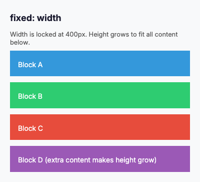 |
height |
Height is fixed; width grows or shrinks to fit the widest content. | 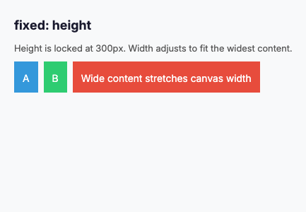 |
both |
Both width and height are fixed. Content that overflows is clipped. | 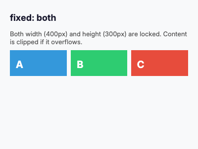 |
none |
Neither dimension is fixed. Both width and height adjust to fit content exactly. | 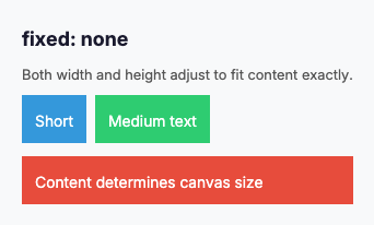 |
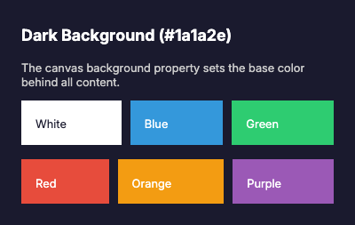
The background property sets the base color of the canvas behind all rendered content. Accepts hex color strings.
The rotate property applies a post-render rotation to the entire canvas. The layout is computed in the original orientation, then the final image is rotated. For 90-degree and 270-degree rotations, the output image dimensions are swapped.
| Value | Degrees | Description | Visual Example |
|---|---|---|---|
none |
0 | No rotation (default). | 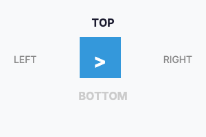 |
right |
90 | Rotate 90 degrees clockwise. Width and height are swapped in the output. | 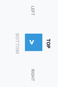 |
flip |
180 | Rotate 180 degrees. The image appears upside down. | 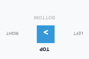 |
left |
270 | Rotate 270 degrees clockwise (90 degrees counter-clockwise). Width and height are swapped. | 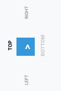 |
Note: The
rotatevalue is applied after the entire layout is rendered. All element sizes, positions, and text wrapping are computed in the pre-rotation coordinate system. Therotateproperty also accepts arbitrary numeric degree values (e.g.,45), though named values cover the most common use cases. For thermal printers, userotate: rightto convert a wide horizontal layout into a tall vertical image suitable for paper roll printing.
| Property | Type | Description | Default |
|---|---|---|---|
fixed |
enum | Sizing mode: width, height, both, none
|
width |
width |
integer | Canvas width in pixels | 300 |
height |
integer | Canvas height in pixels |
0 (auto) |
background |
color | Background color in hex format (e.g., #ffffff) |
#ffffff |
rotate |
string | Post-render rotation: none, left, right, flip, or numeric degrees |
none |
text-direction |
enum | Text direction: ltr, rtl
|
ltr |
The direction property defines the main axis direction in which flex items are laid out within a flex container. It determines whether items flow horizontally or vertically, and in what order.
| Value | Description | Visual Example |
|---|---|---|
row |
Items are laid out horizontally from left to right. This is the default behavior. The main axis runs horizontally. | 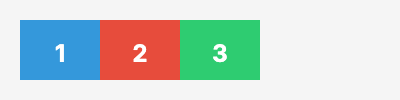 |
column |
Items are laid out vertically from top to bottom. The main axis runs vertically. | 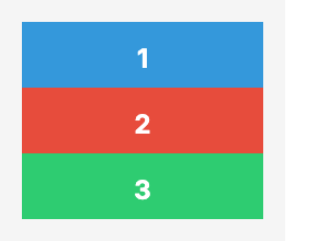 |
row-reverse |
Items are laid out horizontally from right to left. The main axis runs horizontally in reverse. | 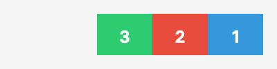 |
column-reverse |
Items are laid out vertically from bottom to top. The main axis runs vertically in reverse. | 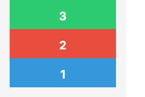 |
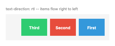
When text-direction: rtl is set on the canvas or element, row layout is mirrored so items flow right-to-left.
| Value | Description | Visual Example |
|---|---|---|
row (RTL) |
Items flow right-to-left instead of left-to-right. |  |
row-reverse (RTL) |
Items flow left-to-right (reversed from RTL default). |  |
row (RTL, labeled) |
Three labeled items showing right-to-left positioning with text-direction: rtl. |
 |
FlexRender supports Arabic and other RTL scripts when using an Arabic-capable font (e.g., Noto Sans Arabic). Use text-direction: rtl on the canvas for full RTL layout and text alignment.
| Example | Description | Visual |
|---|---|---|
| Arabic card | RTL layout with Arabic heading and body text using Noto Sans Arabic font. | 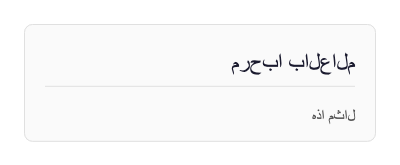 |
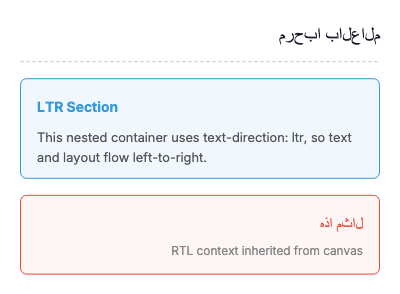
| Mixed LTR/RTL | RTL page with a nested dir: ltr section for left-to-right content within an RTL context. |
 |
Note: For proper Arabic glyph shaping (ligatures, contextual forms), enable HarfBuzz text shaping via
.WithHarfBuzz()on the Skia builder, or use the--harfbuzzflag with the CLI.
The justify property defines how flex items are aligned along the main axis of a flex container. It distributes extra free space when items don't fill the entire container width (for direction: row) or height (for direction: column).
| Value | Description | Visual Example |
|---|---|---|
start |
Items are packed toward the start of the flex container's main axis. This is the default behavior. | 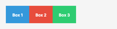 |
center |
Items are centered along the main axis, with equal space on both sides. | 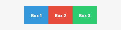 |
end |
Items are packed toward the end of the flex container's main axis. | 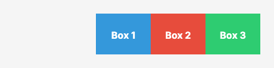 |
space-between |
Items are evenly distributed with the first item at the start and the last item at the end. Remaining space is distributed evenly between items. | 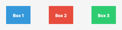 |
space-around |
Items are evenly distributed with equal space around each item. Note that the space at the edges is half the space between items. | 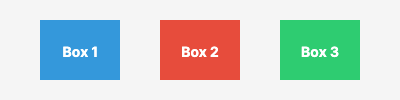 |
space-evenly |
Items are evenly distributed with equal space between all items and at the edges. | 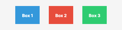 |
The align property defines how flex items are aligned along the cross axis of a flex container. For direction: row, the cross axis is vertical. For direction: column, the cross axis is horizontal.
| Value | Description | Visual Example |
|---|---|---|
stretch |
Items are stretched to fill the container's cross-axis. This is the default behavior. Items without an explicit cross-axis size will expand to fill available space. | 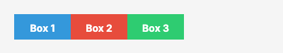 |
start |
Items are aligned at the start of the cross axis. Items maintain their intrinsic cross-axis size. | 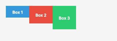 |
center |
Items are centered along the cross axis, with equal space above and below (for row) or left and right (for column). | 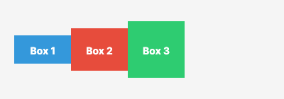 |
end |
Items are aligned at the end of the cross axis. Items are positioned at the bottom (for row) or right (for column). | 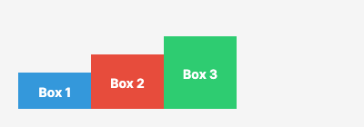 |
baseline |
Items are aligned such that their text baselines line up. Particularly useful when items contain text of different sizes. | 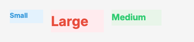 |
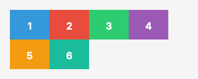
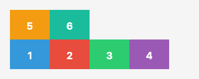
The wrap property controls whether flex items are forced onto a single line or can wrap onto multiple lines within a flex container. It determines how items behave when they exceed the container's main axis size.
| Value | Description | Visual Example |
|---|---|---|
nowrap |
All items are laid out on a single line, even if they overflow the container. This is the default behavior. Items may shrink to fit. | 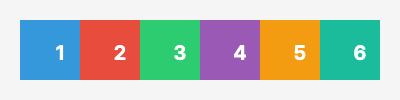 |
wrap |
Items wrap onto multiple lines from top to bottom (for row) or left to right (for column). New lines are added in the natural direction. |
 |
wrap-reverse |
Items wrap onto multiple lines from bottom to top (for row) or right to left (for column). New lines are added in reverse order. |
 |
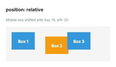
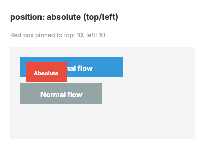
The position property controls how an element is positioned within its container. FlexRender supports three positioning modes matching CSS behavior: static (default), relative, and absolute.
Element follows normal flex flow. No offset properties are applied.
Element is offset from its normal flow position. Siblings are not affected.
| Example | Description | Visual |
|---|---|---|
| Offset | Middle box shifted with top: 15, left: 20 from normal position |
 |
Element is removed from flex flow and positioned relative to its containing flex parent's padding box.
| Example | Description | Visual |
|---|---|---|
| Top/Left | Box pinned to top: 10, left: 10
|
 |
| Bottom/Right | Box pinned to bottom: 10, right: 10
|
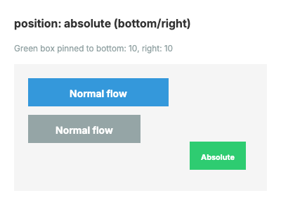 |
| Centered | Box centered via equal insets on all sides | 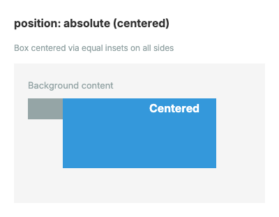 |
| Flow Exclusion | Absolute elements excluded from flex flow -- A, C, D stack normally | 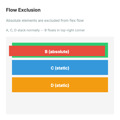 |
| Inset Sizing | Width/height computed from opposing insets (no explicit size) | 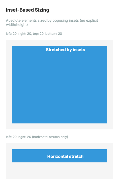 |
| Pattern | Description | Visual |
|---|---|---|
| Badge | Star badge overlaid on product card with top: 8, right: 8
|
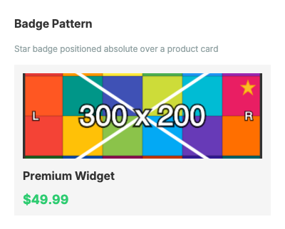 |
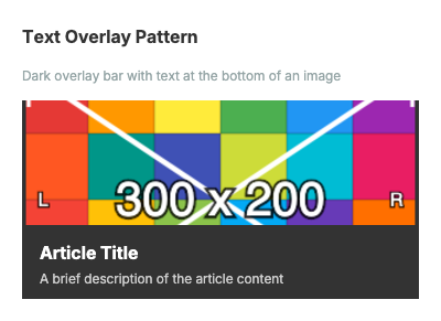
| Text Overlay | Dark bar with text at bottom of image using bottom: 0, left: 0, right: 0
|
 |
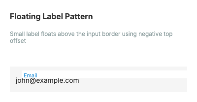
| Floating Label | Input label floats above border with top: -8, left: 12
|
 |
| Property | Type | Description |
|---|---|---|
top |
string | Offset from top edge of containing block's padding box |
right |
string | Offset from right edge |
bottom |
string | Offset from bottom edge |
left |
string | Offset from left edge |
Priority rules:
-
lefttakes priority overrightwhen both are specified (forposition: relative) -
toptakes priority overbottomwhen both are specified (forposition: relative) - For
position: absolute, opposing insets (left+rightortop+bottom) without explicit size compute the element's width/height (inset sizing)
The order property controls the visual order of flex items independently from their source order in the YAML template. Items with lower order values appear first. Items with equal order preserve their source order (stable sort). The default value is 0.
| Example | Description | Visual |
|---|---|---|
| Basic reordering | Three items A(order:2), B(order:0), C(order:1) display as B, C, A. | 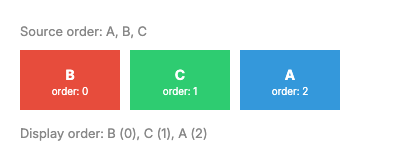 |
| Negative order | Item B(order:-1) moves before A(order:0) and C(order:0), displaying as B, A, C. | 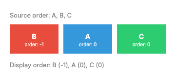 |
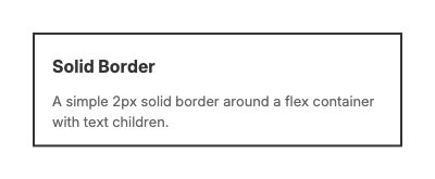
Border properties add visible borders around any element. Borders support CSS-like shorthand syntax and per-side customization.
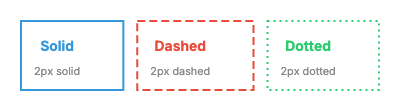
Shorthand format: "width style color" (e.g., "2 solid #333")
Styles: solid, dashed, dotted, none
A simple solid border around a flex container.
Three boxes side by side showing solid, dashed, and dotted border styles.
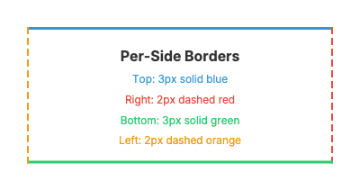
Different border styles, widths, and colors on each side using border-top, border-right, border-bottom, and border-left.
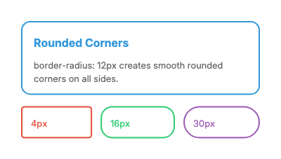
Rounded corners using border-radius. Larger values create more rounding.
| Property | Type | Description | Default |
|---|---|---|---|
border |
string | Shorthand for all sides: "width style color"
|
(none) |
border-top |
string | Top side shorthand: "width style color"
|
(none) |
border-right |
string | Right side shorthand | (none) |
border-bottom |
string | Bottom side shorthand | (none) |
border-left |
string | Left side shorthand | (none) |
border-width |
string | Width override for all sides (px, em) | (none) |
border-color |
color | Color override for all sides | (none) |
border-style |
enum | Style override: solid, dashed, dotted, none
|
(none) |
border-radius |
string | Corner rounding (px, em, %) | (none) |
The opacity property controls the transparency of an element and all its children. Values range from 0.0 (fully transparent) to 1.0 (fully opaque, default).
# Semi-transparent element
- type: flex
  opacity: 0.5
  background: "#3498db"
  padding: "16"
  children:
    - type: text
      content: "50% transparent"
color: "#ffffff"| Value | Effect |
|---|---|
1.0 |
Fully opaque (default) |
0.75 |
75% visible |
0.5 |
50% visible |
0.25 |
25% visible |
0.0 |
Fully transparent (invisible) |
Opacity is implemented via canvas.SaveLayer() with an alpha paint, so it applies to the entire element subtree including children, background, and borders.
The box-shadow property adds a shadow behind an element. The shadow is defined with offset, blur radius, and color.
Format: "offsetX offsetY blurRadius color"
# Simple drop shadow
- type: flex
  box-shadow: "4 4 8 #00000040"
  background: "#ffffff"
  padding: "16"
  children:
    - type: text
      content: "Card with shadow"

# Elevated card effect
- type: flex
  box-shadow: "0 8 24 #00000030"
  background: "#ffffff"
  padding: "20"
  border-radius: "8"
  children:
    - type: text
content: "Elevated card"| Component | Type | Description |
|---|---|---|
| offsetX | float | Horizontal offset in pixels (positive = right) |
| offsetY | float | Vertical offset in pixels (positive = down) |
| blurRadius | float | Blur radius in pixels (0 = sharp edge) |
| color | hex | Shadow color with optional alpha (e.g., #00000040 for 25% black) |
Both box-shadow and boxShadow YAML names are accepted.
The background property accepts CSS-like gradient values in addition to solid hex colors.
# Left to right gradient
- type: flex
  background: "linear-gradient(to right, #ff0000, #0000ff)"
  padding: "20"
  children:
    - type: text
      content: "Left to right"
      color: "#ffffff"

# Angled gradient with color stops
- type: flex
  background: "linear-gradient(45deg, #ff0000, #00ff00 50%, #0000ff)"
  padding: "20"
  children:
    - type: text
      content: "Diagonal gradient"
      color: "#ffffff"
Supported direction keywords:
| Keyword | Angle | Direction |
|---|---|---|
to top |
0deg | Bottom to top |
to top right |
45deg | Bottom-left to top-right |
to right |
90deg | Left to right |
to bottom right |
135deg | Top-left to bottom-right |
to bottom |
180deg | Top to bottom (default) |
to bottom left |
225deg | Top-right to bottom-left |
to left |
270deg | Right to left |
to top left |
315deg | Bottom-right to top-left |
# Radial gradient from center
- type: flex
  background: "radial-gradient(#ffffff, #000000)"
  padding: "30"
  width: "200"
  height: "200"
  children:
    - type: text
      content: "Radial"
      color: "#888888"
      align: center
Color stops can include optional percentage positions:
# Custom color stop positions
- type: flex
  background: "linear-gradient(to right, #ff0000, #ffff00 30%, #00ff00 70%, #0000ff)"
  padding: "16"
  height: "60"
Stops without explicit positions are evenly distributed between neighboring positioned stops.
The text element is used to display styled text content in your templates.
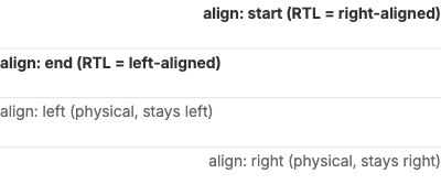
The align property controls horizontal text alignment within its container.
Values: left, center, right, start (logical), end (logical)
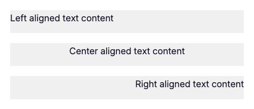
The start and end values resolve based on the text direction. In RTL mode, start maps to right-aligned and end maps to left-aligned.
The wrap property controls whether text wraps to multiple lines or overflows.
Values: true, false
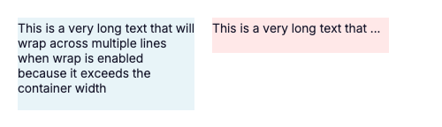
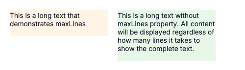
The maxLines property limits text to a specific number of lines. Use with overflow: ellipsis to show truncation.
Values: Any positive integer
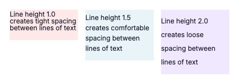
The lineHeight property controls vertical spacing between lines of text.
Values: Decimal numbers (e.g., 1.0, 1.5, 2.0)
| Property | Type | Description | Default |
|---|---|---|---|
content |
string | Text to display | (required) |
align |
enum | Horizontal alignment: left, center, right, start (logical), end (logical) |
left |
size |
length | Font size (e.g., 14px, 1em) |
14px |
color |
color | Text color | #000000 |
font |
string | Font variant (e.g., default, bold, semibold) |
default |
wrap |
boolean | Enable text wrapping | false |
maxLines |
integer | Maximum number of lines | (unlimited) |
overflow |
enum | Overflow behavior: clip, ellipsis
|
clip |
lineHeight |
number | Line height multiplier | 1.0 |
background |
color | Background color | (transparent) |
padding |
length | Internal spacing | 0 |
The separator element creates horizontal or vertical dividing lines between content sections.
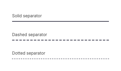
The style property controls the visual appearance of the line.
Values: solid, dashed, dotted
The orientation property controls whether the separator is horizontal or vertical.
Values: horizontal, vertical
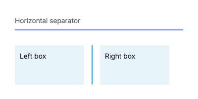
Note: Vertical separators work best inside flex containers with
direction: rowandalign: stretch.
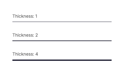
The thickness property controls the width of the separator line.
Values: Any positive number (in pixels)
| Property | Type | Description | Default |
|---|---|---|---|
style |
enum | Line style: solid, dashed, dotted
|
solid |
orientation |
enum | Direction: horizontal, vertical
|
horizontal |
thickness |
number | Line thickness in pixels | 1 |
color |
color | Line color | #000000 |
height |
length | Fixed height (for vertical separators) | (auto) |
The image element displays images from HTTP URLs or local file paths.
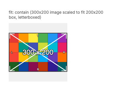
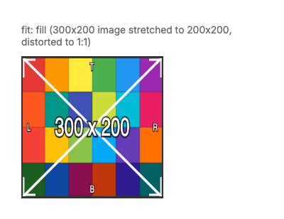
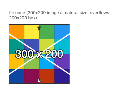
The fit property controls how images are sized and positioned within their container.
Scales the image to fit inside the container while maintaining aspect ratio. The entire image is visible, and letterboxing may occur.
Scales the image to fill the entire container while maintaining aspect ratio. The image may be cropped to fit.

Stretches the image to fill the container exactly. Aspect ratio is NOT maintained and the image may appear distorted.
Displays the image at its natural size without any scaling. The image may overflow the container.
| Property | Type | Description | Default |
|---|---|---|---|
src |
string | Image URL (HTTP/HTTPS) or local file path | (required) |
fit |
enum | Fit mode: contain, cover, fill, none
|
contain |
width |
length | Container width | (auto) |
height |
length | Container height | (auto) |
The qr element generates QR codes dynamically from text data.
The errorCorrection property controls the amount of redundancy in the QR code, allowing it to remain readable even if partially damaged.
Values: L (Low ~7%), M (Medium ~15%), Q (Quartile ~25%), H (High ~30%)

QR codes support custom foreground and background colors.
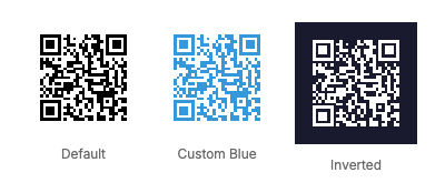
| Property | Type | Description | Default |
|---|---|---|---|
data |
string | Text content to encode | (required) |
size |
number | QR code size in pixels | 100 |
errorCorrection |
enum | Error correction: L, M, Q, H
|
M |
foreground |
color | QR code foreground color | #000000 |
background |
color | QR code background color | #ffffff |
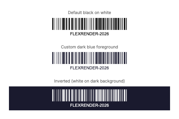
The barcode element generates linear barcodes (Code 128) dynamically from text data.
The showText property controls whether the human-readable barcode value is displayed below the barcode.
Values: true, false
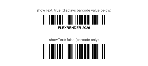
Barcodes support custom foreground and background colors.
| Property | Type | Description | Default |
|---|---|---|---|
data |
string | Text content to encode | (required) |
format |
enum | Barcode format (currently only code128) |
code128 |
width |
number | Barcode width in pixels | 200 |
height |
number | Barcode height in pixels | 50 |
showText |
boolean | Display human-readable text below barcode | true |
foreground |
color | Barcode line color | #000000 |
background |
color | Barcode background color | #ffffff |
SVG elements render vector graphics in templates. Requires FlexRender.SvgElement.Skia.Render (or FlexRender.SvgElement) package.
- type: svg
  src: "assets/icons/logo.svg"
  width: 100
  height: 100
fit: contain- type: svg
content: |
<svg viewBox="0 0 100 100" xmlns="http://www.w3.org/2000/svg">
<circle cx="50" cy="50" r="40" fill="#4CAF50"/>
<text x="50" y="55" text-anchor="middle" fill="white" font-size="20">SVG</text>
</svg>
width: 80
height: 80Same as image fit: fill (stretch), contain (fit within bounds), cover (fill bounds, may crop), none (original size).
| Property | Type | Description | Default |
|---|---|---|---|
src |
string | Path to SVG file (mutually exclusive with content) |
(optional) |
content |
string | Inline SVG markup (mutually exclusive with src) |
(optional) |
width |
number | Target render width in pixels | (auto) |
height |
number | Target render height in pixels | (auto) |
fit |
enum | Fit mode: fill, contain, cover, none
|
contain |
FlexRender supports three rendering backends. The same template produces visually similar output across all backends, with some backend-specific features:
| Backend | Strengths | Limitations |
|---|---|---|
| Skia | Gradients, box-shadow, opacity, SVG elements, HarfBuzz shaping | Requires native SkiaSharp libraries |
| ImageSharp | Zero native dependencies, cross-platform | No gradients, no box-shadow, no SVG elements, no text rotation |
| SVG | Vector output, scalable, smallest file size | No raster output without Skia fallback |
See the showcase-capabilities template with per-renderer data files for a live comparison.
- Flexbox-Layout - Complete flexbox layout engine documentation
- Element-Reference - Detailed property reference for all element types
- Template-Syntax - Template structure, canvas settings, and element types