Annotation
On this page are examples of how QOL.plots can help you annotate plots:
- Create a horizontal or vertical line and label it with text
- Put a textbox or legend at an empty spot on the plot
- Draw lines over an image
Before running any of the following examples, make sure to do:
import matplotlib.pyplot as plt
import numpy as np
import QOL.plots as pqol- These functions to not play well when the default scale is adjusted, e.g. via
plt.yscale('log').-
Workaround: perform scale function on data instead of plot scale, e.g.
plt.plot(np.log10(yy))instead ofplt.plot(yy)to have a logarithmic "scale". -
Resource required to fix issue: knowledge of how to access parameters related to the active plot's scale. (E.g. I am looking for something like:
plt.gcf()._yscalebut that is not the correct name for it....) If you know how to help, please let me know at sevans7@bu.edu.
-
Workaround: perform scale function on data instead of plot scale, e.g.
pqol.hline(y0, "hello") #line at y=y0 [data coords] labeled "hello"
   #or
pqol.vline(x0, "oh hi") #line at x=x0 [data coords] labeled "oh hi"
For more complicated usage, see the images and description below.
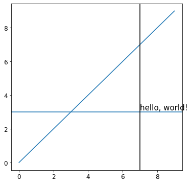
## Labeled hline, with a black vline for reference ##
plt.plot(range(10)) #initial plot
pqol.hline(3, "hello, world!", textloc=7, textspec="data") #hline at y=3, text at x=7.
#textspec = coord system for textloc. it is "axes" by default.
pqol.vline(7, color="black") #vline at x=7.
plt.show()
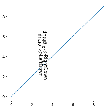
## Labeled vline
plt.plot(range(10)) #initial plot
pqol.vline(3, ">LeftUp") #default textside and textdirection.
pqol.vline(3, ">LeftDown", textdirection='down') #default textside.
pqol.vline(3, ">RightUp", textside='right') #default textdirection.
pqol.vline(3, ">RightDown", textside='right', textdirection='down')
plt.show()There are many more ways to relatively easily customize text/line placement, text properties, line color/style, and more. For further information see the documentation for pqol.hline and pqol.vline, e.g. via help(pqol.hline) and help(pqol.vline).
Known issues: the margin is strange, for text which reads upwards on the right or downwards on the left. For now, the fix is to just edit the margin parameter to around 0.01 for such text, instead of its default of 0.002. I am not sure why it is different, but I may get around to fixing this one day....
pqol.text("Hello, World!")  #places textbox on plot, with text "Hello, World!"
   #or
pqol.legend()               #places legend on plot
For more complicated uses, check out the example image generated by the code below.
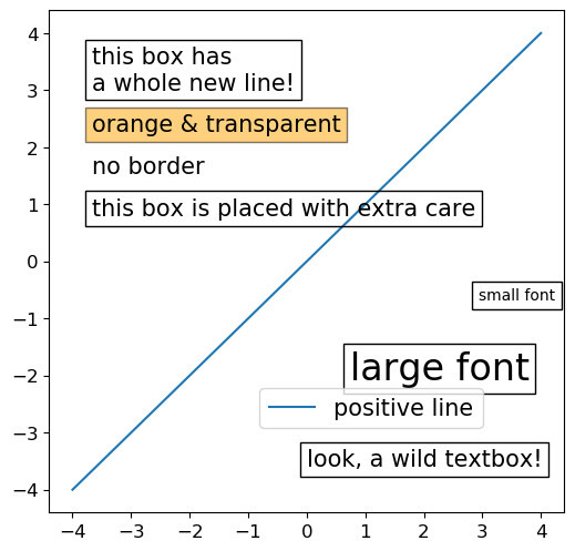
x = np.linspace(-4,4,20)
plt.plot(x, x, label='positive line')
annotate() #defined below
plt.show()
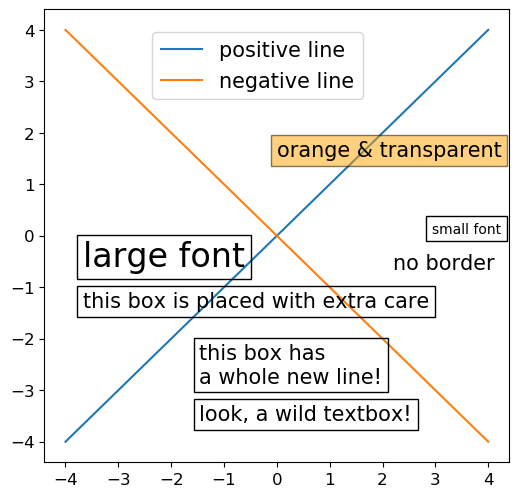
plt.plot(x, x, label='positive line')
plt.plot(x, -x, label='negative line')
annotate() #defined below
plt.show()
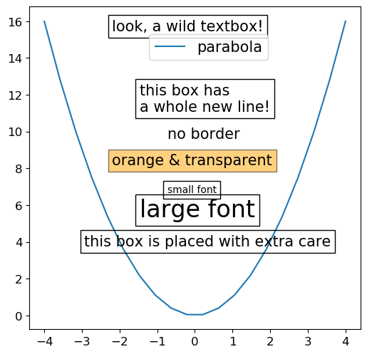
plt.plot(x, x**2, label='parabola')
annotate() #defined below
plt.show()
def annotate():
'''adds a legend and many textboxes.'''
pqol.legend()
pqol.text('look, a wild textbox!')
pqol.text('this box has\na whole new line!')
pqol.text('no border', bbox=None)
pqol.text('orange & transparent', bbox=dict(facecolor='orange', alpha=0.5))
pqol.text('small font', fontsize=10)
pqol.text('large font', fontsize=24)
pqol.text('this box is placed with extra care', iters=100)Notes (for all users of these commands):
- Each call of
pqol.textorpqol.legendautomatically searches for the best ('least cluttered') place to put the text or legend. This is especially useful when you have something you need on the plot, but don't care much where on the plot it ends up. - Any keyword arguments entered to
pqol.textorpqol.legendwill be passed toplt.textorplt.legend, respectively, so you can do any type of stylizations as you normally would, as demonstrated via the borderless, orange, small, and large text objects above. - When adding many text or legend objects to your plot, it is best practice (i.e. it will make overlapping objects least likely) to put them in the following order, since
pqol.textandpqol.legenddo not retroactively rearrange existing objects on the plot:- First, add anything with a location you want to specify.
- Next, add objects from biggest to smallest.
- If you have a textbox you need to place in a very specific location, you can use
pqol.text('text', ax_xy=axes_coordinates_for_box), orplt.text(x, y, 'text')wherexandyare in data coordinates.-
pqol.textandpqol.legendwill still take into account any text objects placed in specific locations. For example, if you place a textbox at the top right corner viaplt.text, then callpqol.text,pqol.textwill take this top-right-corner textbox into account while deciding where to add the new textbox.
-
More details (for more advanced use of these commands):
- Each call to
pqol.textorpqol.legenddoes a few iterations before finally placing the object in the best spot the code could find during those iterations. Each iteration involves placing the object at one grid point (on a 12x12 grid, by default), and deciding if that is a better spot for it than any of the previously tried spots. The code tries grid point anchors in order of least overlap with data/text/legends, to most overlap. By default, the code tries 20 iterations for a legend, and 40 iterations for a text object.- To improve selection, increase number of iterations via the
itersparameter. For example, see the code for the box "placed with extra care" in the example above. - To reduce plotting time, reduce number of iterations via the
itersparameter. - To iterate over all points in the grid, use
iters=144for the 12x12 grid, or useiters=-1for any grid size.
- To improve selection, increase number of iterations via the
- By default, the 'emptiness' of a spot is resolved on a 12x12 grid by counting the amount of data points in each grid box, blurring this image via a 5x5 gaussian kernel with
$\sigma$ =0.5 grid boxes, then determining the overlap with existing text and legend objects, weighted by the fraction of each grid box that they cover.- This produces a behavior which seems close to what would be desirable, and for most users this should be left alone.
- If you want to edit the parameters, you can do so by inputting optional keyword arguments to functions. Examine the documentation (docstrings) of the relevant functions to learn how to do this.
- In its current implementation,
pqol.textmay still lead to overlap between outlines of objects. This is mainly becauseplt.gca().transData.inverted().transform( obj.get_window_extent(renderer=plt.gcf().canvas.get_renderer() ), forobjbeing text or legend, gives an imprecise box which does not actually align with the textbox or legend outline, but is "close enough" to be worth using. (If you know a better way to learn the size of a text or legend object, please contact me and I will try to get it implemented!)- To view the box which is actually being used to calculate overlap, you can do, for example,
t=pqol.text('text')pqol.draw_bbox(pqol.bbox_corners(t, output='data'), color='red')before doingplt.show(), to draw the box in red. (Also note, you can get a list of all the text objects on the active plot by callingpqol.get_texts(), and you can get the legend object by callingpqol.get_legend().)
- To view the box which is actually being used to calculate overlap, you can do, for example,
- Mainly for debugging purposes: you can see the calculated "overlap" shown on top of the plot by doing
pqol.imshow_overplot(pqol.total_overlap()).
pqol.line_on_imshow(m=slope, b=y_intercept)For more complicated usage, see the images and description below.
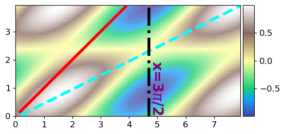
## make some data ##
yy, xx = np.indices((64, 128))/16
     #makes x & y values corresponding to the indices of a 64x128 grid, divided by 16.
data   = np.sin(xx+yy)*np.cos(yy)

## plot the data ##
extent = [np.min(xx), np.max(xx), np.min(yy), np.max(yy)]
plt.imshow(data, extent=extent, cmap='terrain', alpha=0.7) #alpha is used here just to make the colors less bright.
pqol.colorbar()        #makes a nice colorbar. See Colors & Colorbars page of wiki for more details.

## begin to use pqol function: line_on_imshow ##
pqol.line_on_imshow(1, 0, color='red', ls='-', linewidth=4)
    #makes a red solid line with slope=1, y_intercept=0.
pqol.line_on_imshow(**pqol.linecalc([1.5, 7.5], [0.7, 3.7]), color='cyan', ls='--', linewidth=4)
    #makes a cyan dashed line going through the points (x1,y1)=(1.5,0.7), (x2,y2)=(7.5,3.7)

## note that you could use vline or hline to draw lines as well! Here is an example: ##
pqol.vline(3*np.pi/2, "x=3$\pi$/2", textparams={'color':'purple', 'fontsize':20, 'weight':'bold'}, \
           textloc=0.5, textside='right', textdirection='down', color='black', ls='-.', linewidth=4)
    #makes a vertical line at x=3pi/2, labels it with "x=3$\pi$/2" in purple bold fontsize=20 text,
    #with the start of the text located halfway up the y-axis, on the right side of the line,
    #with text going downwards. The line itself is black and dash-dotted.
Notes:
- The cyan line is created using
pqol.linecalc()to determine its slope and y-intercept.pqol.linecalc(x1x2, y1y2)takes as inputs the x coordinates of two points and y coordinates of those same two points, and returnsdict(m=slope, b=y_intercept). - You can plot lines outside of imshow as well. For example, make a
plt.plot()then plot a line of best fit. That is a bit less difficult than plotting on top of images; you can either figure it out on your own, or usepqol.plotline(xdata, m, b, xb=0, **pltplotkwargs), withxdata=x-coordinates of points where you want the line to be plotted,m=slope,b=y-intercept,xb=x-coordinate where y=b(for a y-intercept, this is at x=0. Puttingxb!=0 meansbis no longer actually the y-intercept). - For more info on
pqol.colorbar()and other color-relatedpqolfunctions, see Colors & Colorbars