Annotation
On this page are examples of how QOL.plots can help you annotate plots:
- Create a horizontal or vertical line and label it with text
- Find the "least bad" spot on a plot for annotation, and...
- (NOTE: THESE ARE CURRENTLY NOT UPDATED TO REFLECT RECENT CHANGES)
- ...put a textbox there
- ...put a legend there (TODO: this example)
- ...show visually the "badness" grid
Before running any of the following examples, make sure to do:
import matplotlib.pyplot as plt
import numpy as np
import QOL.plots as pqolpqol.hline(y0, "hello") #line at y=y0 [data coords] labeled "hello"
#or
pqol.vline(x0, "oh hi") #line at x=x0 [data coords] labeled "oh hi"For more complicated usage, see the images and description below.
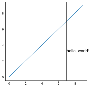
## Labeled hline, with a black vline for reference ##
plt.plot(range(10)) #initial plot
pqol.hline(3, "hello, world!", textloc=7, textspec="data") #hline at y=3, text at x=7.
#textspec = coord system for textloc. it is "axes" by default.
pqol.vline(7, color="black") #vline at x=7.
plt.show()
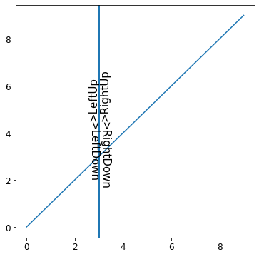
## Labeled vline
plt.plot(range(10)) #initial plot
pqol.vline(3, ">LeftUp") #default textside and textdirection.
pqol.vline(3, ">LeftDown", textdirection='down') #default textside.
pqol.vline(3, ">RightUp", textside='right') #default textdirection.
pqol.vline(3, ">RightDown", textside='right', textdirection='down')
plt.show()There are many more ways to relatively easily customize text/line placement, text properties, line color/style, and more. For further information see the documentation for pqol.hline and pqol.vline, e.g. via help(pqol.hline) and help(pqol.vline).
pqol.text("Hello, World!") #places textbox with "Hello, World!" on plot, at "emptiest" spot.For more complicated uses, check out the example image generated by the code below.
(NOTE: THIS IS CURRENTLY NOT UPDATED TO REFLECT RECENT CHANGES)
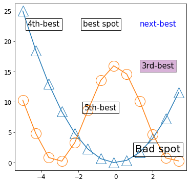
x = np.arange(-5, 4, 0.7)                             #pick some x data
plotstyle = dict(markersize=20, fillstyle='none')     #just for style
plt.plot(x,       x**2     , marker='^', **plotstyle) #plot    x^2   , with style
plt.plot(x, 8*(1+np.cos(x)), marker='o', **plotstyle) #plot 8+8cos(x), with style
pqol.text("best spot", badness=0)
pqol.text("next-best", badness=1, color="blue", bbox=None)
pqol.text("3rd-best", badness=2, bbox=dict(facecolor='purple', alpha=0.3))
pqol.text("4th-best", badness=3)
pqol.text("5th-best", badness=4)
pqol.text("Bad spot", badness=10, fontsize=30)
plt.show()(NOTE: RECENT CHANGES HAVE MADE THIS FUNCTION OBSOLETE)
pqol.locs_visual()If having trouble getting your annotations to go where you want them, try using locs_visual, choosing the number you want, and passing that to pqol.text or pqol.legend using the parameter badness. (For example, pqol.legend(badness=2) will put the legend in the box that is labeled 2 by locs_visual)
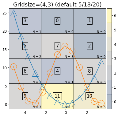
x = np.arange(-5, 4, 0.7)
plotstyle = dict(markersize=20, fillstyle='none') #just for style
plt.plot(x, x**2 , marker='^', **plotstyle) #plot, with style
plt.plot(x, 8*(1+np.cos(x)), marker='o', **plotstyle) #plot, with style
plt.title("Gridsize=(4,3) (default 5/18/20)") #default at time of writing
pqol.locs_visual()
plt.show()
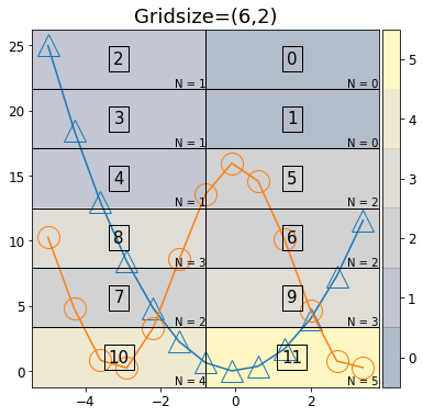
x = np.arange(-5, 4, 0.7)
plotstyle = dict(markersize=20, fillstyle='none') #just for style
plt.plot(x, x**2 , marker='^', **plotstyle) #plot, with style
plt.plot(x, 8*(1+np.cos(x)), marker='o', **plotstyle) #plot, with style
plt.title("Gridsize=(6,2)")
pqol.locs_visual(gridsize=(6,2))
plt.show()The values (N=__) in the lower corner of each box represent the number of data points in that box. This overlap is what determines "badness" (in ascending order, i.e. low badness means low overlap).
You can also adjust the grid size via the gridsize optional parameter, in this function (and also in pqol.text() and pqol.legend()). For example, pqol.legend(badness=2, gridsize=(6,2)) will put the legend in the box labeled 2 in the "gridsize=(6,2)" image). By default at time of writing, gridsize=(4,3), for 4 rows and 3 columns.