Skip to content

Conversation

@spencercanner
Copy link
Contributor

@spencercanner spencercanner commented Apr 12, 2021

WHY are these changes introduced?

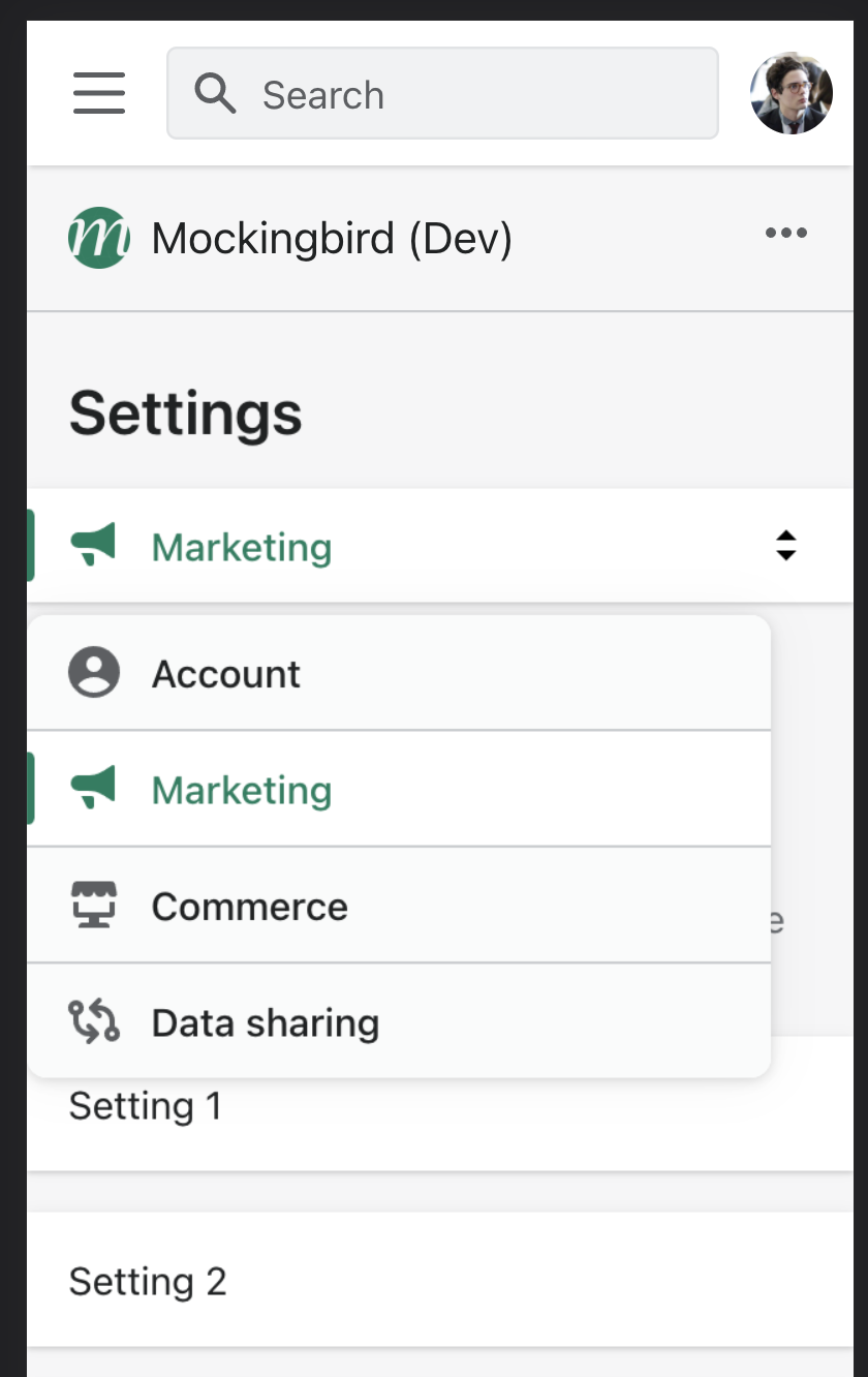
Full width popovers have a max width of 100vw - 3.2rem, which results in a popover that is smaller than the viewport on narrow screens. Since no horizontal margins are applied, the popover defaults to being left aligned on the screen.

Narrow screen with an open popover that is left aligned

Given the popover is smaller than the viewport width and has rounded corners, it should be centered aligned on the screen regardless of the preferred alignment.

WHAT is this pull request doing?

  • Add in auto horizontal margins to full width popovers to ensure that it is centered on smaller viewports

Narrow screen with an open popover that is center aligned

How to 🎩

🖥 Local development instructions
🗒 General tophatting guidelines
📄 Changelog guidelines

  • Verify that full width popovers still take up the full width on larger viewports (positioned above and below the activator)
  • Verify that the popover is centered above/below the activator when its width is smaller
Copy-paste this code in playground/Playground.tsx:
import React, {useState} from 'react';

import {Button, Page, Popover} from '../src';

export function Playground() {
  const [popover1Active, setPopover1Active] = useState(false);
  const [popover2Active, setPopover2Active] = useState(false);

  const togglePopover1 = () => {
    setPopover1Active(!popover1Active);
  };

  const togglePopover2 = () => {
    setPopover2Active(!popover2Active);
  };

  const activatorBelow = (
    <Button onClick={togglePopover1}>Button with popover below</Button>
  );

  const activatorAbove = (
    <Button onClick={togglePopover2}>Button with popover above</Button>
  );

  return (
    <Page title="Playground">
      <Popover
        active={popover1Active}
        onClose={togglePopover1}
        fullWidth
        activator={activatorBelow}
        sectioned
      >
        <p>some text</p>
      </Popover>
      <br />
      <br />
      <Popover
        active={popover2Active}
        onClose={togglePopover2}
        fullWidth
        preferredPosition="above"
        activator={activatorAbove}
        sectioned
      >
        <p>some text</p>
      </Popover>
    </Page>
  );
}

🎩 checklist

  • Tested on mobile
  • Tested on multiple browsers
  • Tested for accessibility
  • Updated the component's README.md with documentation changes
  • Tophatted documentation changes in the style guide
  • For visual design changes, pinged one of @ HYPD, @ mirualves, @ sarahill, or @ ry5n to update the Polaris UI kit

@github-actions
Copy link
Contributor

github-actions bot commented Apr 12, 2021

🟡 This pull request modifies 2 files and might impact 60 other files. This is an average splash zone for a change, remember to tophat areas that could be affected.

Details:
All files potentially affected (total: 60)
📄 UNRELEASED.md (total: 0)

Files potentially affected (total: 0)

🎨 src/components/Popover/Popover.scss (total: 60)

Files potentially affected (total: 60)

@alex-page alex-page force-pushed the main branch 7 times, most recently from 2c6e842 to d2611d6 Compare June 11, 2021 16:24
Copy link
Member

@kyledurand kyledurand left a comment

Choose a reason for hiding this comment

The reason will be displayed to describe this comment to others. Learn more.

Code looks good but I'm wondering if we really need this to be centered, especially if it overrides the alignment prop. Can you ping a designer on this change?

@spencercanner
Copy link
Contributor Author

we made this change for a component we use in channel apps, which leverages a full width popover on smaller viewports. since the popover has a border radius, we wanted to give a bit of margin between the edge of the screen and the start of the popover

current desired

since the preferredAlignment prop doesn't currently have an effect on the alignment for full width popovers, we opted to force center alignment on smaller viewports so there would be some margin on both sides. this change shouldn't have an impact on the alignment for non-full width popovers.

chatted with my team's designer (@stephentjoa) and we're happy to align with the Polaris pattern for popovers, so if the left alignment is expected then we can close this. but happy to get this ready to merge otherwise

cc @sarahill

@sarahill
Copy link
Contributor

sarahill commented Dec 1, 2021

I'm ok with the center alignment but agree with Kyle it does feel a little odd if it overrides the alignment prop. That being said I recognize you mentioned the alignment prop doesn't affect full-width popovers.

One question I have: do you know if it gets weird on mid breakpoints?

If this is the desired affect and it doesn't negatively affect other areas using the component I'm ok with the change

@spencercanner
Copy link
Contributor Author

The alignment prop doesn't have an impact on full width popovers, and this change will only apply to full width popovers, so there shouldn't be any negative impact on existing any popovers. The only change that should happen is shown in the gifs below

Before:
old-popover

After:
new-popover

@sarahill
Copy link
Contributor

sarahill commented Dec 1, 2021

Thanks for that context! I'm cool with that 🚢

@github-actions
Copy link
Contributor

github-actions bot commented Dec 3, 2021

size-limit report

Path Size
cjs 165.74 KB (0%)
esm 96.39 KB (0%)
esnext 143.07 KB (-0.01% 🔽)
css 34.34 KB (+0.02% 🔺)

Copy link
Member

@kyledurand kyledurand left a comment

Choose a reason for hiding this comment

The reason will be displayed to describe this comment to others. Learn more.

Looks good to me just left a couple of non-blocking comments around conventions and past tense in UNRELEASED.
@spencercanner spencercanner merged commit ff5642c into main Dec 3, 2021
@spencercanner spencercanner deleted the popover-full-width branch December 3, 2021 18:29
Sign up for free to join this conversation on GitHub. Already have an account? Sign in to comment

Labels

None yet

Projects

None yet

Development

Successfully merging this pull request may close these issues.

3 participants