[Page] Sync small screen header with native mobile #707
Conversation
 chloerice
force-pushed
the
page-mobile-rollup
branch
from
chloerice
force-pushed
the
page-mobile-rollup
branch
from
2c5ff2a to
9fcd725
Compare
chloerice
force-pushed
the
page-mobile-rollup
branch
from
9fcd725 to
80b5a56
Compare
| .PrimaryAction { | ||
| display: flex; | ||
| align-self: stretch; | ||
| // align-self: stretch; |
There was a problem hiding this comment.
| // align-self: stretch; |
|
Hi all! It looks like this is ready to merge and just needs some Percy review and an |
|

|
☝️ I'm seeing the same things as @tmlayton when I look at the deployment. When I tested locally with the different variations I wasn't seeing these issues. |
chloerice
force-pushed
the
page-mobile-rollup
branch
from
80b5a56 to
5195b61
Compare
chloerice
force-pushed
the
page-mobile-rollup
branch
from
5195b61 to
ad444a5
Compare
chloerice
force-pushed
the
page-mobile-rollup
branch
from
ad444a5 to
d4c43d2
Compare
chloerice
force-pushed
the
page-mobile-rollup
branch
from
d4c43d2 to
8077d57
Compare
|
@tmlayton @sarahill I've fixed all issues 👍 Be sure to hard refresh and clear your cache when viewing the examples in the latest deployment 😺
Regarding the difference in fill between the example in the issue and this PR: I don't think it would add value to write smelly Sass in order to override the fill of the plain icon button. All plain buttons have |
|
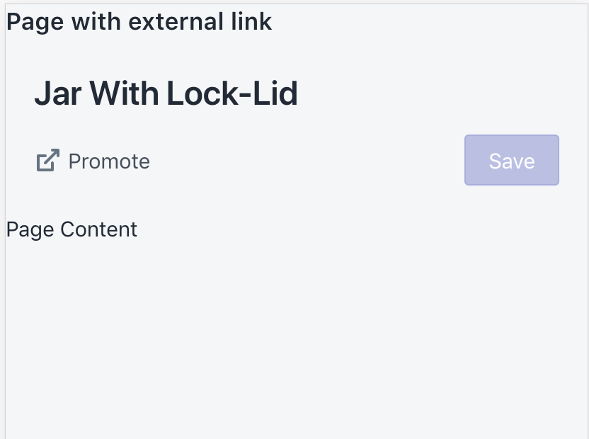
The alignnment is looking good to me just seeing a couple things still. The example with external link and action groups isn't rolling up.
|
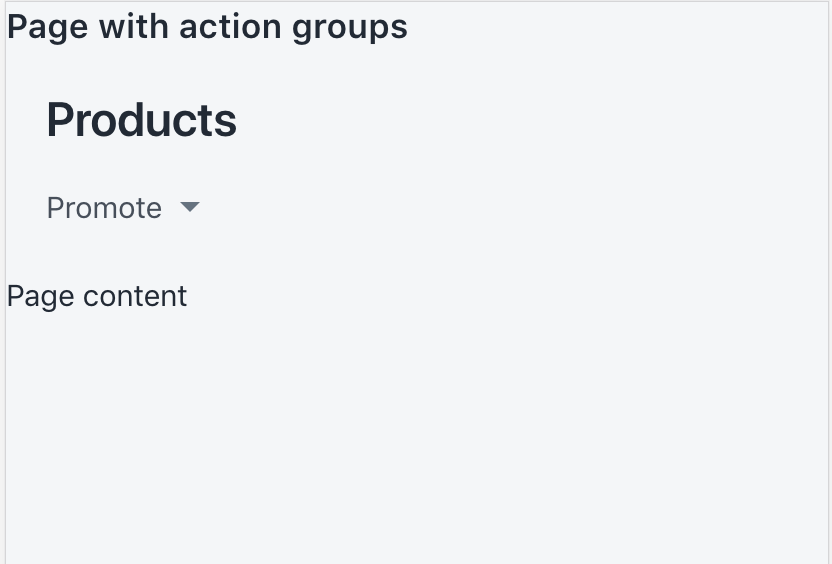
Hey @sarahill, the current UX for the rollup is that it only rolls up when the actions don't fit. Is part of the desired outcome of this feature request to change that so that actions (other than the primary) always rollup? |
|
@chloerice Ah I see. That was my original thought but this makes more sense. Show them if we can and roll them up if they don't fit. Thanks for clarifying 👍 and thank you again for doing this 🙌 |
|
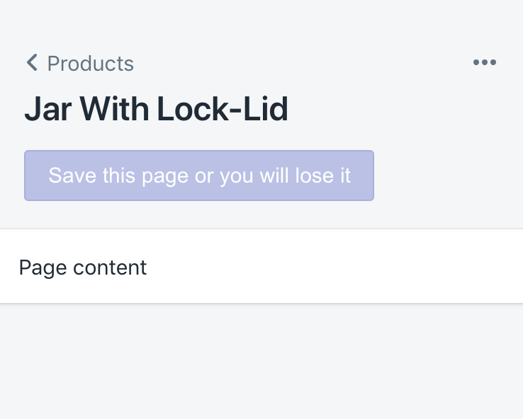
@sarahill Dug into it further and I think your original thought was right and updated for consistency's sake. Primary button labels can get pretty lengthy in German, don't want to end up in situations like this:
|
 chloerice
force-pushed
the
page-mobile-rollup
branch
from
chloerice
force-pushed
the
page-mobile-rollup
branch
from
8077d57 to
b20287a
Compare
chloerice
force-pushed
the
page-mobile-rollup
branch
from
b20287a to
13e587e
Compare
chloerice
force-pushed
the
page-mobile-rollup
branch
from
13e587e to
f0e9860
Compare
chloerice
force-pushed
the
page-mobile-rollup
branch
from
f0e9860 to
42000da
Compare
|
☝️ nice catch! |
|
@chloerice this looks like it's ready to go. @tmlayton any objections? |
UNRELEASED.md
Outdated
| ### Enhancements | ||
|
|
||
| - Moved icons to a separate npm package ([#686](https://github.com/Shopify/polaris-react/pull/686)) | ||
| - Updated the `Page.Header` so that actions take up less room on small screens ([#707](https://github.com/Shopify/polaris-react/pull/707)) |
There was a problem hiding this comment.
| - Updated the `Page.Header` so that actions take up less room on small screens ([#707](https://github.com/Shopify/polaris-react/pull/707)) | |
| - Updated the `Page` so that actions take up less room on small screens ([#707](https://github.com/Shopify/polaris-react/pull/707)) |
I would just say Page because for a consumer that is the only API they know
| </DisplayText> | ||
| <div className={styles.TitleAndRollup}> | ||
| <div className={styles.Title}> | ||
| {/* Anonymous divs are here for layout purposes */} |
There was a problem hiding this comment.
Just a side note, no need to do anything here, but when I see a comment like this I wonder if we can instead write the code in a more meaningful way like creating a component called AnonymousDivForLayout that just renders a div.
There was a problem hiding this comment.
Nitpick on the changelog entry, also needs a rebase. Otherwise this looks awesome, so much better! Nice work @chloerice, @HYPD, and @ivymukherjee92
 chloerice
force-pushed
the
page-mobile-rollup
branch
from
chloerice
force-pushed
the
page-mobile-rollup
branch
from
42000da to
38398f7
Compare
6 participants
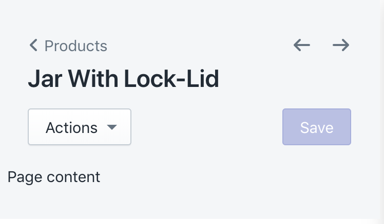
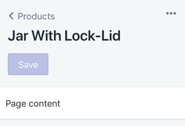
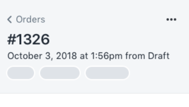
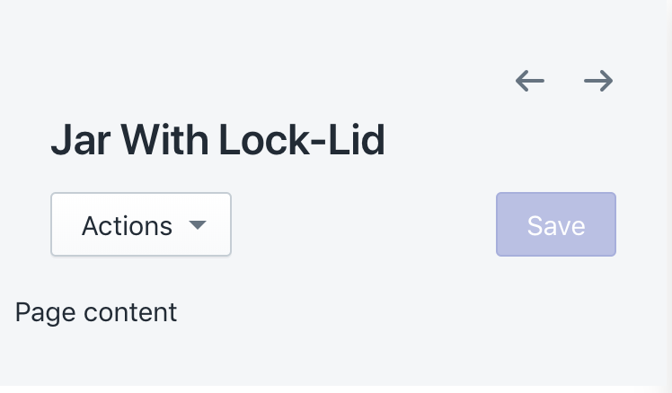
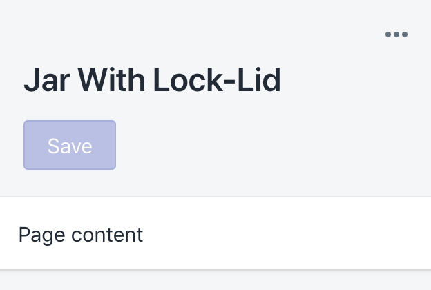
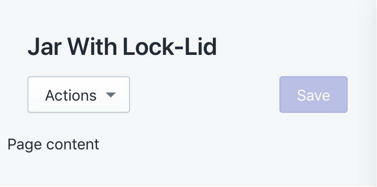
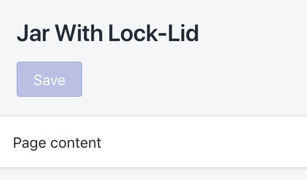
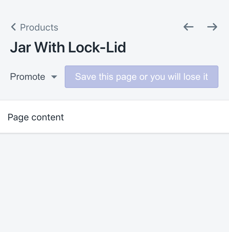
WHY are these changes introduced?
Updates the page component's header to align with the Shopify mobile app's layout, which fixes #706.
WHAT is this pull request doing?
On small screens, the page component's header now rolls up secondary actions and action groups into a plain ellipsis button, which replaces pagination if it exists.
How to 🎩
🖥 Local development instructions
🗒 General tophatting guidelines
📄 Changelog guidelines
git checkout page-mobile-rollup && yarn dev/playground/Playground.tsxand navigate to localhost:8080**breadcrumbsprop to ensure the rollup still aligns right**Click to view collapsed example code
🎩 checklist