[SkeletonPage] Rebuild with layout primitives #7797
Conversation
 chazdean
force-pushed
the
rebuild-skeleton-page
branch
from
chazdean
force-pushed
the
rebuild-skeleton-page
branch
from
99efe2e to
0d0aee0
Compare
size-limit report 📦
|
chazdean
force-pushed
the
rebuild-skeleton-page
branch
from
0d0aee0 to
aa5898f
Compare
chazdean
requested review from
aveline,
kyledurand,
laurkim,
nayeobkim and
sarahill
|
@chaz I created a codepen of how we should be able to use flex to center when https://codepen.io/enileva/pen/xxzjOej then I tried it with the component by wrapping the outer
which worked
but as we know, using Let's try to figure out if we can fix |
…7799)

<!--
  ☝️How to write a good PR title:
- Prefix it with [ComponentName] (if applicable), for example: [Button]
  - Start with a verb, for example: Add, Delete, Improve, Fix…
  - Give as much context as necessary and as little as possible
  - Prefix it with [WIP] while it’s a work in progress
-->

### WHY are these changes introduced?

Supports #7797 which needs access to role attribute

<!--
  Context about the problem that’s being addressed.
-->

### WHAT is this pull request doing?

Adds role attribute support to `Box`

<!--
  Summary of the changes committed.

Before / after screenshots are appreciated for UI changes. Make sure to
include alt text that describes the screenshot.

If you include an animated gif showing your change, wrapping it in a
details tag is recommended. Gifs usually autoplay, which can cause
accessibility issues for people reviewing your PR:

    <details>
      <summary>Summary of your gif(s)</summary>
      <img src="..." alt="Description of what the gif shows">
    </details>
-->

<!-- ℹ️ Delete the following for small / trivial changes -->

Co-authored-by: Kyle Durand <kyledurand@users.noreply.github.com>
chazdean
force-pushed
the
layout-components-beta
branch
from
eebe9a8 to
eca95d5
Compare
chazdean
force-pushed
the
rebuild-skeleton-page
branch
from
39c661e to
aa28250
Compare
|
I looked at It's overriding the @laurkim @kyledurand any context on why we added |
Might have something to do with the For now, as an unblocker, we could remove the max width and do: .fullWidth {
> * {
flex: 1 1 auto;
}
}And see if that causes any visual regressions. We shouldn't need to use width on a flex container these days. OR Try removing the fullWidth prop because I'm not sure it's used anywhere and it's kind of misleading. The flex container should take the full width anyway and messing with the |

@aveline @kyledurand I think it was added to fix a bug on content when the @chazdean can we add separate storybook examples for SkeletonPage with |
chazdean
changed the base branch from
layout-components-beta
to
layout-rebuild-batch-2
chazdean
force-pushed
the
rebuild-skeleton-page
branch
2 times, most recently
from
adf8e99 to
cd530d3
Compare
Yea, this is one I expected we'd have to manually set as it does behave differently. Expected behavior: Page title remains
|
…7799)

<!--
  ☝️How to write a good PR title:
- Prefix it with [ComponentName] (if applicable), for example: [Button]
  - Start with a verb, for example: Add, Delete, Improve, Fix…
  - Give as much context as necessary and as little as possible
  - Prefix it with [WIP] while it’s a work in progress
-->

### WHY are these changes introduced?

Supports #7797 which needs access to role attribute

<!--
  Context about the problem that’s being addressed.
-->

### WHAT is this pull request doing?

Adds role attribute support to `Box`

<!--
  Summary of the changes committed.

Before / after screenshots are appreciated for UI changes. Make sure to
include alt text that describes the screenshot.

If you include an animated gif showing your change, wrapping it in a
details tag is recommended. Gifs usually autoplay, which can cause
accessibility issues for people reviewing your PR:

    <details>
      <summary>Summary of your gif(s)</summary>
      <img src="..." alt="Description of what the gif shows">
    </details>
-->

<!-- ℹ️ Delete the following for small / trivial changes -->

Co-authored-by: Kyle Durand <kyledurand@users.noreply.github.com>
There was a problem hiding this comment.
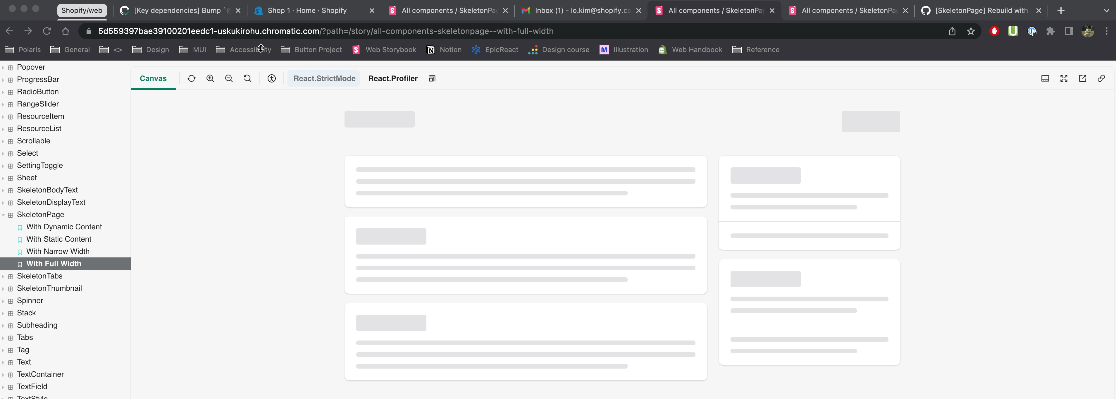
I recommend decoupling the new full width and narrow width stories from this PR and just merging those into main directly, then rebasing this and layout-rebuild-batch-2 to pick up the changes (or dropping the commit to add those stories).
I tested the existing SkeletonPage without any of the layout primitive changes off latest main with those new stories added and I'm seeing a difference for the withFullWidth example. Here's a gif comparing the chromatic from this PR and me running latest main with the story locally.
Also, looks like this is exceeding size limit. Can we bump to the threshold to 220 kb?
<!--
  ☝️How to write a good PR title:
- Prefix it with [ComponentName] (if applicable), for example: [Button]
  - Start with a verb, for example: Add, Delete, Improve, Fix…
  - Give as much context as necessary and as little as possible
  - Prefix it with [WIP] while it’s a work in progress
-->

### WHY are these changes introduced?

The `SkeletonPage` rebuild
[PR](#7797) currently in progress
is exceeding the size limit. This PR increases the size limit threshold
from `216 kB` to `220 kB` to allow the size limit check to pass

<!--
  Context about the problem that’s being addressed.
-->
 chazdean
force-pushed
the
rebuild-skeleton-page
branch
from
chazdean
force-pushed
the
rebuild-skeleton-page
branch
from
573bfd0 to
ce0b85f
Compare
 laurkim
left a comment
laurkim
left a comment
laurkim
left a comment
There was a problem hiding this comment.
Tophatted stories at all breakpoints against latest main running locally and lgtm! Nice 💯
Co-authored-by: Lo Kim <lo.kim@shopify.com>
chazdean
force-pushed
the
rebuild-skeleton-page
branch
from
ce0b85f to
1d1bb69
Compare
<!--
  ☝️How to write a good PR title:
- Prefix it with [ComponentName] (if applicable), for example: [Button]
  - Start with a verb, for example: Add, Delete, Improve, Fix…
  - Give as much context as necessary and as little as possible
  - Prefix it with [WIP] while it’s a work in progress
-->

Fixes [#7714](#7714)

<!--
  Context about the problem that’s being addressed.
-->

- Refactors `SkeletonPage` and its child components to use our layout
primitives.
- Removes `max-width: 100%` property from AlphaStack
- Adds storybook examples for `SkeletonPage` with `narrowWidth` and with
`fullWidth` props

   <details>
<summary>Unable to center `SkeletonPage` when `narrowWidth` prop is used
- SOLVED ✅</summary>
<table>
<tr>
<td> Before </td> <td> After </td>
</tr>
<tr>
<td> <img width="400" alt="Screenshot 2022-11-24 at 9 13 21 AM"
src="https://user-images.githubusercontent.com/59836805/203805854-4748a46a-8208-476e-9c16-d0071e4ff66b.png">
</td>
<td> <img width="400" alt="Screenshot 2022-11-24 at 9 10 25 AM"
src="https://user-images.githubusercontent.com/59836805/203806188-bd5cde58-0787-46f1-a2b3-cbaf2a228d52.png">
</td>
</tr>
<tr>
<td> <img width="400" alt="Screenshot 2022-11-24 at 9 13 42 AM"
src="https://user-images.githubusercontent.com/59836805/203806392-466df6a0-29ee-4d06-bc40-523b60b97853.png">
</td>
<td> <img width="400" alt="Screenshot 2022-11-24 at 9 11 17 AM"
src="https://user-images.githubusercontent.com/59836805/203806492-6793f6a3-591a-4cb4-9f13-46da44f64dfe.png">
</td>
</tr>
</table>
    </details>

<details>
<summary>Our current `Text` component has the opposite breakpoint
behaviour compared to how `.Title` is used in `SkeletonPage` - SOLVED
✅</summary>
      <table>
<tr>
<td> Before </td> <td> After </td>
</tr>
<tr>
<td> <img width="400" alt="before text"
src="https://user-images.githubusercontent.com/59836805/203808391-3f3bd9d2-421e-4e09-a843-e579b936d39f.gif">
</td>
<td> <img width="400" alt="before text"
src="https://user-images.githubusercontent.com/59836805/203808879-55e311ef-708b-44c9-a28e-4582c77d0992.gif">
</td>
</tr>
<tr>
<td>

```java
.Title {
  font-weight: var(--p-font-weight-semibold);
  font-size: 24px;
  line-height: 28px;

  @media #{$p-breakpoints-md-up} {
    font-size: 20px;
  }
}
```

 </td>
<td>

```java
.headingXl {
  font-size: var(--p-font-size-300);
  line-height: var(--p-font-line-height-3);

  @media #{$p-breakpoints-md-up} {
    font-size: var(--p-font-size-400);
    line-height: var(--p-font-line-height-4);
  }
}
```

</td>
</tr>
</table>
    </details>

~~`role` prop is missing from `Box`, creating a separate issue to solve
this [here](#7799 SOLVED ✅

<!--
  Summary of the changes committed.

Before / after screenshots are appreciated for UI changes. Make sure to
include alt text that describes the screenshot.

If you include an animated gif showing your change, wrapping it in a
details tag is recommended. Gifs usually autoplay, which can cause
accessibility issues for people reviewing your PR:

    <details>
      <summary>Summary of your gif(s)</summary>
      <img src="..." alt="Description of what the gif shows">
    </details>
-->

<!-- ℹ️ Delete the following for small / trivial changes -->

- [ ] Tested on
[mobile](https://github.com/Shopify/polaris/blob/main/documentation/Tophatting.md#cross-browser-testing)
- [ ] Tested on [multiple
browsers](https://help.shopify.com/en/manual/shopify-admin/supported-browsers)
- [ ] Tested for
[accessibility](https://github.com/Shopify/polaris/blob/main/documentation/Accessibility%20testing.md)
- [ ] Updated the component's `README.md` with documentation changes
- [ ] [Tophatted
documentation](https://github.com/Shopify/polaris/blob/main/documentation/Tophatting%20documentation.md)
changes in the style guide

Co-authored-by: Lo Kim <lo.kim@shopify.com>
<!--
  ☝️How to write a good PR title:
- Prefix it with [ComponentName] (if applicable), for example: [Button]
  - Start with a verb, for example: Add, Delete, Improve, Fix…
  - Give as much context as necessary and as little as possible
  - Prefix it with [WIP] while it’s a work in progress
-->

Fixes [#7714](#7714)

<!--
  Context about the problem that’s being addressed.
-->

- Refactors `SkeletonPage` and its child components to use our layout
primitives.
- Removes `max-width: 100%` property from AlphaStack
- Adds storybook examples for `SkeletonPage` with `narrowWidth` and with
`fullWidth` props

   <details>
<summary>Unable to center `SkeletonPage` when `narrowWidth` prop is used
- SOLVED ✅</summary>
<table>
<tr>
<td> Before </td> <td> After </td>
</tr>
<tr>
<td> <img width="400" alt="Screenshot 2022-11-24 at 9 13 21 AM"
src="https://user-images.githubusercontent.com/59836805/203805854-4748a46a-8208-476e-9c16-d0071e4ff66b.png">
</td>
<td> <img width="400" alt="Screenshot 2022-11-24 at 9 10 25 AM"
src="https://user-images.githubusercontent.com/59836805/203806188-bd5cde58-0787-46f1-a2b3-cbaf2a228d52.png">
</td>
</tr>
<tr>
<td> <img width="400" alt="Screenshot 2022-11-24 at 9 13 42 AM"
src="https://user-images.githubusercontent.com/59836805/203806392-466df6a0-29ee-4d06-bc40-523b60b97853.png">
</td>
<td> <img width="400" alt="Screenshot 2022-11-24 at 9 11 17 AM"
src="https://user-images.githubusercontent.com/59836805/203806492-6793f6a3-591a-4cb4-9f13-46da44f64dfe.png">
</td>
</tr>
</table>
    </details>

<details>
<summary>Our current `Text` component has the opposite breakpoint
behaviour compared to how `.Title` is used in `SkeletonPage` - SOLVED
✅</summary>
      <table>
<tr>
<td> Before </td> <td> After </td>
</tr>
<tr>
<td> <img width="400" alt="before text"
src="https://user-images.githubusercontent.com/59836805/203808391-3f3bd9d2-421e-4e09-a843-e579b936d39f.gif">
</td>
<td> <img width="400" alt="before text"
src="https://user-images.githubusercontent.com/59836805/203808879-55e311ef-708b-44c9-a28e-4582c77d0992.gif">
</td>
</tr>
<tr>
<td>

```java
.Title {
  font-weight: var(--p-font-weight-semibold);
  font-size: 24px;
  line-height: 28px;

  @media #{$p-breakpoints-md-up} {
    font-size: 20px;
  }
}
```

 </td>
<td>

```java
.headingXl {
  font-size: var(--p-font-size-300);
  line-height: var(--p-font-line-height-3);

  @media #{$p-breakpoints-md-up} {
    font-size: var(--p-font-size-400);
    line-height: var(--p-font-line-height-4);
  }
}
```

</td>
</tr>
</table>
    </details>

~~`role` prop is missing from `Box`, creating a separate issue to solve
this [here](#7799 SOLVED ✅

<!--
  Summary of the changes committed.

Before / after screenshots are appreciated for UI changes. Make sure to
include alt text that describes the screenshot.

If you include an animated gif showing your change, wrapping it in a
details tag is recommended. Gifs usually autoplay, which can cause
accessibility issues for people reviewing your PR:

    <details>
      <summary>Summary of your gif(s)</summary>
      <img src="..." alt="Description of what the gif shows">
    </details>
-->

<!-- ℹ️ Delete the following for small / trivial changes -->

- [ ] Tested on
[mobile](https://github.com/Shopify/polaris/blob/main/documentation/Tophatting.md#cross-browser-testing)
- [ ] Tested on [multiple
browsers](https://help.shopify.com/en/manual/shopify-admin/supported-browsers)
- [ ] Tested for
[accessibility](https://github.com/Shopify/polaris/blob/main/documentation/Accessibility%20testing.md)
- [ ] Updated the component's `README.md` with documentation changes
- [ ] [Tophatted
documentation](https://github.com/Shopify/polaris/blob/main/documentation/Tophatting%20documentation.md)
changes in the style guide

Co-authored-by: Lo Kim <lo.kim@shopify.com>
…hopify#7799)

<!--
  ☝️How to write a good PR title:
- Prefix it with [ComponentName] (if applicable), for example: [Button]
  - Start with a verb, for example: Add, Delete, Improve, Fix…
  - Give as much context as necessary and as little as possible
  - Prefix it with [WIP] while it’s a work in progress
-->

### WHY are these changes introduced?

Supports Shopify#7797 which needs access to role attribute

<!--
  Context about the problem that’s being addressed.
-->

### WHAT is this pull request doing?

Adds role attribute support to `Box`

<!--
  Summary of the changes committed.

Before / after screenshots are appreciated for UI changes. Make sure to
include alt text that describes the screenshot.

If you include an animated gif showing your change, wrapping it in a
details tag is recommended. Gifs usually autoplay, which can cause
accessibility issues for people reviewing your PR:

    <details>
      <summary>Summary of your gif(s)</summary>
      <img src="..." alt="Description of what the gif shows">
    </details>
-->

<!-- ℹ️ Delete the following for small / trivial changes -->

Co-authored-by: Kyle Durand <kyledurand@users.noreply.github.com>
<!--
  ☝️How to write a good PR title:
- Prefix it with [ComponentName] (if applicable), for example: [Button]
  - Start with a verb, for example: Add, Delete, Improve, Fix…
  - Give as much context as necessary and as little as possible
  - Prefix it with [WIP] while it’s a work in progress
-->

### WHY are these changes introduced?

The `SkeletonPage` rebuild
[PR](Shopify#7797) currently in progress
is exceeding the size limit. This PR increases the size limit threshold
from `216 kB` to `220 kB` to allow the size limit check to pass

<!--
  Context about the problem that’s being addressed.
-->
5 participants
WHY are these changes introduced?
Fixes #7714
WHAT is this pull request doing?
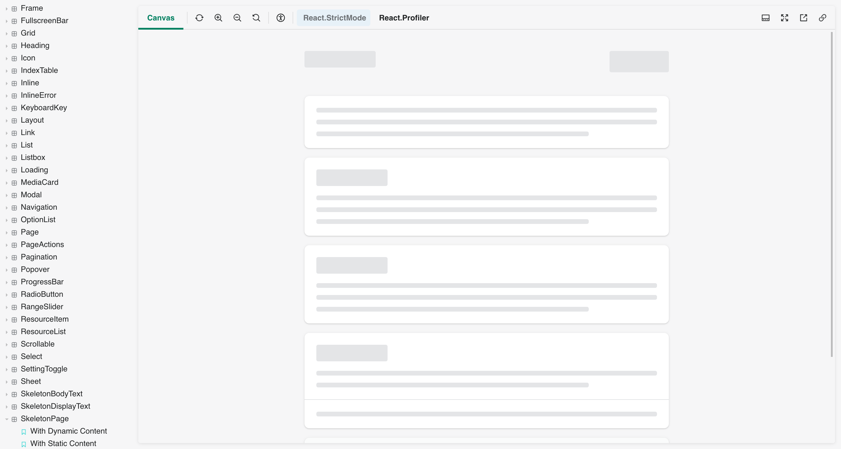
SkeletonPageand its child components to use our layout primitives.max-width: 100%property from AlphaStackSkeletonPagewithnarrowWidthand withfullWidthpropsIssues with current PR:
Unable to center `SkeletonPage` when `narrowWidth` prop is used - SOLVED ✅
Our current `Text` component has the opposite breakpoint behaviour compared to how `.Title` is used in `SkeletonPage` - SOLVED ✅
roleprop is missing fromBox, creating a separate issue to solve this here🎩 checklist
README.mdwith documentation changes