Update New badge pattern #8110
Merged
Update New badge pattern #8110
Conversation
This file contains hidden or bidirectional Unicode text that may be interpreted or compiled differently than what appears below. To review, open the file in an editor that reveals hidden Unicode characters.
Learn more about bidirectional Unicode characters
alex-page
reviewed
Jan 19, 2023
| - Use a major icon for item actions. | ||
| - Use a minor icon for secondary actions. | ||
| - Use the provided navigation section component to group navigation items. | ||
| - Not use the [New badge](/patterns/new-badge) in navigation items. |
Member
There was a problem hiding this comment.
I wonder if the documentation could be.. "Do not add additional components like Badge into the navigation". I foresee people trying to sneak other components in.
Contributor
alex-page
approved these changes
Jan 19, 2023
Member
 alex-page
left a comment
alex-page
left a comment
alex-page
left a comment
There was a problem hiding this comment.
Looks good to me. One comment, not blocking.
lizlin2022
reviewed
Jan 20, 2023
 lizlin2022
left a comment
lizlin2022
left a comment
lizlin2022
left a comment
There was a problem hiding this comment.
Looks good to me too, thank you all!
Merged
sophschneider
pushed a commit
that referenced
this pull request
Jan 24, 2023
This PR was opened by the [Changesets
release](https://github.com/changesets/action) GitHub action. When
you're ready to do a release, you can merge this and the packages will
be published to npm automatically. If you're not ready to do a release
yet, that's fine, whenever you add more changesets to main, this PR will
be updated.


# Releases
## @shopify/polaris-icons@6.9.0

### Minor Changes

- [#8139](#8139)
[`b998ca007`](b998ca0)
Thanks [@leileu](https://github.com/leileu)! - Adding content minor icon
for left nav in admin


- [#8094](#8094)
[`94988bc26`](94988bc)
Thanks [@Tamas-Kisss](https://github.com/Tamas-Kisss)! - Added major and
minor icon for Papercheck


- [#8121](#8121)
[`f74e8ffcc`](f74e8ff)
Thanks [@zecarlostorre](https://github.com/zecarlostorre)! - Added
EnterMajor icon

## @shopify/polaris@10.23.0

### Minor Changes

- [#8134](#8134)
[`8d80691b5`](8d80691)
Thanks [@mrcthms](https://github.com/mrcthms)! - Removed the focus ring
from `Listbox` options

### Patch Changes

- [#8093](#8093)
[`60dd5a0c5`](60dd5a0)
Thanks [@highfieldjames](https://github.com/highfieldjames)! - Added
`borderRadius` style to `TooltipOverlay`


- [#8090](#8090)
[`bdcc291a4`](bdcc291)
Thanks [@emmanueletti](https://github.com/emmanueletti)! - Replaced
mouse up and down events on Backdrop with onClick to close Modal


- [#8131](#8131)
[`6096c3492`](6096c34)
Thanks [@henryyi](https://github.com/henryyi)! - Fixed Navigation item
secondaryActions alignment in mobile when floating actions are enabled


- [#8114](#8114)
[`e6aa9c801`](e6aa9c8)
Thanks [@highfieldjames](https://github.com/highfieldjames)! - Dismiss
index table tooltip on mouse out


- [#8091](#8091)
[`23ee70d13`](23ee70d)
Thanks [@ginabak](https://github.com/ginabak)! - Added `onBlur` prop to
numerical steppers (`Spinner` component of `TextField`) to remove multi
focus issue in `TextField`.

- Updated dependencies
\[[`b998ca007`](b998ca0),
[`94988bc26`](94988bc),
[`f74e8ffcc`](f74e8ff)]:
    -   @shopify/polaris-icons@6.9.0

## @shopify/plugin-polaris@0.0.30

### Patch Changes

-   Updated dependencies \[]:
    -   @shopify/polaris-migrator@0.11.1

## @shopify/polaris-migrator@0.11.1

### Patch Changes

- Updated dependencies
\[[`cd150396b`](cd15039)]:
    -   @shopify/stylelint-polaris@5.1.1

## @shopify/stylelint-polaris@5.1.1

### Patch Changes

- [#8097](#8097)
[`cd150396b`](cd15039)
Thanks [@qt314](https://github.com/qt314)! - Fix incorrect unit function
categorization

## polaris.shopify.com@0.30.0

### Minor Changes

- [#8110](#8110)
[`5db7778e4`](5db7778)
Thanks [@yurm04](https://github.com/yurm04)! - Added New badge pattern
guidance for the primary nav

### Patch Changes

- [#8107](#8107)
[`fc30bbd32`](fc30bbd)
Thanks [@Rmnlly](https://github.com/Rmnlly)! - Adding examples for
truncateText and multiple secondary actions and updating props on the
documentation site

- Updated dependencies
\[[`b998ca007`](b998ca0),
[`60dd5a0c5`](60dd5a0),
[`bdcc291a4`](bdcc291),
[`6096c3492`](6096c34),
[`94988bc26`](94988bc),
[`e6aa9c801`](e6aa9c8),
[`8d80691b5`](8d80691),
[`f74e8ffcc`](f74e8ff),
[`23ee70d13`](23ee70d)]:
    -   @shopify/polaris-icons@6.9.0
    -   @shopify/polaris@10.23.0

Co-authored-by: github-actions[bot] <github-actions[bot]@users.noreply.github.com>
Merged
juzser
pushed a commit
to juzser/polaris
that referenced
this pull request
Jul 27, 2023
<!--
  ☝️How to write a good PR title:
- Prefix it with [ComponentName] (if applicable), for example: [Button]
  - Start with a verb, for example: Add, Delete, Improve, Fix…
  - Give as much context as necessary and as little as possible
  - Prefix it with [WIP] while it’s a work in progress
-->

### WHY are these changes introduced?

Adds new guidance to the New badge pattern page to address New badges
being added to the primary admin nav

<!--
  Context about the problem that’s being addressed.
-->

### WHAT is this pull request doing?
Adds a few bullet points to the new badge pattern and the navigation
component documentation

**On the New badge pattern page**
<img width="846" alt="Screenshot 2023-01-19 at 5 01 08 PM"
src="https://user-images.githubusercontent.com/4642404/213581845-76f932ab-b73b-4ef1-afd1-308850fb4231.png">

**On the navigation component page**
<img width="811" alt="Screenshot 2023-01-19 at 5 01 47 PM"
src="https://user-images.githubusercontent.com/4642404/213581863-bbc0426a-7eee-4c7c-b6a1-13dde645c39e.png">


<!--
  Summary of the changes committed.

Before / after screenshots are appreciated for UI changes. Make sure to
include alt text that describes the screenshot.

If you include an animated gif showing your change, wrapping it in a
details tag is recommended. Gifs usually autoplay, which can cause
accessibility issues for people reviewing your PR:

    <details>
      <summary>Summary of your gif(s)</summary>
      <img src="..." alt="Description of what the gif shows">
    </details>
-->

<!-- ℹ️ Delete the following for small / trivial changes -->

### How to 🎩

🖥 [Local development
instructions](https://github.com/Shopify/polaris/blob/main/README.md#local-development)
🗒 [General tophatting
guidelines](https://github.com/Shopify/polaris/blob/main/documentation/Tophatting.md)
📄 [Changelog
guidelines](https://github.com/Shopify/polaris/blob/main/.github/CONTRIBUTING.md#changelog)

<!--
  Give as much information as needed to experiment with the component
  in the playground.
-->

<details>
<summary>Copy-paste this code in
<code>playground/Playground.tsx</code>:</summary>

```jsx
import React from 'react';
import {Page} from '../src';

export function Playground() {
  return (
    <Page title="Playground">
      {/* Add the code you want to test in here */}
    </Page>
  );
}
```

</details>

### 🎩 checklist

- [ ] Tested on
[mobile](https://github.com/Shopify/polaris/blob/main/documentation/Tophatting.md#cross-browser-testing)
- [ ] Tested on [multiple
browsers](https://help.shopify.com/en/manual/shopify-admin/supported-browsers)
- [ ] Tested for
[accessibility](https://github.com/Shopify/polaris/blob/main/documentation/Accessibility%20testing.md)
- [ ] Updated the component's `README.md` with documentation changes
- [ ] [Tophatted
documentation](https://github.com/Shopify/polaris/blob/main/documentation/Tophatting%20documentation.md)
changes in the style guide
juzser
pushed a commit
to juzser/polaris
that referenced
this pull request
Jul 27, 2023
This PR was opened by the [Changesets
release](https://github.com/changesets/action) GitHub action. When
you're ready to do a release, you can merge this and the packages will
be published to npm automatically. If you're not ready to do a release
yet, that's fine, whenever you add more changesets to main, this PR will
be updated.


# Releases
## @shopify/polaris-icons@6.9.0

### Minor Changes

- [Shopify#8139](Shopify#8139)
[`b998ca007`](Shopify@b998ca0)
Thanks [@leileu](https://github.com/leileu)! - Adding content minor icon
for left nav in admin


- [Shopify#8094](Shopify#8094)
[`94988bc26`](Shopify@94988bc)
Thanks [@Tamas-Kisss](https://github.com/Tamas-Kisss)! - Added major and
minor icon for Papercheck


- [Shopify#8121](Shopify#8121)
[`f74e8ffcc`](Shopify@f74e8ff)
Thanks [@zecarlostorre](https://github.com/zecarlostorre)! - Added
EnterMajor icon

## @shopify/polaris@10.23.0

### Minor Changes

- [Shopify#8134](Shopify#8134)
[`8d80691b5`](Shopify@8d80691)
Thanks [@mrcthms](https://github.com/mrcthms)! - Removed the focus ring
from `Listbox` options

### Patch Changes

- [Shopify#8093](Shopify#8093)
[`60dd5a0c5`](Shopify@60dd5a0)
Thanks [@highfieldjames](https://github.com/highfieldjames)! - Added
`borderRadius` style to `TooltipOverlay`


- [Shopify#8090](Shopify#8090)
[`bdcc291a4`](Shopify@bdcc291)
Thanks [@emmanueletti](https://github.com/emmanueletti)! - Replaced
mouse up and down events on Backdrop with onClick to close Modal


- [Shopify#8131](Shopify#8131)
[`6096c3492`](Shopify@6096c34)
Thanks [@henryyi](https://github.com/henryyi)! - Fixed Navigation item
secondaryActions alignment in mobile when floating actions are enabled


- [Shopify#8114](Shopify#8114)
[`e6aa9c801`](Shopify@e6aa9c8)
Thanks [@highfieldjames](https://github.com/highfieldjames)! - Dismiss
index table tooltip on mouse out


- [Shopify#8091](Shopify#8091)
[`23ee70d13`](Shopify@23ee70d)
Thanks [@ginabak](https://github.com/ginabak)! - Added `onBlur` prop to
numerical steppers (`Spinner` component of `TextField`) to remove multi
focus issue in `TextField`.

- Updated dependencies
\[[`b998ca007`](Shopify@b998ca0),
[`94988bc26`](Shopify@94988bc),
[`f74e8ffcc`](Shopify@f74e8ff)]:
    -   @shopify/polaris-icons@6.9.0

## @shopify/plugin-polaris@0.0.30

### Patch Changes

-   Updated dependencies \[]:
    -   @shopify/polaris-migrator@0.11.1

## @shopify/polaris-migrator@0.11.1

### Patch Changes

- Updated dependencies
\[[`cd150396b`](Shopify@cd15039)]:
    -   @shopify/stylelint-polaris@5.1.1

## @shopify/stylelint-polaris@5.1.1

### Patch Changes

- [Shopify#8097](Shopify#8097)
[`cd150396b`](Shopify@cd15039)
Thanks [@qt314](https://github.com/qt314)! - Fix incorrect unit function
categorization

## polaris.shopify.com@0.30.0

### Minor Changes

- [Shopify#8110](Shopify#8110)
[`5db7778e4`](Shopify@5db7778)
Thanks [@yurm04](https://github.com/yurm04)! - Added New badge pattern
guidance for the primary nav

### Patch Changes

- [Shopify#8107](Shopify#8107)
[`fc30bbd32`](Shopify@fc30bbd)
Thanks [@Rmnlly](https://github.com/Rmnlly)! - Adding examples for
truncateText and multiple secondary actions and updating props on the
documentation site

- Updated dependencies
\[[`b998ca007`](Shopify@b998ca0),
[`60dd5a0c5`](Shopify@60dd5a0),
[`bdcc291a4`](Shopify@bdcc291),
[`6096c3492`](Shopify@6096c34),
[`94988bc26`](Shopify@94988bc),
[`e6aa9c801`](Shopify@e6aa9c8),
[`8d80691b5`](Shopify@8d80691),
[`f74e8ffcc`](Shopify@f74e8ff),
[`23ee70d13`](Shopify@23ee70d)]:
    -   @shopify/polaris-icons@6.9.0
    -   @shopify/polaris@10.23.0

Co-authored-by: github-actions[bot] <github-actions[bot]@users.noreply.github.com>
Sign up for free
to join this conversation on GitHub.
Already have an account?
Sign in to comment
4 participants
Add this suggestion to a batch that can be applied as a single commit.
This suggestion is invalid because no changes were made to the code.
Suggestions cannot be applied while the pull request is closed.
Suggestions cannot be applied while viewing a subset of changes.
Only one suggestion per line can be applied in a batch.
Add this suggestion to a batch that can be applied as a single commit.
Applying suggestions on deleted lines is not supported.
You must change the existing code in this line in order to create a valid suggestion.
Outdated suggestions cannot be applied.
This suggestion has been applied or marked resolved.
Suggestions cannot be applied from pending reviews.
Suggestions cannot be applied on multi-line comments.
Suggestions cannot be applied while the pull request is queued to merge.
Suggestion cannot be applied right now. Please check back later.
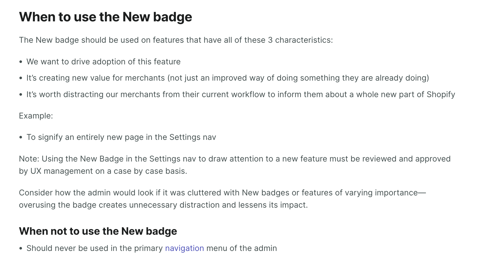
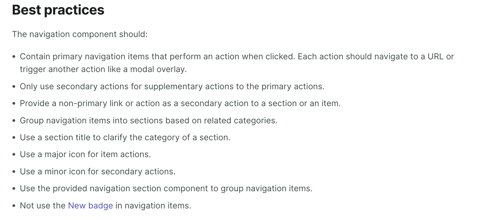
WHY are these changes introduced?
Adds new guidance to the New badge pattern page to address New badges being added to the primary admin nav
WHAT is this pull request doing?
Adds a few bullet points to the new badge pattern and the navigation component documentation
On the New badge pattern page

On the navigation component page

How to 🎩
🖥 Local development instructions
🗒 General tophatting guidelines
📄 Changelog guidelines
Copy-paste this code in
playground/Playground.tsx:🎩 checklist
README.mdwith documentation changes