[Icons] Add "enter" icon #8121
Merged
[Icons] Add "enter" icon #8121
Conversation
This file contains hidden or bidirectional Unicode text that may be interpreted or compiled differently than what appears below. To review, open the file in an editor that reveals hidden Unicode characters.
Learn more about bidirectional Unicode characters
sarahill
approved these changes
Jan 20, 2023
Contributor
 sarahill
left a comment
sarahill
left a comment
sarahill
left a comment
There was a problem hiding this comment.
Looks good! I think the error might be something with the svg but I can't quite tell what it is. Maybe a dev can take a look.
Member
|
@zecarlostorre it looks like the SVG has some values that are not supported in mobile devices. You might need to simplify the svg. If you are struggling to do this reach out to any developer on our team. |
Contributor
Author
|
Thanks for the eyes @sarahill & @alex-page! I think I fixed it. |
kyledurand
approved these changes
Jan 23, 2023
Member
 kyledurand
left a comment
kyledurand
left a comment
kyledurand
left a comment
There was a problem hiding this comment.
Just removed the duplicate changeset entry, changed from patch to minor since this is an enhancement. I think this is good to go now. Thanks José!
Contributor
Author
|
Thanks @kyledurand! 🙌 |
Merged
sophschneider
pushed a commit
that referenced
this pull request
Jan 24, 2023
This PR was opened by the [Changesets
release](https://github.com/changesets/action) GitHub action. When
you're ready to do a release, you can merge this and the packages will
be published to npm automatically. If you're not ready to do a release
yet, that's fine, whenever you add more changesets to main, this PR will
be updated.


# Releases
## @shopify/polaris-icons@6.9.0

### Minor Changes

- [#8139](#8139)
[`b998ca007`](b998ca0)
Thanks [@leileu](https://github.com/leileu)! - Adding content minor icon
for left nav in admin


- [#8094](#8094)
[`94988bc26`](94988bc)
Thanks [@Tamas-Kisss](https://github.com/Tamas-Kisss)! - Added major and
minor icon for Papercheck


- [#8121](#8121)
[`f74e8ffcc`](f74e8ff)
Thanks [@zecarlostorre](https://github.com/zecarlostorre)! - Added
EnterMajor icon

## @shopify/polaris@10.23.0

### Minor Changes

- [#8134](#8134)
[`8d80691b5`](8d80691)
Thanks [@mrcthms](https://github.com/mrcthms)! - Removed the focus ring
from `Listbox` options

### Patch Changes

- [#8093](#8093)
[`60dd5a0c5`](60dd5a0)
Thanks [@highfieldjames](https://github.com/highfieldjames)! - Added
`borderRadius` style to `TooltipOverlay`


- [#8090](#8090)
[`bdcc291a4`](bdcc291)
Thanks [@emmanueletti](https://github.com/emmanueletti)! - Replaced
mouse up and down events on Backdrop with onClick to close Modal


- [#8131](#8131)
[`6096c3492`](6096c34)
Thanks [@henryyi](https://github.com/henryyi)! - Fixed Navigation item
secondaryActions alignment in mobile when floating actions are enabled


- [#8114](#8114)
[`e6aa9c801`](e6aa9c8)
Thanks [@highfieldjames](https://github.com/highfieldjames)! - Dismiss
index table tooltip on mouse out


- [#8091](#8091)
[`23ee70d13`](23ee70d)
Thanks [@ginabak](https://github.com/ginabak)! - Added `onBlur` prop to
numerical steppers (`Spinner` component of `TextField`) to remove multi
focus issue in `TextField`.

- Updated dependencies
\[[`b998ca007`](b998ca0),
[`94988bc26`](94988bc),
[`f74e8ffcc`](f74e8ff)]:
    -   @shopify/polaris-icons@6.9.0

## @shopify/plugin-polaris@0.0.30

### Patch Changes

-   Updated dependencies \[]:
    -   @shopify/polaris-migrator@0.11.1

## @shopify/polaris-migrator@0.11.1

### Patch Changes

- Updated dependencies
\[[`cd150396b`](cd15039)]:
    -   @shopify/stylelint-polaris@5.1.1

## @shopify/stylelint-polaris@5.1.1

### Patch Changes

- [#8097](#8097)
[`cd150396b`](cd15039)
Thanks [@qt314](https://github.com/qt314)! - Fix incorrect unit function
categorization

## polaris.shopify.com@0.30.0

### Minor Changes

- [#8110](#8110)
[`5db7778e4`](5db7778)
Thanks [@yurm04](https://github.com/yurm04)! - Added New badge pattern
guidance for the primary nav

### Patch Changes

- [#8107](#8107)
[`fc30bbd32`](fc30bbd)
Thanks [@Rmnlly](https://github.com/Rmnlly)! - Adding examples for
truncateText and multiple secondary actions and updating props on the
documentation site

- Updated dependencies
\[[`b998ca007`](b998ca0),
[`60dd5a0c5`](60dd5a0),
[`bdcc291a4`](bdcc291),
[`6096c3492`](6096c34),
[`94988bc26`](94988bc),
[`e6aa9c801`](e6aa9c8),
[`8d80691b5`](8d80691),
[`f74e8ffcc`](f74e8ff),
[`23ee70d13`](23ee70d)]:
    -   @shopify/polaris-icons@6.9.0
    -   @shopify/polaris@10.23.0

Co-authored-by: github-actions[bot] <github-actions[bot]@users.noreply.github.com>
Merged
juzser
pushed a commit
to juzser/polaris
that referenced
this pull request
Jul 27, 2023
<!--
  ☝️How to write a good PR title:
- Prefix it with [ComponentName] (if applicable), for example: [Button]
  - Start with a verb, for example: Add, Delete, Improve, Fix…
  - Give as much context as necessary and as little as possible
  - Prefix it with [WIP] while it’s a work in progress
-->

### WHY are these changes introduced?

In the context of new customer accounts, we have the need to explain
how/when buyers will log in to their account. So @heydouble-a proposed a
more general icon for the action of buyers and/or merchants
"authenticating" "gaining access to" or "log in."

### WHAT is this pull request doing?

New icon:
<img width="271" alt="Screenshot 2023-01-20 at 21 40 18"
src="https://user-images.githubusercontent.com/55551051/213810073-0ba3f1ef-34c3-446c-90fd-0713e1551d38.png">

Co-authored-by: Kyle Durand <kyledurand@users.noreply.github.com>
juzser
pushed a commit
to juzser/polaris
that referenced
this pull request
Jul 27, 2023
This PR was opened by the [Changesets
release](https://github.com/changesets/action) GitHub action. When
you're ready to do a release, you can merge this and the packages will
be published to npm automatically. If you're not ready to do a release
yet, that's fine, whenever you add more changesets to main, this PR will
be updated.


# Releases
## @shopify/polaris-icons@6.9.0

### Minor Changes

- [Shopify#8139](Shopify#8139)
[`b998ca007`](Shopify@b998ca0)
Thanks [@leileu](https://github.com/leileu)! - Adding content minor icon
for left nav in admin


- [Shopify#8094](Shopify#8094)
[`94988bc26`](Shopify@94988bc)
Thanks [@Tamas-Kisss](https://github.com/Tamas-Kisss)! - Added major and
minor icon for Papercheck


- [Shopify#8121](Shopify#8121)
[`f74e8ffcc`](Shopify@f74e8ff)
Thanks [@zecarlostorre](https://github.com/zecarlostorre)! - Added
EnterMajor icon

## @shopify/polaris@10.23.0

### Minor Changes

- [Shopify#8134](Shopify#8134)
[`8d80691b5`](Shopify@8d80691)
Thanks [@mrcthms](https://github.com/mrcthms)! - Removed the focus ring
from `Listbox` options

### Patch Changes

- [Shopify#8093](Shopify#8093)
[`60dd5a0c5`](Shopify@60dd5a0)
Thanks [@highfieldjames](https://github.com/highfieldjames)! - Added
`borderRadius` style to `TooltipOverlay`


- [Shopify#8090](Shopify#8090)
[`bdcc291a4`](Shopify@bdcc291)
Thanks [@emmanueletti](https://github.com/emmanueletti)! - Replaced
mouse up and down events on Backdrop with onClick to close Modal


- [Shopify#8131](Shopify#8131)
[`6096c3492`](Shopify@6096c34)
Thanks [@henryyi](https://github.com/henryyi)! - Fixed Navigation item
secondaryActions alignment in mobile when floating actions are enabled


- [Shopify#8114](Shopify#8114)
[`e6aa9c801`](Shopify@e6aa9c8)
Thanks [@highfieldjames](https://github.com/highfieldjames)! - Dismiss
index table tooltip on mouse out


- [Shopify#8091](Shopify#8091)
[`23ee70d13`](Shopify@23ee70d)
Thanks [@ginabak](https://github.com/ginabak)! - Added `onBlur` prop to
numerical steppers (`Spinner` component of `TextField`) to remove multi
focus issue in `TextField`.

- Updated dependencies
\[[`b998ca007`](Shopify@b998ca0),
[`94988bc26`](Shopify@94988bc),
[`f74e8ffcc`](Shopify@f74e8ff)]:
    -   @shopify/polaris-icons@6.9.0

## @shopify/plugin-polaris@0.0.30

### Patch Changes

-   Updated dependencies \[]:
    -   @shopify/polaris-migrator@0.11.1

## @shopify/polaris-migrator@0.11.1

### Patch Changes

- Updated dependencies
\[[`cd150396b`](Shopify@cd15039)]:
    -   @shopify/stylelint-polaris@5.1.1

## @shopify/stylelint-polaris@5.1.1

### Patch Changes

- [Shopify#8097](Shopify#8097)
[`cd150396b`](Shopify@cd15039)
Thanks [@qt314](https://github.com/qt314)! - Fix incorrect unit function
categorization

## polaris.shopify.com@0.30.0

### Minor Changes

- [Shopify#8110](Shopify#8110)
[`5db7778e4`](Shopify@5db7778)
Thanks [@yurm04](https://github.com/yurm04)! - Added New badge pattern
guidance for the primary nav

### Patch Changes

- [Shopify#8107](Shopify#8107)
[`fc30bbd32`](Shopify@fc30bbd)
Thanks [@Rmnlly](https://github.com/Rmnlly)! - Adding examples for
truncateText and multiple secondary actions and updating props on the
documentation site

- Updated dependencies
\[[`b998ca007`](Shopify@b998ca0),
[`60dd5a0c5`](Shopify@60dd5a0),
[`bdcc291a4`](Shopify@bdcc291),
[`6096c3492`](Shopify@6096c34),
[`94988bc26`](Shopify@94988bc),
[`e6aa9c801`](Shopify@e6aa9c8),
[`8d80691b5`](Shopify@8d80691),
[`f74e8ffcc`](Shopify@f74e8ff),
[`23ee70d13`](Shopify@23ee70d)]:
    -   @shopify/polaris-icons@6.9.0
    -   @shopify/polaris@10.23.0

Co-authored-by: github-actions[bot] <github-actions[bot]@users.noreply.github.com>
Sign up for free
to join this conversation on GitHub.
Already have an account?
Sign in to comment
4 participants
Add this suggestion to a batch that can be applied as a single commit.
This suggestion is invalid because no changes were made to the code.
Suggestions cannot be applied while the pull request is closed.
Suggestions cannot be applied while viewing a subset of changes.
Only one suggestion per line can be applied in a batch.
Add this suggestion to a batch that can be applied as a single commit.
Applying suggestions on deleted lines is not supported.
You must change the existing code in this line in order to create a valid suggestion.
Outdated suggestions cannot be applied.
This suggestion has been applied or marked resolved.
Suggestions cannot be applied from pending reviews.
Suggestions cannot be applied on multi-line comments.
Suggestions cannot be applied while the pull request is queued to merge.
Suggestion cannot be applied right now. Please check back later.
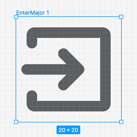
WHY are these changes introduced?
In the context of new customer accounts, we have the need to explain how/when buyers will log in to their account. So @heydouble-a proposed a more general icon for the action of buyers and/or merchants "authenticating" "gaining access to" or "log in."
WHAT is this pull request doing?
New icon:
