A customizable Flutter widget that elegantly disables child widgets with smooth animations and visual feedback.
SDisabled provides an easy way to disable user interaction on any widget while providing visual indication through opacity changes. It's perfect for disabling buttons, forms, and other interactive elements with a smooth animated transition.
- Smooth Opacity Animation: Animated opacity transitions when enabling/disabling (300ms duration)
- Customizable Opacity: Control the exact opacity level when disabled (default: 0.3)
- Optional Visual Feedback: Choose whether to show opacity changes or keep widget fully visible
- Tap Detection: Detect and handle tap events on disabled widgets with optional callback
- Touch Blocking: Uses
AbsorbPointerto prevent interaction with disabled children - Zero Dependencies: Built with Flutter framework only (except for soundsliced_dart_extensions)
- Efficient: Uses
AnimatedOpacityfor smooth, performant animations - Easy Integration: Drop-in widget for any Flutter project
Add this to your package's pubspec.yaml file:
dependencies:
  s_disabled: ^1.0.0
Or install from the command line:
flutter pub add s_disabledImport the package:
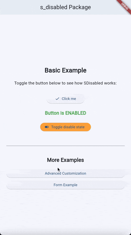
import 'package:s_disabled/s_disabled.dart';Disable a button with visual feedback:
class MyHomePage extends StatefulWidget {
  const MyHomePage({super.key});

  @override
  State<MyHomePage> createState() => _MyHomePageState();
}

class _MyHomePageState extends State<MyHomePage> {
  bool _isButtonDisabled = false;

  @override
  Widget build(BuildContext context) {
    return Scaffold(
      appBar: AppBar(
        title: const Text('s_disabled Example'),
      ),
      body: Center(
        child: Column(
          mainAxisAlignment: MainAxisAlignment.center,
          children: <Widget>[
            SDisabled(
              isDisabled: _isButtonDisabled,
              child: ElevatedButton(
                onPressed: () {
                  ScaffoldMessenger.of(context).showSnackBar(
                    const SnackBar(content: Text('Button pressed!')),
                  );
                },
                child: const Text('Click me'),
              ),
            ),
            const SizedBox(height: 20),
            Text(
              _isButtonDisabled ? 'Button is disabled' : 'Button is enabled',
              style: Theme.of(context).textTheme.headlineSmall,
            ),
            const SizedBox(height: 20),
            ElevatedButton(
              onPressed: () {
                setState(() {
                  _isButtonDisabled = !_isButtonDisabled;
                });
              },
              child: const Text('Toggle disable state'),
            ),
          ],
        ),
      ),
    );
  }
}Control opacity level and handle tap events on disabled widgets:
SDisabled(
  isDisabled: true,
  opacityWhenDisabled: 0.5,  // Custom opacity level
  onTappedWhenDisabled: (offset) {
    // Handle tap on disabled widget
    print('User tapped disabled widget at: $offset');
    ScaffoldMessenger.of(context).showSnackBar(
      const SnackBar(content: Text('Widget is currently disabled')),
    );
  },
  child: ElevatedButton(
    onPressed: () {},
    child: const Text('Try clicking me'),
  ),
)Disable interaction but maintain full opacity:
SDisabled(
  isDisabled: true,
  disableOpacityChange: true,  // Don't change opacity
  child: TextField(
    enabled: false,
    decoration: InputDecoration(
      hintText: 'This field is disabled',
      border: OutlineInputBorder(),
    ),
  ),
)Disable form submission while validating:
class MyForm extends StatefulWidget {
  const MyForm({super.key});

  @override
  State<MyForm> createState() => _MyFormState();
}

class _MyFormState extends State<MyForm> {
  final _formKey = GlobalKey<FormState>();
  bool _isSubmitting = false;

  Future<void> _submitForm() async {
    if (_formKey.currentState!.validate()) {
      setState(() => _isSubmitting = true);

      // Simulate API call
      await Future.delayed(const Duration(seconds: 2));

      setState(() => _isSubmitting = false);

      if (mounted) {
        ScaffoldMessenger.of(context).showSnackBar(
          const SnackBar(content: Text('Form submitted successfully')),
        );
      }
    }
  }

  @override
  Widget build(BuildContext context) {
    return Scaffold(
      appBar: AppBar(title: const Text('Form with Disable')),
      body: Padding(
        padding: const EdgeInsets.all(16.0),
        child: Form(
          key: _formKey,
          child: Column(
            children: [
              TextFormField(
                decoration: const InputDecoration(
                  labelText: 'Email',
                  border: OutlineInputBorder(),
                ),
                validator: (value) {
                  if (value?.isEmpty ?? true) {
                    return 'Please enter an email';
                  }
                  return null;
                },
              ),
              const SizedBox(height: 16),
              SDisabled(
                isDisabled: _isSubmitting,
                opacityWhenDisabled: 0.6,
                onTappedWhenDisabled: (_) {
                  ScaffoldMessenger.of(context).showSnackBar(
                    const SnackBar(content: Text('Please wait...')),
                  );
                },
                child: ElevatedButton(
                  onPressed: _submitForm,
                  child: _isSubmitting
                      ? const SizedBox(
                          height: 20,
                          width: 20,
                          child: CircularProgressIndicator(strokeWidth: 2),
                        )
                      : const Text('Submit'),
                ),
              ),
            ],
          ),
        ),
      ),
    );
  }
}| Parameter | Type | Default | Description |
|---|---|---|---|
child |
Widget |
Required | The widget to be disabled/enabled |
isDisabled |
bool |
Required | Controls whether the widget is disabled |
disableOpacityChange |
bool |
false |
If true, opacity won't change when disabled |
opacityWhenDisabled |
double? |
0.3 |
Custom opacity level when disabled (0.0 - 1.0) |
onTappedWhenDisabled |
Function(Offset)? |
null |
Callback when disabled widget is tapped, receives tap position |
The example/ directory contains a complete Flutter application demonstrating the s_disabled package. The example app features:
- Basic usage with button disabling
- Toggle state management
- Visual feedback demonstration
- Disabled state indication
To run the example:
cd example
flutter run- Use for UX feedback: Disable buttons during API calls or validations to prevent duplicate submissions
- Provide feedback: Use
onTappedWhenDisabledto inform users why a widget is disabled - Combine with other widgets: Works great with CircularProgressIndicator during loading states
- Consider accessibility: Always provide visual feedback when disabling widgets
Widget interactions still work when disabled:
- Ensure
isDisabledis properly set totrue - Check that the child widget itself isn't overriding pointer behavior
Opacity changes look abrupt:
- The default animation duration is 300ms. If you need faster/slower transitions, wrap with
AnimatedOpacitydirectly
This package is licensed under the MIT License. See the LICENSE file for details.
- 🐛 Bug reports: Issue tracker
- 📚 Documentation: See this README and the example app
- 🔗 Repository: https://github.com/SoundSliced/s_disabled
Made with ❤️ by SoundSliced