A Flutter package providing customizable glowing effects for widgets. This package includes two distinct glow widgets: Glow1 for breathing/pulsating animations and Glow2 for ripple/wave effects.
- 🌟 Glow1: Breathing glow effect with customizable scale and opacity animations (simple glow)
- 🌊 Glow2: (completely refactored different glow widget for advanced usage): Ripple glow effect with multiple expanding waves
- 🎨 Fully customizable colors, durations, curves, and shapes
- ⚡ Performance optimized with RepaintBoundary and efficient animations
- 🔄 Support for repeating and one-time animations
- 📱 Works with any Flutter widget
Add this to your package's pubspec.yaml file:
dependencies:
  s_glow: ^2.0.0
Then run:
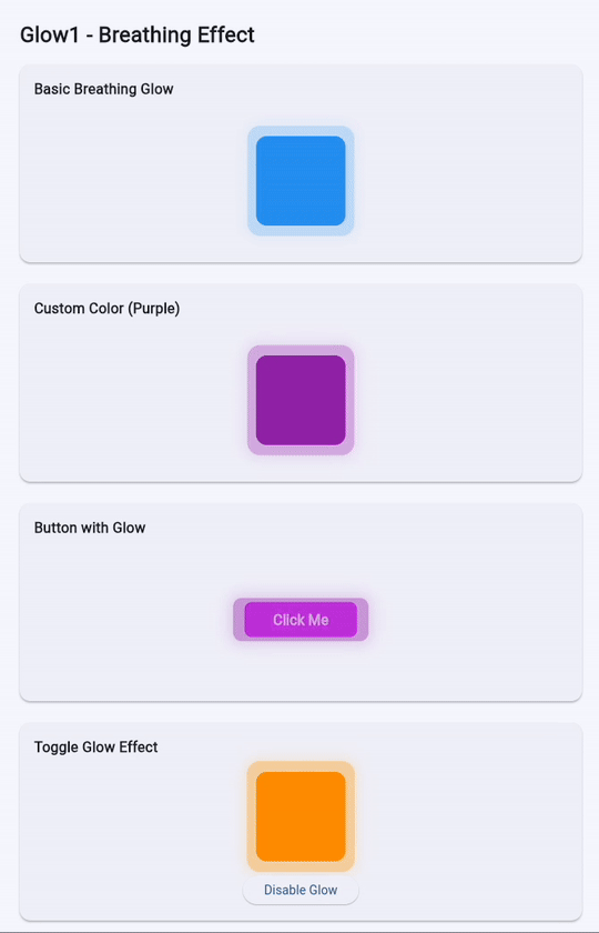
flutter pub getThe Glow1 widget creates a breathing/pulsating glow effect around your widget:
import 'package:s_glow/s_glow.dart';

Glow1(
  child: Container(
    width: 100,
    height: 100,
    decoration: BoxDecoration(
      color: Colors.blue,
      borderRadius: BorderRadius.circular(12),
    ),
  ),
  isEnabled: true,
  opacity: 0.4,
  color: Colors.blue.shade400,
  animationDuration: Duration(milliseconds: 1500),
  repeatAnimation: true,
  startScaleRadius: 1.08,
  endScaleRadius: 1.1,
)| Property | Type | Default | Description |
|---|---|---|---|
child |
Widget |
required | The child widget to apply the glow effect to |
isEnabled |
bool |
true |
Whether the glow effect is enabled |
opacity |
double |
0.4 |
Maximum opacity of the glow (0.0 to 1.0) |
color |
Color? |
Colors.blue.shade400 |
Color of the glow effect |
animationDuration |
Duration |
1500ms |
Duration of one animation cycle |
repeatAnimation |
bool |
true |
Whether to repeat the animation continuously |
startScaleRadius |
double |
1.08 |
Starting scale factor for the glow |
endScaleRadius |
double |
1.1 |
Ending scale factor for the glow |
borderRadius |
BorderRadiusGeometry? |
BorderRadius.circular(12) |
Border radius for the glow shape |
alignment |
AlignmentGeometry |
Alignment.center |
Alignment of the glow effect |
animationCurve |
Curve |
Curves.fastEaseInToSlowEaseOut |
Animation curve for the effect |
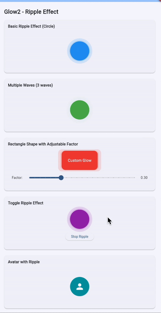
The Glow2 widget creates an expanding ripple effect with multiple waves:
import 'package:s_glow/s_glow.dart';

Glow2(
  child: Container(
    width: 100,
    height: 100,
    decoration: BoxDecoration(
      color: Colors.green,
      shape: BoxShape.circle,
    ),
  ),
  glowCount: 2,
  glowColor: Colors.white,
  glowShape: BoxShape.circle,
  duration: Duration(milliseconds: 3500),
  animate: true,
  repeat: true,
  glowRadiusFactor: 0.7,
  startInsetFactor: 0.1, // Start glow 10% inside the borders
)| Property | Type | Default | Description |
|---|---|---|---|
child |
Widget |
required | The child widget to apply the glow effect to |
glowCount |
int |
2 |
Number of expanding glow waves |
glowColor |
Color |
Colors.white |
Color of the glow effect |
glowShape |
BoxShape |
BoxShape.circle |
Shape of the glow (circle or rectangle) |
glowBorderRadius |
BorderRadius? |
null |
Border radius (only for rectangle shape) |
duration |
Duration |
3500ms |
Duration of one animation cycle |
startDelay |
Duration? |
null |
Delay before starting the animation |
animate |
bool |
true |
Whether to animate the glow |
repeat |
bool |
true |
Whether to repeat the animation continuously |
curve |
Curve |
Curves.fastOutSlowIn |
Animation curve for the effect |
glowRadiusFactor |
double |
0.7 |
For circles: % of radius; For rectangles: % of half-width/half-height |
startInsetFactor |
double |
0.1 |
How far inside borders the glow starts (0.0=border, 1.0=center) |
- Smart Start Position: Glow now starts slightly inside the widget borders (controlled by
startInsetFactor) for a more polished appearance - Shape-Aware Expansion:
- Circle glows expand based on radius percentage
- Rectangle glows expand proportionally based on width and height
- Simplified API: Removed redundant
glowRectFactor- nowglowRadiusFactorintelligently adapts to both shapes - Interactive Examples: Try the live example app with real-time adjustment sliders
Glow2(
  glowShape: BoxShape.circle,
  glowRadiusFactor: 0.3,  // Expand 30% of radius
  startInsetFactor: 0.15, // Start 15% inside border
  child: YourWidget(),
)Glow1(
child: ElevatedButton(
onPressed: () {},
child: Text('Click Me'),
),
color: Colors.purple,
opacity: 0.5,
repeatAnimation: true,
)Glow2(
child: CircleAvatar(
radius: 40,
backgroundImage: NetworkImage('https://example.com/avatar.jpg'),
),
glowCount: 3,
glowColor: Colors.blue.withValues(alpha: 0.5),
glowShape: BoxShape.circle,
duration: Duration(seconds: 2),
)Glow2(
child: Container(
width: 150,
height: 80,
decoration: BoxDecoration(
color: Colors.red,
borderRadius: BorderRadius.circular(16),
),
child: Center(child: Text('Custom Glow')),
),
glowShape: BoxShape.rectangle,
glowBorderRadius: BorderRadius.circular(16),
glowColor: Colors.red.withValues(alpha:0.3),
glowCount: 2,
)class ToggleGlowExample extends StatefulWidget {
@override
_ToggleGlowExampleState createState() => _ToggleGlowExampleState();
}
class _ToggleGlowExampleState extends State<ToggleGlowExample> {
bool _isGlowing = true;
@override
Widget build(BuildContext context) {
return Column(
children: [
Glow1(
isEnabled: _isGlowing,
child: Container(
width: 100,
height: 100,
color: Colors.blue,
),
),
ElevatedButton(
onPressed: () => setState(() => _isGlowing = !_isGlowing),
child: Text(_isGlowing ? 'Disable Glow' : 'Enable Glow'),
),
],
);
}
}This package relies on:
- soundsliced_tween_animation_builder - For smooth animations
- states_rebuilder_extended - For efficient state management
Both widgets are optimized for performance:
- Uses
RepaintBoundaryto isolate repainting - Efficient animation controllers
- Minimal widget rebuilds
- Customizable animation parameters for performance tuning
Contributions are welcome! Please feel free to submit a Pull Request.
This project is licensed under the MIT License - see the LICENSE file for details.
Christophe Chanteur
See CHANGELOG.md for a detailed list of changes.