5. Getting Started!
The tariff analysis tool is designed to assist stakeholders to investigate how different tariff structures impact on the expected bills of different types of residential consumers. The tool offers a range of different analysis and result visualisations as described in this section. In summary the tool allows users to:
- Create projects and add analysis to different projects for later referral
- Choose from the existing load profiles (more than 5000 annual household load profiles)
- Filter the load profiles based on the available demographic information
- Import new load profile and demographic information
- Visualise the individual and aggregate load profiles using multiple methods including seasonal pattern, peak analysis, annual energy distribution, daily interquartile range, etc
- Apply the network tariffs available in the tool (60+ tariffs for different Australian States) to calculate the annual bill based on any subset of the load profiles
- Apply the retail tariffs available in the tool
- Modify the parameters of the tariffs to investigate the impacts on annual bills
- Investigate different components of the network bill (DUOS, TUOS, and NUOS) to calculate the revenue for different sectors (distribution, transmission, etc). This can also be done for the retail component where retail tariffs are available
- Adjusting the network peak time to see the impact on the tariffs based on the coincident peak demand
- Create different types of new tariffs including, flat rate, time of use, block usage, demand charge, etc
- Compare the results of multiple analyses in different visualisation platforms including single variable comparison, dual variable comparison, and individual cases
- Export the figures, and copy them into clipboard to incorporate in any report
- Export the results to excel file to do further analysis on the results outside the tool The rest of this section introduces different parts of the tool and gives instructions on how to work with the tool.
The TDA tool does not need to installed in your computer. You only need to run the tool and do the analysis. In order to import and export the data properly (such as selecting load data, exporting result, etc), you need to keep all contents of the TDA folder. If you save a project, or create a new load/tariff, it will be also saved in this folder. Windows users need to run the TDA.exe and work with the tool. But if you are using Mac, each time you open the software, it will ask you to locate the TDA folder in your computer. Once asked, you should find the TDA folder and open it and then work with the tool.
While you are working with the tariff tool, you may want to save your current session for later referral. You can “save” the project, and later “open” the project with your saved analysis loaded in the tool. You can also delete any of the previously saved projects. You can also restart the tool to delete all analysis currently displaying on the tool and restart your analysis. If you do not save the project, the project name will be shown as “undefined” and any analysis will be lost if you close the software. Restarting the tool does not delete any project or load data. But any analyses after the last save will be lost. You cannot restore any deleted projects!
Using this menu, you can import new load data, delete any of the existing load data, or restore to the original load data list. Importing new load data is explained here. You can also define the network load as described in 5.5. We will provide new load data as it becomes available. In that case you can just download the load data (.mat file) and put it in the “Data” directory in the TDA folder. You can check for new updates by clicking on Menu: Help > Check for Update. You can also set the maximum amount of missing data allowed as well as the down-sample rate (where a smaller percentage of the sample can be randomly selected, as described in section 5.3). By restoring the load data, any new load data you created will be lost.
You can create new tariffs, obtain the excel file with all the parameters of all the tariffs used in this tool and also reset the tariff lists to the original list of tariffs. We will provide new tariff data as it becomes available. As new tariffs are generally introduced every year, new versions will be made available and you can download them and copy them in the “Data” directory in the TDA folder as advised in the update page. NOTE. By resetting the tariffs, any new tariffs you have created or modified will be lost and this cannot be undone!
You can export the figure currently showing in the tool (ctrl+E) or copy it to the clipboard (ctrl+C) so you can paste it in another document, email, etc. You can also export the data directly from the figure (ctrl+D) or export the whole case’s results as described in following sections.
Using this menu, you can specify some options such as ‘ask to name new cases’, ‘confirm before exiting the tool’, and ‘confirm before deleting some items’.
The option “About” provides information about the software. You can click on any of three options (CEEM webpage, Researchgate project page, or GitHub page) for more information, updates, and comments about the software. You can also open the instruction file via the “Users’ Guide” option and give feedback on the software, and subscribe to receive the latest news of the software. Please note that due to some issues with internet security programs, the options to send feedback or subscribe may not work properly in some cases. If you experience this issue and receive any error message, or if you successfully submit your request but don’t receive an email confirmation, please send an email to n.haghdadi@unsw.edu.au with your feedback or subscription request.
You can select one of the existing load datasets in the tool by choosing from the dropdown list as shown in Figure 1. Before importing, you can specify the maximum allowed missing data from the menu: Load > Maximum Allowed Missing Data (%). The default value is 5%, which means only homes with less than 5% missing intervals will be loaded. You can change this each time you select a new load. You can also down-sample the load data to speed up the calculation by selecting from menu: Load > Down-sample Users (Random Selection). The default option is 100% (full data) which loads the whole dataset. 50% means randomly selecting 50% of the homes, and so forth. Please note, each time you press “Set”, a new subset will be randomly selected, so multiple selection of one load dataset with the same down-sample value will result in different users being selected.
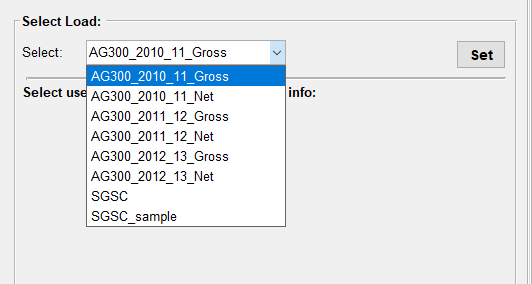
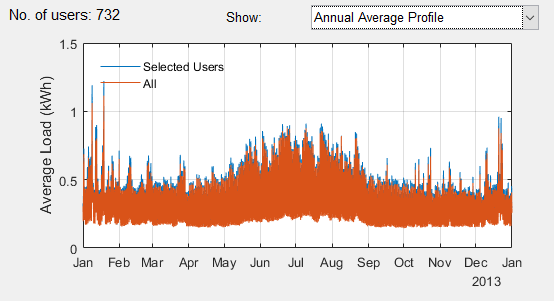
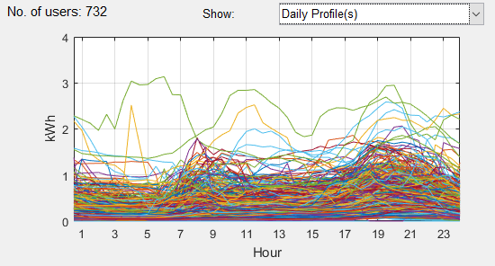
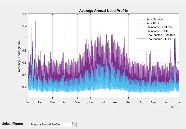
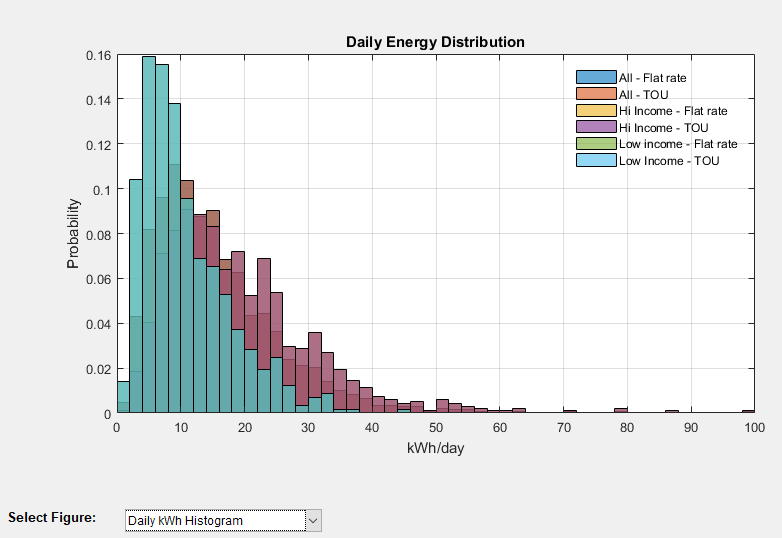
You can see the number of homes loaded into the software in the below part of the “Select Load” panel. Each dataset can be selected, and the analysis can be done based on the whole or part of that dataset which is grouped by demographic information. If the demographic information is available for any load data, it will be shown below the dropdown list (see Figure 1). You can then filter the load based on any part of the demographic information. The number of homes obtained with any particular filter is shown. There is also a set of diagrams which show the individual or aggregate behaviour of the selected load profile. So, you can see the load pattern while selecting the filters. In some of the figure options, you can see and compare the filtered load (by missing data%, down-sampling, and demographic filters) with the whole dataset. This is particularly useful if you want to check if important information (e.g. load profile on a peak day) is similar in the down-sampled load and the whole dataset. If you see a significant difference you may load the demand data again to randomise the users and load a new group. You can change the diagram type from the dropdown list. You can choose the following options (Figure 2):
- Annual Average Profile
- Daily Profiles
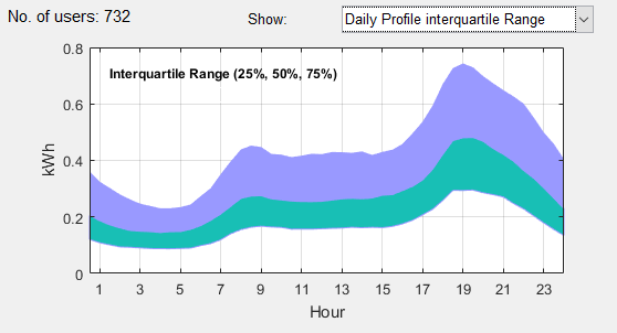
- Daily Profile Interquartile Range (25%, 50%, and 75% of load)
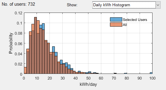
- Daily kWh Histogram
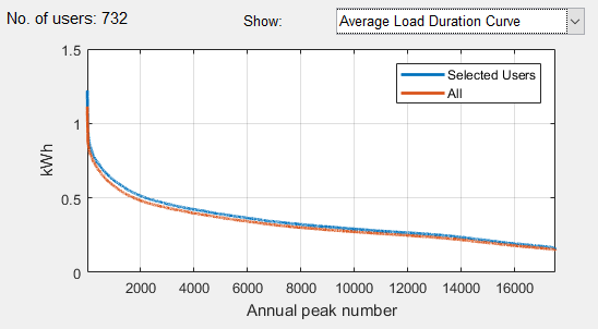
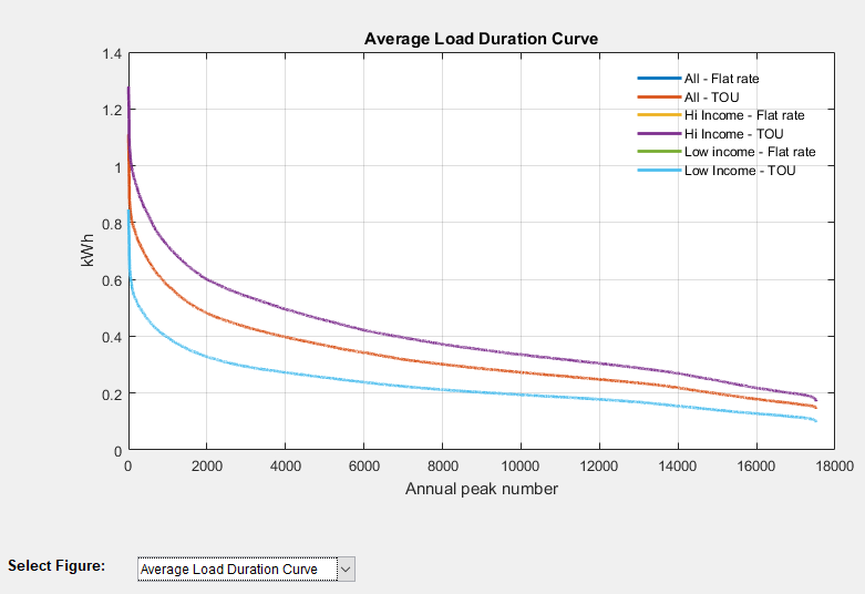
- Average Load Duration Curve (sorted aggregate load profile in kW in descending order)
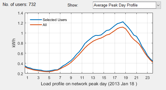
- Average Peak Day Profile (daily pattern in highest aggregate peak day)
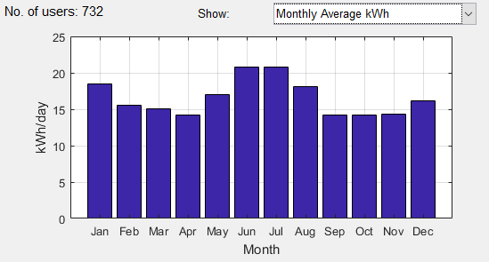
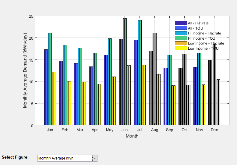
- Monthly Average kWh
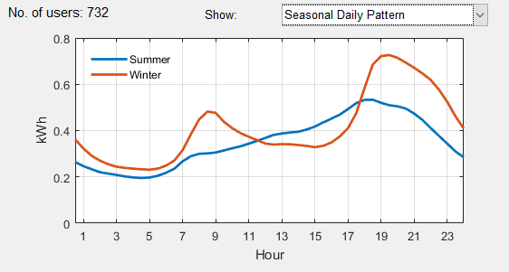
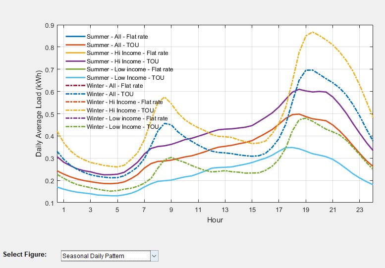
- Seasonal Daily Pattern (average daily load pattern in summer and winter months)
You can also import a new load data by clicking on the “Import load data” on the main menu option “Load”. Press the “Create new” button and upload the excel file containing the load profile from your computer. The excel file should contain two sheets with names “Load”, and “Info” containing the half hourly data and demographic information. If there is no “Info” sheet, the software will not import the demographic information, and if there is no “Load” sheet, the import will not be processed and an error message will be shown.
The first column of the load data sheet should contain the timestamp of the load profile and it should be exactly one-year of data. The data should be half hourly with the timestamp showing the end of each time period. Therefore, for example if the data is for year July 2012 to June 2013, it should start with 1 July 2012 00:30:00 and end with 30 June 2013 00:00:00. Please note the tool can handle only one year of data. However, you can analyse more years of load data individually by uploading them as separate years. The first row of the “Load” sheet should contain the home numbers and the following rows will contain the actual load data in kWh. Any empty cell or non-numeric data will be considered as a missing value. Any negative values will be considered but please note the tariff tool does not calculate any premium for exporting power, so the negative values will be ignored in the tariff calculation, but they will have an impact on the network load if you choose the network load to be calculated based on the aggregation of the household load data. The network load is described in more detail in section ??. Please note the tool only works with a half hourly load profile. You should convert your load data to half hourly (by averaging higher resolution data such as 15 min data or repeating lower resolution data such as hourly).
Any information about the household can be put in this sheet, and once imported it will show up in the demographic information section. This can be the type of household, dwelling type, income group, etc. A maximum of 10 types of demographic info can be put in the excel file. The tool will group the information and let the tool operator filter the homes based on any of the demographic info when selecting the load data. If you want to include more than 10 types of demographic info, you can upload the same load profile but with different demographic info. The first row of this sheet should contain the type of info (for example: “Dwelling type”). The first row contains the Home numbers (to match with the home number in the “Load” sheet).
A sample file is also provided that you can use as a reference for the required format. You can also paste your load and info data into this file and save as a new file on your computer and load that when creating a new load dataset. You can open this file by pressing “Open sample file” option. Please note, failing to follow the required format will result in an unsuccessful load import. If you receive an error, make sure you follow the instructions carefully. The home IDs should be in “number” format (i.e. do not use home 1, etc.) and these numbers will be used to match the load and demographic information so please make sure they are identical. If you have or know of any load data which can be made available, please let us know so we can put the load data into the tool. Another option is to send us your excel files containing the load and demographic data, and we will create the “.Mat” file for you - so you just need to put the mat file in the TDA folder, Data directory instead of importing the load yourself. We won’t of course make the data available without your permission.
When you create a new load file, an assumed network load profile is also created by summing all the households’ data over the year. You can specify in the tool if you want to use this network load for finding the network peak time or instead use a new network load. Under the menu “Load”, select the option “Network load”. You can select the network load profile to be the aggregation of the selected database load profiles, or the aggregation of the filtered load profile (only selected homes with specified demographic information), or based on a synthetic network load profile which you have previously created (see Figure 3). You can create a new synthetic network load profile by uploading a new csv file. You can have only one synthetic network load profile at a time so if you want to check multiple network load profiles you will need to upload the desired load profile each time. In order to create the new synthetic network load profile, put the network load in a csv file with the first column being the timestamp, and the second column being the network load. The first row will be ignored. You can also open the sample file, paste your new network load (or only adjust the load at timestamps you want) in that and save it as a new file in your computer, then import it as the synthetic network load file. The sample file provided has a flat rate of value 1 so you can increase the values in different months, days, and hours to see the impact of different network load peak times. As the tool analyses only one year of load data, the network load should also be one-year of data. Also, the “year” of each timestamp is not considered. e.g. you can import network load for 2014, and use the load of 2013 and the tool will assume the network load is for 2013.
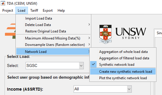
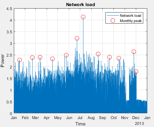
Once you create a new synthetic network load profile, you can plot it and see the load pattern as well as the monthly peak times and value (Figure 4). It will allow you to quickly observe the monthly peak time and confirm if the network load profile looks correct. You can also plot the synthetic network load profile (or the network load profile based on the other two options) by choosing it in menu “Load > Network Load > Plot network load pattern”.
Once the load data has been selected, the tariff should be selected. The state, type, provider, and year can be used to filter the tariffs. Figure 5 shows the tariff selection panel. The “Tariff Info” option in the “Tariff” menu will open an excel file containing all the information and parameters of the network tariffs used in this tool. The rates shown are GST inclusive. If you want to exclude the GST, you can tick the “Exclude GST” option. Once a tariff is selected, the options for deleting the tariff or the available information for the tariff will appear in the “x” and “i” buttons respectively located beside the tariff dropdown list. The info button will open a folder with all the documents used to provide the tariff details for the selected provider (e.g. AusGrid).
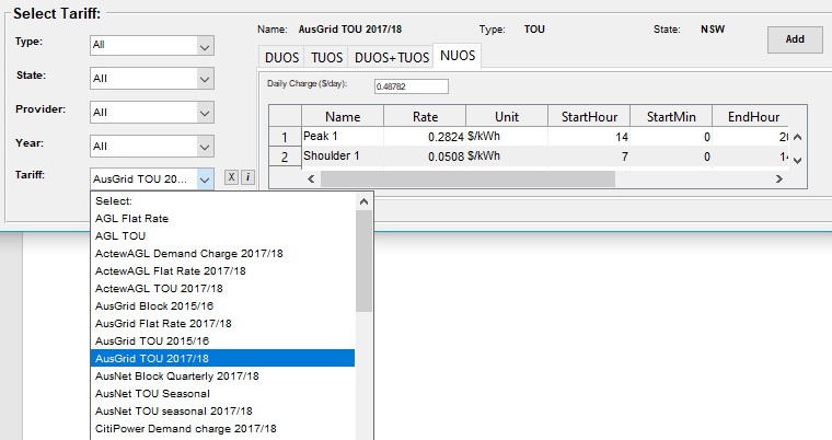
When using a network tariff, you can choose whether you want to apply the whole tariff (NUOS) or only a component of the tariff. NUOS is “Network Use Of System” which is made up of DOUS, “Distribution Use of System”, and TUOS, the “Transmission Use of System”. Some NUOS tariffs might include other components (e.g. NSW Climate Change Fund or the Qld Solar Bonus Scheme). You can choose DUOS (to evaluate the distribution revenue), TUOS (to evaluate the transmission revenue), DUOS+TUOS (to evaluate both), and NUOS (to evaluate the actual tariff). By moving between tabs you can choose which component you want to apply. When using a retail tariff, you can only use the entire tariff (which is in DUOS tab, so you should select DUOS tab for those).
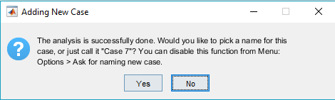
Once you have selected the tariff (from the dropdown list) and the tariff component (by selecting the tab), you can click on “Add” to add the analysis to the graphs. This will apply the selected component of the tariff to the selected subset of the load and perform a variety of analyses which are described later in this document. Please note when you add the analysis, the tool will generate the network load data based on the option you have selected (i.e. based on the whole database, filtered databased, or synthetic network load which was described in section 5.5). Before adding the analysis, make sure the network load profile is selected properly. Once the analysis has been added to the diagrams, you cannot change the network load for this analysis. In order to do so, you may consider deleting the analysis (case) and then undertaking the analysis again using a new network load profile. When you add a new case, the tool will ask (Figure 6) if you want to pick a name for the new case. If you choose No, or close the dialog box, the new case will be named as Case + number. You can disable this option (asking for naming the new case) in menu Options.
5.7 Creating new tariff The components of the tariff including daily charge, energy cost, and others are shown in the panel. Any of the shown components can be adjusted to create a new tariff. Once any component of a tariff is changed, the modified tariff can be saved with a new name into the list of existing tariffs. When you edit a component, the saving option will appear. Please note, if you change any component of a tariff it won’t automatically change in other components of that tariff. For instance, if you edit the demand window starting hour in DUOS, it won’t change this parameter in the TUOS, DUOS+TUOS, and NUOS even if you save the tariff. As a result, the DUOS+TUOS might no longer be the addition of DUOS and TUOS. You can also create a new tariff from scratch by selecting it from menu, “Tariff > Create New Tariff”. There are currently seven types of tariff which you can create:
- Flat rate, where a flat constant rate applies to the kWh usage
- Flat rate seasonal, where the rates are different in different seasons
- Block, where the rates are different for different levels of kWh
- Block quarterly, where rates are different for different levels of kWh in each quarter
- Time of use, where rates are different in different times of the day
- Time of use seasonal, where rates are different in different times of the day and different months
- Demand charge, where the tariff is applied to the household peak demand (kW) or the household demand at the time of the network peak (kW) instead of (or in addition to) the kWh
The following tables show the tariff options and parameters.
Flat rate:
| Parameters | Values |
|---|---|
| Daily charge ($/day) | Non-negative value |
| Energy cost ($/kWh) | Non-negative value |
Flat rate seasonal:
| Parameters | Values | Comment |
|---|---|---|
| Daily charge ($/day) | Non-negative value | |
| Energy cost ($/kWh) | Non-negative value | |
| StartMonth | 1-12 | Start month of the season |
| EndMonth | 1-12 | End month of the season |
**Block **:
| Parameters | Values | Comment |
|---|---|---|
| Daily charge ($/day) | Non-negative value | |
| Energy cost ($/kWh) | Non-negative value | |
| High Bound (kWh) | Non-negative value | The high bound of the block |
Block Quarterly:
| Parameters | Values | Comment |
|---|---|---|
| Daily charge ($/day) | Non-negative value | |
| Energy cost ($/kWh) | Non-negative value | |
| High Bound (kWh) | Non-negative value | The high bound of the block in quarter |
Time of Use:
| Parameters | Values | Comment |
|---|---|---|
| Daily charge ($/day) | Non-negative value | |
| Energy cost ($/kWh) | Non-negative value | |
| StartHour | 0 to 23 | Start hour of the time period |
| StartMin | 0 or 30 | Start minute of the time period |
| EndHour | 0 to 23 | End hour of the time period |
| EndMin | 0 or 30 | End minute of the time period |
| Weekday | Logical (true or false) | Select if the tariff should be applied on weekdays |
| Weekend | Logical (true or false) | Select if the tariff should be applied on weekends |
Time of Use Seasonal:
| Parameters | Values | Comment |
|---|---|---|
| Daily charge ($/day) | Non-negative value | |
| Energy cost ($/kWh) | Non-negative value | |
| StartHour | 0 to 23 | Start hour of the time period |
| StartMin | 0 or 30 | Start minute of the time period |
| EndHour | 0 to 23 | End hour of the time period |
| EndMin | 0 or 30 | End minute of the time period |
| StartMonth | 1 to 12 | Start month |
| EndMonth | 1 to 12 | End month |
| Weekday | Logical (true or false) | Select if the tariff should be applied on weekdays |
| Weekend | Logical (true or false) | Select if the tariff should be applied on weekends |
Demand Charge:
| Parameters | Values | Comment |
|---|---|---|
| Daily charge ($/day) | Non-negative value | |
| Energy cost ($/kWh) | Non-negative value | |
| Demand charge ($/kW/month) | Non-negative value | |
| StartHour | 0 to 23 | Start hour of the time period |
| StartMin | 0 or 30 | Start minute of the time period |
| EndHour | 0 to 23 | End hour of the time period |
| EndMin | 0 or 30 | End minute of the time period |
| StartMonth | 1 to 12 | Start month |
| EndMonth | 1 to 12 | End month |
| Weekday | Logical (true or false) | Select if the tariff should be applied on weekdays |
| Weekend | Logical (true or false) | Select if the tariff should be applied on weekends |
| NetworkPeak | Logical (true or false) | Select if the tariff should be applied on the demand at network peak (coincident peak) |
| NumberofPeaks | Natural number (1,2,…) | Number of peak periods on which tariff should be applied |
| DemandWindowTSNo | Natural number (1,2,…) | The average of this number of half hourly periods before the peak demand (including the peak demand timestamp) will be considered. Default value is 1. |
| MinDemandkW | Non-negative value | Minimum demand in kW. Any value below this will convert to this limit. |
| MinDemandCharge | Non-negative value | Minimum demand charge in $. Any charge below this will convert to this limit. |
| TimeGroup | Natural number (1,2,…) | Condition groups. All rows with the same TimeGroup will be considered as one demand charge. For example you can specify the demand charge based on 7-10am and 4-9pm in two rows and then use the same TimeGroup for both of them. This means one demand charge will be applied to the peak and both time periods will be considered to find the peak demand. |
| DayAverage | Logical (true or false) | Select if the tariff should be applied on the average demand in the time period of the day (instead of just the peak demand). |
You can select a name and specify the provider, state, and year. You can also include some info about the tariff for your own reference. Once you save the tariff and select this tariff from the dropdown list, you can hover over the tariff name and the info will appear. You should put the DUOS, TUOS, and NUOS “rates” separately and they can be different and even zero in some components (e.g. demand charge in the TUOS component in some demand tariffs is zero). However, the other parameters (such as StartHour, ..) cannot be different in different components. As opposed to the “modify tariff” option, here if you change a tariff parameter (e.g. start hour, end hour, etc) in one component (e.g. DUOS) it will change in other components as well. So if you really need a different parameter in different tariff components you can create the tariff, select it in the “Select Tariff” panel, and then edit the parameter in only one component. If you need to add more rows to the parameters table, you can press ‘+’ to add a row. This will add the row to all components tabs. You can also delete the last row by pressing ‘-‘. If the NUOS component of your tariff is equivalent to DUOS+TUOS, you can click on the button below to fill the NUOS rates based on the DUOS+TUOS. You can also modify the rates afterwards. Once you finish everything you can press “Add” to save this tariff in the list of tariffs. The new tariff will be checked for consistency and the software will prompt an error message if it finds any problem in the tariff. You may later delete this tariff by selecting it from the select tariff dropdown list and press -. You can also reset all tariff lists to the original list provided by this tool by selecting from menu, Tariff > Reset Tariff.
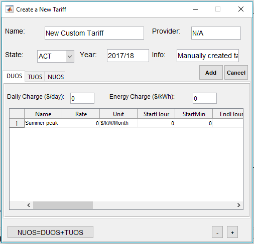
Please note the tool may not be able to catch all possible errors in the tariff design, so please make sure all components of the tariff are designed as intended before saving the tariff.
After selecting the data and adjusting the tariff (if applicable), the analysis can be performed, and the results can be shown on the graphs by pressing the “Add” button. Depending on the load size, complexity of the tariff, and your computer’s specification, adding the analysis to the plot window may take up to a few minutes. When you add a new case, the tool will ask if you would like to pick a name for the new case. It will appear in the graphs, exported data, and case information panels. If you select “No”, it will be saved as “Case + the number of case”. Please note, when you delete one case, the name of the other cases will be updated. So for instance, if you delete case 3, case 4 and 5 will be renamed to case 3 and 4 respectively and so on. More analyses can be added to the plot by selecting a different user group or tariff and pressing “Add” again. Up to 10 analyses can be added to the diagrams. There are three types of diagrams used for analysis, titled “Single Variable Graphs”, Dual Variable Graphs”, and “Single Case Graphs”. When adding the analyses (cases), you can see the list of all cases beside the plotting panel where you can show/hide the graphs, display the information of the cases, export the case to excel file, and delete the case. Figure 8 shows different components of the plotting panel.
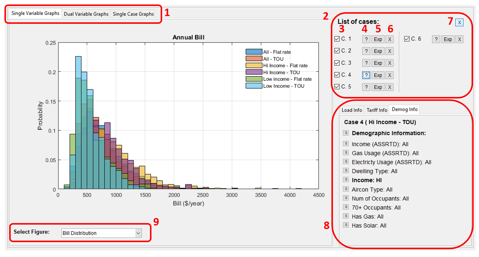 1- Select the graph type, 2- List of cases, 3- Hide/show one case, 4- Display the case information in info panel, 5- Export the result to excel, 6- Delete the case, 7- Clear all cases, 8- Info panel, 9- Select the plot option
You can export the figure currently displayed on the plotting panel. The figure will pop out of the panel with more options (zoom, pan, etc). Also, you can save the figure in multiple standard figure formats. For this option, click on menu Export > Export Figure or simply press ctrl + E.
You can also copy the figure in the clipboard and then paste it in any document (word, email, etc). The figure might not be exactly the same as what is being shown on the panel for some figure options (aspect ratio, etc). You can also take a screenshot of the figure, or export the figure and then insert it into your document. You can also print the figure to pdf after exporting it for better quality. For this option refer to menu: Export > Copy Figure (Ctrl + C).
If you want to access the underlying data of the figures you can copy the data of the current figure to the clipboard and paste it in any excel file, etc. You can find this option in menu: Export > Copy Data (Ctrl + D).
In the info panel, you can see the load info (Case number, Number of users, load database, and network peak time calculation method), Tariff info (Tariff name, type, State, selected component, and tariff parameters), and Demographic info based on the available demographic information. If any of the demographic options were selected to filter the load, it will be shown in bold font (Figure 9). You can click on the “S” buttons beside the demographic information items to run a quick statistical analysis on the results grouped by the options available for that demographic info. For example, Figure 10 shows the statistical analysis results of one case for demographic information “Income”. You can copy the table in the clipboard by clicking on “Copy Data”. You can then paste in an Excel file, or any document for any further work on the statistical analysis results. The table contains the mean, standard deviation, min and max of analysis results (annual kWh, annual peak, demand at network peak, average daily kWh, annual bill, and Unitised annual bill) for all users within the same demographic option. By clicking on the “S” button beside “Demographic Information” you can see a statistical analysis of all the homes in this case (not grouped based on any demographic information). Of course, for demographic information items which have already been selected in filtering the load (and shown in bold font in the list), there will be only one group in the statistical analysis.
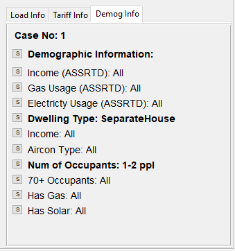
List of demographic information
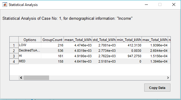
Statistical Analysis of one case grouped by demographic information "Income"
In the following, different graph types are introduced.
In this diagram panel, the graphs based on one variable are shown. You can select one of the following variables from the dropdown list:
- Average Annual Profile:
- Daily kWh Histogram:
- Monthly Average kWh:
- Seasonal Daily Pattern:
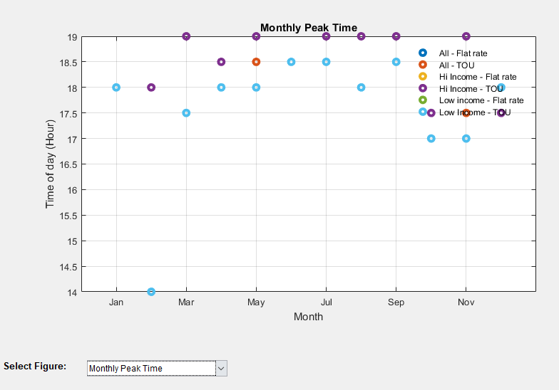
- Monthly Peak Time:
- Average Load Duration Curve:
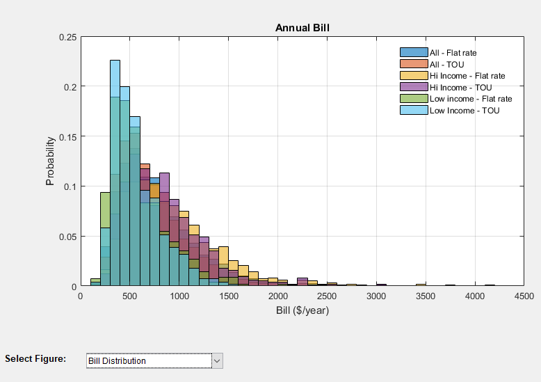
- Bill Distribution:
- Bill Box Plot:
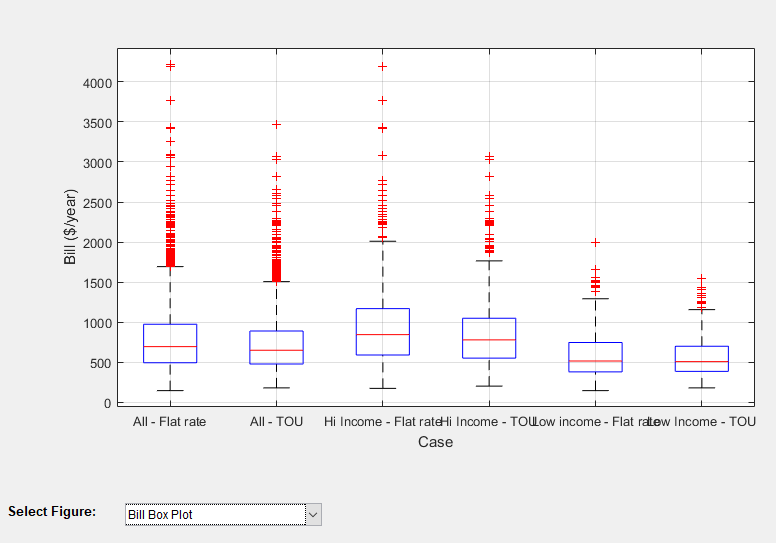
Once you add more analyses to the diagram, they will show up together in both single variable and dual variable diagram panels. If you click on any point in a graph the values of x and y axis will be shown in a data tip. You can add multiple data tips to the graph by holding shift and clicking on a new point in the graph. You can see two sample data tips showing in “Monthly Peak Time” graph in Figure 11 representing the hour of peak in March in two cases. You can use left and right arrow keys to move between points (or groups in boxplot option). Please note if you use a similar load profile for multiple cases (e.g. to test the impact of different tariffs on similar user group), the graphs showing the characteristics of the load (and not the bill), will be similar and therefore you will see one plot for them. As an example, in the graph mentioned above we have two sets of monthly peak points instead of three. In boxplot you can see the Median, Maximum, Minimum, number of points and number of finite outliers.
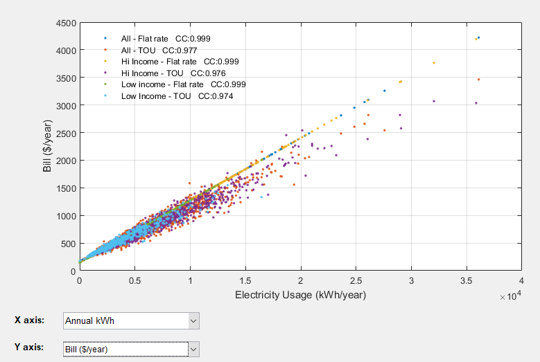
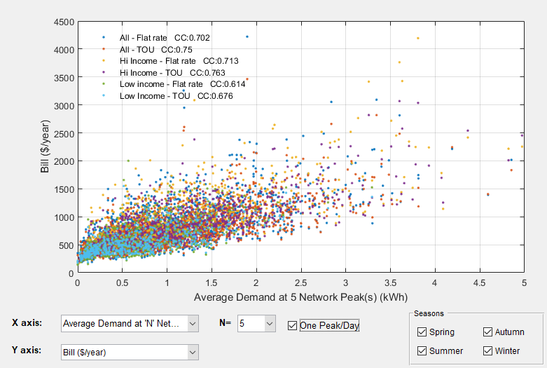
In this diagram panel, multiple variables can be compared together by selecting them in the x or y axis. The following results can be shown:
- Annual kWh
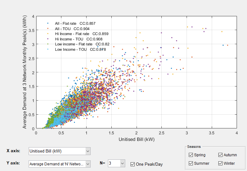
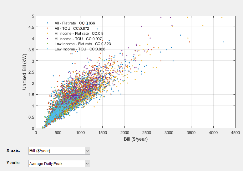
- Average Demand at “N” Network Peaks (coincident demand)
- Average Demand at “N” Network Monthly Peaks (coincident demand)
- Average Demand at Top “N” Peaks (non-coincident demand)
- Average Demand at Top “N” Monthly Peaks (non-coincident demand)
- Average Daily kWh
- Average Daily Peak
- Bill ($/year)
- Unitised Bill (kW)
Average demand at “N” network peaks (and “N” monthly peaks) is calculated based on the network peak option selected (refer to section 5.5 for options for Network load). You can select the number of peaks (N) from the dropdown list. You can also specify if you want to allow only one peak period per day. Please note if you don’t tick this option, multiple peak periods in a single day may be considered. You can also specify which season is included. Average Demand at Top “N” peaks (and “N” monthly peaks) are the average demand at the top peaks of each home. Again you can allow more that one peak per day and also filter the seasons. Average daily kWh and average daily peaks are also calculated for each home and can be selected from the dropdown list. Unitised Bill is defined as the customers’ annual bill divided by the annual bill of a reference customer with constant demand throughout the year (1 kW or 0.5kWh in all half hour periods). The purpose of this unitised bill is to make it independent of the value of the tariff components, so different tariffs with different component values can be compared to each other based only on their structure and not their rates. The unit for this bill is kW as the reference customer’s bill considered is $/kW. For more info about the application of the Unitised Bill refer to our paper on cost-reflective tariff design here.
The correlation coefficient (CC) of the X and Y data of the plot is also calculated and shown in the legend for each case. Figure 12 shows some examples of different plotting options. Please note that while you can change the number of peaks, multiple peaks per day, and seasonal filtering and update the figure, they are not updated in the saved data for exporting to an excel file. However, you can access this updated data by copying the data from figure (as described in 5.8.1.3). Please note, if the number selected for “N” is higher than the total available peaks (e.g. selecting 100 peaks for the monthly peak and selecting one peak/day), a warning will be shown, and the total available peak times will be considered instead of “N”. Therefore if this happens, the x or y label (showing the number of peaks) may not be valid for all cases. For example it may be Average of top 100 peaks while the actual number of available peaks for different cases currently showing in the graph could be lower.
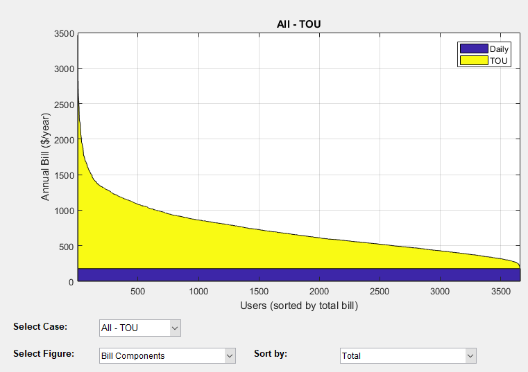
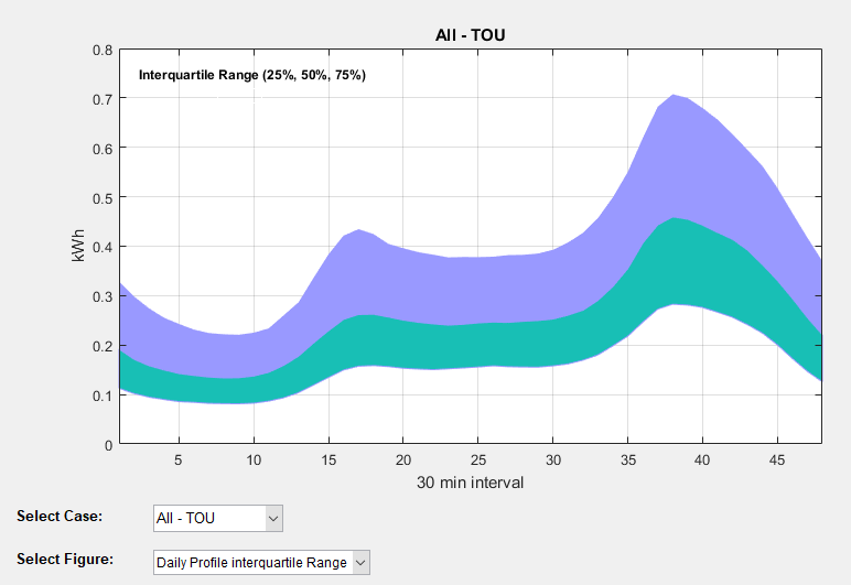
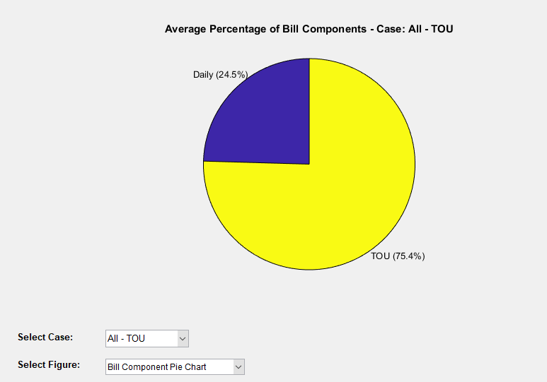
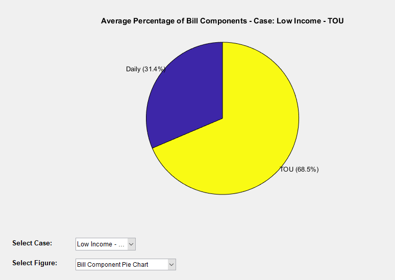
As some results can not be plotted for more than one case, a third type of diagram can be used for single cases. You can select the case number and the variable to be shown on the plot. The following options are possible:
- Bill Components
- Bill Components Pie Chart
- Daily Profile Interquartile Range Please note, Bill Component here means the portion of the bill (Daily, Energy, Capacity Charge, etc) and should not to be confused with DUOS, TUOS, etc. In the first option (Bill Components), you can specify the parameter used to sort the bills. The default parameter is the total bill.
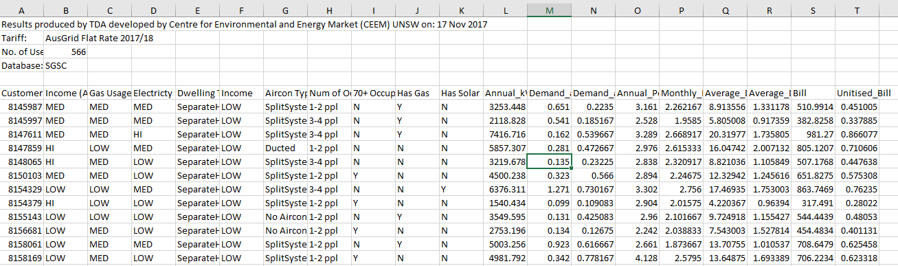
While you can directly copy the data of the current figure to the clipboard and paste it where you want, you can also export the result of individual or all cases to an excel file. You can click on the “Exp” button beside the case name in the list of cases to export the result of that case. Alternatively, you can use the menu: Export > Export Results. Figure 14 shows an example of an exported result. Please note there currently seems to be an issue with saving the results while working in a network drive or shared folder (e.g. OneDrive folder, etc) due to automatic syncing, etc. It is therefore recommended that you place and run the TDA folder on a non-shared folder which is not being synced with the internet.