Neumorphism has started gaining some traction in popularity and polarizing designers in the industry. You either love it or you hate it. If you haven't heard by now what this new trend is all about it's basically a design style to create Soft User Interfaces. With Material Design dominating the industry for the past decade in Android and most web apps, i think it's safe to say it's time for a change!
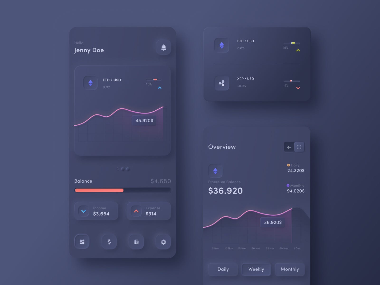
With the rise of Neumorphism it's still too early to say if this trend will stick around for years to come. Some may balk at the idea of this Soft Ui style with comments like "it's not versatile enough" to create a plethora of custom products (Check out Michael Malewics article on why). While i do agree it does have some limitations, I think it's at a perfect stage to get designers and developers involved to come with an answer(s) to it's in-versatility. Some of the issues we face now with this pattern are:
- Visibility
- Accessibility
- Flexibility
To execute a Neumorphism design you need to pick 3 shades of the same color. A light shadow, a mid color and a dark shadow. This sounds easy but in practice it can be hard to produce a high contrast design without obscuring the product especially being that you're using the same color. The gradients dictate the borders between your figure and the background so you need to pick your colors carefully. Check out this soft-ui code generator and play around with it's settings to see what i mean for yourself https://neumorphism.io.
Recently law suits have been sprouting up all over the US by people with disabilities suing companies that state their websites are not accessible to them. Here is one where Dominoes was sued by a blind man that couldn't use their site or app despite using screen reading software https://www.cnbc.com/2019/10/07/dominos-supreme-court.html. In another lawsuit the plantiff is not only holding the business responsible but also the web developers directly https://www.boia.org/blog/web-developers-could-be-targets-of-new-website-accessibility-lawsuits
With cases like these emerging, it's clear that the days of scraping accessibility features until later are over. All users must be treated equally in their own UX therefor we need to use mature frameworks or libraries to help us develop rapidly while also remaining competitive.
So what other issues do we face or will face with the current state of Neumorphism? For one is the visibility issue mentioned above. If we apply this same style to a Button the visibility becomes even more abhorrent and confusing. Is the button pressed? Is it floating? What about color blindness? Light mode vs Dark mode? These are some questions that haven't been tackled yet.
This one is interesting as solving this problem will solve a lot of other problems and answer a lot of objections in Neumorphism. It seems that there can be a huge limitation in this UI if everything has to be wrapped in a card. It can also hurt your UX/Ui if everything looks like it's floating on the page. I still believe in the old less is more cliché. The solution may be a combination of old styles and new styles to provide a robust framework.
So what is the purpose of this project? What am I proposing? Ideally i'd like to develop a React based component framework for Neumorphism. I can see this becoming very popular in the future but in the mean time it's all for fun and learning. We will need to start at the documentation level like Materal.io to provide clarity and consistency for everyone and ultimately graduate to something like Material-Ui. Who's up for the challenge? 🙋♂️🙋♀️
Join our Spectrum chat group to discuss more into detail some of the ideas you have and the challenges we face if you're interested in contributing to this project or using it in the future. All are welcome!

Pull requests are welcome. For ideas and proposals, please open an issue first to discuss what you would like to create.