Repository navigation
Typography #6027

Replies: 73 comments

|
Idea: include ideas on what to do when you can't use Transport font |

|
The style of having a smaller heading above the H1 shouldn't be called a "caption," which is used in publishing to mean the information associated with an image or non-text item. I'd suggest calling it a supraheading, which describes it's relationship to the H1. |

|
Hi folks. Have been discussing "captions" versus "secondary headings" versus "supraheadings" with @stevenaproctor, and he suggested that what we gain in clarity with "supraheading" we lose in terms of Plain English. We suggest "section heading"...? Descriptive of what it's used for, easy to understand... Thoughts? |
|
Seems like a good iteration to me. Thanks.
…On 6 August 2018 at 10:31, Jennifer Hodgson ***@***.***> wrote:
Hi folks. Have been discussing "captions" versus "secondary headings"
versus "supraheadings" with @stevenaproctor
<https://github.com/stevenaproctor>, and he suggested that what we gain
in clarity with "supraheading" we lose in terms of Plain English. We
suggest "section heading"...? Descriptive of what it's used for, easy to
understand... Thoughts?
—
You are receiving this because you commented.
Reply to this email directly, view it on GitHub
<#6002 (comment)>,
or mute the thread
<https://github.com/notifications/unsubscribe-auth/Aildwmuaj-7g3mLzCnnDxLgFAjZbbFUkks5uOA0JgaJpZM4RchTM>
.
--
Tory Dunn
Head of Design | CDIO Digital Services | Dorset House | 07392
289160
|

|
An issue has been raised in the past about the 'link ink skipping' feature in modern browsers:
There's a concern that this causes some users to see single links as multiple links, and that is this a problem. Does anyone have any evidence to support this? If so, please comment here, or on this issue. |


|
There's an interesting thread on ink skipping on Twitter here. |

|
@timpaul People have commented that the "Births, deaths, marriages and care" link on the GOV.UK frontpage looks like 3 links because the commas make it look like the link has ended. The underline definitely makes q, y, g, j, commas and other descenders harder to read. I think this is true for all users and may contribute to why some sites do not have underlines. There are situations where the ink skipping can cause people to read the link differently. There is an example in the Twitter thread @36degrees linked to of 9.9 or 99 percent. This kind of confusion would definitely cause problems if someone misreads an amount of money or percentage. |

Styles->Typography includes: “You should use an alternative typeface like Helvetica or Arial for services that are publicly available on different domains.” — are those the best alternatives in terms of accessibility? Especially when it comes to small sizes? At least one person suggests they might not be. There's also a pretty interesting comment thread there. Some free typefaces that come to mind that are probably more readable would be something like Fira Sans, PT Sans or Source Sans. |

|
I have been looking at the H1 and H2 styles in the prototyping kit recently and their apparent difference to the front end implementation (as far as I can see). Just focusing on the H1 in the prototyping kit, I can see that the effective space below the H1 (50) is greater than the space above the H1 (either 30 or 40 depending on whether a Back link is present). In live it is 30 below I believe. It is also possible to created similar situations for H2s in the prototyping kit where there is more space below than above the heading. Theoretically there should always be less space below the heading than above, whatever the heading (H1, H2 or H3), as the content and heading need to be obviously visually associated. It is possible that further guidance (to interaction designers) is required to make this happen with available styles or that the styles should be updated to achieve this affect. The desired effect can be achieved with override codes but we do not want to be overriding default behaviour I don't think. In terms of importance of this issue, I would say it is greatly important that headings and hierarchical relationships are immediately understandable to a casual eye to avoid confusion and misunderstanding and that this potentially affects every page in a prototype, so for me high priority. |

|
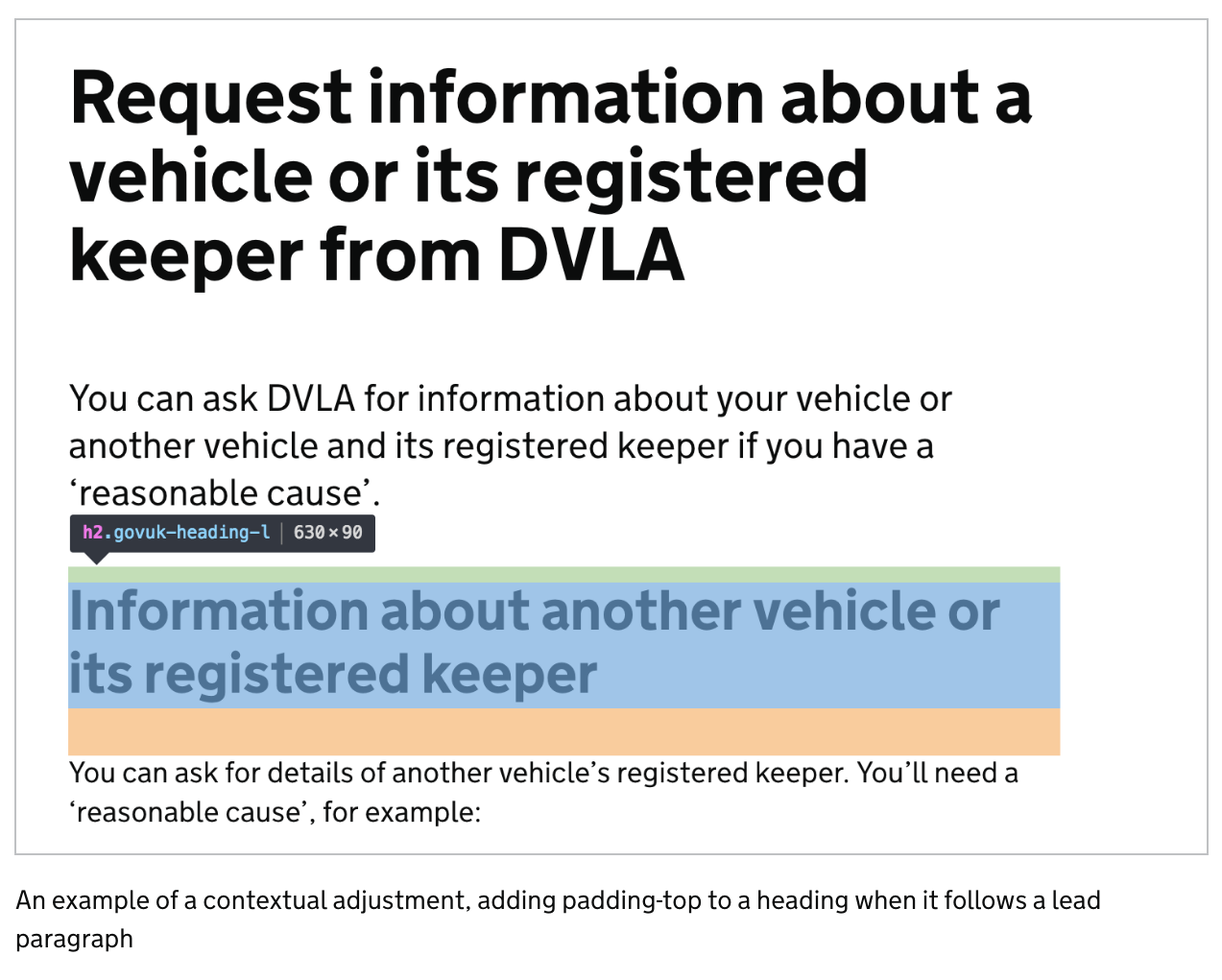
Hi @chaslinn, Thanks for your comment and your desire for good web typography :) Hopefully I will be able to give you a response to all of your questions. Let me know if anything isn't clear. Frontend vs Prototype kit Regarding "live" and "frontend" – It really depends what you mean by those terms. In terms of the GOV.UK Design System, GOV.UK Prototype Kit and GOV.UK Frontend, they all use the same rules. If you are referring to GOV.UK itself then spacing has been applied in many different ways across all of the individual rendering apps. You'll find completely different values, applied in different ways from page to page. The spacing defined in GOV.UK Frontend (and therefore the Design System and Prototype Kit) was an attempt to systemise the typography and create a single way to do things. I wrote a blog about this which I think will help give you some more context, even if the technical implementation is out of date. In this case check out the first image on to see just a few of the variants on just a few pages of GOV.UK. General spacing rules Regarding "Theoretically there should always be less space below the heading than above, whatever the heading (H1, H2 or H3), as the content and heading need to be obviously visually associated." If we initially focus on Typography as a whole, this is what we're doing. We have a rule that "margin should flow in one direction", however to make sure there is more space below the heading (on every H level) than above then we have the concept of contextual adjustments. This means h2, h3, h4, paragraphs, although only having margin-bottom when used on their own will actually have padding-top added in certain scenarios automatically. For example: The h2, when following a lead paragraph has padding-top applied as a contextual adjustment.
If I zoom out and show you an example of using lots of heading levels, paragraphs and lists you'll see that these rules are in place for every level. Providing that there is nothing stopping the adjacent sibling selectors from working such as wrapping text inside
We have a great amount of consideration to the typographic hierarchy, making sure these relationships stay intact when the font size changes at the smaller breakpoints too. However there are some scenarios where a designer should make their own adjustments using overrides. Page structure / Layout Hopefully the above addresses the h2 and below, however you brought up an interesting point about the h1 and it's position on the page. There was a couple of things at play here, we wanted text to start in the same position (give or take 5px) as it does on GOV.UK even though the margin and padding is applied in a different way. For this we wanted to achieve an visually equal space (this may be technically slightly off) between the top of the heading and the start of the content below rather than having more space on top. One thing you may not be aware of is the new way the page is structured. Taking these from the Layout section of the Design System - https://design-system.service.gov.uk/styles/layout/ you can see that the spacing above the h1 comes from a wrapper called
This should look like this:
When there is no back link, breadcrumbs or phase banner then there is a modifier to the
When applied this should look like this:
If you feel that what you're seeing in these screenshots is not how the typography is rendering in your app then we might be able to help find out why. Otherwise, I hope that at least explains some of the decisions we've made. Dave |


|
@dashouse I created a page in the prototype to demonstrate what @chaslinn is saying. This uses all the standard code from the Design System.
This means the H2 is always the same distance away from the In your example content 1, the first paragraph is further away from the H1 than it is from the H2. The same is true in this example as well. |

|
Hey @stevenaproctor, sorry the original comment didn't mention headings as part of labels and legends. My answers, although relevant were largely based around text based content and didn't mention forms. This particular problem with styling labels and legends as headings is that the heading needs to work in in context with the hint, error and the form element, locked in as one group inside a component. It also needs to have the same spacing applied so regardless if the heading is a legend or a label it looks the same. For example the "Passport number" and "Expiry date" questions below:
We spent a number of weeks trying to find an automatic solution for some of the problems you have raised, we have a test scenario for the ways in which labels, legends and headings can be applied which has over 100 possible combinations. To show just one scenario, here you see the spacing relationship between each potential element in the checkboxes component. As the heading changes size the relationship between the hint and error also changes.
Ideally, we would be able to adapt the spacing of the heading if a hint has not been entered, or if an error message isn't visible, however really pushing the limits of what we can achieve with SCSS and the Nunjucks macro. In regards to form design this is the perfect scenario to use the override classes. They aren't intended as a last resort, but a way to adapt the defaults to your specific context. For example, if you know you don't have any hints in your questions, you could override the margin so that the white space is equivalent to the hint just being invisible, rather than the block not being there at all. We feel that this is where the Interaction Designer on each team will be able to make the best decisions for the particular question or service. Perhaps we could include a few more examples on the question page pattern, showing how we'd use the overrides in specific scenarios? |


I totally agree that they should be considered a unit. If you remove the
I totally agree that the override classes could be used here. But it means they would always have to be used if people legitimately used headings around their form groups. In my example, the I wonder if |
|
Hi @dashouse thanks for taking the time for your detailed explanation. Unfortunately I feel I am not quite technical enough to easily understand it and am not totally clear what you are saying (sorry about that): Are you saying the by design there will be more space below an H1 that above?
Also that for H2 and H3 that there should be less space below than above if coded correctly? In my prototype page I also have an issue with the default headings which means that I do not get the spacing you are talking about:
It is possible that my code has errors (although I have had it checked), but I am wondering if I am missing guidance on how to ensure that my example doesn't happen. Label's and legends do complicate the matter further but just sticking to the H(s) at this point. |

|
Thanks @stevenaproctor, we can discuss this as a team and get back to you |

|
At the end of last year we added This may present an issue if a link has been customised with paddings or margins. In this hypothetical example, here the link has been given some However, when the link becomes focused, the start of the next line becomes indented as the margin is cloned on focus. This is probably not a significant issue at this time, but something to note down for future reference. |


|
We recently tested our service with additional captions above our h1s which indicated which section they are currently on, and I thought it would be worth sharing the feedback we received on them. Most users did not notice them
Users felt the design / spacing (next to h1) wasn't right
Some users got that it's not essential information and is there if you need it
I realise that the intention is likely it doesn't want to draw attention from the h1 and if users don't necessarily notice it, it's not a bad thing. But I wanted to share those findings as I felt general feedback on specific designs will likely be helpful. We significant improved comprehension by adding "This section: in front". This didn't make the grey captions more noticeable, but ensured that participants did understand the captions - and their relationship to the page titles - when they did notice, or when the captions were pointed out to them.
|


|
In the latest accessibility audit of www.gov.uk DAC raised an issue with the blue link colour ( One of their low vision users commented:
The same low vision user also mentioned how the hover state of links is very difficult to see for them and therefore makes it difficult to understand where the pointer is. They were very happy with the focus state, but because they are someone who predominantly uses a mouse to navigate, the focus state doesn't help them to find where they are on the page. It would be interesting to know if other services had similar feedback for either of those two issues. |

|
Regarding the "Links to change a language" and the 3rd guideline:
I've spent some time reading about that attribute (mainly, but not only, here) Also, minor point probably but anyhow the link might better point to the standard RFC8288, rather than to w3schools which in some places (here or here) is not considered the best source |

|
Hi @sbasile-ch 👋🏻 Could you please expand on what you expect the Re: your second point, I think it's reasonable to swap out w3schools for MDN as we reach for MDN more commonly in guidance. I've raised a PR to this effect for the rest of the team to assess. |
|
Hi @owenatgov EDIT: I think I went to the bottom of this. Most of what is detailed out there refers to |

|
Hey gang - new designer here for HMRC - does anyone know how we handle orphan/widow copy. In previous roles (external companies) we've always hunted them down and coded in so they shouldn't happen. Just wondering what the system is here (a quick glance says that we don't force them). |


|
Hiya, in a recent DAC audit of the Claim Child Benefit service, they raised an issue with the link colour (#1d70b8) on white backgrounds. It fails WCAG 1.4.6 Contrast (Enhanced) (Level AAA). Although this isn't critical as it's AAA criteria, I thought I'd share it here in reference to @selfthinker 's post from February 7 also. DAC had raised:
It would be interesting to know if other services had similar feedback from audits. |
|
We had a question from a user today about when to use and when to omit bullets/numbers. Specifically because the first example on the lists page has a list of links without any bullets and there is no other example of links with bullets. I noticed that we don't have any guidance around that distinction on the page. My assumption is: |

|
I have a discussion point regarding best practices for screen readers when using lists. Its a specific use case where a bullet list item contains both text and a link. Here's a small example...
Screen readers function to stop when they reach a link and treat it as a new interactive item so as to give the user the chance to follow. The unique situation here concerns the second and third list items where a screen reader is grouping the bullet and the immediate text to be read together. It then, when stopping at the link believes it is at the end of that list item and announces as such. Here's a transcription of the screen reader announcements (note each newline represents a stopping point where the user would move to the next item manually)... List 4 items You can see how this would effect the logical order, similar complications can arise when text follows a link. I think it could be useful to provide some guidance around how to structure the list items themselves so as to try and prevent these kinds of issues. |

|
Silly question about the use of a colon after the lead in sentence on lists... Is it really necessary? Do we have any evidence that it helps users? |
|
@JonathanDHolden This isn't really a question for the Design System, but I doubt that's something we'll have ever put user research into, it's just assumed to be beneficial via being a common convention of written English. The GOV.UK style guide uses colons prior to lists in its examples, though doesn't specify that you must. The Guardian style guide, which is the secondary guide after the GOV.UK one, is explicit about using colons before a list of items. For screen reader users it almost certainly doesn't make a difference, as most punctuation isn't announced—though it may affect the intonation of what is announced. My inclination would be that they more useful to include than to omit, purely on the basis that it's what most people expect. |

|
@querkmachine @JonathanDHolden I wrote an example for the GOV.UK style guide point about bulleted lists in 2013. That example (with apples, oranges and pears) has been taken out of the style guide and used in the GDS Design System: https://design-system.service.gov.uk/styles/lists/ That entry also specifies: "Introduce bulleted lists with a lead-in line ending in a colon. Start each item with a lowercase letter, and do not use a full stop at the end." Using basic grammar conventions is an important element of good readability. We found that to be true as a general overall point on the Readability Guidelines project. A bullet list whose points finish a sentence that does not have a colon would be incorrect, and could also be confusing. The error is a distraction which may distract users from focusing on the information itself. |

|
Not quite Typography related, but related to links, we've had a report on support (internal link) of a user who 'finds it easier to respond to visual links, such as pictures rather than reading through the text links within our GOV.UK pages'. |

|
Im a FE working in the Payments team. I wanted to ask what is considered 'Long form content' with regards to using the XL size heading. Has there been a set of criteria set out that dictates when these should be used? |


 and others
Uh oh!
There was an error while loading. Please reload this page.
Uh oh!
There was an error while loading. Please reload this page.
Use this issue to discuss typography in the GOV.UK Design System, including links and lists.
All reactions