Repository navigation
Service navigation #6062

Replies: 50 comments

|
As discussed with some designers in the past xgov design system workshop, this pattern could just be general 'Navigation' which has different applications (Primary, secondary, account navigation, content list, etc.) @timpaul @joelanman thoughts? |

|
Yeah, I think we could have a general 'Navigation' pattern, but we might need to also make some more specific navigation components to go with it. |

|
Related to site header (#5958), which frequently contains navigation elements |
|
please consider whether there is value in supporting optional icons next to key navigation items for a site, e.g. "Search, Home, Help" |

|
@penx do you know of any government services that have done this? |
|
@joelanman we have an internal system at the Home Office, that was originally not using govuk styles, but now does. We have a bespoke nav that includes icons. This isn't exactly how it looks but I have done a mockup of the kind of thing I mean:
|
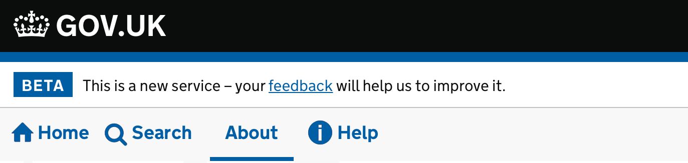
|
the icons above are from the home office design system https://home-office-digital-patterns.herokuapp.com/components/icons |
|
Thanks, good to know! |

|
We care currently designing an application that provides a number of services/forms/reports. The end user can be required to re-visit and make edit/additions to these services/forms/reports - so all need to be available after sumbission. Additionally there may be a number of different user settings that require administration. Finally we also require a section that provides secure messaging and uploading. We were hoping create a navigation system with both a primary and secondary navigation - similar to that provided here: https://design-system.service.gov.uk/components/ . After some investigation we have been advised that this pattern is not recommended for service. Are there any navigation patterns that can be used that are similar |

|
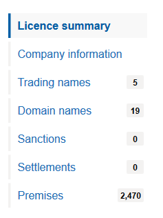
Just wanted to share some feedback for vertical navs and what we learnt on a service we are working on at the moment. We've gone with a vertical as horizontal tabs didn't work well with the content we have and users completely missed them. We looked at vertical tabs, and tried link lists but they didn't work well with users. So we adapted the vertical nav thats in the design system. This worked really well with our uses and we have created a pattern for it in our design system. It worked well with screen readers and users with assistive tech. We had one user who said they were very surprised it was easy to navigate the pages. Using tags for the counts, with some hidden descriptive text also helped with screenreaders, similar to the "Change" link in the CYA/Summary pattern.
|


|
This is something we have recently been looking at DfE, we have gone through #5906 for reference to try and get something consistent with other top navigation bars. I think the only thing really to highlight is the sign out link on the right.
|


|
We’ve chosen to prioritise ‘Navigation’ as one of our Upcoming components and patterns. If you’d like to help, join the GitHub discussion page for Navigation. We’ve created it to make it easier for the community to discuss issues and options. |

|
We've just added some guidance on how to 'share findings about your users' with us 📝. This will help us learn more about how your users navigate within your service. |
|
Hi folks, for anyone who missed or wants a recap of our Navigation: help us define our next component kick off workshop, on 18 April 2024, we've posted a summary to the discussion thread Navigation - related research and resources #3661 |
GOV.UK Design System working group reviewRepresentatives from the GOV.UK Design System working group reviewed a 'navigation’ contribution in April 2024. Four of the members in the group agreed that the component met the criteria for a useful and unique contribution to the Design System. One member disagreed that the contribution met the criteria. The working group also made the following recommendations. Scope of the contributionThere was a range of feedback on the scope of the component and how it relates to other components in the Design System. The main themes were that:
Guidance
Design
Code
|

|
yes one can 
|

|
I should've mentioned: the DS team did some investigation into service nav on the tech docs gem a few months ago and there's a plan to soon-ish aka before v6, maybe even this quarter, to implement it as a feature in the tech docs gem properly. |

|
Hello Team, I had a quick question regarding the service navigation links. Is there a specific reason why these links do not include an underline text decoration? |
|
Hi @SKSruthi That's a reasonable point, however this is intentional. We made this decision because the context of the content being words or phrases in a UI element such as in the service navigation, under the header, communicate that they are links in that context without the need for an underline style. We mention this in our links guidance under links without underlines:
This is a common convention across the web so the likelihood of a user confusing a link in service nav for text is low. This was consistent with our investigations into findings from early versions of the component from other departments. |
Hi @owenatgov |

the links in the Anything else section are all broken |

Hi there - I came to ask the same thing. Have just done an accessibility audit on my service, and removing the underlining on links in the top navigation feels like a step backwards for accessibility, but at the same time will make it more inkeeping with the design system. |
|
On back links vs service navigation, I think the design thinking is that the navigation links are visually inside the navigation section, therefore they don't need underlines. The back links are visually in the 'content' area where there is other non-link text, so it helps to have an underline to differentiate it. |
|
OK, thanks for the clarification! |

|
Updated version of the initial descriptive comment @joelanman WhatHelp users navigate sections in your service. WhyServices that use this pattern:
Examples of similar components
Anything elseHMRC decided it was "not a thing" for them in a HMRC GitHub navigation discussion Related items:https://github.com/alphagov/govuk-design-system-backlog/issues/33 |

|
Hello, we did some testing of the service navigation component during UR and we found all 5 participants struggled to figure out how to get to the service homepage using the service navigation bar. They didn't realise that the service name was clickable (possibly because it's black text?). We experimented with adding a 'home' link next to the service name and this tested much better. However, this creates repetitive links which isn't great from a screen reader accessibility point of view. Has this come up for any other services? |


To Mark's point above, this service nav with a long service name makes the design look really weird!
|

|
Heya @alrobboOC, thanks for raising! There's an issue about this over on GOV.UK Frontend to look into this: |
|
Hi folks, I thought I'd used this thread to summarise a few improvements we think we could make to the Service navigation component and see if these issues are shared by the wider community. Maybe some of you have even come up with fixes for them 🤞🏻. The issues we have noticed are:
Hearing from you all will help us determine whether we can prioritise over other things. |

|
I also have a proposed improvement to make on the nav:
|


 and others
Uh oh!
There was an error while loading. Please reload this page.
Uh oh!
There was an error while loading. Please reload this page.
What
Help users navigate sections in your service.
Why
Services that use this pattern:
Anything else
Related items:
All reactions