Repository navigation
Question pages #6078

Replies: 27 comments

|
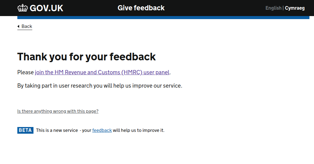
Should there be additional guidance/linked guidance to confirmation page or a final page for question pages? I think it's really important for the user to know when they have finished a process and what they can do next. e.g after the feedback questions once you have logged out of a digital service you are presented with a thank you page. It is neither a confirmation page nor a question and in my opinion doesn't quite close the user journey.
|

|
Should we mention not auto-tabbing on entry in text boxes? It seems to be in the date component (but not pattern page) but feels more like a general design principle for question pages. |

|
When we break questions into many pages (or one thing per page) we increase the risk of a bad network breaking a user's journey.
alphagov/govuk-frontend#754 (comment) There are things we could consider here technically, has anyone else seen any examples of where too many views are frustrating for users on slow connections? |

|
Just to elaborate on the comment that @NickColley quoted: We're building a lot of services for staff in DWP. The equipment Civil Servants have to use isn't great. They use thin clients with a streamed desktop. The majority are Windows 7 with IE9. When using a streamed desktop with Windows 7 and IE9, the equipment itself is pretty slow. Particularly because the staff often have to have several legacy systems open and have to keep switching between the windows. What we've found is even when we integrate with a legacy system, it doesn't always speed anything up. Sure, the staff have to switch between windows less so it slightly reduces the processing power of the awful equipment and the time to orientate themselves in the new window. But, there are so many layers of security that by the time you bounce an API call through all the firewalls etc the latency is still several seconds between pages. So, we've ended up chunking a lot of information. For example, rather than have a page for the clamant's name. Then a new page for their date of birth etc. We just have one page with 5 or 6 fields titled: Claimant details. So our one thing per page is more one theme per page. We also rely a bit more on conditional reveals. For services that citizens use, I'd avoid them as much as I could and fork the journeys between page loads. But because of the latency we know we'll have we do reveal the content a little more on the fly. There is little we can do to impact the latency, as it's a technical constraint we didn't really pick up on when testing early prototypes on a Macbook. But we have found a nice balance between one thing per page and agents wanting to smash the screen in. 😅 Hopefully this all makes sense. So, my caveat is that this is a staff facing service, it may not be relevant for anything citizen facing. But I would be interested in seeing more research on anybody with a poor or throttled connection. |

|
THIS is fascinating. Designing for the real world. It would make for a really good blog post. |

|
@jennifer-hodgson commented on 27 Sep 2018 We suggest that there is a need for extra guidance as regards the content design of questions, that is: to guide designers to ask direct question to elicit information, rather than just naming input boxes, whether or not to have the question in the h1, etc. |

|
Is this the right place to ask about examples of optional fields? If not, please point me in the right direction. The Questions Pages pattern includes the advice to ...
... but doesn't give any examples as to whether this should be part of the question itself, or appended to the question. e.g. Which of the following (if any) is correct (as they all look a little odd to me)?
or
or
Many thanks. |

|
If the visual presentation of '(optional)’ were to be clarified it would be worth clarifying its inclusion within the label element too. |

|
@floodmeadows @jbuller I think the intention of the guidance is that you add <label for="feedback">How could we improve this service? (optional)</label>Sometimes it can be a good idea to avoid optional questions by asking a preceding question (such as "Do you have any feedback on this service?"), depending on the context. |

|
Hello @govuk-design-system, Hope you're well. I am doing some research on how mandatory fields should be displayed to users. In the Question page, it says "Never mark mandatory fields with asterisks" - can you kindly share the reasons for this? If you also have any references or links that you can share, I would much appreciate them. Many thanks, Mel |

|
There may be a need to add guidance about optional question labels that end with parentheticals — e.g. "Short (less than 5 years) (optional)" for an input field asking for a percentage. It isn't a true question so doesn't have a question mark to separate it from the "(optional)" marker. I've come across a requirement for a form to show all possible questions instead of hiding them in conditional reveals and many of them are in this parenthetical format. I do, however, agree with @frankieroberto's comment that optional questions should be avoided where possible, however, by using guard questions and I'd add conditional reveals.
|

|
Has any else had question pages fail accessibility tests? We have had question pages fail accessibility tests. I had the tester check the example page The issue was raised using VoiceOver on Safari, iPhone X "The A Standard states that the screen reader should read out what a user with good vision would be able to see including format changes and the visual structure of the page e.g. headings and subheadings." However, on this page Voice over is reading the heading text, says heading level one and then reads the heading text again. Does anyone have any thoughts on how to fix this issue? |

|
Hi @charvey-1, thank you for sharing this with us. I've been able to reproduce the issue with VoiceOver/Safari on macOS, and have created a new issue to record it alphagov/govuk-frontend#2395. The problem seems to be specific to VoiceOver/Safari, so I'm not sure yet whether we will be able to resolve it. We believe that the reason that VoiceOver reads the heading text twice is because it is programmatically associated with the form, as a |
I would class this as oddity (caused by a particular combination of assistive technology), not a WCAG failure. There are many examples, not least alt text where screen readers announce more than what is visible. |
|
To those who are curious about the guidance of using '(optional)' instead of marking questions as mandatory: The team did a bit of archaeology on this recently. We know the rationale behind it, there should be as few optional questions as possible (the service manual expands on this [1], but we wanted to see if we could find it how long we've been recommending this, and where the rationale came from. It turns out the advice was ported to the GOV.UK Design System from GOV.UK Elements soon after the Design System was launched [2], and before that it was added to GOV.UK Elements added way back in 2014 , before version 0.1.0 [3]. We blogged about the update to the guidance around that time [4], and although we don't refer to the guidance on optional fields directly, we do mention that the new guides replace some older guidance. Unfortunately the trail goes cold here, but it seems clear that this principle has been around since the early days of GOV.UK and GDS itself, and we know it makes sense just from how long it has survived! As @timpaul puts it:
|

|
There's some nuance here that might be worth covering, either in the design system or service manual. It's fairly common for services to ask for information that's not essential, but improves the outcome for the user. For example, asking for additional information to improve the chances of matching the user's identity, so they don't have to send documents through the post. Or asking for multiple sets of contact details, so you can maximise your chances of getting essential information to the user. So it's probably fair to say something along the lines of "Only collect information over the bare minimum required if you can justify it. For example, because ..." |

|
I think this is accurate based on my recollection of being around and working on this stuff back in 2014. Here is some of the experiences in 'the trail' before 2014 that informed my views. Of course my views were only part of the discussion and I fully agree with the rationale as put by @timpaul I'd seen a variety of user research that told me that only web-savvy users grasped the concept '* indicates mandatory fields', with non-web-savvy users typically not noticing the asterisks, not understanding the term 'mandatory' (even when expressed as 'required', and not knowing what 'field' was anyway. Also, I'd wasted loads of hours in discussions about 'the best way to indicate required fields' in teams working on forms when truthfully this was the least of their problems. I used to teach an exercise in conference presentations about this where the required field indicator was indeed pants, but there were many far worse problems on the exact form - of which, by far the most important was about user needs and nothing at all to do with interaction design. I'd also seen lots and lots of users pretty much expect that they would need to answer every question on a form in a government or official context. Looking back, I found the exercise in an old deck from 2010 - see slide 42 onwards. https://www.effortmark.co.uk/placing-labels-forms-time-consuming-controversies/ At that time, I was recommending the use of (optional) to indicate optional fields, but was also still mired in the discussion of how to do the indicator for the required fields. In fact, I was so bored of the whole topic that I started to share my slides freely on SlideShare in 2010 in the hopes that I'd never again have to talk publicly about label placement in forms or required field indicators. And here we are, 12 years later (almost to the day)! As @lfdebrux accurately says, we seem to have got the 2014 advice about right as it's worked OK ever since |
|
(I was writing my reply when @StephenGill commented) On asking ONLY for what government needs: the principle to follow here is 'start with user needs'. Sometimes users have a need to tell us things that are not what we think we need for the service. That's OK. Give them space to do it. Anyone who has looked at the comments that come in on any sort of feedback form will know about this. For example, no matter how much you tell users that they must not share personal details on a feedback form - they still will. They have a need to share those details and there's no way to stop them. |
|
One thing I'd add is that it might not always be clear to users what you mean by 'optional', depending on the context. For example, do you mean:
If it's not completely clear which of these applies, it might be worth making it explicit by using a filter question, through guidance text, or some other pattern. |
@cjforms I'm puzzled by this example, and would love to learn more. I understand that trying to prevent users from including certain types of information in a free-text field on a feedback form is almost impossible (or at least probably not worth the effort required, even if it were possible). You seem to be saying that we should, "let people tell you more than just the bare minimum, because sometimes they need to tell you, even if you don't think you need that information". Have I understood that correctly? I can understand this approach in the context of your example (feedback form), but I'm unsure how to apply this to other situations, such as registering a vehicle, or applying for a government-backed savings account. If the process only requires the user to provide certain pieces of information, are you suggesting that we let them provide additional information? Is that purely in order to learn more about their needs (perhaps in order to discover ways to improve the process)? Or for some other reason? The thing that puzzles me most is the idea that, just because a customer might want to provide some additional information (over and above what's currently required by the process), then that constitutes a user need. Where would you draw the boundary between "wants" and "needs", in a situation where a piece of information isn't necessary to complete a task / achieve an outcome? Perhaps I've mis-understood the point you were trying to make? |
|
@floodmeadows Thanks for the follow-up question. Here are some more examples.
The most common everyday example, but perhaps less frequent in government, is the (optional) 'delivery instructions' field that some, but not all, e-commerce services offer. Many people don't ever user it. I rarely use it for deliveries to my home, but I always, always use it for delivery to my Mum because the entrance for her flat is in a completely different street to the actual street address. I think I recall in the past seeing an instruction 'we don't need to know xxx at this stage'. I can't recall exactly now but I think it was in the context of a job application, or an expression of interest in a grant. I also definitely recall research by the Home Office folks who went to China to learn about how Chinese people were using the 'apply for a visa' service. At that time, Chinese people were used to sending in some specific types of reference documents in many Chinese contexts - I think it was a family record book of some sort, sorry to be vague - and jolly well sent them in even though the visa service didn't need them. In this case, it was an example of 'other services have insisted on this information in the past, so I don't believe I've done it properly until I've given you this information too'. |
|
@cjforms - really appreciate you taking the time to clarify and expand on this - thanks v much. |

|
However design system suggests not to include Linking a thread on slack that I started regarding this: https://ukgovernmentdigital.slack.com/archives/C6DMEH5R6/p1678198782589409 |

|
Note: heading captions with question numbers could be misleading if there are conditional questions. |


|
The GOV technique of not marking 'required' questions and only marking 'optional' questions is occasionally failed by auditors. My understanding is that SC 3.3.2: Labels or Instructions "requires that ... inputs have labels or instructions", BUT "whether or not labels ... are sufficiently clear or descriptive is covered separately by SC 2.4.6: Headings and Labels." Technique G131: Providing descriptive labels does give an example of including the word "required", but that's just one technique and is not mandated. Another way to look at it is that GOV chooses to use another technique which is to mark optional and not required. My feeling is that DAC should mark their concern as a usability issue and not a WCAG failure. One way to respond is to stick to established designs and say that hundreds of user research sessions have been run across government and this issue doesn't come up (or if it does, doesn't seem to get a lot of publicity). Another is to attempt to make the pattern clearer to new users by adding content such as "All questions are required unless marked as optional". Note - there has been a small wording change between WCAG 2.1 and 2.2 that might be causing this: In WCAG 2.1 SC 3.3.2: Labels or Instructions, there was an example given: "In a form which contains both required and optional fields, the required fields and/or the optional fields are clearly labeled as such." In WCAG 2.2 SC 3.3.2: Labels or Instructions, the example has been removed. |

|
Hi. I see that the GDS guidance says... 'If you need to ask for multiple related things on a page, use a statement as the heading. You can style each or to make the questions easier to scan.' This implies that questions should be listed vertically. Is that correct? Questions should never be laid out horizontally on a page? Is there any guidance that explicitly says that? I'd appreciate any further guidance. Thanks. |

|
@mlsnsw , thank you for your earlier question in 2021.
I have run into an issue with this. We recently failed an accessibility assessment on WCAG success criterion 3.3.2 Labels or instructions - Level A because we were missing asterisks on our questions. WCAG states this for 3.3.2:
(source link in text above) However, as per GDS guidance on questions, we:
This is still recommended in 2025:
Source: GDS Question Pages pattern I have also read the response from @mglancy indicating that a recent adjustment to WCAG for 2.2 might have had a negative impact on the GDS approach, because a supporting example was removed. However, in the case where our system failed WCAG, there were only required fields on the page (I think we only have one optional field on our whole system and it is clearly marked with the word "Optional"). One way we might look at mitigating this failure is to add some instructions at the start of our process stating that all questions are required unless otherwise indicated, much like mglancy's suggestion, but I feel this is unlikely to affect the grading, given each page seems to be assessed in isolation. If we added this to every page, it would detract from the otherwise clean look and feel. Sadly, to meet the WCAG requirement, a visible label is needed. In this case, I actually think the WCAG is wrong. In my opinion, GDS has a better pattern of: only ask for what you need. All questions can be assumed to be required; the user does not need to be in any doubt. However, my opinion is worth approximately zilch when it comes to gauging web content accessibility. It would be great to have some guidance from GDS on how best to mediate this conflict between the two design approaches. |


Uh oh!
There was an error while loading. Please reload this page.
Uh oh!
There was an error while loading. Please reload this page.
Use this issue to discuss this pattern in the GOV.UK Design System.
All reactions