Repository navigation
Checkboxes #6087

Replies: 60 comments

|
Would it be possible to look at vertical alignment when the option text is longer than a single line? Should alignment be top aligned, in general - would that help? |

|
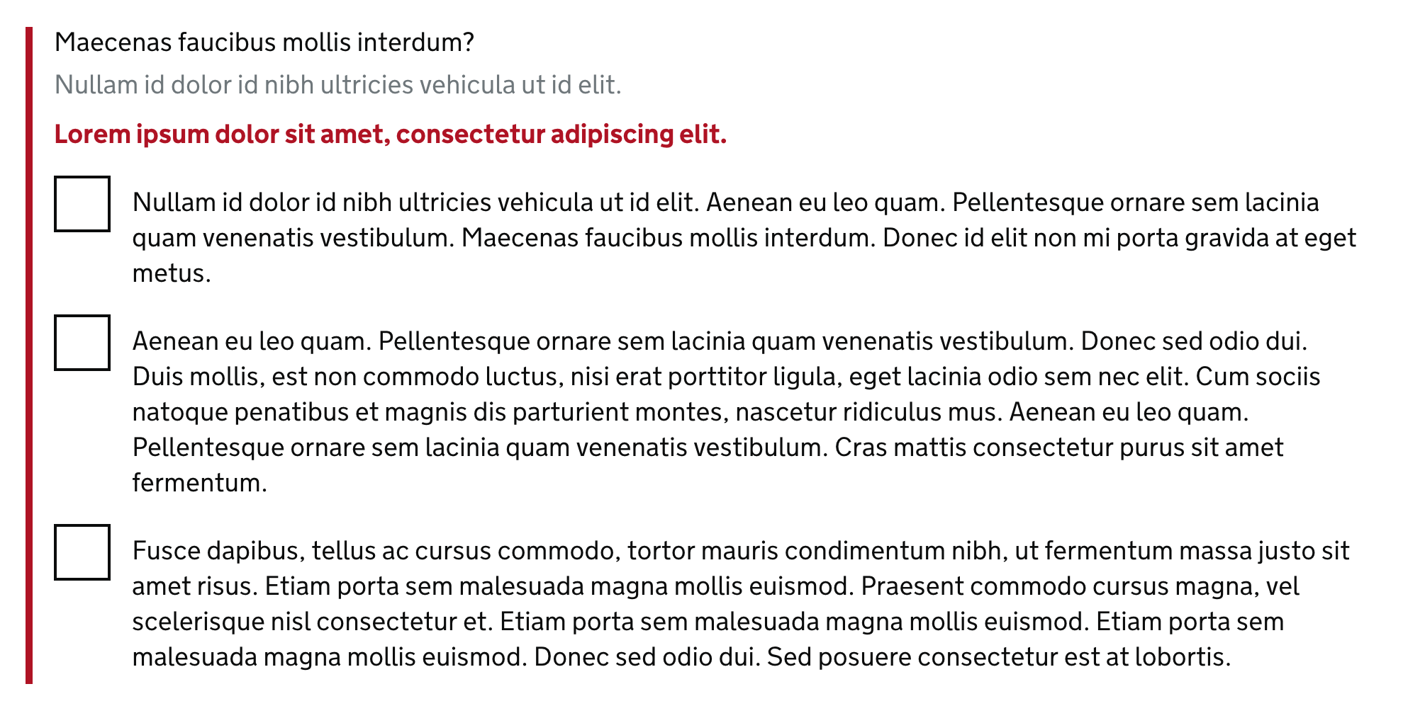
Hey @torydunn-hmrc – I just want to check what you're asking for. When you say 'would it be possible to look at' do you think there's an issue with the checkbox component that needs looking at, or do you just want to see an example so you know what it does? We don't currently have any examples of checkboxes with very long option text in the Design System, because we'd generally encourage service teams to keep their option text short. But I can show you what it looks like if you do have a lot of text…
As you can see, the first line of the option text is vertically aligned with the middle of the checkbox, and then any further lines just wrap underneath it. Does that help? |
|
Hi Oliver
Thanks for the examples.
Yes that's what I mean. We certainly try to avoid long text and options,
but there can be some complicated distinctions in tax options that make
things wrap. Looking at the design system again: even with 2 lines, it
looks unaligned vertically. And when some of our tax options reach 3 lines
(the max I have seen), it gets pretty weird.
Could you see what it's like with at top aligning, even when it's a single
line? Because I imagine trying to do vertical centring of multiple lines
would be a real nightmare!
[image: Screen Shot 2018-10-11 at 13.11.28.png]
Cheers
Tory
…On Thu, 11 Oct 2018 at 12:16, Oliver Byford ***@***.***> wrote:
Hey @torydunn-hmrc <https://github.com/torydunn-hmrc> – I just want to
check what you're asking for. When you say 'would it be possible to look
at' do you think there's an issue with the checkbox component that needs
looking at, or do you just want to see an example so you know what it does?
We don't currently have any examples of checkboxes with very long option
text in the Design System, because we'd generally encourage service teams
to keep their option text short. But I can show you what it looks like if
you *do* have a lot of text…
[image: screenshot 2018-10-11 at 12 04 59bst]
<https://user-images.githubusercontent.com/121939/46800310-2f088c80-cd4f-11e8-8c5c-76bd91b4eeb9.png>
As you can see, the first line of the option text is vertically aligned
with the middle of the checkbox, and then any further lines just wrap
underneath it.
Does that help?
—
You are receiving this because you were mentioned.
Reply to this email directly, view it on GitHub
<#6042 (comment)>,
or mute the thread
<https://github.com/notifications/unsubscribe-auth/AildwgLXP_mxrf0CQDuqWXAS-HcnNGu9ks5ujyiIgaJpZM4RcUPt>
.
--
Tory Dunn
|

|
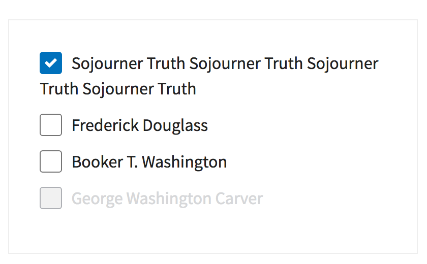
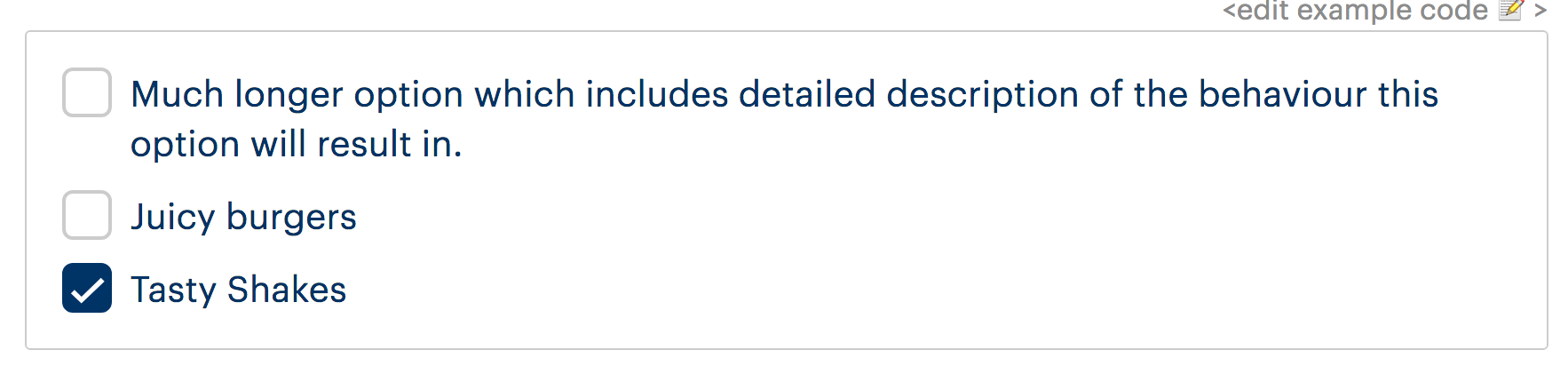
Hi Tory, I think many people have tried (and failed) to dynamically vertically centre the text next to a checkbox or radio button, however when we put these components together we didn't find any examples where the first line wasn't vertically aligned to the middle of the checkbox, with the content wrapping below that. In our case this looks slightly more dramatic as our radios and checkboxes are certainly larger than most. Here's a few examples from other design systems.
The main factor here though is that we simply don't know if the content is going to wrap or not, something that doesn't wrap on a large screen may well wrap on a small one. We can't set up any rules for these to behave differently at different breakpoints because it's entirely dependent on the character length of the label not the screen size. Here's an example of something that doesn't wrap on desktop, but starts to wrap at a undefinable point.
Aligning the label to the top of the checkbox would fix this as you say, however with our radios and checkboxes being larger than normal, I think you'll agree it makes them look a little odd when the labels are short and don't wrap.
I think it would be acceptable to adjust this spacing manually for individual use cases with known content but from a Design System perspective, when designing for the unknown there's not a huge amount we can do to change the spacing based on content length of each label. |




|
Not wishing to divert the existing topic of alignment on labels for checkboxes, I wanted also to propose a 'Select all' option for checkboxes. Would it be useful to include such a check-all option? We found a need for something similar at DVSA and added it to our prototype, but perhaps others have needed this also? Of course it'd be JS-driven, but the first option to 'select all' could be removed if JS is disabled, so it's an enhancement... Eg. The first option would also track the state of the other options, so if you checked everything, it'd automatically check itself... Thoughts on the feasibility of this? |

|
Had a go prototyping this: https://select-all-govuk-frontend-prototype.glitch.me/ We could take advantage of the
Quick observations:
Edit: Just realised my example is a bit broken, will make it work properly when I get a second... |
|
Thanks for the examples and experiments, Dave. I think it we can find a way
to adjust them manually, when the majority of options start to wrap, it
will help.
…On Thu, 11 Oct 2018 at 14:37, Dave House ***@***.***> wrote:
Hi Tory,
I think many people have tried (and failed) to dynamically vertically
centre the text next to a checkbox or radio button, however when we put
these components together we didn't find any examples where the first line
wasn't vertically aligned to the middle of the checkbox, with the content
wrapping below that.
In our case this looks slightly more dramatic as our radios and checkboxes
are certainly larger than most. Here's a few examples from other design
systems.
[image: screen shot 2018-10-11 at 13 55 35]
<https://user-images.githubusercontent.com/23356842/46807015-efe33700-cd60-11e8-9770-52169b9e3c88.png>
[image: screen shot 2018-10-11 at 13 56 24]
<https://user-images.githubusercontent.com/23356842/46807033-fa9dcc00-cd60-11e8-8e8f-ddb522490ef6.png>
[image: screen shot 2018-10-11 at 13 58 58]
<https://user-images.githubusercontent.com/23356842/46807041-ff628000-cd60-11e8-8506-940c3e2755b7.png>
[image: screen shot 2018-10-11 at 13 59 30]
<https://user-images.githubusercontent.com/23356842/46807053-038e9d80-cd61-11e8-8106-6506f647c1d0.png>
The main factor here though is that we simply don't know if the content is
going to wrap or not, something that doesn't wrap on a large screen may
well wrap on a small one. We can't set up any rules for these to behave
differently at different breakpoints because it's entirely dependent on the
character length of the label not the screen size.
Here's an example of something that doesn't wrap on desktop, but starts to
wrap at a undefinable point.
[image: checkbozx-wrap]
<https://user-images.githubusercontent.com/23356842/46807275-7566e700-cd61-11e8-9c87-dc481bef1936.gif>
Aligning the label to the top of the checkbox would fix this as you say,
however with our radios and checkboxes being larger than normal, I think
you'll agree it makes them look a little odd when the labels are short and
don't wrap.
[image: screen shot 2018-10-11 at 14 26 11]
<https://user-images.githubusercontent.com/23356842/46807381-afd08400-cd61-11e8-99b4-04d20f42aacc.png>
I think it would be acceptable to adjust this spacing manually for
individual use cases with known content but from a Design System
perspective, when designing for the unknown there's not a huge amount we
can do to change the spacing based on content length of each label.
—
You are receiving this because you were mentioned.
Reply to this email directly, view it on GitHub
<#6042 (comment)>,
or mute the thread
<https://github.com/notifications/unsubscribe-auth/Aildwu63RcpaPHxzV3M6rHAQWlB6Ytt-ks5uj0mHgaJpZM4RcUPt>
.
--
Tory Dunn
Head of Design | CDIO Digital Services | Dorset House | 07392
289160
|

|
I'd like the design system to support dividers for checkboxes as it does for radios - it confused me when it didn't. Like radios, checkboxes sometimes have options that are unlike others - such as 'none of the above' - in this case a divider helps communicate this. Example: WhySimilar reasoning to having it for radios - it helps communicate the options and that these are slightly different. |


|
Just a note that if we supported the 'None' of the above' pattern specifically, we might want to consider JavaScript to unselect the other checkboxes. |
Yep - and unselect 'none of the above' if you then pick one of the others ones. |

|
You would also need to handle it when JavaScript is not available. Do we want to use 'None of the above' in the example or something like 'My event will not include any of these'? |

Dropbox Paper auditOn 5 Feb 2019 the Design System team reviewed a Dropbox Paper document discussing the Checkboxes component. The aim was to reduce the number of places containing guidance and code by:
Below is a record of the outcomes of that review. If you need to, you can see the original Dropbox Paper content in the internet archive. Review outcomesUpdates to the Design SystemThe Design System team will carry out the following updates to ensure that relevant, useful content from the Dropbox Paper file is added to the Design System. Add guidance explaining:
Research and examplesThe following research findings and examples are from the archived Dropbox Paper file. Carer’s AllowanceThe Carer's Allowance tested a range of different styles for the active and hover states of radio buttons, none of which caused users to click the label instead of the control. Only when they removed the controls did people start to click the labels:
They got rid of radios and checkboxes and replaced them with a kind of button. They tested very well and no-one hesitated to use them. GOV.UK VerifyGOV.UK Verify tested some variations on this, and never got a level of confidence they were happy with. Some people paused when presented with a novel interface element. After interacting they were generally fine.
|


|
Just to note that in the Verify gif above, the options all had a grey background that got lost in the gif capture, so they looked like normal buttons |
|
I'm a bit late to reply... I can see how having the "or" for None of the above could be helpful, but it generally isn't necessary, and seems like it is creating more cognitive load. I've also noticed that the use of "or" within a series of radio buttons usually masks that the question should be broken into two. |

Hi @NickColley , do you have any thoughts if this feature is included into the next releases of govuk-frontend or not? |

|
Improved radios and checkboxes in forced colors mode As part of the GOV.UK Frontend v3.13.1 ‘fix release’, we’ve made some visual improvements to radio and checkbox controls for users in forced colors mode. Thanks to Adam Liptrot for reporting this issue. |

|
Hi All, @edwardhorsford Did anyone get to the bottom of the behaviour when "None" is selected in conjunction with another checkbox given that selecting more than one item is the key here. Tested well enough etc, I see that its on the Gov page now. |
|
@a184studio there is more discussion specifically about None here: |

|
Just so it doesn't get lost in the void, I'm leaving a comment here about a conversation we had on slack around the accessibility behaviour of the "none of the above" Javascript solution. In most cases, when you change anything which does not have focus, you need to announce it to a screen reader. I had assumed in this case it was unnecessary as the behaviour is implicit. By clicking none of the above, you'd fully expect any selections already selected above to become irrelevant. However, I had sought clarity on whether this was a deliberate design decision or a happy accident. @frankieroberto did confirm it was a deliberate decision, but if there is any user research to suggest it is an issue then it would be useful to share it. |
|
@abbott567 I had the same conversation the other day. @joelanman Pointed me to this sub thread on CheckBoxes |

|
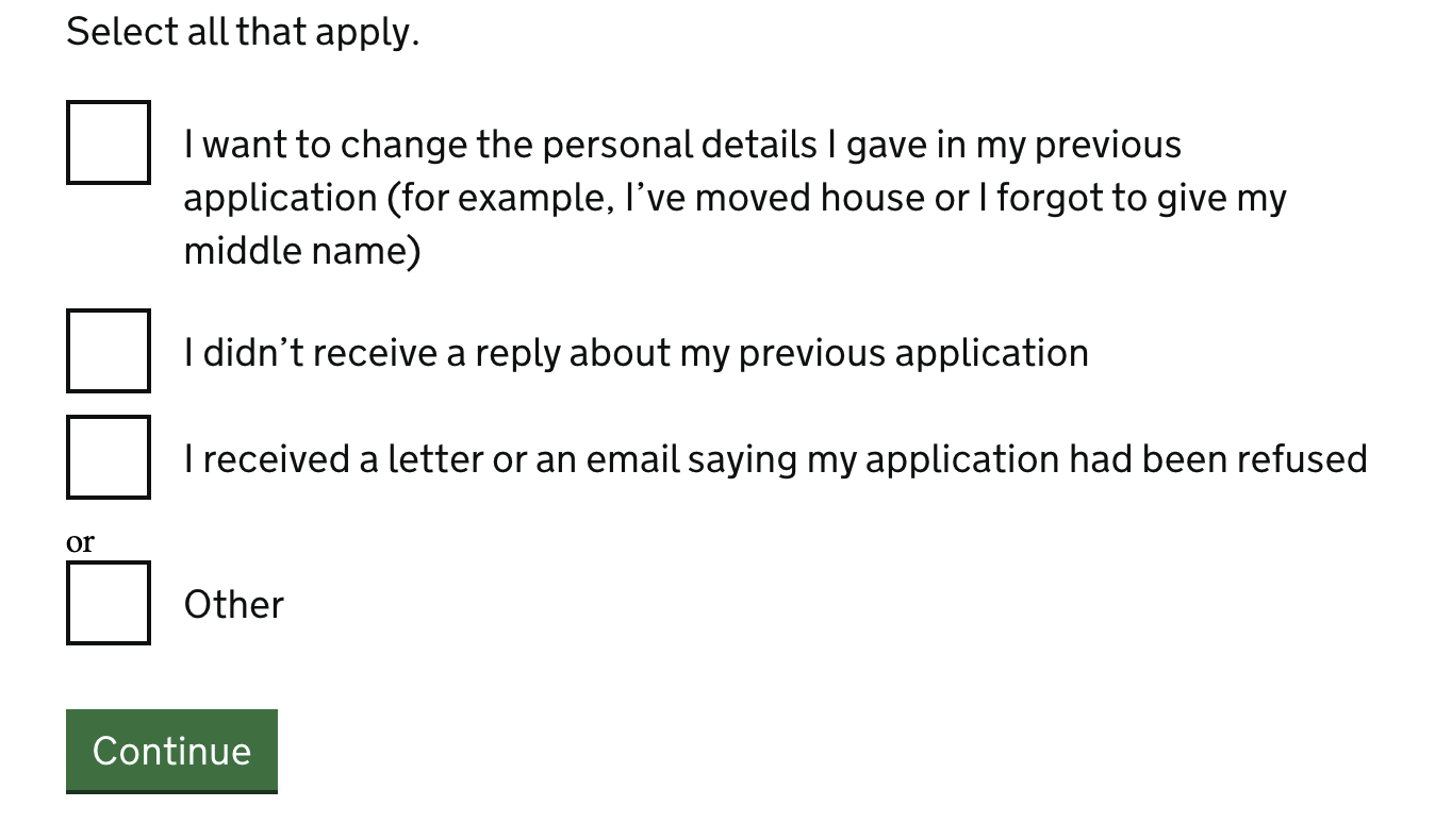
Hi, I believe someone has already pointed this issue earlier on but I haven't seen a feedback for it - I tried using the "or" option by copying the code available on the https://design-system.service.gov.uk/components/checkboxes/ but unfortunately the "or" doesn't seem to be styled as shown on the examples. Would anybody know why this is happening and how can I fix it please?
Thank you |
|
@cristina-agramunt do you know which version of GOV.UK Frontend (or Prototype Kit) you are using? You'll need v3.13.0 or above (or v9.14.0 or above of the Prototype Kit) for the 'or' divider styles to be included. |

|
I'm curious to know if the testing that was done on conditional reveals included radios and checkboxes with hint text. The guidance says conditionally revealing stuff is OK as long as it's simple. It reads like the simplicity only refers to the revealed item itself and not the entirety of the radio or checkbox item. By that reasoning, it would seem it's OK to conditionally reveal simple questions in a radio or checkbox item that has hint text. (See screenshot. Imagine the radio is a checkbox. :)) [This was cross-posted to the related Radios feed.]
|

|
@JodiB-TPR I see no reason why you couldn't. |
|
@JodiB-TPR I agree with @edwardhorsford |

|
We ran an external accessibility audit for some of the components and patterns in GOV.UK Frontend in May 2023. In that audit, we included examples of the Radio and Checkboxes components. We’re adding results from that audit here so that we can:
One usability issue raisedNo visible hover for checkboxes and radios in high contrast mode. Can't tell what's being hovered.
More detail in this issue: |

|
Hi GDS, I've got a request to allow the divider to either be styled or accept HTML, we're currently looking at this pattern where there are subheadings within the checkbox list that need to be styled as headings, but we can't split the list up, as we want the "or" to clear all previous checked boxes. Is this a change that can be made or is there a workaround? 
|
|
@racheld-madetech the problem here is that sub-headings in a single list is not a pattern that's easily supported by checkboxes. If just headings (say h2) are used, a screen reader user would almost definitely miss them as tabbing through the checkboxes would skip the headings. In this particular case is a 'guard' question about whether evidence is required a simpler solution? |
That's a very good point, I hadn't considered the tabbing aspect. I'll go back to the UX designer I'm working with and see if he'll change it to a guard question. Thanks! |


 and others
Uh oh!
There was an error while loading. Please reload this page.
Use this issue to discuss this component in the GOV.UK Design System.
All reactions