Repository navigation
Check answers #6105

Replies: 39 comments

|
We tested Prototype Kit's Check your answers page on NVDA + Firefox + Windows 10). If NVDA is set to read all content from top of page, it reads out "List of 12 items" on encountering the definition list ("Personal items"). As 12 items here includes both the |

|
Posting here for visibility AXe will report an accessibility issue with the Description List that is used in the pattern, with This is a bug in aXe and a pull request has been opened to address it. More details on allowed markup in the Description List element: https://developer.mozilla.org/en-US/docs/Web/HTML/Element/dl under Permitted content section. |

|
I've been testing an alternative version to this pattern within the Apply for Direct Rent Payments service. There is no user need to have a change link at each section, as some of the questions are on the same page and grouped to one thing per page e.g Tenant Details. It's tested really well and I wonder if it's worth having something like this as an alternative, depending on what the needs are?
|


|
We have also been looking at a similar pattern
|


|
@Ash-Wilson @sdh100shaun The official guidance is to start with One thing per page, in which case most answers would need their own 'Change' link. However if you find in research that grouping some questions on a page works better for your users, then you should do that. Be really careful though - one advantage of One thing per page is it makes understanding and interaction simpler for everyone. People who have problems reading and understanding, or interacting with digital services can really benefit from One thing per page. This is normally more important than grouping questions to make it a bit quicker for other people. |
|
thanks @joelanman , our UX person is going to test, especially as this fits into an established application. |

|
We've tested alternative layout of the page - with values in bold and keys/labels in normal font weight. The alternative version performed better for users with sight issues. It was easier for them to read values that were bold. This might be a case of a few values on a page, where it is not needed to scan a lot. |


|
Every now and then we'll get feedback from users indicating they think "Check your answers" means they've made an error, as in they're interpreting the purpose of the page as 'You've made a mistake, check your answers, and correct accordingly". So a title change might be something to consider? |

|
Am I right in saying that 'Check your answers' pattern is not part of the new Design System and is not in the govuk-frontend npm package? Is it more a case of copying over the styles from Elements, in order to use the markup in the example? Just wanted to check it's not directly |

Dropbox Paper auditOn 16 January 2019 the Design System team reviewed and removed a Dropbox Paper document discussing the Check answers pattern. The aim was to reduce the number of places containing guidance and code by:
Below is a record of the outcomes of that review. If you need to, you can see the original Dropbox Paper content in the internet archive. Review outcomesUpdates to the Design SystemThe Design System team will carry out the following updates to ensure that relevant, useful content from the Dropbox Paper file is added to the Design System. |

|
I was wondering how people handle the navigation between this Check Answers page and Question pages, and are there any examples that people can point me in the direction of? Question Pages are seen as a complete flow navigating through them in order until they are all completed. 1 -> 2 -> 3 -> 4 -> 5 -> Check Answers. |
|
@ChazUK When user clicks "Change" on "Check answers" page we direct them to the page with the question. When on that page they click "Continue" we direct them straight to "Check answers" page. No need to go through entire flow again. Does that answer your question? Example: Get MOT reminder: https://www.gov.uk/mot-reminder |
|
Thanks @rafaldrewnowski, that definitely helps. I like the use of "Save and return to review" as the Submit button, but I have noticed that you have used Back and Cancel and return. Attaching screenshots for anyone looking at this in the future.
|

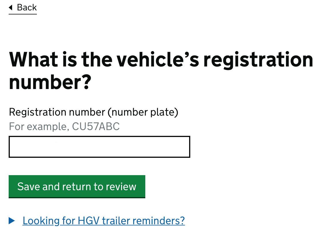
|
That's a good call out. Thank you! |

We've come across this too IIRC. Maybe 'Confirm your answers' would be better? |

|
Please consider adding something about why this page is two-thirds and indicate an option to go full width. We have at least one, possibly more, services where we believe full width would suit users better. After asking on slack comments included: "In many services, the user's answers will tend to be shorter - which is more suited towards 2/3 layout. I don't think the layout is ideal for displaying paragraph like answers though" "sure, you can go full width if you need to" Those answers were very helpful. Please can the information in those comments be considered for inclusion? |

|
I'd like to query the use of a 'govuk-visually-hidden' class mid-sentence. We have a project that are localising content to different languages, and we had to be sure not to assume English grammar can be re-used in a different language when coding it up. To localise the code above, we might assume we can simply translate 'Change' and 'name' separately and put them together in the same order as English grammar. I don't think we should make that assumption. Could we consider having more complete sentences as visible and accessible labels? Is anyone looking at making the localisation of toolkit templates easier btw? |
|
Depending on your chosen translation approach you should be able to include HTML in your translatable fields, which is how I've used it in the past. Although I do like your approach. |

|
There is an accessibility argument for having distinct text of link/buttons visible, rather than hidden. |

|
We tested the Check your answers pattern with a series of GP's who have a lot of text-heavy detailed content to review. We tweaked the Check your answers template by instead of having a govuk-grid-column-two-thirds layout, to a full govuk-grid-column-full layout. The users responded very well to this layout. I would suggested offering an expanded version in the Design System for text-heavy answers.
|

|
@DavDoh Apologies for the delay in replying and thanks for sharing your research 🙌 Your proposal sounds similar to what has been suggested in #1290. I've added a comment to that issue signpost it to your findings here. Feel free to add any further comments to that issue. |
|
@DavDoh if you have a lot of text it can be helpful to go full width to fit it in, but specifically in your screenshot there isn't a lot of text, and then the danger is that screen-magnifier users don't realise the Change links off on the right, as theres a large gap. |

|
What's the recommended design for optional question that have been seen but were not answered? |

|
@f-marry good question! I’ve started to look at what you might do if there’s no answer given but and answer is required (which can happen in a few different contexts) here: #1668 For optional questions though, our service currently uses placeholder text ("Empty") in dark grey. I think that’s probably better than an empty space, but I’m not entirely sure. We also currently add an "(optional)" text to the key, to remind users it is optional. However I'm increasingly not a fan of optional textfields at all, as users sometimes expect all fields to be required. One alternative is to ask a guard question first, eg "Do you want to provide any additional background?" and then display a textarea if they answer Yes. |

|
On the 'check your answers' page, I'd recommend:
On the problem of whether or not to have optional question: I have definitely come across plenty of circumstances where users wanted to provide further information even though it wasn't strictly required. A few examples:
When I was working on the design of the Self Assessment tax return, there was an 'additional information' box that was in fact required in a particular and very rare circumstance that I now forget, but we learned that many taxpayers used it for all sorts of things - most typically "the answer in box xx.xx is an estimate" (even when it had no tax consequences). There is definite merit in @frankieroberto's suggestion of a guard question (I call these 'filter questions'), because in a sense the user has to ask themselves that guard question ("Do I want to provide additional information?") and it often helps to make those sorts of internal conversations explicit on the page. But in this case, it looks like we might be heading to a yes/no question with no third option - and those always worry me, because the real world is so rarely binary. |

|
Like @frankieroberto I make sure to always have something in the value column of a summary list - either One other point though - sometimes it's better to combine several fields and show them as a single row in the summary list. This is implied on the design system, but I'm not sure it's really spelt out. Often optional fields fit as part of some other data - eg part of a full name row, part of an address. The example from the design system has this: Which presumably should link to an address form with an optional address line 2. |


|
In earlier iterations of our Attendance Allowance journey, applicants were only able to review their answers at the very end of the application, as per the pattern. Being overwhelmed and fatigued led users to having a lack of confidence with what they had inputted. Using smaller intervals of check your answers tested well for Bereavement Support Payment (BSP) who have cognitively overloaded users. Because of the size of our journey, we believed that it would give our users more manageable sections to review and move on. 
Various rounds of usability testing findings have been positive:
However, recent end-to-end testing has shown some users thought that they had completed their application after the first CYA page. So this is something we will continue to monitor and look at how we can better manage their expectations. We have looked at some other teams using progress indicators. BSP, for example, added ‘You have completed section 1 of 4’ for their smaller section CYA pages, so this is something we could explore here too. |

|
We used a task list to help visualise the journey to users. This gave them more autonomy when completing the application form and also meant they had a better understanding of the journey/ what to expect. This pattern could help with the issue of users believing they have completed the journey at CYA 1. |


|
Wondering if anyone has any advice on best practice for the following In a check your answers flow - if a user clicks on a change link, and is taken to the relevant page, does the back link still have to show on the top left? Are there any GDS examples? |

|
Adding something we saw in recent accessibility testing on a CICA service. Two participants did not notice or understand the ‘Change’ option on the Check answers page. One was using JAWS and one was using VoiceOver. The JAWS user understood the page was for checking their answers, but was not sure what to do if something was wrong. They navigated past the change link several times before understanding what to do. As JAWS was set to a fairly high speed, they often only heard “link, change” before moving on. The VoiceOver user heard the links read as “Change: [question]. Link”, but still was not sure there was a way to change their answers. They thought they might need to use the back button, and later suggested it would be helpful if the page made it clearer that they could go back to each stage and change it. We were using the standard GOV.UK Check answers pattern, so sharing here in case it’s useful for wider thinking around how people find and understand the change links. |


 and others
Uh oh!
There was an error while loading. Please reload this page.
Use this issue to discuss this pattern in the GOV.UK Design System.
All reactions