A customizable SwiftUI text field component designed to handle various states and UI configurations, including placeholder text, leading/trailing icons, error handling, and more. The TextFieldView is built with reusability and flexibility in mind.
- Supports multiple text field states (
default,disabled,focused,typing,filled, anderror). - Customizable placeholder, label, and error messages.
- Leading and trailing icons with customizable actions.
- Visual feedback for states (e.g., border, background, and text color changes).
- Fully animatable and adaptive to state changes.
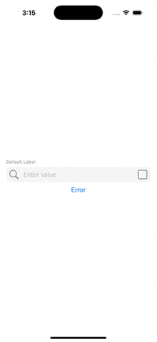
Each state of the text field dynamically adjusts its appearance:
| State | Description | Visual Changes |
|---|---|---|
default |
Normal state | Gray background, blue text. |
disabled |
Non-editable state | Gray background and text. |
focused |
When the text field is focused | Blue border. |
typing |
While typing in the text field | Blue border. |
filled |
When the text field has valid input | Gray background and text. |
error |
When an error occurs | Red text, error icon, and error hint. |
- Copy the
TextFieldViewandTextFeildViewDatsourcecode into your project. - Import
SwiftUIinto your view files to use the component.
Here’s how you can use the TextFieldView in your SwiftUI views:
This GIF demonstrates the TextFieldView component in action. View on Giphy.
import SwiftUI

struct ContentView: View {
    @State private var text: String = ""

    var body: some View {
        VStack(spacing: 16) {
            // Default State
            TextFieldView(
                text: $text,
                datasource: TextFeildViewDatsource(
                    placeholder: "Enter value",
                    state: .default,
                    label: "Default Label",
                    leadingIcon: Image(systemName: "square.fill"),
                    trailingIcon: Image(systemName: "square.fill"),
                    leadingIconAction: { print("Leading icon tapped - Default") },
                    trailingIconAction: { print("Trailing icon tapped - Default") }
                )
            )

            // Error State
            TextFieldView(
                text: $text,
                datasource: TextFeildViewDatsource(
                    placeholder: "Enter value",
                    state: .error,
                    errorLabel: "Invalid input. Please try again.",
                    label: "Error Label",
                    leadingIcon: Image(systemName: "square.fill"),
                    trailingIcon: Image(systemName: "square.fill"),
                    leadingIconAction: { print("Leading icon tapped - Error") },
                    trailingIconAction: { print("Trailing icon tapped - Error") }
                )
            )
        }
        .padding()
    }
}